Radar Widget
The Radar Widget shows the current state of the radar sensors. The forward and backward sensors each have four sectors represented by ObstacleDetectionSector, and the left and right sensors each have a single sector. For the front and back sensors, each sector displays an icon according to its ObstacleDetectionSectorWarning level. For the left and right sensors, the indicator is red if the obstacle is closer than 3 meters and yellow if the obstacle is closer than 6 meters.
Each radar section has its own distance indicator which uses the unit type determined by the UNIT_TYPE UXKey.

Additionally, an icon appears in the center when the upwards sensor detects an obstacle.

For Matrice 200 V2 series and Matrice 300 products, a warning sound plays if the aircraft's motors are on and an obstacle is detected less than 10 meters away. The sounds vary based on the distance of the obstacle.
If no obstacles are detected by a sensor, or there is no sensor in a direction for a certain product, then the radar bars will be hidden for that direction.
<dji.ux.beta.core.widget.radar.RadarWidget
    android:id="@+id/widget_radar"
    android:layout_width="340dp"
    android:layout_height="160dp" />
The ideal dimension ratio for this widget is 17:8.
The UI elements can be customized to match the style of the user's application. The customizations can be done using attributes in XML or programmatically using the APIs.
<dji.ux.beta.core.widget.radar.RadarWidget
    android:id="@+id/widget_air_sense"
    android:layout_width="340dp"
    android:layout_height="160dp"
    app:uxsdk_forwardImages="@array/radar_forward"
    app:uxsdk_backwardImages="@array/radar_backward"
    app:uxsdk_leftImage="@drawable/radar_left"
    app:uxsdk_rightImage="@drawable/radar_right"
    app:uxsdk_distanceArrowIcon="@drawable/ic_keyboard_arrow_up_yellow_24dp"
    app:uxsdk_distanceTextColor="@color/uxsdk_black"
    app:uxsdk_distanceTextBackground="@drawable/distance_bg" />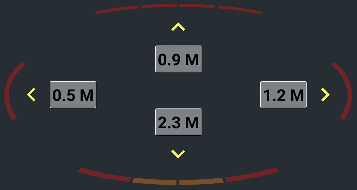
List of the customizable XML attributes
-
uxsdk_forwardImages- The images for the forward radar section. The images will be overlapped to form the sections of the radar. An array of level-list drawables with levels from 0-5 is recommended. -
uxsdk_backwardImages- The images for the backward radar section. The images will be overlapped to form the sections of the radar. An array of level-list drawables with levels from 0-5 is recommended. -
uxsdk_leftImage- The image for the left radar section. A level-list drawable with levels from 0-1 is recommended. -
uxsdk_rightImage- The image for the right radar section. A level-list drawable with levels from 0-1 is recommended. -
uxsdk_distanceArrowIcon- The drawable resource for the arrow icons. The given icon should be pointed up, and each radar direction's icon will be rotated to point the corresponding direction. -
uxsdk_distanceArrowIconBackground- The drawable resource for the arrow icon's background. -
uxsdk_upwardObstacleIcon- The drawable resource for the upward obstacle icon. -
uxsdk_upwardObstacleIconBackground- The drawable resource for the upward obstacle icon's background. -
uxsdk_distanceTextBackground- The background of the distance text views. -
uxsdk_distanceTextAppearance- The text appearance of the distance text views. -
uxsdk_distanceTextColor- The text color of the distance text views. -
uxsdk_distanceTextSize- The text size of the distance text views.
RadarWidget radarWidget = findViewById(R.id.widget_radar);
radarWidget.setForwardRadarImages(forwardRadarImages);
radarWidget.setBackwardRadarImages(backwardRadarImages);
radarWidget.setLeftRadarImage(R.drawable.radar_left);
radarWidget.setRightRadarImage(R.drawable.radar_right);
radarWidget.setDistanceArrowIcon(R.drawable.ic_keyboard_arrow_up_yellow_24dp);
radarWidget.setDistanceTextColor(R.color.uxsdk_black);
radarWidget.setDistanceTextBackground(R.drawable.distance_bg);val radarWidget: RadarWidget = findViewById(R.id.widget_radar)
radarWidget.forwardRadarImages = forwardRadarImages
radarWidget.backwardRadarImages = backwardRadarImages
radarWidget.setLeftRadarImage(R.drawable.radar_left)
radarWidget.setRightRadarImage(R.drawable.radar_right)
radarWidget.setDistanceArrowIcon(R.drawable.ic_keyboard_arrow_up_yellow_24dp)
radarWidget.setDistanceTextColor(R.color.uxsdk_black)
radarWidget.setDistanceTextBackground(R.drawable.distance_bg)The front and back radar images are customized using an array of level-list drawables. The array should have four level-list drawables, each with levels 0-5, with 0 corresponding to ObstacleDetectionSectorWarning.LEVEL_1, and 5 corresponding to ObstacleDetectionSectorWarning.LEVEL_6.
<level-list xmlns:android="http://schemas.android.com/apk/res/android">
    <item android:maxLevel="0" android:drawable="@drawable/radar_forward_1_0" />
    <item android:maxLevel="1" android:drawable="@drawable/radar_forward_1_1" />
    <item android:maxLevel="2" android:drawable="@drawable/radar_forward_1_2" />
    <item android:maxLevel="3" android:drawable="@drawable/radar_forward_1_3" />
    <item android:maxLevel="4" android:drawable="@drawable/radar_forward_1_4" />
    <item android:maxLevel="5" android:drawable="@drawable/radar_forward_1_5" />
</level-list><array name="radar_forward">
<item>@drawable/radar_forward_1</item>
<item>@drawable/radar_forward_2</item>
<item>@drawable/radar_forward_3</item>
<item>@drawable/radar_forward_4</item>
</array>List of the customization APIs
-
var forwardRadarImages: Array<Drawable?>- The images for the forward radar section. The images will be overlapped to form the sections of the radar. An array of level-list drawables with levels from 0-5 is recommended. -
var backwardRadarImages: Array<Drawable?>- The images for the backward radar section. The images will be overlapped to form the sections of the radar. An array of level-list drawables with levels from 0-5 is recommended. -
var leftRadarImage: Drawable?- The image for the left radar section. A level-list drawable with levels from 0-1 is recommended. -
var rightRadarImage: Drawable?- The image for the right radar section. A level-list drawable with levels from 0-1 is recommended. -
var distanceTextColor: Int- The text color for the distance text views. -
var distanceTextColors: ColorStateList?- The text color state list of the distance text views. -
var distanceTextBackground: Drawable?- The background of the distance text views. -
var distanceTextSize: Float- The text size of the distance text views. -
var distanceArrowIcon: Drawable?- The drawable resource for the arrow icons. The given icon should be pointed up, and each radar direction's icon will be rotated to point the corresponding direction. -
var distanceArrowIconBackground: Drawable?- The drawable resource for the arrow icon's background. -
var upwardObstacleIcon: Drawable?- The drawable resource for the upward obstacle icon. -
var upwardObstacleIconBackground: Drawable?- The drawable resource for the upward obstacle icon's background. -
fun setWarningLevelRanges(models: Array<Model>, levelRanges: FloatArray)- Set the warning level ranges for the specified product models. The levelRanges array should be arranged so that each number represents the maximum distance in meters for the corresponding warning level. For example [70, 4, 2] would indicate that warning level LEVEL_1 has the range (4-70], warning level LEVEL_2 has the range (2,4], and warning level LEVEL_3 has the range [0,2]. A distance with a value above the largest number in the array will have the warning level INVALID. -
fun setForwardRadarImages(resourceIds: IntArray)- Set the resource IDs for the forward radar section. The images will be overlapped to form the sections of the radar. -
fun setBackwardRadarImages(resourceIds: IntArray)- Set the resource IDs for the backward radar section. The images will be overlapped to form the sections of the radar. -
fun setLeftRadarImage(@DrawableRes resourceId: Int)- Set the resource ID for the left radar section. -
fun setRightRadarImage(@DrawableRes resourceId: Int)- Set the resource ID for the right radar section. -
fun setDistanceTextAppearance(@StyleRes textAppearanceResId: Int)- Set text appearance of the distance text views. -
fun setDistanceTextBackground(@DrawableRes resourceId: Int)- Set the resource ID for the background of the distance text views. -
fun setDistanceArrowIcon(@DrawableRes resourceId: Int)- Set the resource ID for the arrow icons. The given icon should be pointed up, and each radar direction's icon will be rotated to point the corresponding direction. -
fun setDistanceArrowIconBackground(@DrawableRes resourceId: Int)- Set the resource ID for the arrow icon's background. -
fun setUpwardObstacleIcon(@DrawableRes resourceId: Int)- Set the resource ID for the upward obstacle icon. -
fun setUpwardObstacleIconBackground(@DrawableRes resourceId: Int)- Set the resource ID for the upward obstacle icon's background.
The widget provides hooks for users to add functionality based on state changes in the widget. The Radar widget provides the following hooks
-
ModelState- Provides hooks in events received by the widget from the widget model.
-
data class ProductConnected(val isConnected: Boolean) : ModelState()- Event when product is connected or disconnected. -
data class AscentLimitedUpdated(val isAscentLimited: Boolean) : ModelState()- Event when an upward obstacle is detected. -
data class NoseStateUpdated(val noseState: VisionDetectionState) : ModelState()- Event when the nose state is updated. -
data class TailStateUpdated(val tailState: VisionDetectionState) : ModelState()- Event when the tail state is updated. -
data class RightStateUpdated(val rightState: VisionDetectionState) : ModelState()- Event when the right state is updated. -
data class LeftStateUpdated(val leftState: VisionDetectionState) : ModelState()- Event when the left state is updated.
The user can subscribe to this using fun getWidgetStateUpdate(): Flowable<ModelState>.