List Item Label Button Widget
The widget is an extension of the List Item Title Widget. The primary purpose of this widget is to display read only values and enable user interaction.
abstract class ListItemLabelButtonWidget<T> @JvmOverloads constructor(
        context: Context,
        attrs: AttributeSet? = null,
        defStyleAttr: Int = 0,
        val widgetType: WidgetType
) : ListItemTitleWidget<T>(context, attrs, defStyleAttr)
The WidgetType supports three values:
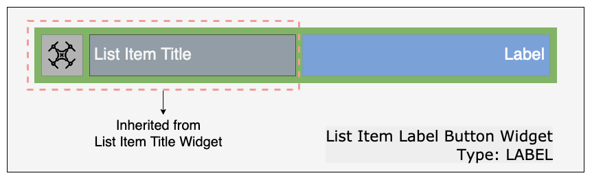
It inherits the title icon and title text and its customizations from the List Item Title Widget. Additionally it provides a label for displaying values and supports all the label customizations mentioned below.
Example of the widget is Flight Mode List Item Widget

It inherits the title icon and title text and its customizations from the List Item Title Widget. Additionally it provides a button for user interaction and supports all the button customizations mentioned below.
Example of the widget is Travel Mode List Item Widget

It inherits the title icon and title text and its customizations from the List Item Title Widget. Additionally it provides a button for user interaction and a label for displaying values. The widget supports all the button customizations and label customizations mentioned below.
Example of the widget is SD Card Status List Item Widget
The UI elements can be customized to match the style of the user's application. The customizations can be done using attributes in XML or programmatically using the APIs.
List of the customizable XML attributes
-
uxsdk_list_item_label- The string value for list item label. -
uxsdk_list_item_label_text_size- The size of the list item label text. -
uxsdk_list_item_label_text_color- The color of the list item label text. -
uxsdk_list_item_label_appearance- The appearance of the list item label text. -
uxsdk_list_item_label_background- The background for the list item label. -
uxsdk_list_item_label_visibility- The visibility for the list item label.
List of the customization APIs
-
var listItemLabel: String?- The string value for list item label. -
var listItemLabelTextSize: Float- The text size of the list item label. -
var listItemLabelTextColor: Int- The text color of the list item label. -
var listItemLabelTextColors: ColorStateList?- The text color state list for the list item label. -
var listItemLabelBackground: Drawable?- The drawable background for the list item label. -
var listItemLabelVisibility: Boolean- The visibility for list item label. -
fun setListItemLabelBackground(@DrawableRes resourceId: Int)- Set the background resource of the list item label. -
fun setListItemLabelTextAppearance(@StyleRes textAppearanceResId: Int)- Set the appearance of the list item label text.
List of the customizable XML attributes
-
uxsdk_list_item_button_text- The string to be displayed on the button. -
uxsdk_list_item_button_text_size- The size of the text diplayed on the button. -
uxsdk_list_item_button_text_color- The color of the text diplayed on the button. -
uxsdk_list_item_button_appearance- The appearance of the text diplayed on the button. -
uxsdk_list_item_button_background- The drawable background for the button. -
uxsdk_list_item_button_enabled- To set the button functionality enabled/disabled. -
uxsdk_list_item_button_visibility- The visibility of the button.
List of the customization APIs
-
var listItemButtonText: String?- The string to be displayed on the button. -
var listItemButtonTextSize: Float- The size of the text diplayed on the button. -
var listItemButtonTextColor: Int- The color of the text diplayed on the button. -
var listItemButtonTextColors: ColorStateList?- The color state list for the text diplayed on the button. -
var listItemButtonBackground: Drawable?- The drawable background for the button. -
var listItemButtonEnabled: Boolean- To set the button functionality enabled/disabled. -
var listItemButtonVisibility: Boolean- The visibility of the button. -
fun setListItemButtonBackground(@DrawableRes resourceId: Int)- Set the background resource for the button. -
fun setListItemButtonTextAppearance(@StyleRes textAppearanceResId: Int)- Set the text apperance of the text displayed on the button.