Error Message Design Guidelines
Interface errors appear when the application can’t do what the user wants, typically because:
- The app technically fails to complete the request
- The app can’t understand the user input
- The user tries to combine operations that can’t work together
In all cases, encountering errors increases user friction and frustration while trying to use the application. Providing an error experience that helps the user understand what happened and their next steps is key to building user confidence and increasing engagement.
The best error experience is no error at all. Before implementing error patterns, consider what you might do in the interface before the user would encounter an error to prevent it from happening at all. This might look like:
- Providing tooltips or microcopy to help users understand how to interact with the interface
- Disabling parts of the UI until desired conditions are met (e.g. disabling a Save button until mandatory fields in a form are completed)
- Correcting an error automatically (e.g. autocorrecting spelling errors)
Only report errors users care about. The only errors that should appear in the interface are errors that require user acknowledgement and action (even if that action is “try again later” or “contact support”).
Do not start the user in an error state. If user inputs are required to display an initial interface (e.g. a chart in Explore), use empty states or field highlighting to drive users to the required action.
Select one pattern per error (e.g. do not implement an inline and banner pattern for the same error).
| When the error... | Use... |
|---|---|
| Is directly related to a UI control (user didn’t fill out a mandatory field, user inputs wrong datatype, etc.) | Inline error |
| Is not directly related to a UI control (technical failure, loading issues, etc.) | Banner error |
Inline errors are used when the source of the error is directly related to a UI control (text input, selector, etc.) such as the user not populating a required field or entering a number in a text field.
Use the LabeledErrorBoundInput component for this error pattern.
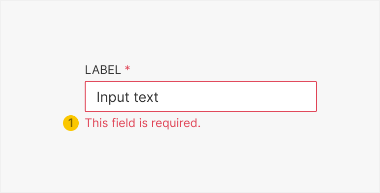
- Message Provides direction on how to populate the input correctly.
- Where and when relevant, scroll the screen to the UI containing the inline error
- If form has multiple fields with inline errors, scroll user to the error closest to the top of the screen and let the user scroll to the next error
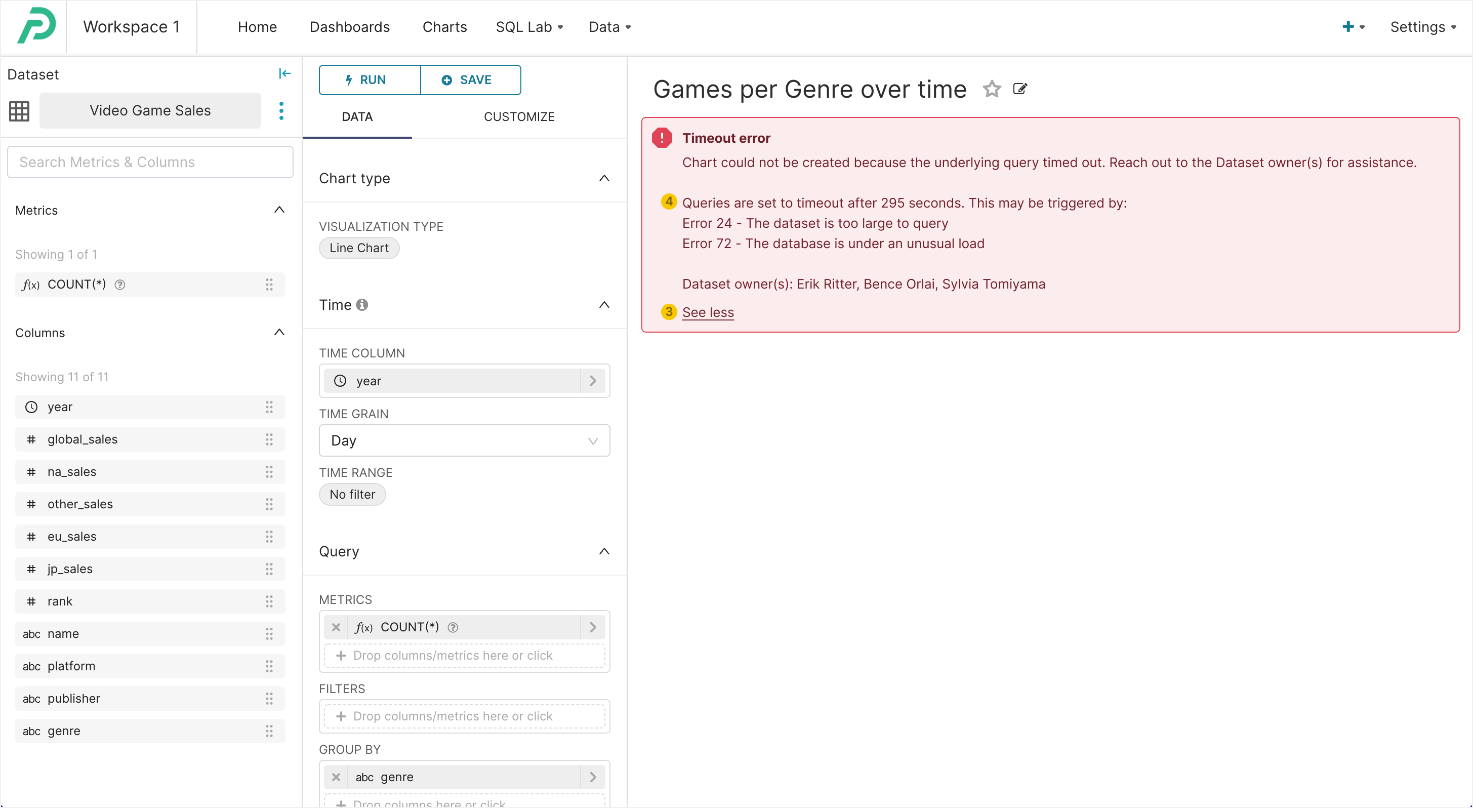
Banner errors are used when the source of the error is not directly related to a UI control, but reflects a larger error related to an area of the screen or the entire screen or application.
Place the component as close to the relevant area as possible (e.g. if the error pertains to a chart loading in Explore, display banner where chart is expected to load). If the error happens in a modal (and is not directly tied to a field), display banner at the bottom, in the footer (see example). If the error is app-wide, place the banner at the top of the screen (above the navigation).
Use the ErrorAlert component for this error pattern.
Error banner collapsed

Error banner expanded
Modal opened from banner error
Alert component in footer
-
Headline [optional] One or two words that summarize the type of error. Can omit if there are space constraints.
-
Message Explains what went wrong and user next steps.
-
Message expand [optional] Expands banner to reveal message details when necessary. Note: This text should always say “See more” (to expand) and “See less” (to collapse).
-
Message details [optional] Provides additional, useful information that may help the user resolve the error. This additional text should follow content guidelines and should not be required for the user to resolve the error.
-
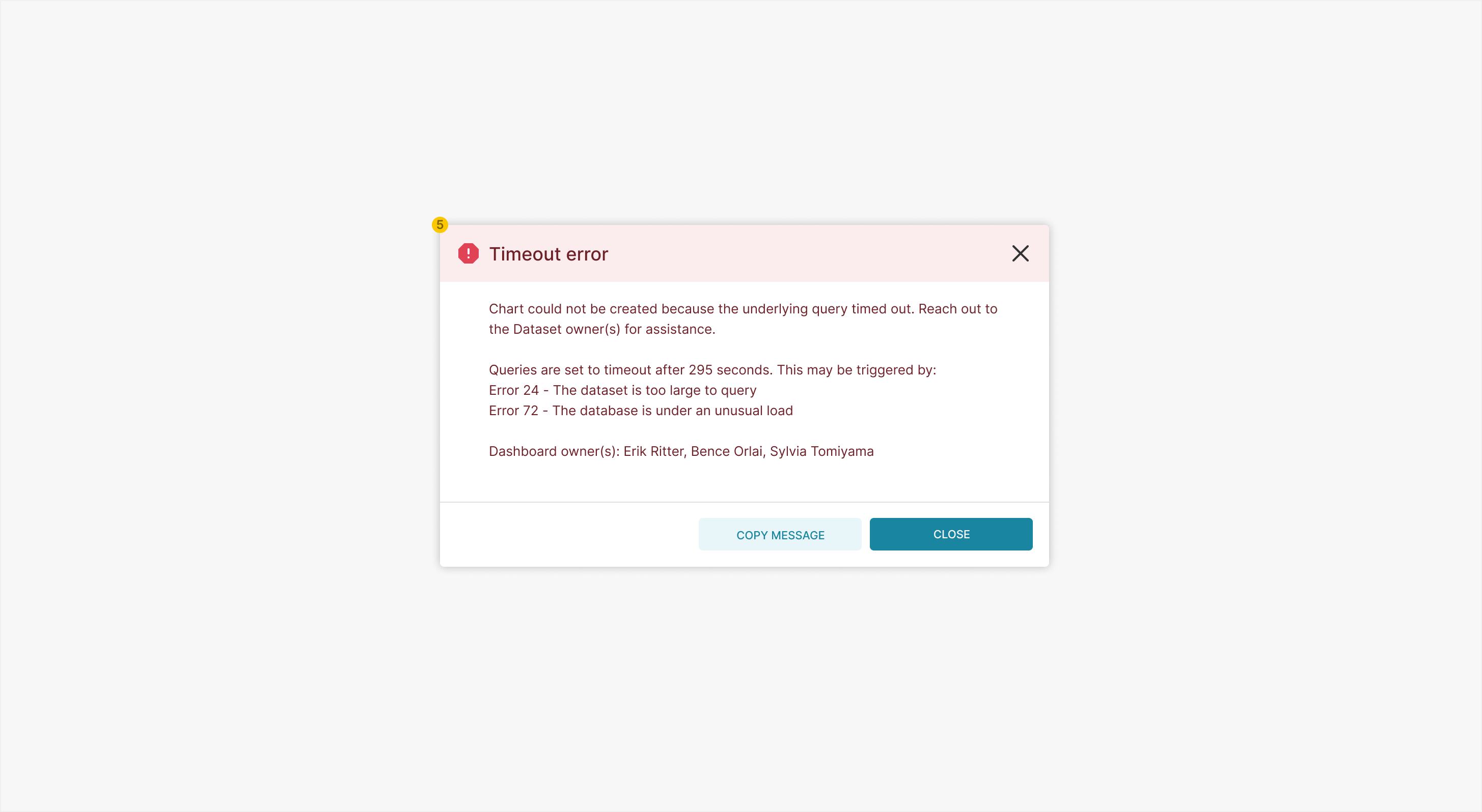
Modal [optional] It may not always be possible to expand an error message in a banner for spatial reasons (e.g. an individual chart banner error in a dashboard). In these cases, a “See more” button may open a modal containing the error message instead. This pattern should be used only if absolutely necessary. Use the
ToastType.DANGERcomponent for this error pattern.
- Banner remains on the screen until the error is resolved
- Banner should move other screen content, not overlay it
Useful error messages communicate two things to the user:
- What went wrong
- What the user should do next
Useful error messages:
- Are clear and accurate, leaving no room for misinterpretation
- Are short and meaningful
- Can be understood by non-technical users
- Don’t blame the user
- Avoid using negative words
Don’t forget to follow capitalization guidelines.
| 🛑 Don’t | ✅ Do |
|---|---|
| “Cannot delete a datasource that has slices attached to it.” | “Please delete all charts using this dataset before deleting the dataset. [list charts].” |
| “You cannot give two datasets the same name.” | “A dataset already exists with this name. Please give a unique name to this dataset.” |
| “System failure.” | “Superset encountered an error while trying to load your dashboard. Please try again later.” |
