Improve look of Pokémon marker label #2476
Conversation
|
I like it! The way it shows IV's is much better like this. |
|
I like this, minimal and easier to read, how would it account for the recent PR #2475 (adding gen info to marker labels), possibly next to level? |
|
@daangroot add |
|
@sebastiaanvercammen I don't see why a top margin would help. There is nothing above it that could be pressed, so nothing can go wrong. |
|
@daangroot u could press something like exclude or notify for e.g. |
|
Oh yes sorry, did not think about the no iv label. |
|
I added a 5px top margin to the navigate class as suggested. |
static/sass/layout/_pokemon.scss
Outdated
| @@ -79,11 +79,13 @@ | |||
| } | |||
|
|
|||
| &.navigate { | |||
| position: absolute; | |||
There was a problem hiding this comment.
why do we need that? im not a fan of position: absolute.
There was a problem hiding this comment.
That's how it was done before. It can be done differently but this is the easiest way.
static/sass/layout/_pokemon.scss
Outdated
| @@ -94,6 +96,6 @@ | |||
| display: block; | |||
| height: 48px; | |||
| width: 48px; | |||
| margin-bottom: 11px; | |||
| margin-bottom: 15px; | |||
There was a problem hiding this comment.
Is there a reason why we would have to increase it?
Also, can u provide a screenshot with the difference compared to my simple change?
There was a problem hiding this comment.
To align the links on the left with the location link. I think it looks better this way.

|
You should consider leaving the ADS labels on the IVs to eliminate confusion. Many (not all) tools use ADS, but the in-game appraisal uses SAD. |
|
@dripdropper I removed them because it looked better, but I can understand that it might cause confusion, so I will add them back. |
|
nice changes, looks neat and triggers no warning or epileptic episodes |
|
Werks Gud. Thanks for your efforts. |
|
Thanks. It works perfect 👍. |
cbb97e5
to
c6eee6c
Compare
|
Looks good and works. |
static/js/map.js
Outdated
| @@ -506,7 +506,7 @@ function initSidebar() { | |||
| } | |||
|
|
|||
| function getTypeSpan(type) { | |||
| return `<span style='padding: 2px 5px; text-transform: uppercase; color: white; margin-right: 2px; border-radius: 4px; font-size: 0.6em; vertical-align: middle; background-color: ${type['color']}'>${type['type']}</span>` | |||
| return `<span style='padding: 2px 5px; text-transform: uppercase; color: white; margin-right: 2px; border-radius: 4px; font-size: 0.75em; vertical-align: middle; background-color: ${type['color']}'>${type['type']}</span>` | |||
There was a problem hiding this comment.
Move all the inline CSS to the stylesheet, and remove the getTypeSpan function. Since the HTML will be much shorter, it'll be clearer if it's no longer a separate function.
|
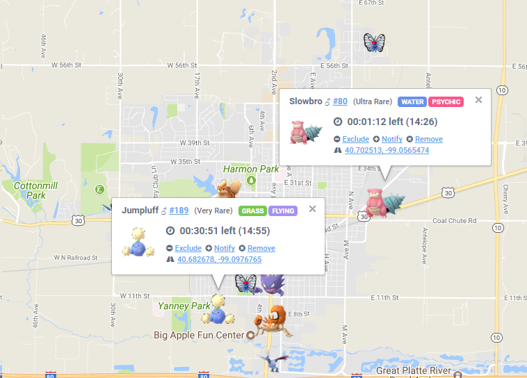
Most up-to-date look of the label: |
There was a problem hiding this comment.
RE: Discord:
[11:57 PM] Konturka: There is a small issue though. The type is not centered inside its box on some mobile browsers.
[11:58 PM] Konturka: This was already an issue but it was less noticeable because the font size was smaller.(edited)
[12:00 AM] Konturka: On chrome and samsungs browser it's not centered.
[12:00 AM] Konturka: On firefox it is.

|
Looking at the Type box code and testing locally |
|
Adding |
|
@sebastienvercammen I've tried a lot of things to make the type text centered, but I couldn't fix it. |
|
Maybe we can merge it and fix it afterwards. I can make an issue for this problem, so other people are aware of it and can maybe fix it. |
|
@daangroot We won't merge without the fix. The PR is instead tagged as "help wanted". |
|
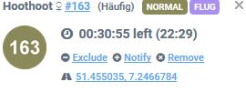
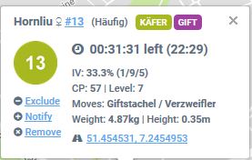
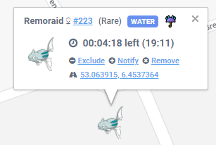
Hopefully the final look:
|
Description
Small improvement of style and formatting of the Pokémon marker label.
See screenshots below for the changes made.
Motivation and Context
I did not really like the look of the label, so I thought lets make it more beautiful :)
How Has This Been Tested?
Tested on my main setup.
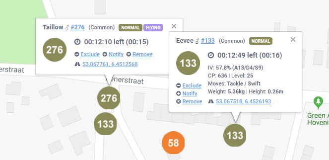
Screenshots (if appropriate):
Old:

New:

Types of changes
Checklist: