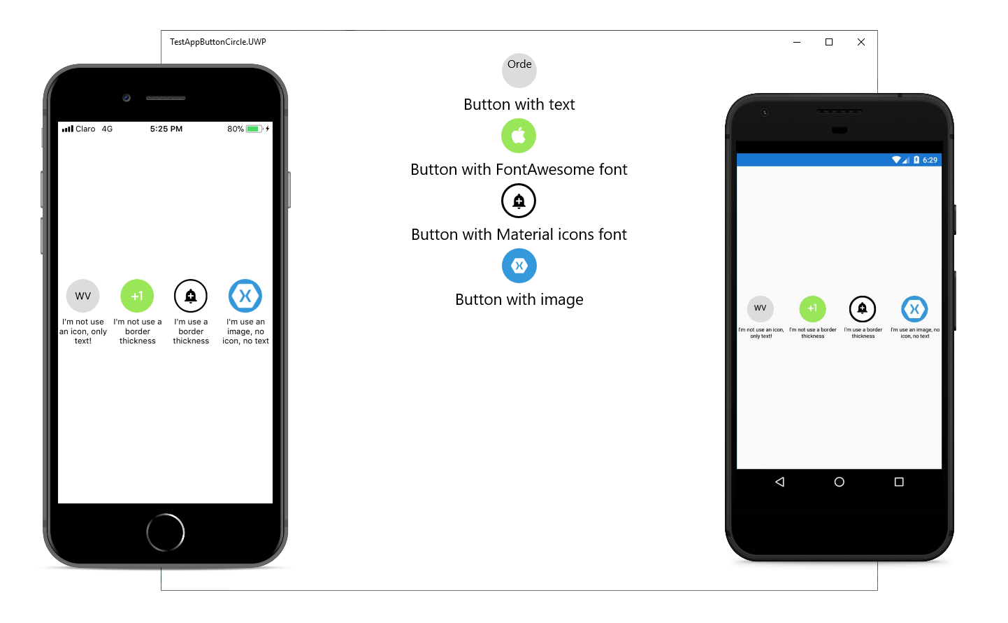
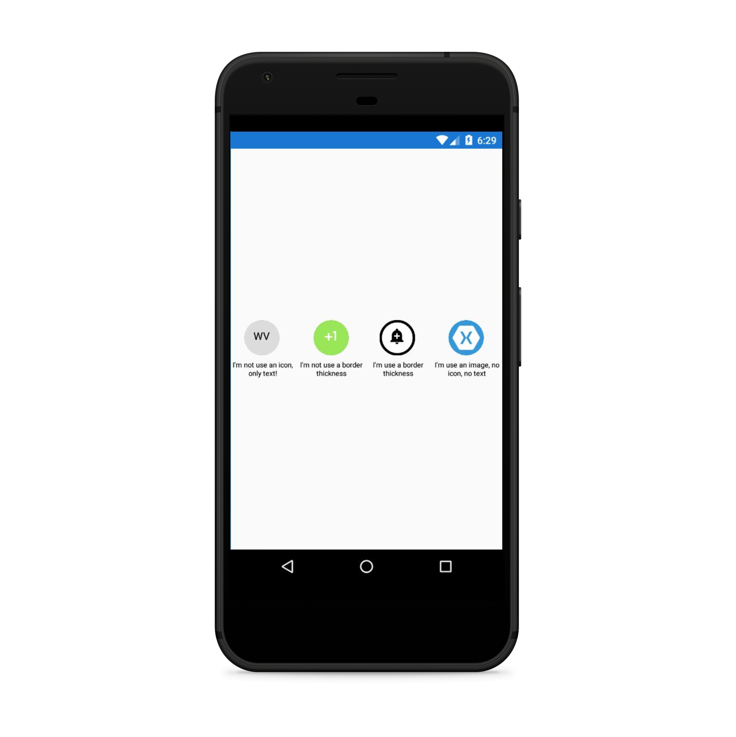
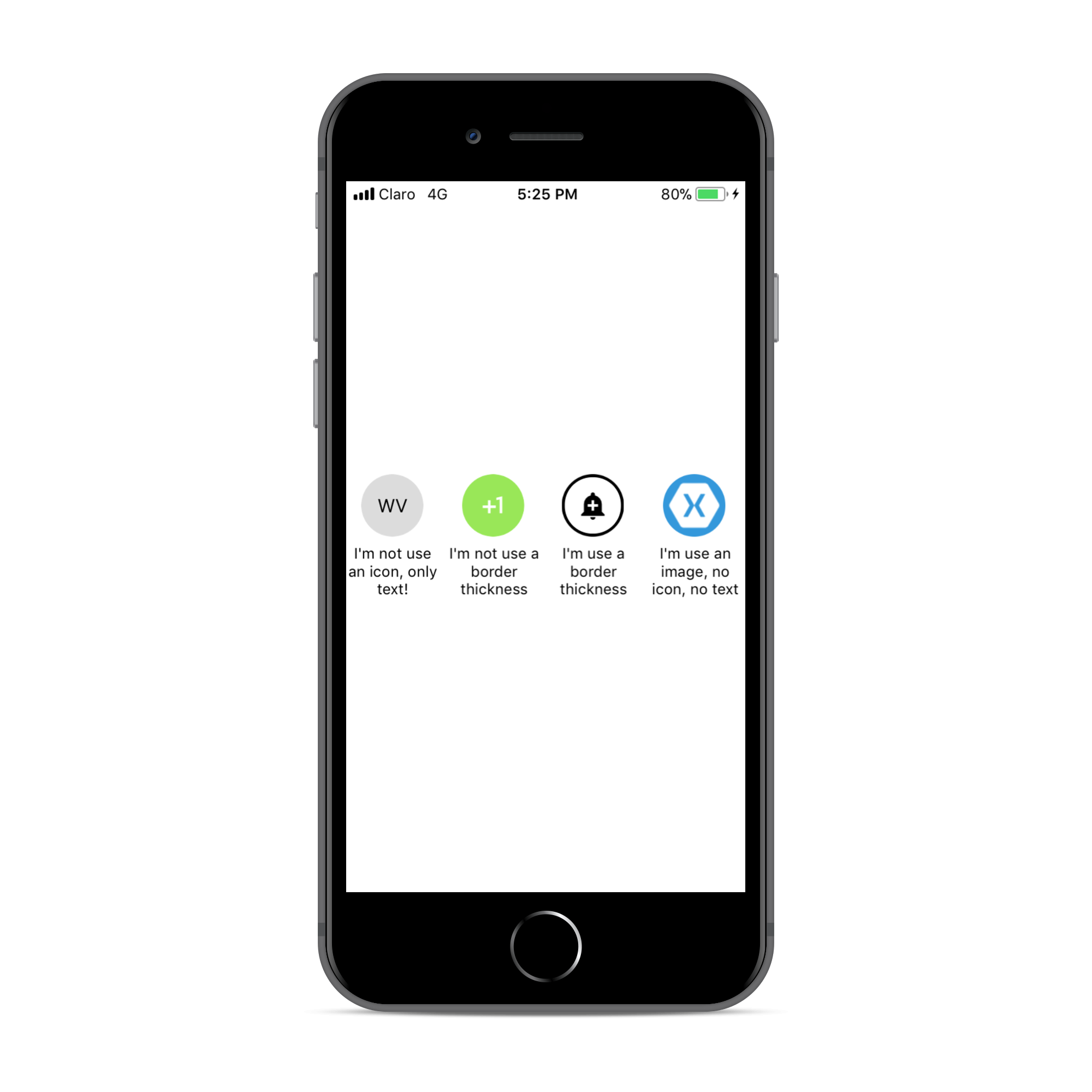
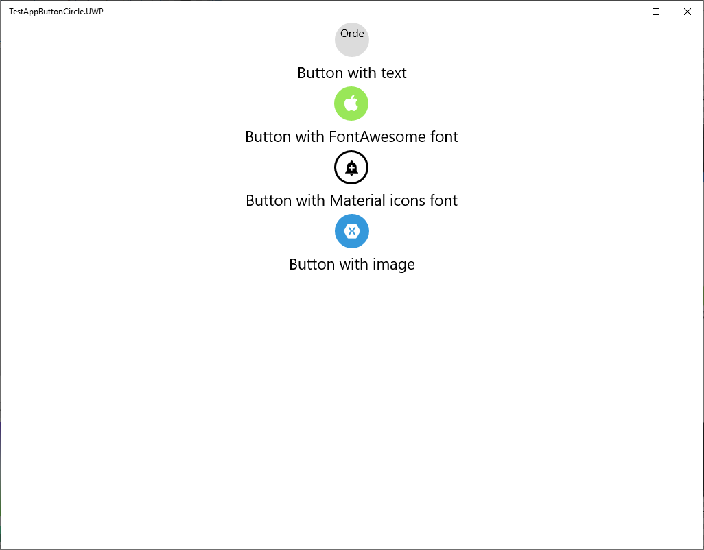
Simple but elegant way of display circle buttons with an icon in your Xamarin.Forms projects.
- Available on NuGet: Plugins.Forms.ButtonCircle
- Install into your PCL or .NET Standard project and Client projects.
In your Android project call:
ButtonCircleRenderer.Init();
In your iOS project call:
ButtonCircleRenderer.Init();
In your iOS project add materialicons.ttf and fontawesome.ttf files to:
Resources
You can download the files here:
And add this key in your Info.plist
<key>UIAppFonts</key>
    <array>
      <string>materialicons.ttf</string>
      <string>fontawesome.ttf</string>
      <string>ionicons.ttf</string>
    </array>
In your UWP project add materialicons.ttf and fontawesome.ttf files to:
Assets/Fonts
You can download the files here:
Also call Init method:
ButtonCircleRenderer.Init();
You must do this AFTER you call Xamarin.Forms.Init();
Note: On UWP, the button's fill color on hover will be a lighter shade of the background color set on the CircleButton, unless it is transparent (which will be the assumed default if no BackgroundColor is explicitly set) in which case the BorderColor will be used.
Platform Support
| Platform | Supported | Version |
|---|---|---|
| Xamarin.iOS | Yes | iOS 7+ |
| Xamarin.Android | Yes | API 14+ |
| Windows 10 UWP | Yes | Build 105086+ |
| Xamarin.Mac | No |
You can see name of icons for FontAwesome here and for Material design icon here
Instead of using an Button simply use a CircleButton instead!
You MUST set the width & height requests to the same value. Here is a sample:
new ButtonImage
{
  BorderColor = Color.Black,
  BorderThickness = 5,
  HeightRequest = 150,
  WidthRequest = 150,
  HorizontalOptions = LayoutOptions.Center,
  FontIcon = Fonts.Material
  Icon = "md-add"
}
XAML:
First add the xmlns namespace:
xmlns:local="clr-namespace:ButtonCircle.FormsPlugin.Abstractions;assembly=ButtonCircle.FormsPlugin.Abstractions"Then add the xaml:
<local:CircleButton
        FontIcon="Material"
        Icon="md-directions-bike"
        FontSize="30" TextColor="Black"
        HeightRequest="70" WidthRequest="70"
        BorderThickness="5" BorderColor="Black"
        BackgroundColor="#DCDCDC">
</local:CircleButton>
If you see the replacement character (�) appear instead of the desired icon, make sure that you have followed the setup instructions above and that you have supplied the correct text key for the "Icon" property.
Licensed under MIT, see license file