

React Tree View Component. Take Advantage of Immutable.js.
An online example from the /example directory can be found here: Here
npm install react-immutable-treeview --save
import React from 'react';
import ReactDOM from 'react-dom';
import ImmutableTree from 'react-immutable-treeview';
import Immutable from "immutable";
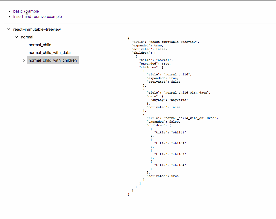
const data = {
title: "react-immutable-treeview",
expanded: true,
activated: true,
children: [
{
title: "normal",
expanded: true,
children: [
{
title: "normal_child",
expanded: true
},
{
title: "normal_child_with_data",
data: {
anyKey: "anyValue"
}
},
{
title: "normal_child_with_children",
expanded: false,
children: [
{
title: "child1"
},
{
title: "child2"
},
{
title: "child3"
},
{
title: "child4"
}
]
}
]
}
]
};
class TreeExample extends React.Component {
constructor(){
super();
this.state = {immutableTreeData:Immutable.fromJS(data)};
this.onExpand = this.onExpand.bind(this);
}
onExpand(e, nodePath, toggled) {
const { immutableTreeData } = this.state;
this.setState({
immutableTreeData: immutableTreeData.setIn(
nodePath.concat('expanded'), toggled)
})
}
render(){
return (
<ImmutableTree
data={this.state.immutableTreeData}
onExpand={this.onExpand}
/>
);
}
}
const content = document.getElementById('app');
ReactDOM.render(<TreeExample/>, app);PropTypes.oneOfType([ImmutablePropTypes.map, ImmutablePropTypes.list]).isRequired
Immutable Data that drives the tree view. State-driven effects can be built by manipulating the attributes in this object. An example can be found in example/data.js
{
    nodeHeight: '[optional] string',
    expandButtonWidth: '[optional] string',
    checkboxWidth: '[optional] Immutable.List',
    checkboxDisplay: '[optional] boolean',
}
Display options of treeview, you can set it here as global or specify every single node in data attributes.
PropTypes.func
Callback function when expand button of a node is clicked. Passes 3 attributes: dom event object, node path and it's expand boolean state.
PropTypes.func
Callback function when label of a node is clicked. Passes 2 attributes: dom event object, node path.
{
    id: '[optional] string',
    title: 'string',
    children: '[optional] Immutable.List',
    expanded: '[optional] boolean',
    activated: '[optional] boolean',
    checkboxDisplay: '[optional] boolean',
    checked: '[optional] string',
}The component key. If not defined, an auto-generated index is used.
The title prop passed into the TreeNode component.
The children attached to the node. This value populates the subtree at the specific node. Each child is built from the same basic data structure.
Visibility of a node's children. False by default.
If true, the node will be highlighted.
override global checkboxDisplay options.
setting checkbox by [checked], [unchecked] or [indeterminate].