Releases: uswds/uswds-for-designers
Design Kit v2.6.0 (USWDS 3.3.0)
f3fdbd9 thisisdano
Dan O. Williams
thisisdano
Dan O. Williams
🍊 January 2023: New components and icons (USWDS 3.3.0)
In January 2023, we added the In-Page Navigation and Language selection components. We also updated the social media icons, removed unused fonts, and updated the version of Public Sans to its current version (2.001).
Design Kit v2.5.0 (USWDS 2.12.0)
🍒 June 2021: New component (USWDS 2.12.0)
In June 2021, we added the Pagination component
Design Kit v2.4.0 (USWDS 2.11.0)
🍦 April 2021: New components and templates (USWDS 2.11.0)
In April 2021, we added the following components and templates:
404 Page TemplateAuthentication page templatesCheckbox tilesCollectionIcon listIconsInput Prefix and SuffixModalProcess ListRadio Button TilesSite AlertSummary BoxTables (mobile, data, and sortable)
We also updated existing components to the new icon set.
Design assets v2.3.0 (USWDS 2.9.0)
🍂 November 2020: New components (USWDS 2.9.0) and color variables
In November 2020, we added the Identifier, Step indicator, and Time picker components to the assets. We also added Sketch color variable support for all USWDS system and theme color tokens.
Design assets v2.2.0 (USWDS 2.8.0)
🐳 July 2020: Added more new components (USWDS 2.8.0)
In July 2020, we added the Breadcrumb, Date picker, Date range picker, File input, and Tooltip components to the assets. This gets us up to date with USWDS 2.8.0.
Design assets 2.1.1
This adds the Card component to the XD files and fixes a few small issues and inconsistencies:
- Cleans up
Cardcomponent in all design assets - Renames
Character limit→Character count - Removes colon from
Combo boxlabel - Removes placeholder text from
Combo box
Design assets v2.1
This new release adds the components from USWDS 2.7.0 and makes some improvements to the organization of the Sketch project file.
- Adds release version of
Cardcomponent to the Sketch file - Adds
Button group,Character count, andCombo boxcomponents Sketch and XD - Improves organization of USWDS components and symbols in Sketch
Note that the Card component is not in these XD assets and will come in a subsequent release.
Design assets 2.0
This new release makes a number of improvements to the USWDS Sketch file:
- Uses only a single library file:
uswds - Adds all themeable token and component symbols to a simplified
uswds-projectfile - Improves organization and navigation of USWDS components
- Provides a starting point for more flexible and customizable components using
mastercomponent building blocks
Note: This new version of the Sketch assets for designers replaces the older version and the two versions are not easily interoperable. You may find some quirks when trying to use the new libraries on existing USWDS projects.
Included design files
Adobe XD Components
- Components and theme colors in Adobe XD format (
adobe-xd/uswds-components).
Sketch Libraries
The sketch/librarires/uswds library includes the following:
- USWDS system colors
- USWDS system typescale in Public Sans
- USWDS avatars
- USWDS block
- USWDS icons
- Helper elements like device frames
- USWDS logos
Note: We have not yet implemented handoff symbols in the new Sketch files.
Sketch project file
This package includes sketch/uswds-project: a project file synchronized to USWDS tokens. This project file includes the following customizable elements:
- USWDS theme colors as symbols and layer styles
- USWDS components as symbols
- USWDS layout grid artboards
Fonts
- Font Awesome
- Merriweather
- Public Sans
- Roboto Mono
- Source Sans Pro
Design assets 1.0
Included design files
NEW: Adobe XD Components
- Components and theme colors in Adobe XD format (
adobe-xd/uswds-components). - System color swatches coming soon
Sketch Libraries
- USWDS block: a layout and design helper tool synchronized to USWDS tokens
- USWDS system colors
- USWDS default theme colors
- Customizable project theme colors
- USWDS system typescale in Public Sans
- USWDS handoff symbols (Beta)
- USWDS Avatars (Beta)
Sketch project file
This package includes sketch/project-files/project-uswds-sketch: a stickersheet and project file synchronized to USWDS tokens.
Demo files
The files in sketch/demo-files are connected to examples, demos, and other tutorials.
Fonts
- Font Awesome
- Merriweather
- Public Sans
- Roboto Mono
- Source Sans Pro
Before you start: Install the fonts
- Unzip the zipped packages in
fonts. - Add all the unzipped files (
.ttfand.otffiles) to your system by dragging them into the Font Book application. If you have older versions of these fonts, you may want to diasable them in Font Book first.
Now the most recent versions of Font Awesome, Merriweather, Public Sans, Roboto Mono, and Source Sans Pro are installed and available to any program.
Using Sketch assets
Before you start: Install the Sketch libraries
- Clone or download this repo using the green
Clone or downloadbutton in the top-right of theuswds-for-designersrepo. This will copy the repo files to your computer. If you downloaded the files, unzip the package and move the new files to an accessible spot on your computer. - Open Sketch > Preferences > Libraries
- Select
Add Library... - Select all the files in
sketch/libraries. You can also add the files insketch/project-files/project-libraries, but they are optional.
Now, all the USWDS libraries are connected to your installation of Sketch, making their styles, symbols, and colors available.
project-libraries libraries, discussed below.
Updating USWDS libraries
Occasionally, we'll make updates to these USWDS libraries and update our user with an email, a tweet, or a message to our public Slack. When you hear that there's a new release of our design assets, either pull that version from GitHub directly, or download the new assets with the provided link and replace the files manually. When you update the library files with a new USWDS release, Sketch will notify you that there are library updates in any affected files, and you can review and accept those updates. This process keeps your local files in sync with USWDS.
Using USWDS Sketch assets
Most of the documentation for the Sketch stickersheet is in the stickersheet file itself. The following are a couple tips to help you get started with the Sketch files.
Update nudge settings
USWDS 2.0 uses spacing units that are a multiples of 8px (with a few exceptions — read more about USWDS spacing units). It's easy to tell Sketch to nudge in multiples of 8px. Open preferences/canvas and use 8 for the Shift-Arrow value.

Now, shift-arrow will nudge an element 8px.
Start a new USWDS project
Copy the USWDS project files
Copy the sketch/project-files folder to a new folder outside the uswds-for-designers folder and rename it.
For the purposes of this example, we'll call our new project
Agency.
Create project theme colors
1. Rename the files in agency/project-libraries by replacing the project- prefix with something unique to your project.

2. Open any of the project colors you'd like to modify.

3. Select the swatch in any artboard and use the Appearance panel to select a new color from the USWDS system swatches.

4. Use the eyedropper (control-c) to copy your new color to the Layer styles swatch below.

5. Then, under Appearance, select the style that needs updating and select Update layer style from the menu.
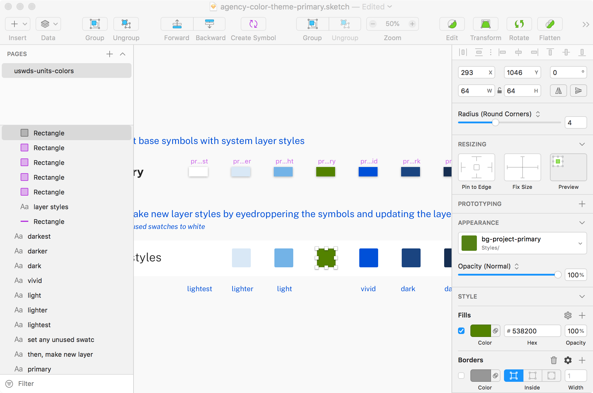
6. Use the same technique for all the swatches you'd like to modify.

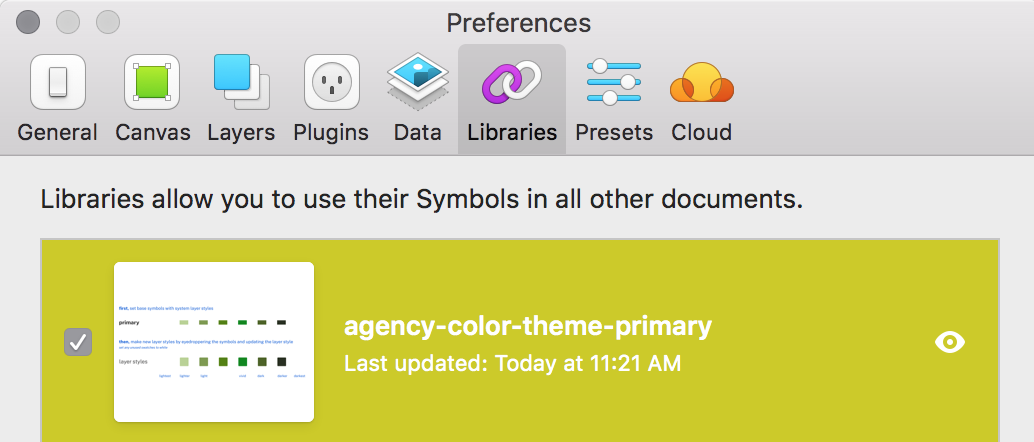
7. Add your updated library to Sketch with Sketch Preferences > Libraries > Add Library....
The new colors are now available just like any of other USWDS color token. Use them with layer styles or with USWDS Block.

Symbol swapping
Once you have your new project theme colors, you can use the Symbol Swapper plugin to replace instances of the default theme colors with your new project theme colors.
- Download and install Symbol Swapper using the instuctions here. (Or install via Sketch Runner).
- Open
plugins > Symbol Swapper > Symbol Swap Libraries - Select the color library you want to replace. (In this example, it's
uswds-theme-color-primary.) - In the dropdown, select the library you want as a replacement. (In this example, it's
agency-color-theme-primary.)

Sketch will prompt you to update symbols.

After updating, the stickersheet symbols now uses your project colors. 🎉

Note: This only works with symbols and designs created with USWDS Block. Symbol swapper will not update layer styles and it cannot update colored text.