Headless forms module to create web-app powerful forms in minutes.


Building forms in apps is complicated.
At first, it seems like just throwing a few input fields, but in reality, it's just the beginning.
Tutim gives you your own in-house form builder that's fully integrated with your component library and design system. Everybody on your team can create, edit, and publish forms and surveys in your app regardless of their technical background.
This repo is 100% free, and will always remain.
- 🌈 Headless: Default design system that can be replaced with yours
- 💅 Rich form: Save draft, wizard, conditional branching, and more are available out-of-the-box
- 🚀 Performant: Best practices are implemented. Never worry about delays
- 🛠️ No-Code Builder: Let PMs and designers create and change forms. Stick with React for styling and embedding
- 👨💻 Built-in Analytics: Opening rate, drop-offs, conversions. privacy-first
(coming soon) - 📦 Templates: Onboarding, personal details, feedback from our gallery
(coming soon)
Create your first form in 2 minutes, by following these steps:
1. Install tutim React package:
yarn add @tutim/headless @tutim/fields @tutim/typesnpm install @tutim/headless @tutim/fields @tutim/types2. Create your first form schema with Tutim Form Builder, or by creating the form JSON schema yourself
3. Render the form:
import { Form, defaultFields } from '@tutim/fields';
import { FormProvider } from '@tutim/headless';

const config = {
  // Use https://tutim.io to create and manage rich schemas with no-code
  fields: [
    { key: 'firstName', label: 'First Name', inputType: 'text' },
    { key: 'lastName', label: 'Last Name', inputType: 'text' },
  ],
};

const TutimForm = () => {
  return <Form onSubmit={console.log} config={config} />;
};

const App = () => {
  return (
    <div className="App">
      <FormProvider fieldComponents={defaultFields}>
        <TutimForm />
      </FormProvider>
    </div>
  );
};

export default App;
4. Output Example:
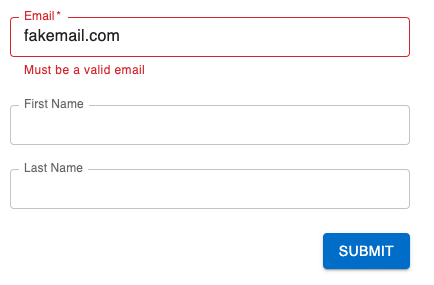
Form is a component that provides a simple interface for defining the fields and form behavior, while handling the infrastructure and user interface for you.
import { FormProvider } from '@tutim/headless';
import { Form, defaultFields } from '@tutim/fields';

const config = {
  fields: [
    { key: 'firstName', label: 'First Name', inputType: 'text' },
    { key: 'lastName', label: 'Last Name', inputType: 'text' },
  ],
};

const TutimForm = () => {
  return <Form onSubmit={console.log} config={config} />;
};

const App = () => {
  return (
    <div className="App">
      <FormProvider fieldComponents={defaultFields}>
        <TutimForm />
      </FormProvider>
    </div>
  );
};

export default App;
ControlledForm is a component with control over the form logic, while leaving the form infrastructure and user interface to be handled for you. It provides a set of tools for managing the form data and form submission, and a FormView component for rendering the form fields and submission button.
import React from 'react';
import { FormView, defaultFields } from '@tutim/fields';
import { FormProvider, useForm } from '@tutim/headless';

const config = {
  fields: [
    { key: 'firstName', label: 'First Name', inputType: 'text' },
    { key: 'lastName', label: 'Last Name', inputType: 'text' },
  ],
};

const ControlledForm = () => {
  const form = useForm(config);
  const { watch, setValue } = form;
  const firstName = watch('firstName');

  React.useEffect(() => {
    if (firstName === 'John') setValue('lastName', 'Doe');
  }, [setValue, firstName]);

  return <FormView onSubmit={console.log} form={form} />;
};

const App = () => {
  return (
    <div className="App">
      <FormProvider fieldComponents={defaultFields}>
        <ControlledForm />
      </FormProvider>
    </div>
  );
};

export default App;
HeadlessForm is a component with complete control over the form logic and design. It provides a set of tools for managing the form infrastructure, such as handling form submissions and managing the form data, while leaving the form logic and design up to you.
import { FormProvider, useForm } from '@tutim/headless';
import { Field, FieldComponents, InputType } from '@tutim/types';

const config = {
  fields: [
    { key: 'firstName', label: 'First Name', inputType: 'text', defaultValue: 'first' },
    { key: 'lastName', label: 'Last Name', inputType: 'text' },
  ],
};

const HeadlessForm = () => {
  const { fieldsByKey, watch, handleSubmit } = useForm(config);
  const name = watch('firstName');
  const style = { display: 'flex', flexDirection: 'column', gap: '5px' };

  return (
    <form onSubmit={handleSubmit(console.log)} style={style}>
      {fieldsByKey['firstName']}
      {name === 'first' && fieldsByKey['lastName']}
      <input type="submit" />
    </form>
  );
};

const fieldComponents = {
  [InputType.Text]: ({ inputProps }) => <input {...inputProps} />,
};

const App = () => {
  return (
    <div className="App">
      <FormProvider fieldComponents={fieldComponents}>
        <HeadlessForm />
      </FormProvider>
    </div>
  );
};

export default App;BYOF - Bring Your Own Field. Use Field type to register any type of field. Can be used on FormProvider level for global inputs or withing FieldConfig for local use cases
CustomField is a component that allows you to define custom form fields that can be used in your react application. You can use it to render any type of form field that you want, based on the inputType specified in the field configuration.
CustomField can be used either globally, by specifying it in the fieldComponents object passed to the FormProvider component, or locally, by specifying the Field prop in the field configuration when creating a form.
import { Field, FieldConfig } from '@tutim/types';

export const CustomField: Field = ({ inputProps, fieldConfig }) => {
  const { value, onChange } = inputProps;
  const onClick = () => onChange(value + 2);
  return (
    <button type="button" onClick={onClick}>
      {fieldConfig.label}: {value}
    </button>
  );
};

export const customFieldConfig: FieldConfig = {
  key: 'clicker',
  label: 'Click Me',
  inputType: 'custom',
  defaultValue: 0,
  Field: CustomField,
};
FormProvider is a component that allows you to define the form fields that you want to use in your react application. It provides a way to specify the field components that will be used to render the form fields, and allows you to use either the default field components provided by the @tutim/fields library, or your own custom field components.
import { FormProvider } from '@tutim/headless';
import { defaultFields, Form } from '@tutim/fields';
import { Field, FieldComponents, InputType } from '@tutim/types';

export const CustomField: Field = ({ inputProps, fieldConfig }) => {
  const { value, onChange } = inputProps;
  const onClick = () => onChange(value + 2);
  return (
    <button type="button" onClick={onClick}>
      {fieldConfig.label}: {value}
    </button>
  );
};

const fieldComponents: FieldComponents = {
  ...defaultFields, // optional built in input fields based on MUI
  [InputType.Text]: ({ inputProps }) => <input {...inputProps} />,
  'custom-field': (fieldProps) => <CustomField {...fieldProps} />,
  // add any type of input and reference it by 'inputType'
};

const App = (): JSX.Element => {
  return (
    <div className="App">
      <FormProvider fieldComponents={fieldComponents}>
        <Form onSubmit={console.log} config={{ fields: [{ key: 'field1' }] }} />
      </FormProvider>
    </div>
  );
};

export default App;Tutim provides all forms solutions. Through code or drag & drop interface.
💌 Inputs
- All basic (Text, Select, Checkbox, Date...)
- Array & Multi fields
- Nested and deep nested support
- Rich input library (coming soon)
📞 Design & Layout
- Simple form layout (one pager)
- Layout and grouping control
- Wizard multi steps (coming soon)
- DnD rich builder
😊 Portal
- Simple form builder
- Drag & Drop form builder
- Templates library
- Conditional branching
☁️ Cloud (closed beta, request early access)
- Manage and serve schemas
- Hosted forms
- Backend support
- 3rd Party integrations
We are more than happy to help you.
If you are getting any errors, facing problems, or need a new feature while working on this project -
Open an issue or join our Discord server and ask for help.
- Home page
- Builder
- Discord community
- Contribution Guidelines
- Docs
- Support on Product Hunt (follow, we're launching soon!)
Powered by Tutim.io