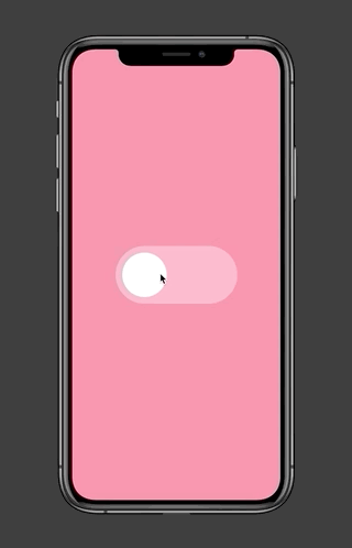
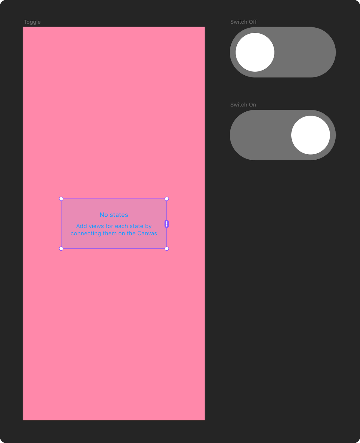
Switch is a utility component that lets you switch between different states of an element on the canvas using animated transitions. It comes with an additional SwitchToStateAction component, which acts as a hotspot that can change the current state of a Switch without writing any code.
→ View documentation on GitHub
3/26/2021
- FIX: Compatibility fixes for latest version of Framer Motion that broke certain gradient, border and cross-dissolve transitions
3/24/2021
- FIX: Compatibility fixes for latest version of Framer Motion that broke Auto Animate transitions
→ See examples in Framer Web (requires free account)
→ Download examples (.framerx file)
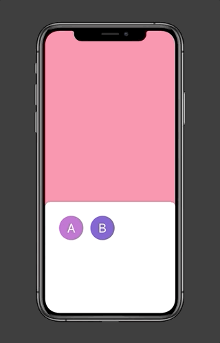
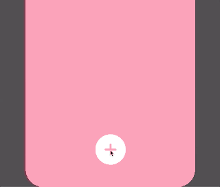
Interactive Switches can manage their own state. Use them when you need to have a Switch change its own state when it's tapped / hovered over. Here are a few examples of components that are a good fit for an interactive Switch:
- A button with a normal / hover / active state
- An on/off toggle
- A checkbox
- A tooltip that expands on hover
- Drag and drop a Switch component onto the canvas.
- Connect it to the states you want to switch between.
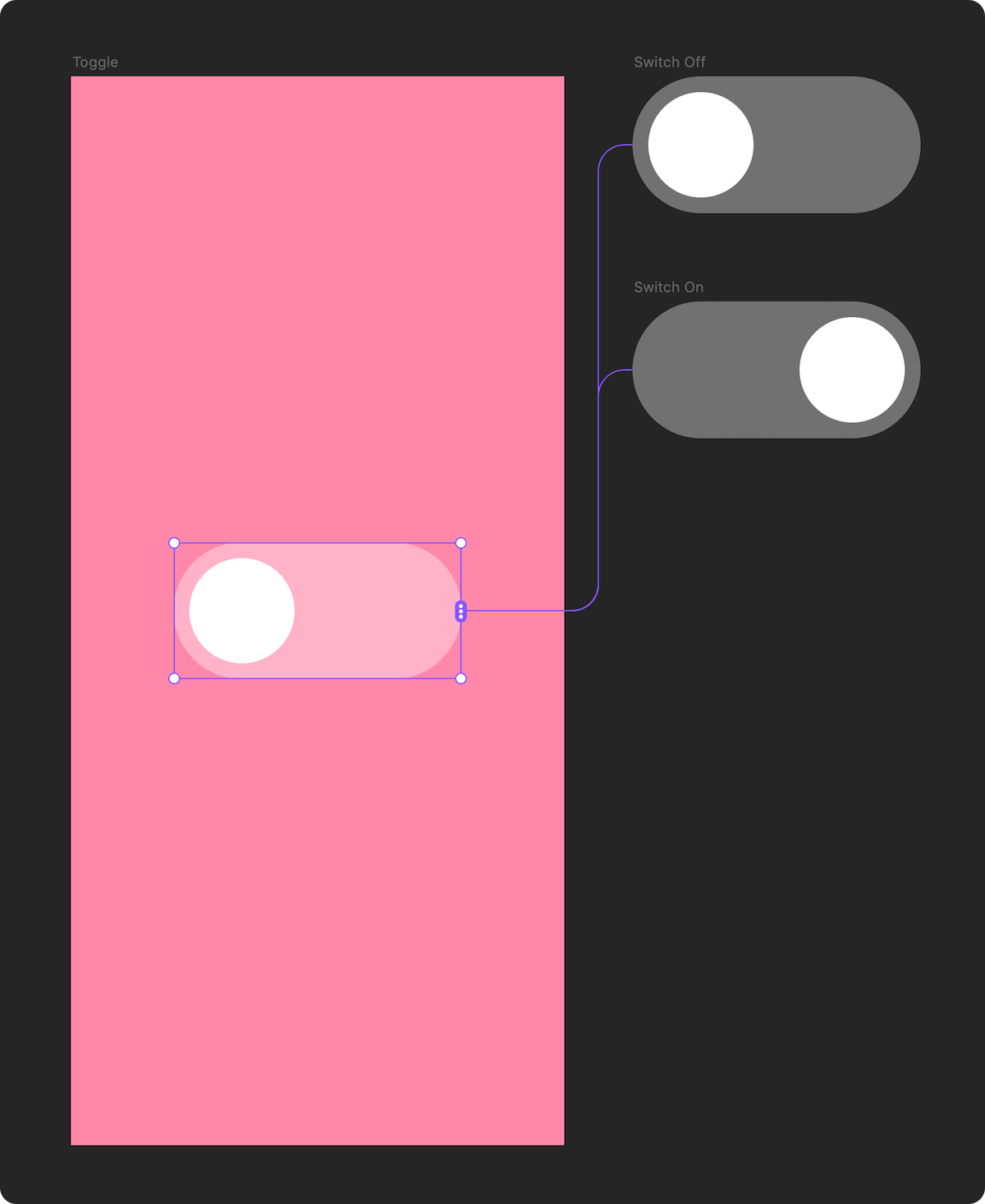
- In the properties panel, set "Interactive" to "Yes".
- Choose the trigger for the state change, and the target action.
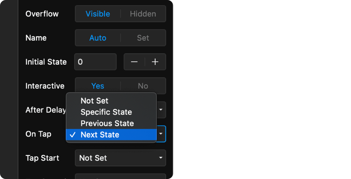
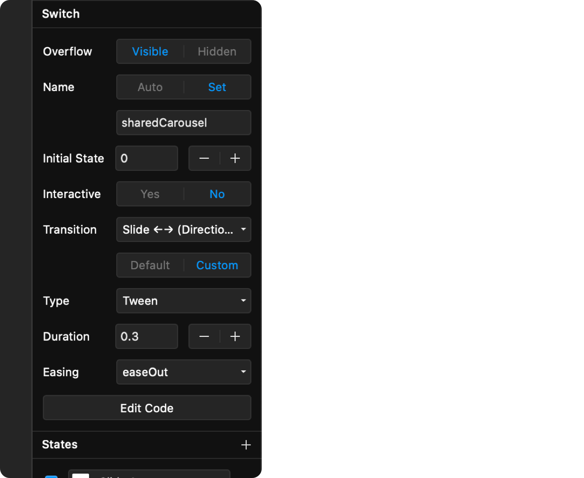
- Customize the transition to use when switching between states.
- Preview your prototype.
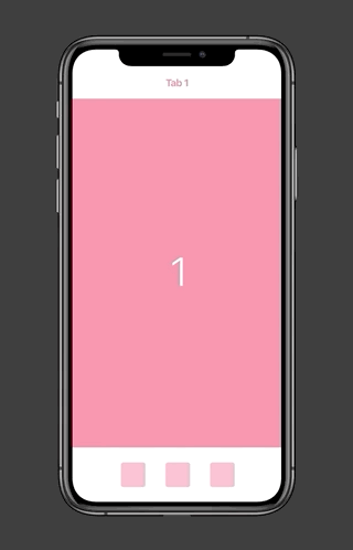
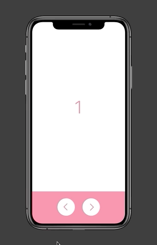
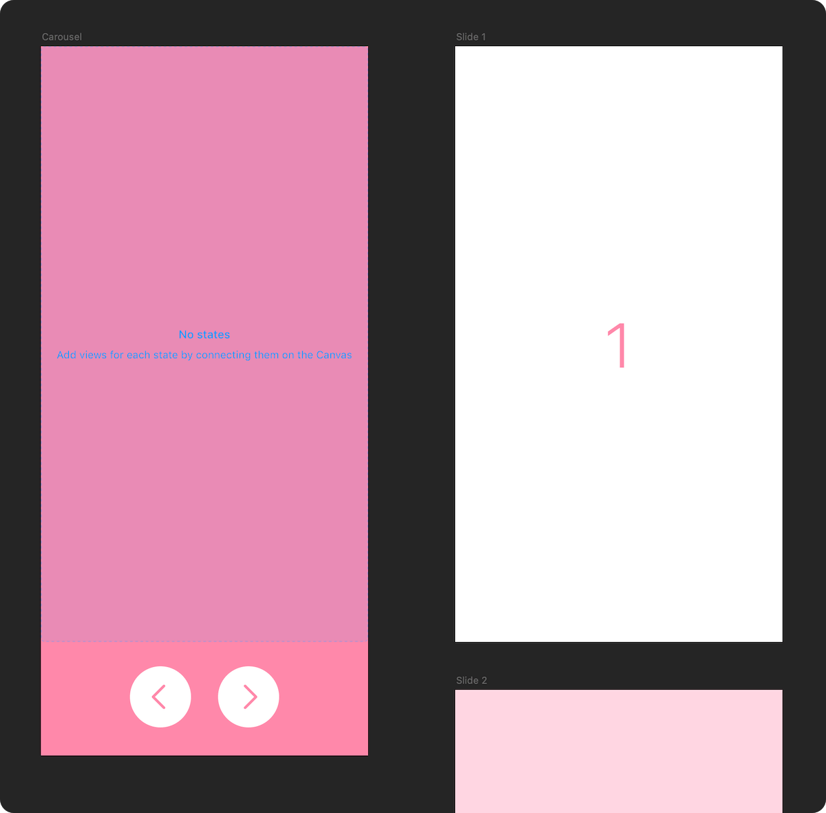
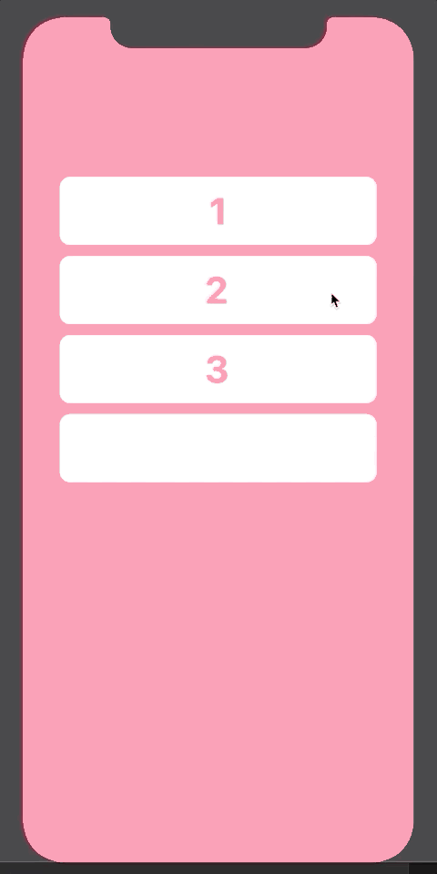
Controlled Switches rely on other elements to set their state. Here are a few use cases that are a good fit for a controlled Switch:
- A bottom sheet that changes its contents based on a button being pressed.
- Tabbed navigation
- A carousel with external Previous / Next buttons
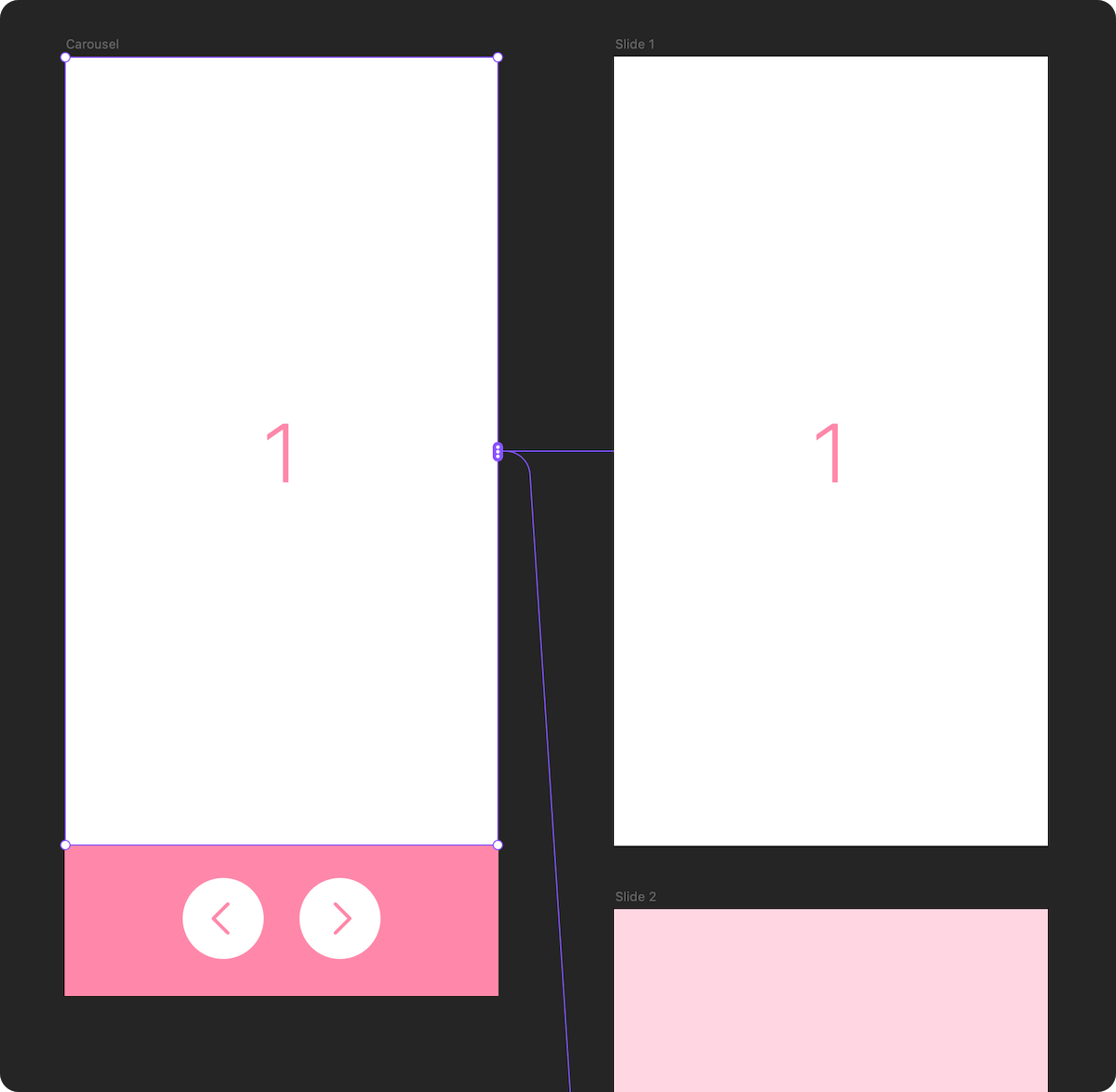
- Drag and drop a Switch component onto the canvas.
- Connect it to the states you want to switch between.
- Choose a unique name for your switch. This name will let other
SwitchToStateActionhotspots control the state of your switch.
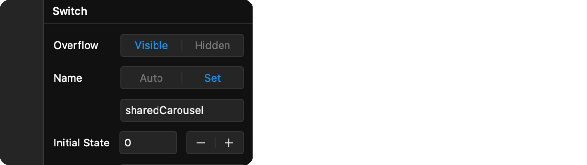
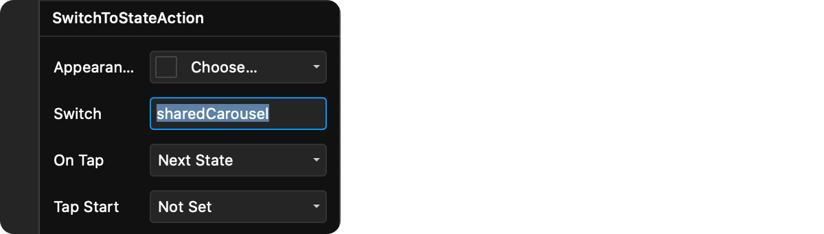
- Drag and drop a
SwitchToStateActioncomponent onto the canvas. This component will act as a hotspot that changes the state of a Switch component when the user interacts with it.

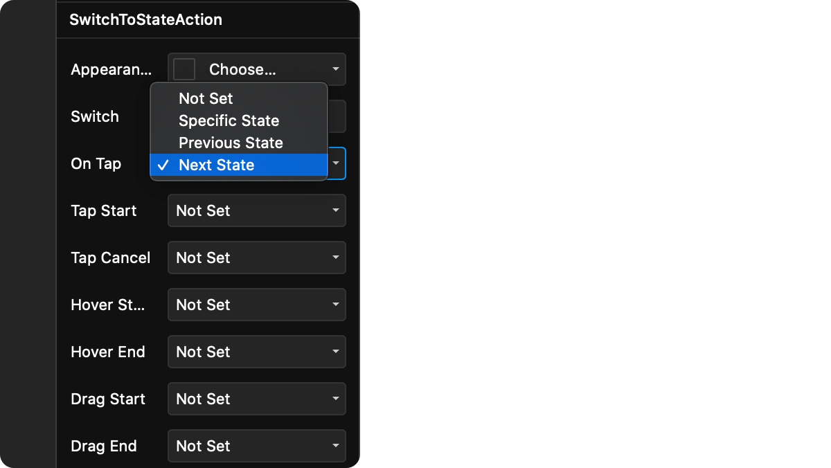
- Change the name of the target
Switchto the name you used in step 3, then pick a trigger, and a target state.
- Customize the transition to use when switching between states.
- Preview your prototype.
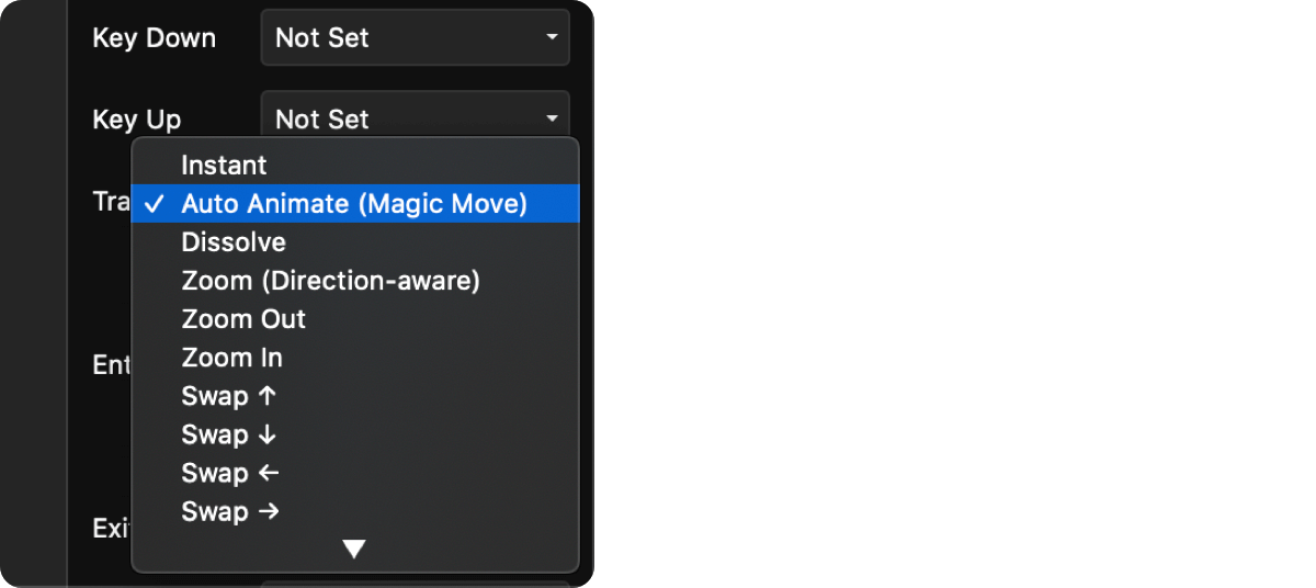
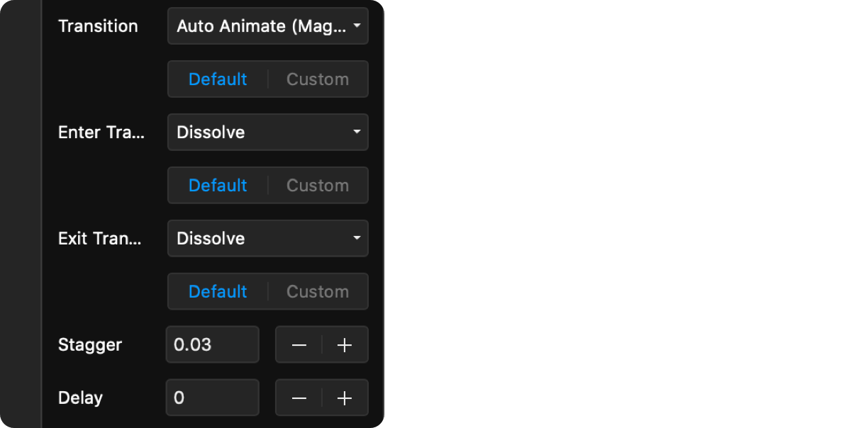
The "Auto-Animate" transition works differently from the other available state transitions. When triggered, elements shared between two states will animate their properties smoothly between each state. If there are elements in the next state that don't exist in the current one, they'll fade in, and elements that should no longer be shown will fade out.
Before an auto-animate transition begins, the Switch component looks for matching elements between the current and the next state. To figure out if an element matches another element, it looks at:
- the element's name in the layer panel
- its type (Frame, Stack, code component, etc)
- its order in the layer list
- what level of the layer hierarchy it sits in (i.e. whether it's nested in another Frame)
Note: Names of Graphic layers are currently not recognized properly. To transition between Graphic layers, wrap them in a Frame and name the Frame.
If an element is found to be matching another element, we'll create an animated transition for the following properties:
- Size
- Position (including layout in Stacks)
- Rotation
- Opacity
- Background (linear gradients, radial gradients, and image fill transitions are all supported)
- Border (radius, color and width)
- Shadow (up to 10 box / inner shadows are supported)
If the two matching elements are of a different type (e.g. a transition between a Frame and a Graphic), or are of a type where a smooth transition isn't possible (e.g. transitions between two Text layers), the two elements will be animated using a cross-dissolve.
Each auto-animate transition groups transitioning elements in 3 categories:
- Morphing Elements: Elements that exist both in the current and the next state
- Entering Elements: Elements that only exist in the next state
- Exiting Elements: Elements that only exist in the current state
Each group can have different transition timing. Morphing elements always use the timing options defined right below the "Transition" property when it's set to "Auto-Animate". The Enter and Exit transitions will have their own options right below (by default, they're set to a 0.3s dissolve).
Additionally, auto-animate lets you take advantage of Framer Motion's ability to stagger or delay animations of nested elements.
Since code components can render arbitrary HTML, it's hard for Switch to figure out if content rendered by the code component should also be auto-animated. To get around this issue, whenever it encounters a Code Component, the Switch will only animate its position and size. It will then determine if any of the component's props have changed between the different states, and if they have, it will pass the new props to the component.
Matching code components will not get unmounted and remounted between states, just passed new props. This is especially powerful with components that are expensive to fully re-render, like maps and videos.
If this behavior doesn't match what you expect, you can set the morphCodeComponentPropsOnly prop on a Switch instance to false through an Override, and we'll fall back to a cross-dissolve between the two states of the code component.
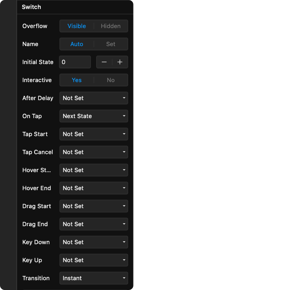
Use these in Overrides, or when you use the Switch component from code.
| Prop | Type | Description |
|---|---|---|
autoAssignIdentifier |
boolean | When true, the Switch instance will get its own random identifier automatically. Default: false |
identifier |
string | The name of the Switch instance. Make sure this is unique. |
initialState |
number | The index of the initial state of the Switch. Default: 0 |
overflow |
boolean | Whether content outside the bounds of the container will be shown or not. Default: true |
onSwitch |
function | A callback function that will be called whenever the Switch component switches its state. The function is passed in the current state index, the previous state index, and the identifier of the Switch component in this order. |
shouldTrigger |
function | A callback function that will be called right before a trigger is fired. Returning false from this callback will stop the trigger from firing. All original arguments to the trigger will be passed down to the function (e.g. event) |
transition |
enum | The transition to use when switching states. Can be one of: instant, autoanimate, dissolve, zoom, zoomout, zoomin, swapup, swapdown, swapleft, swapright, slidehorizontal, slidevertical, slideup, slidedown, slideleft, slideright, pushhorizontal, pushvertical, pushup, pushdown, pushleft, pushright. |
| Prop | Type | Description |
|---|---|---|
targetType |
enum | Defines whether the SwitchToStateAction will target the closest switch, or target a specifically named Switch. Possible values are: closest, named. Default is named. |
target |
string | The name of the Switch instance to target. Make sure this is unique and matches the name of an existing Switch. Only used when targetType is set to named. |
shouldTrigger |
function | A callback function that will be called right before a trigger is fired. Returning false from this callback will stop the trigger from firing. All original arguments to the trigger will be passed down to the function (e.g. event) |
To control Switches from code, first import the useSwitch hook at the top of your file:
import { useSwitch } from "@framer/tishogeorgiev.switch/code"
Note on Framer Web: Sometimes Web will throw an error in the in-app preview saying it can't find useSwitch. This is because it hasn't had time to reload all of its dependencies. When this happens, refresh your browser and it should be fine.
Note: You will likely get a red underline under @framer/tishogeorgiev.switch/code, with an error message like "Cannot find module '@framer/tishogeorgiev.switch/code'". You can safely ignore this error, as the code will work anyway. If it bothers you, import useSwitch like this, instead:
// @ts-ignore
import { useSwitch } from "@framer/tishogeorgiev.switch/code"
Then call the useSwitch() hook in your code component or override:
export function SwitchButton(): Override {
    const controls = useSwitch()

    return {
        onTap: () => {
            controls.setSwitchState("sharedSwitch", 1)
        },
    }
}
Note: you can only call this hook from inside a React component or override. Calling it from a different place in your code could result in unexpected behavior. Read more about the rules of hook usage.
The useSwitch hook will return a controls object with the following functions:
-
controls.getSwitches() => string[]Returns an array of identifiers for all registered Switches.
-
controls.getSwitchStateIndex(identifier: string) => numberReturns the index of the current state of a Switch.
-
controls.setSwitchState(identifier: string, state: string | number)Sets the current state of a Switch. You can use either the name of the target state (which will be the same as the name of its layer in the Layers panel), or its numerical state index.
-
controls.setSwitchStateIndex(identifier: string, state: number)(Deprecated in favor of
setSwitchState) Sets the current state index of a Switch. If the index isn't valid, it will still be accepted, but the targeted Switch will remain set to its last known good state. -
controls.setNextSwitchState(identifier: string, options: { wrapAround?: boolean } = {})Sets the current state of a Switch to the next available one (the order is the same as the order in which you connected the states). The second
optionsparameter is optional, and allows you to specify whether the state will wrap around if trying to advance past the last one. By default,wrapAroundis true.Compatibility note: This method used to be called
setNextSwitchStateIndexin versions prior to v1.8.0. The old name is still supported. -
controls.setPreviousSwitchState(identifier: string, options: { wrapAround?: boolean } = {})Sets the current state of a Switch to the previous one (one behind the current one). The second
optionsparameter is optional, and allows you to specify whether the state will wrap around if trying to go back beyond the first one. By default,wrapAroundis true.Compatibility note: This method used to be called
setPreviousSwitchStateIndexin versions prior to v1.8.0. The old name is still supported. -
controls.getAllSwitchStates(identifier: string) => string[]Returns an array of all names states for a Switch. Frames that haven't been explicitly named might have
undefinedas their name. -
controls.registerSwitchStates(identifier: string, states: string[])Registers a list of named states for a particular Switch identifier. For internal use only.
12/17/2020
- FIX: Compatibility fixes for latest version of Framer that resolve issues with animating border radii and gradient fills.
10/30/2020
- FIX: Fixed an issue where border radius wasn't being parsed correctly when using Auto Animate (Thanks, @astegmaier).
10/07/2020
- FIX: Fixed an issue that prevented Auto Animate from running on latest version of Framer Motion (Thanks, Victor).
9/08/2020
- FIX: Addressed compatibility issues with the version of Framer Motion 2 used in an upcoming release of Framer (Thanks @hemlok). NOTE If your prototype suddenly has glitchy/broken animations, you should update to this version (open the insert menu by pressing
I, then go to the Switch package and wait for the "Update" button to show up). Let me know if you continue to have problems after.
9/01/2020
- FIX: Fixed an issue that could cause border radius properties to not be parsed correctly.
7/17/2020
- FIX: Fixed an issue that could prevent Auto-Animate from working on some versions of Framer Web.
5/29/2020
- NEW: Added the ability for SwitchToStateAction to control the closest parent Switch, instead of needing to specify the name of a Switch to control. This helps tremendously when using Switch in reusable components, or multi-step animations, and takes away the need to even set a name for most Switches. I've reconfigured a lot of the existing examples to take advantage of this, so take a look if you're wondering how to set it up.
5/26/2020
- FIX: Fixed an issue that prevented Switch containers from receiving focus when clicked, which sometimes prevented keyboard triggers from working (thanks @Si).
5/14/2020
- FIX: Fixed an issue that prevented animated borders and box shadows from animating to the right color when using shared colors (thanks @Joe Preston).
4/6/2020
- FIX: Improved the way Switch loads in order to work around some issues in Framer that could cause the Switch component to disappear from the project entirely, leaving existing instances on the canvas disconnected from their states.
- FIX: Fixed a regression that made Switches show an error when you first toggle the "Interactive" property.
3/24/2020
- FIX: Fixed an issue that kept layers visible during an auto-animate transition, even when they were hidden from the layers panel in the target state (thanks @davidhoeller).
- FIX: Fixed text and graphic layers flickering on first render, and significantly reduced flickering between text/graphics that stayed the same between states (thanks @Benjamin Frenzel).
3/23/2020
- NEW: Added two new triggers: Double Tap and Long Press, paving the way for more gestures.
- FIX: The zoom transition was missing transition props (thanks @Johannes Tutsch).
- FIX: Fixed an issue that made states using the slide transition to appear above layers that are technically placed above the Switch in the view hierarchy (thanks @JeppeVolander)
- FIX: Fixed Stacks and Graphics in Framer Web / Beta appearing in the wrong position when using Auto-Animate.
- FIX: Fixed layers with Overrides or Interactions added in Framer Web / Beta appearing in the wrong position when using Auto-Animate.
- FIX: Fixed an issue that made states render twice if they have Overrides or Interactions applied, which made "After Delay" triggers also trigger twice.
2/13/2020
- FIX: Fixed an issue that prevented a Switch container from properly following layout constraints in responsive mode (thanks @Bojan Kocijan).
2/5/2020
- FIX: Fixed a few issues related to using Switch from a code component.
- FIX: Fixed draggable components breaking when used with auto-animate.
- FIX: Fixed an issue that prevented
setSwitchStatefrom switching to an index if the name for the state for that index was undefined.
2/4/2020
- FIX: Fixed custom easing curves not working in tween transitions (thanks @David Ikuye).
- NEW: Added more easing curve presets, including most of the ones on https://easings.net. You can find them all under the Easing dropdown when customizing a tween transition.
1/31/2020
- FIX: Fixed auto-animate breaking in shared link previews on Framer Web (thanks @Alexis).
1/10/2020
- FIX: Fixed an issue where an entering or cross-dissolving element would always animate to opacity: 1, even if its target opacity was different.
- FIX: Fixed an issue where the position of an entering element wasn't computed correctly when its container itself was moving/resizing.
1/8/2020
- FIX: Fixed transitions that include colors defined as shared colors (thanks @CharlieWandCo).
1/2/2020
- NEW: Named states. You can now refer to states by the name you've given them in the Layers panel, instead of by numerical index. You can now set a trigger action to "Specific State Name" and just type the name of the layer for the target state on your canvas. Note that default layer names, such as "Frame", are not supported, so make sure you explicitly set a name in the Layers panel.
- NEW: Related to the named states support, you can now use the new
setSwitchStatefunction from code to set a Switch to either a named state, or a numerical index. See more in the Using Switch in Code section. - FIX: Auto-animate transitions between Text and Graphic layers should now look noticeably better.
- FIX: Auto-animate transitions between Stacks with Overrides applied are now handled correctly.
- FIX: Auto-animate transitions between more complex Graphic layers sometimes produced odd animations. This should now be fixed.
12/15/2019
- NEW: Auto-Animate (Magic Move) added to the list of available transitions between states. Read on to find out how Auto Animate works, and definitely let me know if you spot any bugs when using the auto-animate transition.
- NEW: Switch names can now be set to "Auto" if you never intend to set their state from a hotspot or through code, and don't want the Switch state to be shared with another Switch.
- NEW: Added "After Delay" to the list of available triggers, which lets you switch to another state after a specified amount of time. The time is counted from the moment the hotspot (
SwitchToStateAction) or the Switch component is mounted on the current view. - NEW: Added two new actions available through the
useSwitchhook:setNextSwitchStateIndexandsetPreviousSwitchStateIndex, allowing you to quickly set the next/previous state of a Switch. - FIX: Any time a Switch updated its state, all Switches in view would re-render, regardless of whether the update was intended for them, or not. This is no longer the case.
12/8/2019
- FIX: Ensured that default props are correctly passed to a Switch component when used directly from code.
11/28/2019
- FIX: Fixed an issue where the connecting the first state of a Switch would cause an error.
- FIX: Fixed an issue that prevented event handlers you set through Overrides from firing if the same trigger wasn't also set on the Switch instance.
11/27/2019
- NEW: Added two new triggers: "Key Down" and "Key Up", which allow you to switch states using keyboard shortcuts. You can use single keys as shortcuts, or more complex shortcuts like
ctrl+o, cmd+shift+t. Switch uses the popular hotkeys-js library, so take a look at some of the examples on its Github page to get an idea of the syntax.
11/26/2019
- BREAKING CHANGE:
SwitchToStateActionnow lets you define actions for multiple triggers, similar to a fully interactive Switch. Unfortunately, this change isn't compatible with the previous version of this package, so if you update to the latest version, make sure you rewire all hotspots you're using. - NEW: Code-level API for controlling Switches using the new
useSwitchhook. More details in the docs below. - NEW: Added a
shouldTriggercallback to SwitchToStateAction, which will be called whenever a trigger is about to be executed. IfshouldTriggerreturnsfalse, the trigger won't fire. Check out the "Slide to Unlock" example in the updated examples project. - FIX: Fixed an issue that prevented Switches to use plain Stacks or some code component instances as states.
- FIX: If an invalid state index is passed to the Switch, it will now stay at the last known good state, instead of reverting to the placeholder state.
11/21/2019
- NEW: Added
onSwitchcallback to Switch component, which will be called when the current state changes.
- @tisho on Twitter
- @tisho on the Framer Slack