Contact:
To get in touch with me, find me on twitter @TimGarcia0 via email (tim@rithmschool.com) or check out rithm school's site.
At the simplest level, data visualization is the act of using pictures to represent data. We are using some kind of chart, diagram, plot, etc to convey some information in the data in a more human digestible format.
The biggest challenge in data visualization is projection. trying to project multi dimensional data sets into a 2D World
Name That Baby - Made by Matt Lane @Rithm School

Edward Tufte is a leader in data visualization. His most well known book is The Visualization Of Quantitative Information
Hansel Minutes Episode that discussed data visualization
Data Visualization is a field that has overlap with data science. In many data science problems, you are trying to answer a question by looking at the data, and it usually helps to visualize the data to better answer the question.
For example, a large company might wonder why are sales low in the northwest? You could look at all of the internal company data as well as potentially external data to help find a trend, pattern, correlation, etc between some feature of your data set and the outcome. Then to emphasize the correlation you may visualize the features that you have found to be interesting in different regions to help demonstrate your point.
D3 is a data visualization library made by Mike Bostock
It stands for ddd, which is short for for data driven document.
Mike was a engineer and graphics editor for the NY Times. The NY times has done some great visualizations:
You can also find many examples of D3 in action (along with the code) at https://bl.ocks.org/. Blocks was written by Mike Bostock as a way to show off D3 projects more easily.
D3 v4
The latest version of D3 is version 4. Many of the tutorials you'll see online and examples in blocks are all written in v3. Make sure you're aware of the version number when you're looking for examples.
D3 has become a very popular tool for web visualization. It is very popular and very powerful, but it may not be the right tool for the job in certain circumstances.
May not be right if ...
If you want a simple chart and don't need a ton of customization, chartjs may be an easier option.
If you are mostly interested in exploring the data and doing rapid feature selection. A tool like tableau may be better. Tableau makes selecting different data sources as the X and Y axis very quick and easy. It is mainly a gui tool for data exploration. You can also export a png of your visualization when you're done.
Great choice for ...
Custom visualizations that aren't supported by simple libraries
Dynamic visualizations that need to change on the fly and potentially animate

D3 can be used to select elements in the DOM, and in that way, is not graphing specific. Some people choose to use D3 for all DOM selection instead of a tool like jQuery.
Let's work with this document:
<!DOCTYPE html>
<html lang="en">
<head>
  <meta charset="UTF-8">
  <title>D3 DOM DEMO</title>
  <style>
  	 .intro {
  	   font-size: 6em;
  	 }
  	 .items {
  	   color: green;
  	   font-size: 1.4em;
  	 }
  </style>
</head>
<body>
  <h1 id="page-title">This is my first D3 example!</h1>
  <p class="first-paragraph">Here's my first paragraph.</p>
  <p>Here are some reasons why d3 is dope:</p>
  <ol>
    <li>Makes data more engaging.</li>
    <li>Has built-in math helpers.</li>
    <li>Includes several additional data types.</li>
    <li>Supports graph animations.</li>
    <li>Makes drawing graph axes a breeze!</li>
  </ol>
  <script src="https://d3js.org/d3.v4.js"></script>
</body>
</html>
Open this page up in Chrome, hop into the console, and type d3. If you get an object back, you can be confident that you've set things up correctly!
Note: The source in the script tag refers to version 4 of d3 (hence the d3.v4.js). This version of d3 was released in June of 2016. If you're reading d3 tutorials from before then, you should be aware that version 4 introduced a number of changes that aren't compatible with earlier versions of d3. We'll focus on version 4 here, but just be careful if you're reading older tutorials!
d3 can do a lot of data manipulation, but even if you're not working with any data, it can also be used to manipulate the DOM. While its functionality doesn't intersect entirely with jQuery (you can't easily do event delegation with d3, for instance), when it comes to traversing the DOM and appending things to it, d3 and jQuery can, in many cases, be used interchangeably.
Using the same HTML as in the above, hop into the console and let's make our first selection:
var firstSelection = d3.select("#page-title");The d3.select method is sort of analogous to the vanilla JavaScript document.querySelector method, in that both accept a string corresponding to a CSS selector, and both just search until they find a single element matching the selector. If you'd like to find all elements matching the selector, you should use d3.selectAll (analogous to document.querySelectorAll).
If you look at firstSelection in the console, you'll see that it's got a structure we haven't seen before: it's an object constructed from the native d3 Selection function, and it has two properties: _groups and _parents. The underscore in front of these names indicates that they are intended to be private; if you find yourself accessing these properties directly, you're probably using d3 incorrectly. For example, if you want to pass from the d3 selection object to the HTML element, you can call the .nodes method, which will return to you an array of the HTML elements:
firstSelection.nodes()[0]; // this should return the h1 element on the page.Method chaining is a major part of d3. Working with d3 selections exclusively, rather than mixing d3 selections with plain old HTML elements, allows us to use method chaining with ease. For instance, you can chain together multiple selections:
var firstLi = d3.select("ol").select("li");Just like in jQuery, we can modify the attributes and style of our selections using d3. Try writing the following examples in the Chrome console:
// more method chaining here!
d3.select("#page-title")
	.style("color", "blue")
	.attr("class", "intro");
The above code will select the h1 with an id of "page-title," set the font color to blue, and add a class of "intro".
When adding or removing classes, it's also common to use the classed method, which takes a string and a boolean. The string should be a space-separated list of class names, and the boolean determines whether those classes should be added to or removed from the selection:
// adds "items" class to all li's:
d3.selectAll("li")
	.classed("items", true);

// removes "first-paragraph" class from all p tags:
d3.selectAll("p")
	.classed("first-paragraph", false);
If you don't supply a second argument to classed, it will simply tell you whether the first element in your selection has the class you pass into it:
d3.select(".first-paragraph")
	.classed("first-paragraph"); // true

d3.select("ol")
	.classed("this-should-return-false"); // false
Also like in jQuery, there are text and html methods in d3 to set the inner text and inner HTML of a selection. Try these out in the console:
d3.select("h1")
	.text("New Title!");

d3.select("body")
	.html("<h6>Whoops, all gone.</h6>");
If you'd like to read more about the selection API in d3, head over to the docs.
So far we've only passed primitive values into our selection methods. But we can also pass in functions. Check this out:
d3.selectAll("li")
	.text(function() {
		return Math.random() + " is a random number!";
	});
When you throw this into the console, you should see that each li gets its own random number: in other words, the callback function to text is being executed once per matching element in the selection.
While this example might seem a little contrived, it's not at all uncommon for you to want to iterate through a selection of elements and apply some function to each one. Here's a more realistic example:
d3.selectAll("li")
	.style("background-color", function(d,i) {
		if (i % 2 === 1) return "#cccccc";
	});
In this example, we're using d3 to stripe the list, so that every other item has a different background color. How did we do this? Well, in these callback functions, the second argument refers to the index of the element within the current selection group. In d3, this argument is typically denoted i. So the callback is basically returning a light gray hex code whenever the index is odd.
What about that first argument in the callback, the one we called d? That's a great question! We'll come to that in the next section.
Want another example? Try the following:
- Select the
ptag with a class of 'first-paragraph' - call the
stylemethod on the selection, and get ready to set thecolorof the selection. - To determine the color, generate a random number. If it's less than 0.5, set the color to be red. Otherwise, set it to be blue.
Try executing your code several times in the console to ensure that it randomly sets the paragraph's text to be one of these two colors!
EXERCISE 1
Using the sample html from above, do the following tasks:
- Select all the p tags on the page, give the text a random font size, change the background color to black and the text color to orange.
- Give the first li on page a padding of 20px
Also as with jQuery, you can use d3 to add or remove elements from the DOM. To remove an item, create a selection and then call .remove() on it:
d3.select("p").remove();To add elements to the DOM, d3 provides the append and insert methods. The append method is more straightforward: it simply appends the element you want to add as the last child of each element in your selection:
// append hr tags to each li:
d3.selectAll("li")
	.append("hr");
insert works in a similar way, but it allows you to pass in a second argument which specifies where to insert the new element. The new element will be placed before the second argument in the DOM.
// insert an hr tag before the h1:
d3.select("body")
	.insert("hr","h1");
For more details on these methods, check out the docs.
Here's another similarity to jQuery: there's an on method used for registering event listeners. Unlike jQuery, though, the callback doesn't take the event object as an argument. If you want details of the event, use d3.event:
d3.select("h1").on('mouseover', function() {
	console.log(d3.event);
});
You can access the event target using d3.event.target, or you can simply use the keyword this, which will refer to the DOM element that triggered the event.
EXERCISE 2
Use d3 to randomly change an li's color when you click on the li.

SVG (short for Scalable Vector Graphics) is a way for us to draw images in the DOM. The use of vector graphics means that the images don't degrade in quality as you resize them (for more on vector graphics, Wikipedia offers a nice starting point). The MDN docs perhaps summarize it best: "SVG is essentially to graphics what HTML is to text.
Important SVG elements that we'll be using:
circle
<svg height="220" width="220">
  <circle
   cx=110
   cy=110
   r=100
   stroke="#ff0000"
   stroke-width="4"
   fill='#0000ff'/>
 </svg>
rect
<svg height="200" width="200">
<rect
  x=0
  y=0
  width=200
  height=200
  fill="#ffffff"
  stroke="#000000"
  stroke-width="4" />
</svg>
rect (rounded corners)
<svg height="215" width="210">
<rect
  x=5
  y=5
  rx=35
  ry=35
  width=200
  height=200
  fill="#15Cf2A"
  stroke="#000000"
  stroke-width="4" />
</svg>
path
<svg height="175" width="350">
<path
  d="M160 5 L5 155 L310 150Z"
  fill="rgb(0,255,0)"
  stroke-width="5"
  stroke="black" />
</svg>
g (group)
The g element is used to group other svg elements:
<svg height="250" width="300">
  <g stroke="black" stroke-width="3">
    <circle cx=55 cy=55 r=50 fill="#006BB6"/>
    <rect x=100 y=100 width=100 height=100 fill="#FDB927"/>
  </g>
</svg>
EXERCISE 3
Create an svg that has a triangle inside of a square inside of a circle. Put all of those elements in a group with some shared properties on the group:
For more information on SVGs, check out the MDN docs.
d3 relies on SVG pretty heavily for drawing graphs. Let's create an SVG element and draw some rectangles and circles.
We can use the same HTML starter code as before. Let's begin by appending an SVG to the DOM!
d3.select("body")
  .append("svg")
    .attr("width", 500)
    .attr("height", 500);
You might be wondering what's up with the spacing in the above code. From the d3 docs:
By convention, selection methods that return the current selection use four spaces of indent, while methods that return a new selection use only two. This helps reveal changes of context by making them stick out of the chain.
In this case, the indentation is meant to help emphasize the fact that the width and height attributes that are being set are on the svg, not on the body.
Let's create our first rectangle with D3. How can we do this in d3? By appending a rect element to our svg!
d3.select('svg')
  .append('rect')
    .attr('width',100)
    .attr('height',200)
    .attr('x',50)
    .attr('y',150)
    .attr('fill','red')
    .attr('stroke-width',5)
    .attr('stroke','blue');
That's a lot of attributes we've just set, but if you type this code correctly you should see a red rectangle with a blue border appear in your svg!
Once you've drawn your rectangle, let's draw a circle too!
d3.select('svg')
  .append('circle')
    .attr('cx',250)
    .attr('cy',200)
    .attr('r',100)
.attr('fill','purple');Next, we'll start introducing data into our D3 examples. To begin, let's create some HTML boilerplate:
<!DOCTYPE html>
<html lang="en">
<head>
  <meta charset="UTF-8">
  <title>Putting the Data in d3</title>
</head>
<body>
  <h1>Read this important article!</h1>
  <p>Lorem ipsum dolor sit amet, consectetur adipisicing elit. Inventore perferendis voluptatibus eaque expedita aspernatur, neque quo ratione aut vero, cumque, dolores similique repellendus saepe sapiente, voluptas veniam. Expedita, eius, distinctio.</p>
  <p>Sapiente maxime, unde esse quasi eius facere! Numquam nam officiis dolorem quo dignissimos nobis id quae blanditiis neque, magni similique, aspernatur eligendi quia. Voluptatum architecto perspiciatis amet, deleniti, sit earum.</p>
  <p>Nam maiores error sequi fugiat itaque, quae, odit quo officiis est atque laborum officia, doloremque. Molestiae recusandae maxime repellat aperiam tenetur eveniet sunt ipsum id aliquam, possimus deserunt, laudantium vero?</p>
  <p>Officia libero, est sapiente sint quaerat eaque veritatis neque quod animi nobis nostrum, quisquam rem ea sunt nihil optio earum voluptate ut non ducimus. Maiores soluta, nulla! Quis, possimus quasi?</p>
  <p>Voluptas dicta ducimus nulla, magni id quis ab ratione cupiditate? Necessitatibus exercitationem hic, saepe, voluptatem dolor quibusdam est autem nulla praesentium cumque assumenda illo similique ipsam culpa voluptates, minus! Neque.</p>
  <p>Officiis, veniam, tenetur. Blanditiis consequatur ab fugit veniam totam? Est atque ratione cum odio numquam, animi repellat, dolor nam molestiae facilis harum minus voluptates aspernatur adipisci soluta reprehenderit officia alias.</p>
  <p>Earum obcaecati magnam libero ad molestiae corrupti non, doloribus molestias blanditiis atque fugit voluptate eveniet, quae adipisci provident, repellendus ratione facilis voluptas ipsam? Dolore, repudiandae. Itaque repudiandae illo architecto quaerat.</p>
  <p>Eius impedit minima sapiente sit ut voluptate deleniti tempora, repellendus sed aliquam. A nobis tempora aliquam commodi, voluptate necessitatibus quaerat accusantium incidunt error, iste. Maiores autem mollitia rerum asperiores repellat.</p>
  <p>Neque et magnam ea corporis placeat, recusandae voluptatem quos in cum numquam, beatae animi assumenda. Praesentium non sequi, perspiciatis odit. Quaerat dolorem labore sint dolore, nemo cum amet dolor in?</p>
  <p>Adipisci, natus omnis reprehenderit. Saepe repudiandae accusamus ab? Sapiente eveniet minus ipsam minima quod quisquam assumenda officiis architecto voluptas iure ut odit ab ratione voluptatibus, est quidem cumque voluptate veritatis!</p>
  <script src="https://d3js.org/d3.v4.js"></script>
</body>
</html>
In the Chrome console, let's learn about one of the most important d3 methods: the data method.
Before explaining how this method works, or what it's used for, let's first just examine a quick example:
d3.selectAll('p')
	.data([4, 8, 12, 16, 20, 24, 28, 32, 36, 40])
	.style('font-size', function(d) {
		return d + 'px';
	});
This example shows the power of the d3 data method. It allows you to bind data to DOM elements, then use that data to affect the look of those elements on the page.
So how does this work? When you call the data method on a selection, under the hood d3 is adding a private __data__ property to HTML elements in the selection. Refresh the page and try the following:
document.querySelector('p').__data__; // undefined

// Let's bind some data...
d3.selectAll('p')
	.data([4, 8, 12, 16, 20, 24, 28, 32, 36, 40])

document.querySelector('p').__data__; // 4 - the data value has been joined to the p tag!
While you can access this property, you shouldn't ever be manipulating it directly. If you need to update the data, just call data on the selection again! Refresh the page once more and try this out:
d3.selectAll('p')
	.data([4, 8, 12, 16, 20, 24, 28, 32, 36, 40]);

document.querySelector('p').__data__; // 4

d3.selectAll('p')
	.data(["first", 8, 12, 16, 20, 24, 28, 32, 36, 40]);

document.querySelector('p').__data__; // "first"In the previous example, the number of data points we had (i.e. the size of the array we passed in to data) was equal to the number of paragraphs we had on the page. But very often, there's a mismatch between your data and the number of elements. For example, you may need to get some data via AJAX without knowing beforehand how many data points you're getting. So how can you be sure you'll have enough elements on the page to display the data?
When you have data without any corresponding elements, the way to deal with them is with d3's enter method.
For example, suppose you have the following html:
<!DOCTYPE html>
<html lang="en">
<head>
  <meta charset="UTF-8">
  <title>Putting the Data in d3</title>
</head>
<body>
  <h1>Things to do</h1>
  <ul></ul>
  <script src="https://d3js.org/d3.v4.js"></script>
  <script src="todos.js"></script>
</body>
</html>
In your todos.js, let's write out some things to do:
var todos = [
	"Create 1000 data visualizations with d3",
	"Eat dinner",
	"Sleep",
	"Hang out with friends"
];
Then, in the same JavaScript file, let's try to bind these todo items to HTML elements.
d3.select("ul")
  .selectAll("li")
    .data(todos);
This code may seem a bit strange. After all, our HTML has a ul, but that ul doesn't have any lis in it. So when we select all of the lis, aren't we getting an empty selection?
At first, yes! In fact, if you refresh the page and take a look at d3.select("ul").selectAll("li").nodes(), you should see an empty array. But the power of the data function is that it allows us to bind to elements that aren't yet present on the page.
If you take a look at d3.select("ul").selectAll("li").data(todos) in the Chrome console, you'll see a d3 selection object which is similar to the ones we encountered in the previous chapter, but with an important difference: there are now two new key-value pairs! In addition to the _groups key and the _parents key that we saw before, there's an _enter key and an _exit key as well. We'll talk about _exit momentarily, but for now, let's investigate _enter.
To expose what's in the _enter property, we use the enter method. Let's take a look at the nodes inside of the enter selection:
d3.select("ul")
  .selectAll("li")
    .data(todos)
    .enter()
    .nodes();
You should see that nodes returns an array of EnterNode objects to you. You can think of this as a placeholder: each EnterNode is basically a placeholder for some DOM element that doesn't exist yet. However, the EnterNode does keep track of the data that should be bound to it.
So how do we generate the actual HTML elements on the page? By appending them! Try this code out:
d3.select("ul")
  .selectAll("li")
    .data(todos)
    .enter()
  .append("li")
    .text(function(d,i) {
    	return "Todo #" + (i + 1) + ": " + d;
    });
With this, your todos will render to the page!
Let's take a look at another example, this one using an SVG. Here's some HTML:
<!DOCTYPE html>
<html lang="en">
<head>
  <meta charset="UTF-8">
  <title>Putting the Data in d3</title>
</head>
<body>
  <script src="https://d3js.org/d3.v4.js"></script>
  <script src="bar.js"></script>
</body>
</html>
Let's draw a bar chart! Take a look at the following code and try to understand it line-by-line:
const svgWidth = 500;
const svgHeight = 500;
const barWidth = 90;
const barGap = 10;

d3.select("body")
  .append("svg")
    .attr("width", svgWidth)
    .attr("height", svgHeight)
  .selectAll('rect')
    .data([
      svgHeight * Math.random(),
      svgHeight * Math.random(),
      svgHeight * Math.random(),
      svgHeight * Math.random(),
      svgHeight * Math.random()
    ])
    .enter()
  .append('rect')
    .attr('width', barWidth)
    .attr('height', d => d)
    .attr('y', d => svgHeight - d)
    .attr('x', (d, i) => (barWidth + barGap) * i)
    .attr('fill', 'blue');
Let's discuss the code.
We've seen that if you join more data to a selection than you have elements, you gain access to an enter selection which lets you append elements to the DOM which are automatically joined to this excess data. But what about the opposite problem, when you join less data to a selection than you have elements? In this case, you can use d3's exit selection!
The most common use case for exit is when you remove some data and want to then remove the corresponding element on the page. Let's take a look at a quick example. Let's revisit our list of todos from before, but add an event listener so that clicking on a todo removes it. Let's use the HTML from before, and start with the JavaScript code that adds the todos to the page:
var todos = [
	"Create 1000 data visualizations with d3",
	"Eat dinner",
	"Sleep",
	"Hang out with friends"
];

d3.select("ul")
  .selectAll("li")
    .data(todos)
    .enter()
  .append("li")
    .text(function(d,i) {
    	return "Todo #" + (i + 1) + ": " + d;
    });
Below this code, let's add some logic for the event listeners:
d3.selectAll('li').on('click', function(d) {

  // find the current todo's index in the array and remove it
  var idx = todos.indexOf(d);
  todos.splice(idx,1)

  // update the DOM
  d3.selectAll('li')
    .data(todos)
      .text(function(d,i) {
        return "Todo #" + (i + 1) + ": " + d;
      })
    .exit()
    .remove();

});
As you can see, the first thing that happens on click is that we find the index of the todo that was just clicked on, and then use splice to remove that todo from our array. This isn't enough, however; we also need to update the page!
Next, we select all of the lis, join them to the new data and update the text. It's the last two lines that are new: first we grab the exit selection by calling exit, and then we remove those elements from the page. To appreciate the importance of those two lines, try commenting them out and running the code again. Without calling .exit().remove(), the elements corresponding to data that no longer exists continue to linger on the page.
Scales are a very important feature in D3. It's the toolbelt that helps to make graphing easier, since we do not have to worry about projecting our data into a small domain on our own.
We'll be using this html:
<!DOCTYPE html>
<html lang="en">
<head>
  <meta charset="UTF-8">
  <title>D3 graphing</title>
</head>
<body>
  <script src="https://d3js.org/d3.v4.min.js"></script>
  <script src="states.js"></script>
  <script src="population.js"></script>
</body>
</html>
The states.js file is filled with data on different U.S. states; you can find the data here.
Create an population.js file. Inside of population.js, let's first use d3 to create an SVG and then bind some circles to the states data.
var width = 500;
var height = 500;

var svg = d3.select("body")
          .append("svg")
            .attr("width", width)
            .attr("height", height);

svg.selectAll("circle")
 .data(states)
 .enter()
 .append("circle")
   .attr("cx", function(d) { return d.population; })
   .attr("cy", function(d) { return d.electoralVotes; })
   .attr("r", 10);
If you open up your index.html in Chrome, you should see a blank screen. You could try to do the following:
svg.selectAll("circle")
     .data(states)
     .enter()
     .append("circle")
       .attr("cx", function(d) { return d.population/10000; })
       .attr("cy", function(d) { return d.electoralVotes*10; })
       .attr("r", 10);
But we would be reinventing the wheel, since D3 already provides scales for us. A scale is just a mapping between two intervals: for example, if you want to map the points from 0 to 1 to the points from 0 to 100, a linear scale would map 0.5 to 50, 0.25 to 25, and so on.
D3 has built-in functionality for creating and using scales. Here's how we can scale our data to better fit in the SVG:
const width = 500;
const height = 500;
const xMin = d3.min(states, function(d) { return d.population; });
const xMax = d3.max(states, function(d) { return d.population; });
const yMin = d3.min(states, function(d) { return d.electoralVotes; });
const yMax = d3.max(states, function(d) { return d.electoralVotes; });

var xScale = d3.scaleLinear()
               .domain([xMin,xMax])
               .range([0,width]);

var yScale = d3.scaleLinear()
               .domain([yMin,yMax])
               .range([height,0]);

var svg = d3.select("body")
          .append("svg")
            .attr("width", width)
            .attr("height", height);

svg.selectAll("circle")
   .data(states)
   .enter()
   .append("circle")
     .attr("cx", function(d) { return xScale(d.population); })
     .attr("cy", function(d) { return yScale(d.electoralVotes); })
     .attr("r", 10);
There are a few things going on here. First, we're using d3's min and max methods to calculate the minimum and maximum values for population and electoral votes. This affords us greater flexibility: we don't have to manually go through the data to find the min and max, and if we added or removed data, we could call these methods again to update the min and max for us.
Next we're creating two linear scales. When you create a scale in this way, you need to define two things: a domain and a range. The domain is the interval of values you're mapping from (in this case, the min and max values of our data). The range is the interval of values you're mapping to, and will almost always depend on the dimensions of the SVG.
If you're confused by the scales, just play around with them in the Chrome console. You'll see that they really do map numbers from one interval to numbers in another.
var yMin = d3.min(states, function(d) { return d.electoralVotes; });
var yMax = d3.max(states, function(d) { return d.electoralVotes; });

var yScale = d3.scaleLinear()
               .domain([yMin,yMax])
               .range([height,0]);

yMin; // 3
yMax; // 55 - California has lots of people in it.

yScale(3); // 500 - note we flip the yScale so that the yMin gets mapped to 500, which is at the BOTTOM of the SVG
yScale(55); // 0
yScale(29); // 250 - the midpoint of one interval gets mapped to the midpoint of the other interval, as expected.
Finally, once we have our scales, we use them when we plot the circles. Notice that we're not plotting the data itself anymore, but rather the result of the data after it's passed into either the x or y scale.
If you refresh the page, you should notice an immediate effect. The data now looks much more reasonable: as a state's population grows, so too does its number of electoral votes.
One slightly annoying thing is that the points at the extreme ends of the scale are getting cropped. While the centers of all the points fit in the SVG, the radii sometimes spill outside of the bounds. The most common way to fix this is to include some padding in the scales:
var padding = 10;

var xScale = d3.scaleLinear()
               .domain([xMin,xMax])
               .range([padding,width - padding]);

var yScale = d3.scaleLinear()
               .domain([yMin,yMax])
               .range([height - padding,padding]);
If you want finer control over the padding you can set separate values for top, left, right, and bottom. But for now, we'll use one value for all four sides.
EXERCISE 4
Add a scale to the radius of our points based on the area of the state.
EXERCISE 5
Let's graph a different relationship: median income versus population density. We don't have population density in our objects, but we can calculate it since we know total population and total area! This change will require us to alter how we calculate minima and maxima, as well as the cx and cy attributes on our circles
Let's create one more scale, but this one will be a little different. Notice that in our set of data we keep track of how many democratic and republican representatives each state has. We can use this to calculate a measure of bipartisanship for each state. Our measurement will simply be the percentage of representatives who are Republican. In other words, a score of 1 means every representative is a Republican, a score of 0 means every representative is a Democrat, and a score of 0.5 means half of the representatives are Democrats and half are Republicans.
Let's first write a helper function to calculate this percentage:
function partisanScore(d) {
  return d.republicanReps / (d.democraticReps + d.republicanReps);
}
Let's also create a scale which maps numbers from 0 to 1 onto colors. This might seem like a more complicated process: after all, until now we've always mapped intervals of numbers to other intervals of numbers. But in fact, d3's scales are quite flexible. Take a look!
var colorScale = d3.scaleLinear()
                   .domain([0,1])
                   .range(["blue","red"]);

// some examples
colorScale(0); // "rgb(0, 0, 255)"
colorScale(1); // "rgb(255, 0, 0)"
colorScale(0.5); // "rgb(128, 0, 128)"
colorScale(0.1); // "rgb(26, 0, 230)"
Cool, right? Now let's add some color to our points. We'll do this with the "fill" attribute:
svg.selectAll("circle")
   .data(states)
   .enter()
   .append("circle")
     .attr("cx", function(d) { return xScale(d.population / d.area); })
     .attr("cy", function(d) { return yScale(d.medianIncome); })
     .attr("r", function(d) { return rScale(d.area); })
     .attr("fill", function(d) { return colorScale(partisanScore(d)); });
You can also set a border around the points if you like, using the stroke attribute.
We've now got a graph which illustrates our set of data across four dimensions: population density, land area, median income, and partisanship! Are there any other relationships in the data that you'd like to explore? Try altering the values for the cx, cy, or r attributes and see what other interesting relationships you can find!
There are a number of other features that would be good to add to our graph, but we'll focus on just one more. Right now, there's no way to tell what relationship is being graphed, because we don't have any axes!
Creating axes manually can be a real pain: you've got to decide on the scale, draw lines, draw tick marks, draw labels for the tick marks, and so on. d3 simplifies this process with a number of built-in axis methods. Let's continue with our current application, and see how we can create axes in just a few lines of code.
Let's start by creating a y axis.
svg.append('g')
  .attr("transform", "translate(" + padding + ",0)")
  .call(d3.axisLeft(yScale));
With this code we're doing a few things:
- We're appending a new element to the SVG, called a
g(short for "group") - We're moving this group to the right to account for our padding.
- We're using d3's built-in
axisLeftmethod to create an axis corresponding to ouryScale.
After that, d3 takes care of the rest! It makes the lines, the tick marks, and the tick labels. It doesn't do everything: if you want a label for the axis, you'll need to do that yourself. And if you want more fine-grained control over the tick marks, you should check out the docs. But this is a pretty good amount of functionality for just three lines of code! (If your axis labels are getting cropped, you can increase the padding or use axisRight instead of axisLeft.)
The code for the x axis is very similar:
svg.append('g')
   .attr("transform", "translate(0," + (height - padding) + ")")
   .call(d3.axisBottom(xScale));
If you want to change the default styles of the axes, you can do that with CSS or by setting styles when you append the group. Note that the default axis styling for version d3 wasn't the nicest; it's been cleaned up quite a bit in v4.
Let's revisit bar charts briefly and create one with our data instead of a scatterplot. There's a lot of data to choose from: let's create a bar graph that plots the median income for each state, and colors the bars by partisanship. You should try to implement as much of this as possible on your own, before continuing on to the discussion.
You will need a new type of scale for this example, band scale. Here is how you might use it:
var xScale = d3.scaleBand()
               .domain(states.map(d => d.name))
               .range([padding.left,width - padding.right])
               .padding(0.1);
We'll begin with a similar approach to what we did with the scatterplot: we'll make an SVG, give it some width and height, and create a scale for the y axis which is generated from the data on median income. We'll keep our color scale too. Finally, we'll also want better control over the padding, so we'll specify different padding values for each of the four sides of the SVG.
var width = 1000;
var height = 600;
var padding = {
  left: 40,
  top: 10,
  right: 0,
  bottom: 100
};

var svg = d3.select("body")
            .append("svg")
              .attr("width", width)
              .attr("height", height);

var yMin = d3.min(states, function(d) { return d.medianIncome; });
var yMax = d3.max(states, function(d) { return d.medianIncome; });

var yScale = d3.scaleLinear()
               .domain([yMin,yMax])
               .range([height - padding.top,padding.bottom]);

var colorScale = d3.scaleLinear()
                   .domain([0,1])
                   .range(["blue","red"]);
Our x axis is different in this case, because we're not scaling numbers to numbers, or even colors to numbers. Instead, what we want is an ordinal scale: we just want to rank states and label them by their names.
Fortunately, d3 provides us with another type of scale to deal with this scenario: a band scale. We can use this scale to map a set of non-numeric data (e.g. a list of state names) onto our axis. Here's the syntax for that scale:
var xScale = d3.scaleBand()
               .domain(states.map(function(d) {
                 return d.name;
               }))
               .range([padding.left,width - padding.right])
               .padding(0.1);
The padding method lets us specify how much space we want in between our bars. The larger the number that we pass in (between 0 and 1), the more space there will be.
Next, we need to create our rectangles. We'll also need our partisanScore function from before, to control the fill of each rectangle:
let rects = svg.selectAll("rect")
   .data(states)
   .enter()
   .append("rect");

rects
	.attr("x", function(d) { return xScale(d.name); })
	.attr("width", xScale.bandwidth())
	.attr("y", function(d) {return yScale(d.medianIncome) - padding.bottom + padding.top; })
	.attr("height", function(d) { return height - yScale(d.medianIncome); })
	.attr("fill", function(d) { return colorScale(partisanScore(d)); });

function partisanScore(d) {
  return d.republicanReps / (d.democraticReps + d.republicanReps);
}
There are a couple of things to note. First, the band scale does a fair amount of the work when it comes to drawing the scale. The x attribute is set by the scale itself; as for the width, the scale has a method on it called bandwidth which will automatically size the rectangles so that they are as wide as they need to be to fill the SVG.
The vertical components are a bit trickier. The y attribute isn't so bad, but you need to remember to account for the padding on top and bottom of the SVG. If we don't, there won't be enough room along the bottom for the x-axis along with its labels. The height is probably the trickiest one to get right. Since the scale itself transforms large incomes to small values, we need to subtract the height from the value of the scale. If you don't do this, bars which should be short will be tall (and vice versa).
Finally, we can add our axes. The y axis should look quite familiar:
svg.append('g')
     .attr("transform", `translate(${padding.left},${-padding.bottom+padding.top})`)
     .call(d3.axisLeft(yScale));
However, the x axis requires a bit more care. If we try to do what we did for the y axis, the code should look like this:
svg.append('g')
     .attr("transform", `translate(0,${height - padding.bottom+padding.top})`)
     .call(d3.axisBottom(xScale))
Unfortunately, this presents a problem: the text along the axis is unreadable! Because the state names are all horizontally aligned and relatively long, they overlap on top of one another.
One solution is to rotate the text by 90°:
svg.append('g')
     .attr("transform", `translate(0,${height - padding.bottom+padding.top})`)
     .call(d3.axisBottom(xScale))
   .selectAll("text")
     .attr("transform", "rotate(90)");
Now the text is vertically aligned, but it's too high up and not quite centered relative to the tick mark. With a little bit of nudging, we can get things looking good:
svg.append('g')
     .attr("transform", `translate(0,${height - padding.bottom+padding.top})`)
     .call(d3.axisBottom(xScale))
   .selectAll("text")
     .attr("transform", `rotate(90) translate(${padding.top},${(-3-xScale.bandwidth()/2)})`)
     .style("text-anchor", "start");
Notice that we not only translated the text elements a bit, we also set the text-anchor property to start (rather than its default of middle). For more on this property, check out MDN.
That's it! We've created a bar chart in d3 using real-world data. What other data would you like to see in bar chart form?
A typical trick for creating a tool tip is to create a div that will be your tooltip, and then add css to make the position absolute and the opacity initially 0. Your css might look like this:
  <style>
    div.tooltip {
      position: absolute;
      text-align: center;
      padding: 5px;
      border-radius: 5px;
      font-size: 1em;
      background: lightgrey;
    }
  </style>
Then in your javascript, have d3 create a div and add the tooltip class to it:
  var tooltipDiv = d3.select('body')
                    .append("div")
                      .attr('class', 'tooltip')
                      .style("opacity", 0);
Next, we need to save the rects that we are creating to a variable (called rects in this case) and add our mouseover and mouseout events to it:
  rects.on("mouseover", function(d) {
        // Setting the html inside of our div
        tooltipDiv.html("<p>"+d.name +"</p>");

        // Get the value of the height and width of the div
        // so that we can determine where to place it on the screen
        var width = parseInt(tooltipDiv.style("width"));
        var height = parseInt(tooltipDiv.style("height"));


        // Using absolute positioning, put the left side of the div
        // where the mouse is minus half of the width of the div
        // This essentially means the middle of the div will be positioned
        // where the mouse is on the x axis
        tooltipDiv.style("left", `${d3.event.pageX - (width / 2)}px`);

        // Position the y value for the top of the div above the mouse
        tooltipDiv.style("top", `${d3.event.pageY - height - 20}px`);

        // Making the div visible
        tooltipDiv.style("opacity",1);
     })
     .on("mouseout", function() {
      // Hide the div on mouse out
      tooltipDiv.style("opacity", 0);
     })
If you run into a problem where the div shows up and then immediately hides, you have have to put the div higher so that it doesn't show up under your mouse and then cause a mouseout event to happen.
In D3 we use transitions to animate our visualizations. Typically, a transition is just starting your data at an initial value and then moving it to another value over time.
If we want to make the bar chart animate in, let's do the following. First, save the rects that you create for the chart:
 var rects = svg.selectAll("rect")
   .data(states)
   .enter()
   .append("rect")
     .attr("x", function(d) { return xScale(d.name); })
     .attr("width", xScale.bandwidth())
     .attr("y", height - padding.bottom)
     .attr("height", 0)
     .attr("fill", function(d) { return colorScale(partisanScore(d)); });
Notice that the height is set to 0 and the y value is set to the bottom of the chart.
Next, we'll add a transition that animates to the full value of each bar:
 // describes our transition.
 // We can add a ease function here as well
 var t = d3.transition()
             .duration(2000);

 // Next, add our transition to rects and set the y and
 // the height to the values that we want to visualized.
 rects
    .transition(t)
      .ease(d3.easeExpOut) // setting a easeExpOut so it's not a linear animation
      .attr('y', d=> yScale(d.medianIncome) - padding.bottom + padding.top )
      .attr('height', (d) => {
        return height - yScale(d.medianIncome);
      })
You can see all of the pre-defined ease functions in the d3-ease repo
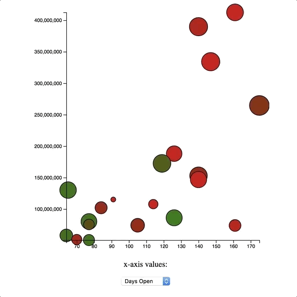
Given the following movies data set Implement the following scatter plot:
d3.selectAll("p")
	.style('color', '#FB5B1F')
	.style('background-color', 'black')
	.style('font-size', (d) => ((5 * Math.random()) + .25)+"em");

d3.select("li").style('padding', '20px');d3.selectAll("li").on('click', function() {
// generate random numbers between 0 and 255;
var randomRed = Math.floor(Math.random() * 256);
var randomBlue = Math.floor(Math.random() * 256);
var randomGreen = Math.floor(Math.random() * 256);
var randomColor = `rgb(${randomRed},${randomBlue},${randomGreen})`;
d3.select(this).style('color', randomColor);
});<svg height="230" width="250">
<g stroke="black" stroke-width="1">
<circle cx=110 cy=110 r=100 fill="#006BB6"/>
<rect x=60 y=60 width=100 height=100 fill="#FDB927"/>
<path
d="M80 150 L80 80 L150 150Z"
fill="rgb(0,255,0)"
stroke="black" />
</g>
</svg>document.addEventListener("DOMContentLoaded", function() {
const width = 500;
const height = 500;
const xMin = d3.min(states, function(d) { return d.population; });
const xMax = d3.max(states, function(d) { return d.population; });
const yMin = d3.min(states, function(d) { return d.electoralVotes; });
const yMax = d3.max(states, function(d) { return d.electoralVotes; });
const rMin = d3.min(states, function(d) { return d.area; });
const rMax = d3.max(states, function(d) { return d.area; });
var padding = 20;
var xScale = d3.scaleLinear()
.domain([xMin, xMax])
.range([padding, width - padding]);
var yScale = d3.scaleLinear()
.domain([yMin, yMax])
.range([height - padding, padding]);
var rScale = d3.scaleLinear()
.domain([rMin, rMax])
.range([5,20]);
var svg = d3.select("body")
.append("svg")
.attr("width", width)
.attr("height", height);
svg.selectAll("circle")
.data(states)
.enter()
.append("circle")
.attr("cx", function(d) { return xScale(d.population); })
.attr("cy", function(d) { return yScale(d.electoralVotes); })
.attr("r", d => rScale(d.area));
});document.addEventListener("DOMContentLoaded", function() {
var width = 500;
var height = 500;
var padding = 10;
var svg = d3.select("body")
.append("svg")
.attr("width", width)
.attr("height", height);
var xMin = d3.min(states, function(d) { return d.population / d.area; });
var xMax = d3.max(states, function(d) { return d.population / d.area; });
var yMin = d3.min(states, function(d) { return d.medianIncome; });
var yMax = d3.max(states, function(d) { return d.medianIncome; });
var xScale = d3.scaleLinear()
.domain([xMin,xMax])
.range([padding,width - padding]);
var yScale = d3.scaleLinear()
.domain([yMin,yMax])
.range([height - padding,padding]);
svg.selectAll("circle")
.data(states)
.enter()
.append("circle")
.attr("cx", function(d) { return xScale(d.population / d.area); })
.attr("cy", function(d) { return yScale(d.medianIncome); })
.attr("r", 10);
});We've covered a fair amount of ground when it comes to d3, but there's still plenty left to discover. Here are some other areas to learn about if you're interested:
- Check out the docs to learn more about other kinds of scales available in d3.
- You can learn more about transitions here.
- d3's
datafunction takes an optional second argument, called a key function. What do these functions do, and what's a good use case for them? (This lesson is a good place to start.)