Add MONITOR support and status icons for queries #4550
Conversation
|
I would prefer not to move the online icon away when you open a query. It's really helpful to scan a list of online people quickly (least I used that a lot for work in other chat like things) and you really want that all in the same place. Duplicate the bubble, that's fine, but please don't move it. |
|
It has to move anyways. Should it move to the left of the close icon?
|

|
That's not what I meant by move, it's still in the same global position, namely the chan list. Yes it physically moves slightly to the left, but it still hugs the channel list entry. What I meant by moving was your "let's portal it to some completely different UI element" and suddenly it's in the titlebar which has no relationship to the chanlist at all per se. |
|
On mobile specifically, when you have the chanlist open you don't see the titlebar of the open chan/query anymore. It gets dimmed and is under the chanlist |
|

|
This is just a design thought: The badge would be more "scannable" if it lived either to the left of each nick or pinned to the far right edge like the unread-count indicators in the channel list. Other than that nitpick, I'm fairly excited to see this new feature land. |
|
Fixed and updated screenshot in comment, @dgw |
|
Beautiful, @MaxLeiter! |
|
indeed much better on the lefthand side in the user list |
|
awesome work!!! |
| </template> | ||
| </div> | ||
| </div> | ||
| </aside> | ||
| </template> | ||
|
|
||
| <style> | ||
| .userlist { |
There was a problem hiding this comment.
I didn't change any of the CSS, it's copied from style.css
| } | ||
|
|
||
| /* Status icon */ | ||
| #chat .names .status { |
| @@ -23,5 +25,10 @@ export default { | |||
| network: Object, | |||
| message: Object, | |||
| }, | |||
| computed: { | |||
| awayMessage() { | |||
| return this.message.text.trim(); | |||
There was a problem hiding this comment.
this is not really necessary to shove in this PR, but we shouldn't show empty away messages, as it looks like ( )
|
I'm just gonna mention (non blocking), that different states should probably use different shapes/icons in the future, because colors alone are not good for accessibility or quick scanning. Also, what about combining the status icons into the channel icon in the channel list, similar to how notification dot looks on the hamburger button. |
|
When this is merged I'll open a discussion on how it should look |
Co-authored-by: ts-migrate <>
Co-authored-by: ts-migrate <>
Co-authored-by: ts-migrate <>
Co-authored-by: ts-migrate <>
Co-authored-by: ts-migrate <>
Co-authored-by: ts-migrate <>
Co-authored-by: ts-migrate <>
Co-authored-by: ts-migrate <>
|
Is there a reasonable way to revive the work in this branch? |
|
@brettgilio yeah, but its probably easiest to start fresh and just copy paste code over. Its on my eternal todo list |
When a query is open the icon disappears from the sidebar and is moved to the titlebar:

There's also tooltips:

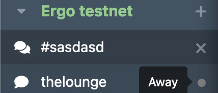
Away support:
Closes #337, closes #872 (#337 can't really be fully addressed -- tracking nick changes isn't really possible atm)
I also added requesting the
draft/extended-monitorcap, so away messages will be sent to users in the monitor list. https://ircv3.net/specs/extensions/extended-monitorUpdated to typescript