Author: Taylor B. Arnold
License: GPL-2

The package is currently only available on GitHub and can be installed with
remotes::install_github("statsmaths/ggmaptile")
It is planned to submit the package to CRAN by the end of the month (March 2020).
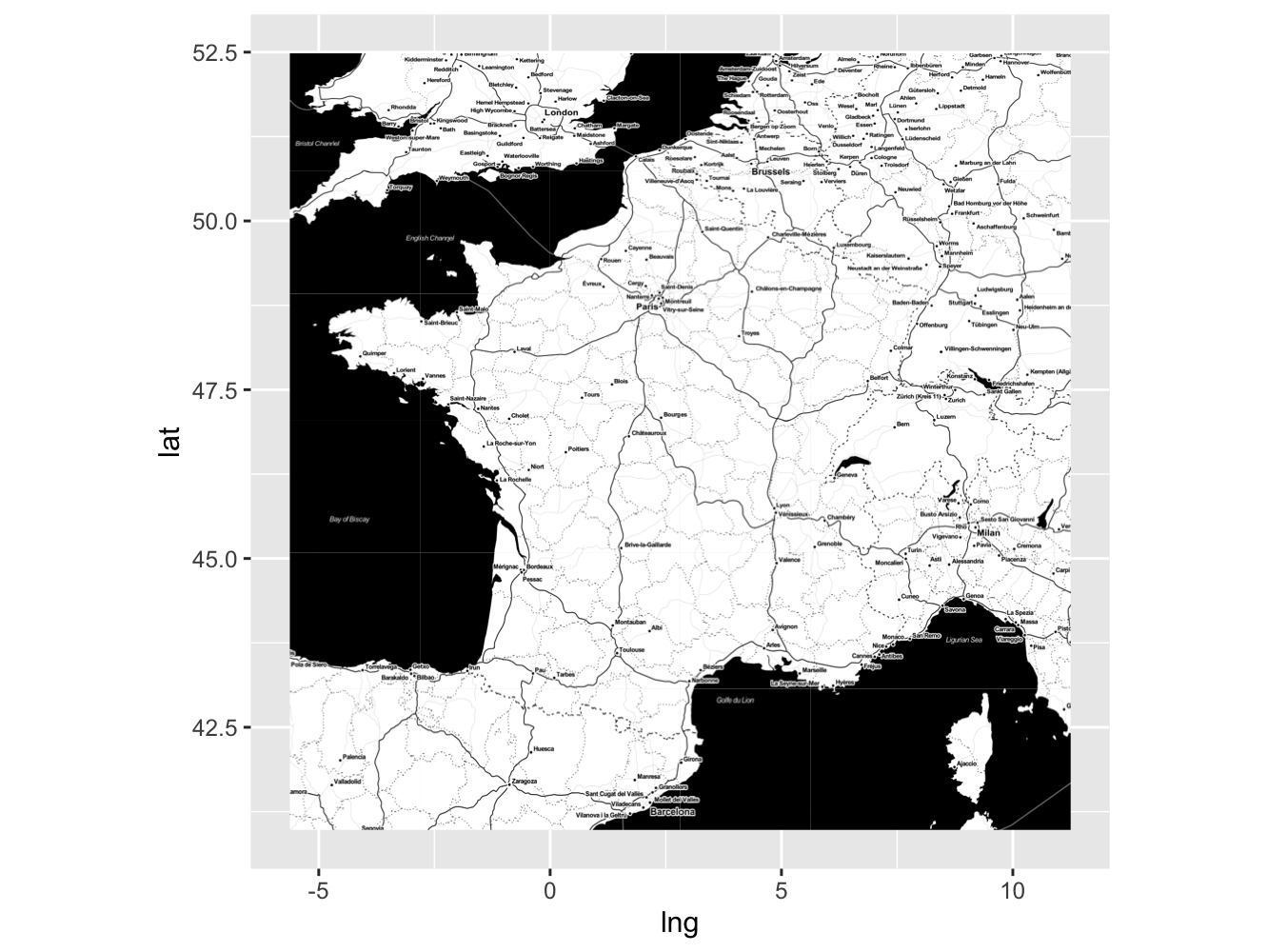
There are two datasets included with the package. The first gives the location of the largest 58 cities in France. We will start by using this dataset to illustrate how the package works.
The main function in ggmaptile is called stat_maptiles, which
automatically adds map tiles to a plot. To use it, simply construct a ggplot
object where a longitude is assigned to the x aesthetic and a latitude is
assigned to the y aesthetic. The function will cover the region spanned by the
data. Here, we grab tiles to cover the region of the largest 58 cities in
France.
library(ggplot2)
library(ggmaptile)
library(dplyr)

french_city %>%
  ggplot(aes(x = lng, y = lat)) +
    stat_maptiles()
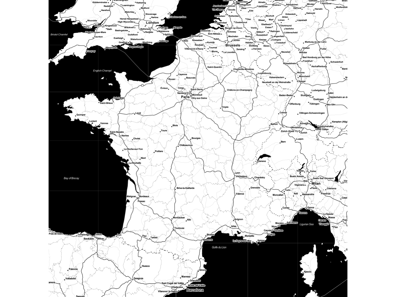
Often, with a map, it is best to hide the axes and reserve the entire plot
region for the map itself. The function mapview included with the package,
along with ggplot2's theme theme_void, make this relatively easy.
french_city %>%
  ggplot(aes(x = lng, y = lat)) +
    stat_maptiles() +
    theme_void() +
    mapview()
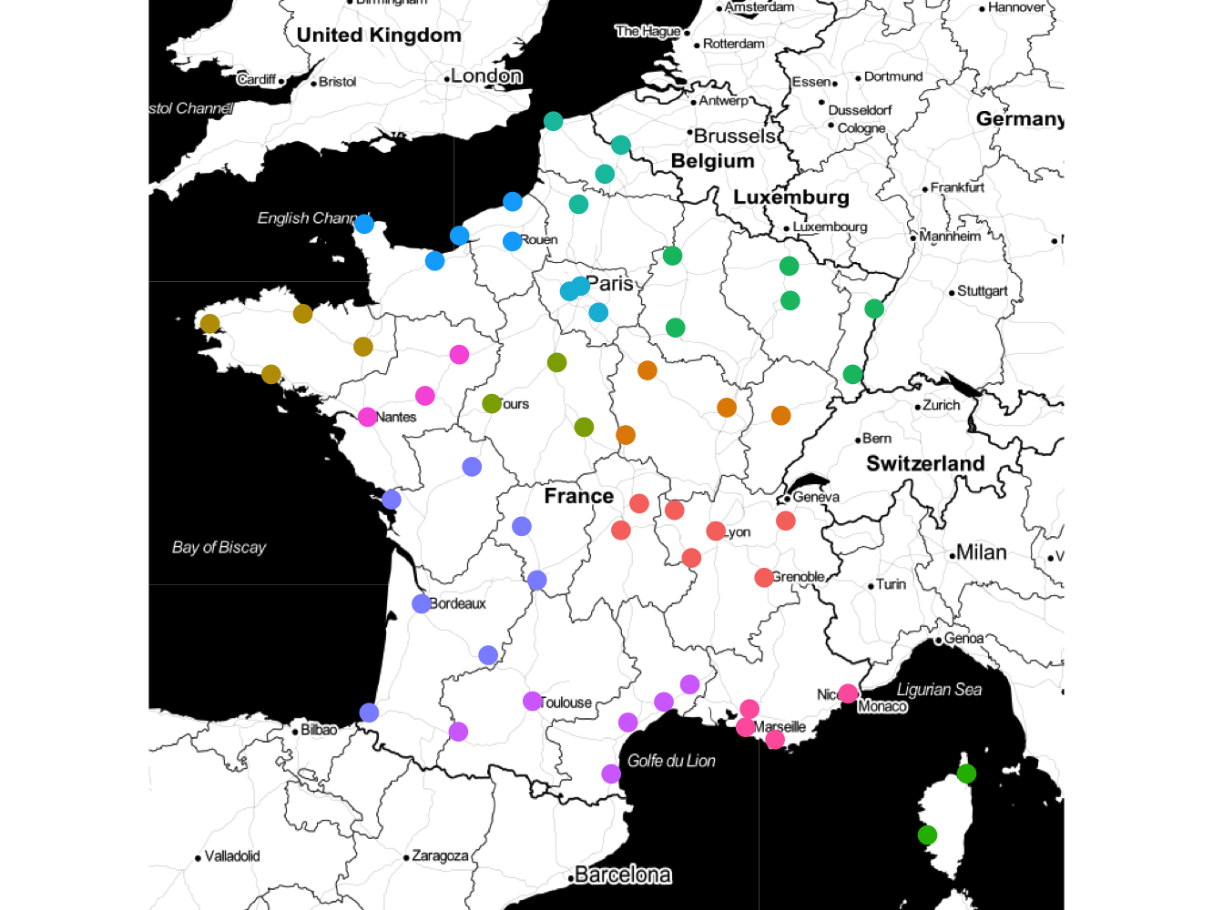
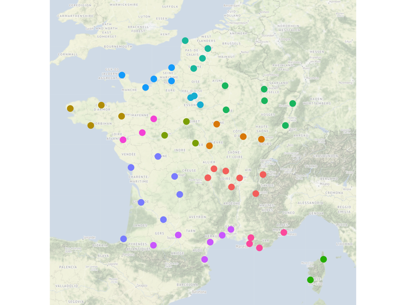
Additional layers can be added on top of the map tiles. So, for example, we can add points associated with each of the cities and color them according their administrative region.
french_city %>%
  ggplot(aes(x = lng, y = lat)) +
    stat_maptiles() +
    geom_point(aes(color = admin_name), size = 3, show.legend = FALSE) +
    theme_void() +
    mapview()

And that's it! In the following sections, options and guidance for how to use
stat_maptiles are highlighted to optimise the package for various use cases.
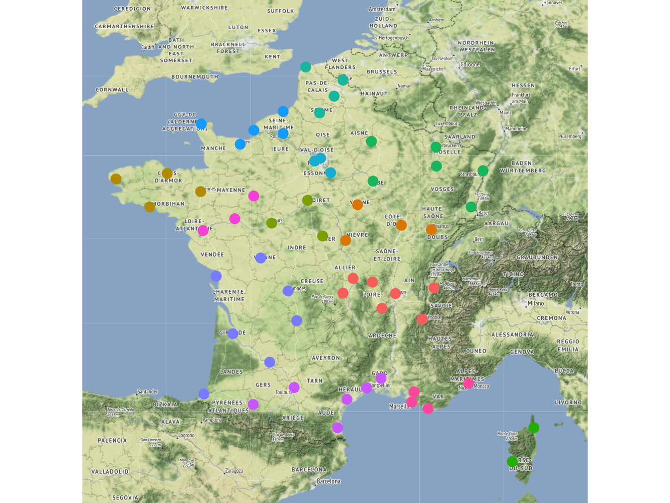
There are several options built into the stat_maptiles function that can be
adjusted to control how map tiles are selected and shown on your plot. By
default, a zoom level will be determined for your plot in order to approximately
cover the region in 25 tiles. Providing a positive or negative integer to the
option zoom_adj can adjust this default to zoom in (positive value) or out
(negative) value. Here is our previous map zoomed out one level.
french_city %>%
  ggplot(aes(x = lng, y = lat)) +
    stat_maptiles(
      zoom_adj = -1
    ) +
    geom_point(aes(color = admin_name), size = 3, show.legend = FALSE) +
    theme_void() +
    mapview()
In this case, the zoomed out map actually looks quite nice and provides more
readable labels for the countries and major landmarks. Be careful when zooming
in too much beyond the default as it can require downloading and displaying a
very large number of tiles. It is also possible to set an explicit zoom level
from 1 to 19 using the parameter zoom.
By default, map tiles come from the "toner-lite" category supplied by
Stamen Design, under CC BY 3.0.. To use a
different set of tiles, supply a string to the parameter url to describe
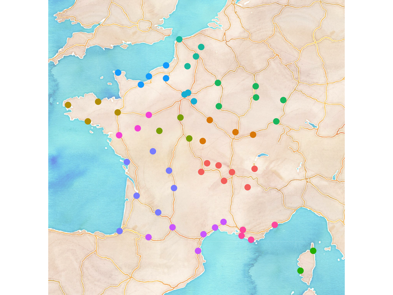
how to grab tiles. Here, for example, are the "terrain" map tiles from Stamen.
We also need to set the option force = TRUE; by default the package
caches downloaded tiles within a session and would reuse the "toner-lite"
tiles that were previously downloaded.
french_city %>%
  ggplot(aes(x = lng, y = lat)) +
    stat_maptiles(
      url = "http://tile.stamen.com/terrain/%d/%d/%d.png",
      force = TRUE
    ) +
    geom_point(aes(color = admin_name), size = 3, show.legend = FALSE) +
    theme_void() +
    mapview()
You can also supply a value to the option alpha to control the opacity of the
tiles. This is useful when using bright tiles, such as the terrain ones, to
make sure your other layers are not lost in the colors of the map itself.
Note that we do not need to set force = TRUE here because the correct tiles
are already downloaded from the previous code block.
french_city %>%
  ggplot(aes(x = lng, y = lat)) +
    stat_maptiles(
      url = "http://tile.stamen.com/terrain/%d/%d/%d.png",
      alpha = 0.4
    ) +
    geom_point(aes(color = admin_name), size = 3, show.legend = FALSE) +
    theme_void() +
    mapview()
By default, downloaded tiles are stored in a local temporary directory. This
persists within an R session but is lost when closing R. To set an alternative
local directory, which can be stored between sessions to avoid the constant
re-downloading of tiles, set the parameter cache_dir to the desired root of
your cache location. Here is its usage with the "watercolor" tiles:
french_city %>%
  ggplot(aes(x = lng, y = lat)) +
    stat_maptiles(
      url = "http://tile.stamen.com/watercolor/%d/%d/%d.jpg",
      alpha = 0.6,
      cache_dir = "cache"
    ) +
    geom_point(aes(color = admin_name), size = 3, show.legend = FALSE) +
    theme_void() +
    mapview()
Combining these options can produce a myriad of interesting plots to help visualize and communicate your spatial data. One final option, which requires a bit more discussion, is included in the section below.
One of the more subtle issues with grabbing map tiles to visualize a dataset
is determining what tiles to use to cover a given set of data. At the root of
the difficulty is that there is generally a fixed aspect ratio that must be
preserved to avoid distorting the tile images. This means that the number of
tiles depends on the desired aspect ratio of plotting device, which is difficult
to always know ahead of time when grabbing map tiles. By default, the function
stat_maptiles grabs just enough tiles to cover the given data and constrains
the plot to fit these tiles with the desired aspect ratio. While often,
particularly when working data roughly distributed in a square area as with
the major France cities, the default behavior works fine. Here, we see how
to modify this behavior.
The second dataset provided in the package provides information about the Parisian metro system. It is a good dataset to illustrate the issue with aspect ratios because metro lines tend to extend in one direction (north-south or east-west) and offer several different ways that we may want to control the dimensions of the output.
Here, we will start by looking at the default map constructed for the M4 metro
line. The dataset includes the metro path and canonical colors associated with
each line. We will use geom_segment the scale_color_identity to show these
features on top of the map.
paris_metro %>%
  filter(ligne == 4) %>%
  ggplot(aes(lon, lat)) +
    stat_maptiles() +
    geom_point(
      aes(color = ligne_couleur),
      show.legend = FALSE
    ) +
    geom_segment(
      aes(xend = lon_fin, yend = lat_fin, color = ligne_couleur),
      show.legend = FALSE
    ) +
    scale_color_identity() +
    theme_void() +
    mapview()
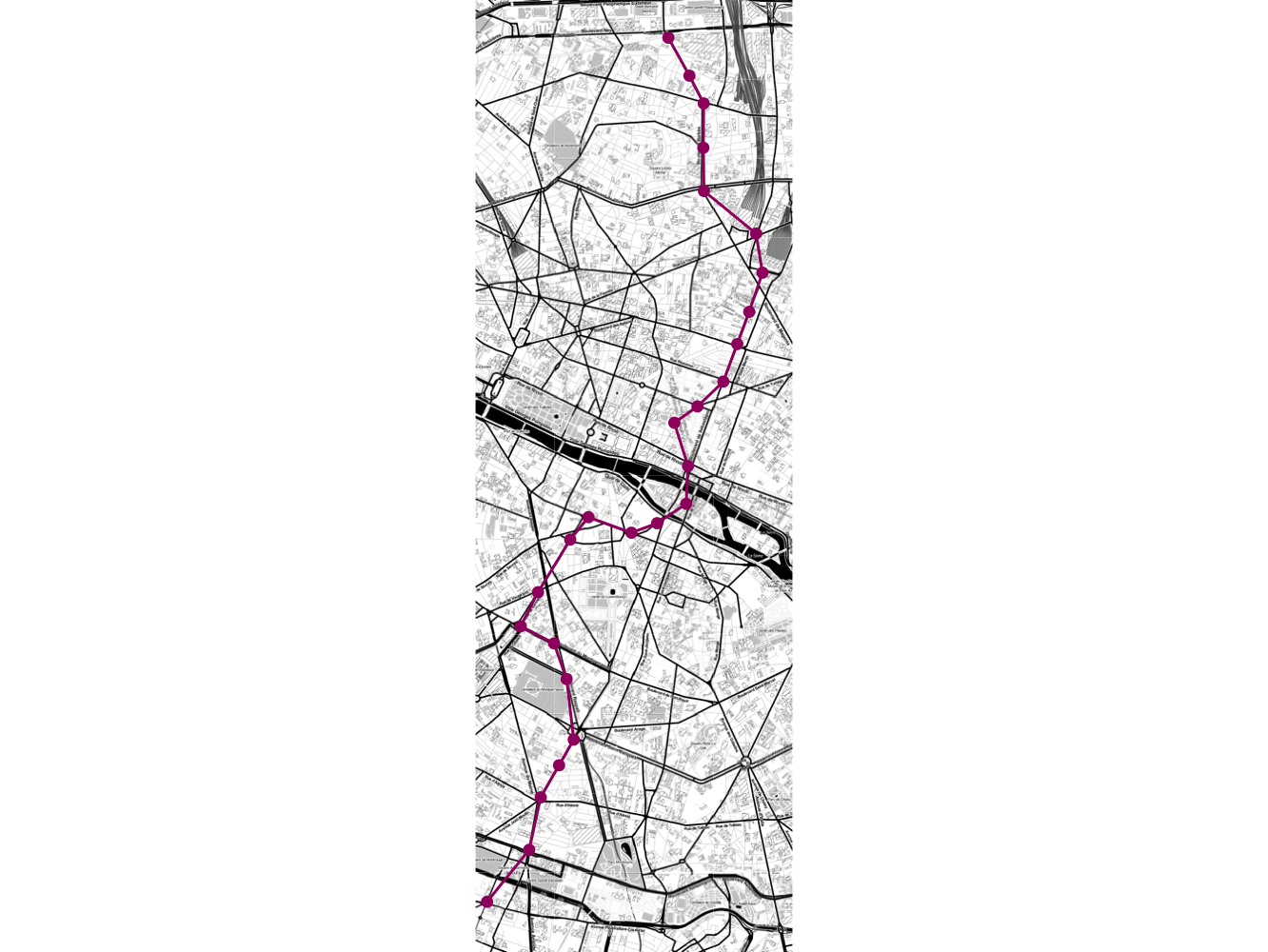
The default output looks quite nice. It does a good job of determining the required number of tiles. It also makes sure that the plotted map tiles are not distorted by only using part of the plot region for the map.
What if we wanted to fill out the white region with map tiles? They are not
needed to show the data, but if (for whatever reason) we need to have a square
plot it makes sense to use this space to give more context to our data. To do
this we can set the parameter aspect_ratio to control the desired aspect
ratio of the selected tiles. This will add additional tiles either the x or y
(as needed) dimension to produce a plot of the desired aspect ratio. Here, we
set the aspect ratio to 1, to have an equal number of x and y tiles.
paris_metro %>%
  filter(ligne == 4) %>%
  ggplot(aes(lon, lat)) +
    stat_maptiles(
      aspect_ratio = 1
    ) +
    geom_point(
      aes(color = ligne_couleur),
      show.legend = FALSE
    ) +
    geom_segment(
      aes(xend = lon_fin, yend = lat_fin, color = ligne_couleur),
      show.legend = FALSE
    ) +
    scale_color_identity() +
    theme_void() +
    mapview()
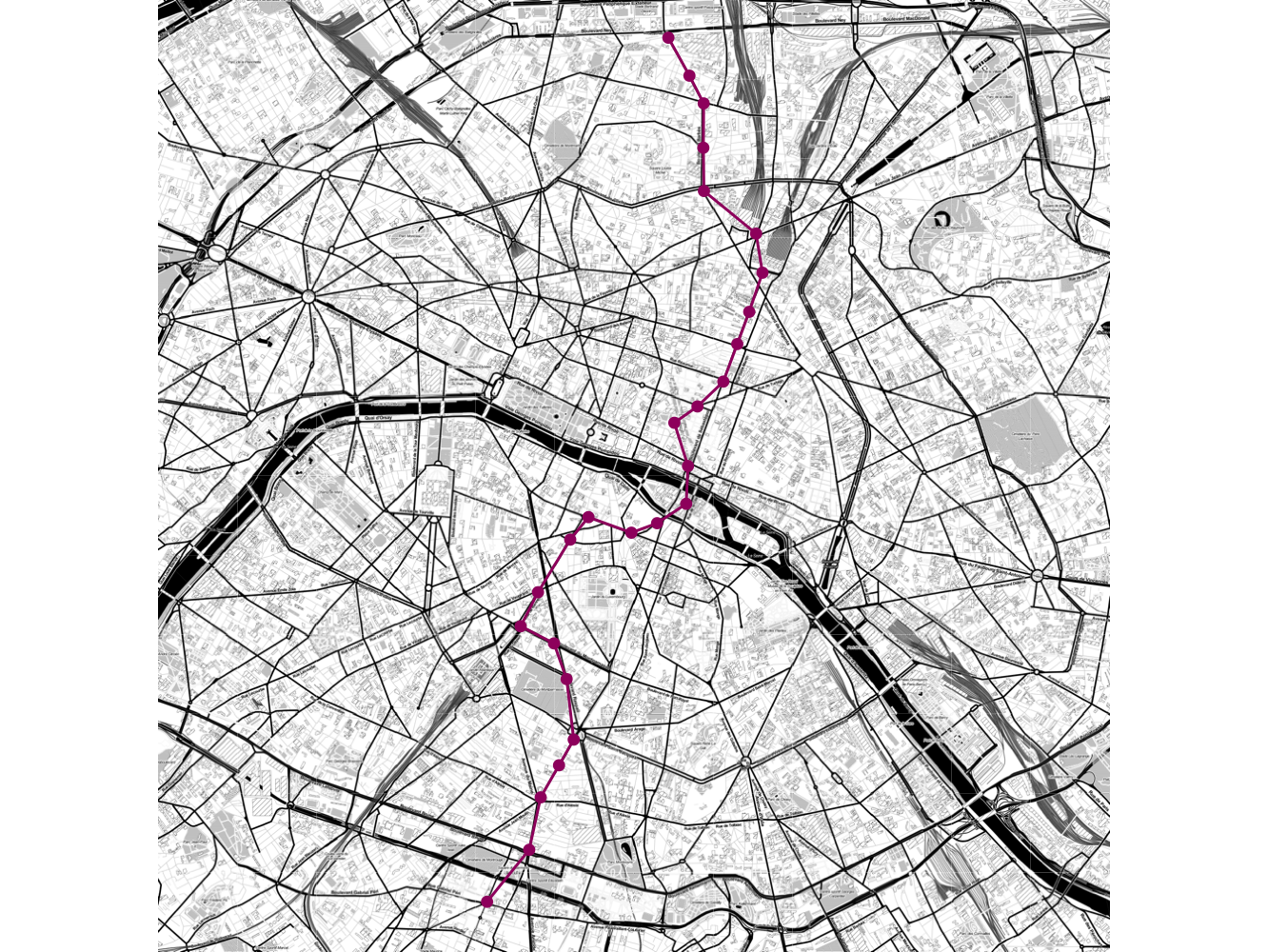
Note that, because the tiles are discrete, the aspect ratio of the output may only be approximate.
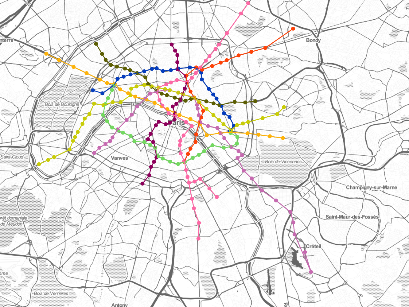
Showing a number of the metro lines on the same map is interesting, but can get a bit messy:
paris_metro %>%
  filter(ligne <= 9) %>%
  ggplot(aes(lon, lat)) +
    stat_maptiles(
      alpha = 0.6
    ) +
    geom_point(
      aes(color = ligne_couleur),
      show.legend = FALSE
    ) +
    geom_segment(
      aes(xend = lon_fin, yend = lat_fin, color = ligne_couleur),
      show.legend = FALSE
    ) +
    scale_color_identity() +
    theme_void() +
    mapview()
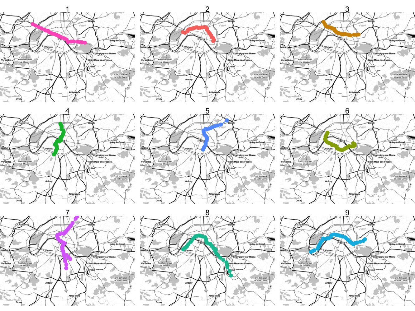
An alternative approach is to use ggplot2's facets to show each line in its
own small plot. Here, we have two options. First, you could use a
consistent plot region for all of the maps with fixed scales (the default of
facet_wrap). We will set the option quiet = TRUE to avoid printing a
status message for each facet and zoom each image out by a factor of 1, since
the default algorithm assumes each map is being printed
paris_metro %>%
  filter(ligne <= 9) %>%
  ggplot(aes(lon, lat)) +
    stat_maptiles(
      zoom_adj = -1,
      quiet = TRUE
    ) +
    geom_point(
      aes(color = ligne_couleur),
      show.legend = FALSE
    ) +
    geom_segment(
      aes(xend = lon_fin, yend = lat_fin, color = ligne_couleur),
      show.legend = FALSE
    ) +
    theme_void() +
    mapview() +
    facet_wrap(~ligne)
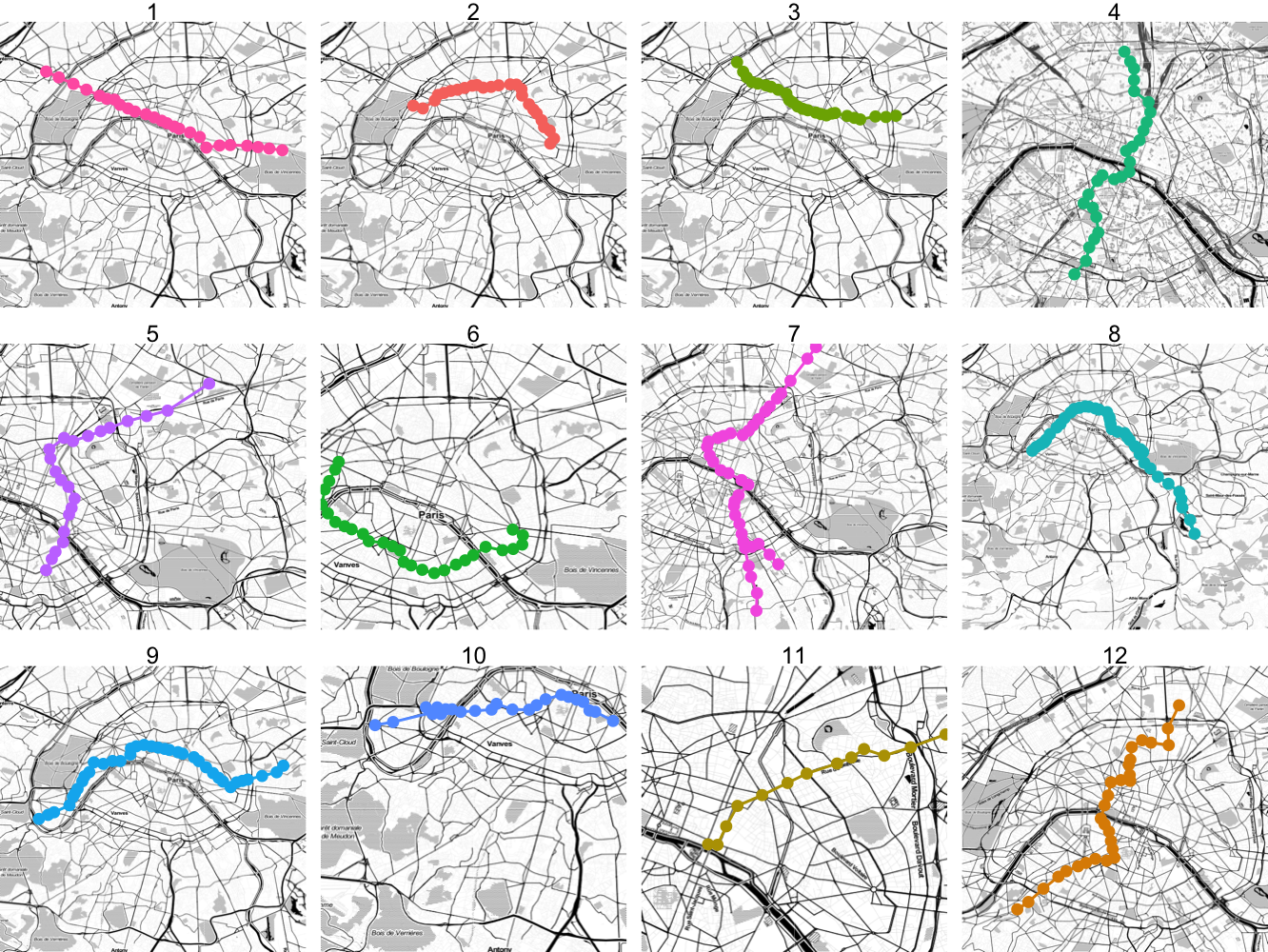
It is also possible to allow the scales to float freely so that each region can display a different map. However, in this case you will need to set the aspect ratio to a fixed value (otherwise the images will becomes distorted):
paris_metro %>%
  filter(ligne <= 12) %>%
  ggplot(aes(lon, lat)) +
    stat_maptiles(
      aspect_ratio = 1,
      zoom_adj = -1,
      quiet = TRUE
    ) +
    geom_point(
      aes(color = ligne_couleur),
      show.legend = FALSE
    ) +
    geom_segment(
      aes(xend = lon_fin, yend = lat_fin, color = ligne_couleur),
      show.legend = FALSE
    ) +
    theme_void() +
    mapview() +
    facet_wrap(~ligne, scale = "free", ncol = 4)
Using free scales are particularly useful when you want to facet by different regions of the plot, such as showing the french cities data with a facet for each region.
If you make use of the package in your work, please cite it as follows:
@Manual{,
  title = {ggmaptile},
  author = {Taylor B. Arnold},
  year = {2020},
  note = {R package version 0.1.0},
  url = {https://github.com/statsmaths/ggmaptile},
}
Contributions, including bug fixes and new features, to the package are welcome. When contributing to this repository, please first discuss the change you wish to make via a GitHub issue or email with the maintainers of this repository before making a change. Small bug fixes can be given directly as pull requests.
Please note that this project is released with a Contributor Code of Conduct. By participating in this project you agree to abide by its terms.