Our auto-generated search integrations are a quick and easy way to get Sajari Website Search running on your site.
This repository is used in the Console to generate search interfaces which can be copy-pasted directly into your website.
This website search integration is built using the Sajari React SDK.
This integration requires a website collection. You can Sign Up and create a website collection to get started.
From the Install tab in the Console you can generate a search interface which can be copy-pasted into your site. It's easy to add further customizations using styling object (see Styling), or by changing the JSON configuration (see Configuration).

The generated interface is designed to be responsive by default, and can be easily styled to fit your websites look and feel.
Styling is a part of the configuration object. The styling object is derived from the styling interface that is a part of the Sajari React SDK.
This new styling object, provides an easy way of customizing the entire look of your search interface, by providing a high level theme object, and also allowing customizations right down to the component level.
All styling customizations live under the styling member of the configuration object:
{
  // ...other config
  styling: {
  }
}
Current ways of change the styling of your search integration:
Current theming options:
- Primary Color
- Results Layout
A Primary Color can be set by adding the following to your configuration object:
{
  styling: {
    theme: {
      colors: {
        brand: {
          primary: "#3b5998";
        }
      }
    }
  }
}
The Results Layout can be changed by using a preset type like so:
{
  styling: {
    theme: {
      layout: {
        type: "list"; // options list or grid, defaults to list.
      }
    }
  }
}The styling object also allows for the customization of the individual components that make up your search interface.
To style individual components add the following to your styling object:
styling: {
  components: {
    // input: {}
    // results: {}
    // summary: {}
    // tabs: {}
    // paginator: {}
  }
}
You can also style the components using regular css. The styling information for each component can be found in the links below.
For more details on what can be passed to the objects, please refer to the styling section of the React SDK.
Setting a primary brand color:

styling: {
  theme: {
    colors: {
      brand: {
        primary: "#ed6e24";
      }
    }
  }
}
Customizing the input styles:

styling: {
  components: {
    input: {
      input: {
        container: {
          backgroundColor: '#999',
          color: '#fff',
          border: '1px solid #999',
          boxShadow: 'none',
        },
        button: {
          color: '#eee',
        }
      }
    }
  }
}There are 4 types of integration:
-
inline: search box, results. Interface is embedded directly into a page (or pages) on your website, for instance a dedicated search page with a search box + results.
-
overlay: full page overlay, search box, results. Interface appears as an overlay on top of the current page. Can be used to search without leaving the page.
-
search box: search box. Typical usage includes being embedded into headers and menus.
-
dynamic content: results. Typically used to put pre-baked searches into pages, to show similar or popular content, or article listings by tag/category etc for landing pages.
It's possible to use multiple integrations on the same site/page. For instance: have a search box in the header of your site, which then redirects to an inline search results page when triggered.
NOTE: The code examples in this README assume integrations have been generated from the Console. Generated interfaces come with a handful of helper functions which are referenced in the following examples.
The inline search integration renders a full search interface (input box and
results) inside a webpage. A typical example would be a dedicated search results
page which is linked to/navigated to by search forms on a website. In the
configuration example given below, the search query can be passed to the page
using the query parameter q.

myUI({
  mode: "inline", // Set the integration mode
  project: "<your project>", // Set this to your project.
  collection: "<your collection>", // Set this to your collection.
  values: { resultsPerPage: "10", q: getUrlParam("q") }, // Default pipeline values
  attachSearchBox: document.getElementById("search-box"), // DOM element to render search box.
  attachSearchResponse: document.getElementById("search-response"), // DOM element to render search results.
  results: { showImages: false }, // Results configuration
  pipeline: "website", // Set this to your search pipeline
  instantPipeline: "autocomplete", // Set this to your instant pipeline
  inputPlaceholder: "Search", // Placeholder text for the input element
  maxSuggestions: 5, // Maximum number of suggestions in the search box
  tabFilters: {}, // Tab configuration
});The overlay search integration renders a search interface on top of existing pages. Typically this is used on sites that prefer not to navigate users away from their current page to see results.

myUI({
  mode: "overlay", // Set the integration mode
  project: "<your project>",
  collection: "<your collection>",
  values: { resultsPerPage: "10", q: getUrlParam("q") },
  results: { showImages: false },
  pipeline: "website",
  instantPipeline: "autocomplete",
  inputPlaceholder: "Search",
  autocompleteMaxSuggestions: 5,
  inputAutoFocus: true,
  tabFilters: {},
});The Search Box integration creates an autocomplete-enabled input box typically embedded into site headers and menu bars. It performs autocomplete lookups for each user keypress and can be customized to redirect to a search results page or trigger custom search actions.
myUI({
  mode: "search-box", // Set the integration mode
  project: "<your project>",
  collection: "<your collection>",
  instantPipeline: "autocomplete",
  inputPlaceholder: "Search",
  maxSuggestions: 5,
  attachSearchBox: document.getElementById("search-box"),
});The Dynamic Content integration creates a results block using search results from a pipeline. It can typically be used to show similar or popular pages.
myUI({
  mode: "dynamic-content", // Set the integration mode
  project: "<your project>",
  collection: "<your collection>",
  pipeline: "website",
  attachDynamicContent: document.getElementById("dynamic-content"),
  values: { resultsPerPage: "3" },
  results: { showImages: false },
  searchOnLoad: true,
});The generated interface code comes with two helper functions:
getUrlParam(x)extracts a value from a url parameterx.setupcreates an object that controls an instance of the integration.
Every integration is bound to its own variable (using the setup function), so
it's easy to have multiple integrations running on the same page. You an also
have them interact with each other by subscribing and publishing events between
them.
myUI = setup(...);
secondUI = setup(...);

myUI(...);
secondUI(...);The generated search interfaces are configured using a JSON object. Generating an interface from the console will prefill the configuration for you, setting default values where necessary.
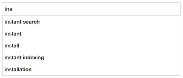
By default search boxes have instant enabled and use the pipeline specified by instantPipeline. To disable instant searching, set the value of instantPipeline to "".
General configuration
| Property | Default | Description |
|---|---|---|
| project | "<your project>" |
Project to search |
| collection | "<your collection>" |
Collection to search |
| pipeline | "website" |
Pipeline to query when pressing enter or clicking an autocompleted suggestion |
| instantPipeline | "autocomplete" |
Pipeline to query when typing, set to "" to disable |
| tracking | click |
Sets the tracking mode, set to "none" to disable. |
| maxSuggestions | "5" |
Sets how many autocomplete suggestions are shown in the box below the search input |
| inputMode | suggestions |
Sets the mode of the input component, set to "typeahead" to enable instant-search with typeahead completion. |
| inputPlaceholder | "Search" |
Placeholder text in the search input box |
| inputAutoFocus | false |
Focus the search input html element on initialization |
| inputSearchButtonText | undefined |
Sets the text inside of the search button in the input component |
| inputVoiceToText | undefined |
Enables voice search functionality in supported browsers |
| values | see table below | Configuration of the pipeline values |
| results | see table below | Configuration for the search results |
| urlQueryParam | "q" |
Sets the query param to be used in the url |
| updateQueryStringParam | true |
Sets whether to update the query param in the url |
| searchOnLoad | false |
Enable a search to be triggered on page load |
| disableGA | false |
Disable the Google Analytics events integration |
| styling | see above | Styling configuration |
Values configuration
| Property | Default | Description |
|---|---|---|
| q | getUrlParam("q") |
The initial value of q in the pipeline, commonly used as the query text |
| resultsPerPage | "10" |
Number of results to show per page |
| filter | "" |
Filter expression to apply to results |
Results configuration
| Property | Default | Description |
|---|---|---|
| showImages | false |
Show images next to search results |
Interfaces are created using setup which is included when generating the
interface from the console.
myUI = setup(window, document, "script", "sajari");You can subscribe to events by calling your interface with the "sub" value
followed by the pipeline (either pipeline or instantPipeline) and event
name, then a callback. It takes the form
// To listen to an event on the main pipeline
myUI("sub", "pipeline.<event>", callback);

// To listen to an event on the instant pipeline
myUI("sub", "instantPipeline.<event>", callback);
For example, if you are using the default inline interface and want to listen to
the search-sent event, you'd write:
myUI("sub", "pipeline.search-sent", function (event, values) {
  console.log("Search sent with values: ", values);
});| Event | Data | Description |
|---|---|---|
"search-sent" |
value dictionary | Search request has been sent |
"values-updated" |
value dictionary | Value map has updated |
"response-updated" |
response object | Response has updated |
"page-closed" |
query string | Page is about to be closed |
"query-reset" |
query string | Body has changed enough to be considered a new query |
"result-clicked" |
query string | Result has been clicked |
"search-event" |
query string | Search event |
"overlay-show" |
none | Overlay is shown |
"overlay-hide" |
none | Overlay is hidden |
You can also publish events which the search interface will pick up.
| Event | Data | Description |
|---|---|---|
"values-set" |
value dictionary | Values to merge in |
"search-send" |
none | Perform a search |
"overlay-show" |
none | Show the overlay |
"overlay-hide" |
none | Hide the overlay |
A search has sent and we are now waiting for results. The values used in the search are given to the subscribed function.
myUI("sub", "<pipeline>.search-sent", function (eventName, values) {
  console.log("Search sent with ", values);
});
Values in the interface have been updated. A function is given as the 3rd
argument that can be used to merge new values into the value dictionary, it
behaves like pub("values-set", {}) except that it doesn't trigger an event.
myUI("sub", "<pipeline>.values-updated", function (eventName, values, set) {
  console.log("New values are", values);
});The search response has been updated. Caused by a network response being received or results being cleared (usually because the input box has become empty).
You can see more info about the response object
here.
myUI("sub", "<pipeline>.response-updated", function (eventName, response) {
  if (response.isEmpty()) {
    return;
  }
  if (response.isError()) {
    console.log("Got error", response.getError());
  } else {
    console.log("Got results", response.getResults());
  }
});A search event signals the end of a search session. A common use case of subscribing to them is for reporting.
myUI("sub", "<pipeline>.search-event", function (eventName, query) {
  console.log("Search session finished, last query", query);
});
If you'd like more granular events you can also subscribe to these events.
function searchFinished(eventName, query) {
  console.log("Search session finished, last query", query);
}
myUI("sub", "<pipeline>.page-closed", searchFinished);
myUI("sub", "<pipeline>.query-reset", searchFinished);
myUI("sub", "<pipeline>.result-clicked", searchFinished);Opening and closing the overlay can be done by publishing either the show or hide event.
Note: The show and hide events do not have a pipeline prefixing the event name!
myUI("pub", "overlay-show");
myUI("pub", "overlay-hide");
You can also subscribe to these events
myUI("sub", "overlay-show", function (eventName) {
  console.log("The overlay has been shown");
});
myUI("sub", "overlay-hide", function (eventName) {
  console.log("The overlay has been hidden");
});Merge new values into the values dictionary. Setting a value to undefined will remove it from the values dictionary.
myUI("pub", "<pipeline>.values-set", { q: "<search query>" });Search will perform a search request using the values in the value map.
myUI("pub", "<pipeline>.search-send");Create tabs to filter search results. Tabs are rendered in a UI component when
search results are shown. If a tab is clicked then the algorithm parameter
filter is set to the tab's filter attribute.
tabFilters: {
   defaultTab: "All", // The title of the default tab.
   tabs: [
      {title: "All", filter: ""},
      {title: "Blog", filter: "dir1='blog'"}, // First directory in URL is 'blog'.
      {title: "Not Blog", filter: "dir1!='blog'"} // First directory in URL is not 'blog'.
   ],
}
For more information on building filter expressions, see filters.
Filters are used to limit the pages that are returned in a search. Filters can be used in Tabs or by setting the filter property in the values configuration attribute (see Configuration).
Our crawler extracts common fields when it parses web pages (such as the first and second directories of URLs), which make filtering much easier. It's well worth taking a look at all the extracted fields before you start building filters, as most use cases are quick and easy to get running.
Here is a list of the most commonly used fields.
titleThe page title.descriptionThe page description.imageThe URL of an image which corresponds to the page.langThe language of the page, extracted from the<html>element (if present).
Fields that are based on the URL of the page (ideal for filtering on subsections
of a site) are given below. Examples here assume that the page URL is
https://www.sajari.com/blog/year-in-review:
urlThe full page URL:https://www.sajari.com/blog/year-in-reviewdir1The first directory of the page URL:blogdir2The second directory of the page URL:year-in-reviewdomainThe domain of the page URL:www.sajari.com
When querying a field, there are a few operators that can be used. Note, all
values must be enclosed in single quotation marks, i.e. "field boost must be
greater than 10" is written as boost>'10'.
| Operator | Description | Example |
|---|---|---|
Equal To (=) |
Field is equal to a value (numeric or string) | dir1='blog' |
Not Equal To (!=) |
Field is not equal to a value (numeric or string) | dir1!='blog' |
Greater Than (>) |
Field is greater than a numeric value | boost>'10' |
Greater Than Or Equal To (>=) |
Field is greater than or equal to a numeric value | boost>='10' |
Less Than (<) |
Field is less than a given numeric value | boost<'50' |
Less Than Or Equal To (<=) |
Field is less than or equal to a given numeric value | boost<'50' |
Begins With (^) |
Field begins with a string | dir1^'bl' |
Ends With ($) |
Field ends with a string | dir1$'og' |
Contains (~) |
Field contains a string | dir1~'blog' |
Does Not Contain (!~) |
Field does not contain a string | dir1!~'blog' |
It's also possible to build more complex filters by combining field filter
expressions with AND/OR operators, and brackets.
| Operator | Description | Example |
|---|---|---|
AND |
Both expressions must match | dir1='blog' AND domain='www.sajari.com' |
OR |
One expression must match | dir1='blog' OR domain='blog.sajari.com' |
For example, to match pages with language set to en on www.sajari.com or any
page within the en.sajari.com domain:
(domain='www.sajari.com' AND lang='en') OR domain='en.sajari.com'
Contributions are welcome. See the Contributing guide.