tag visualization of all tags #1502
Comments
|
Hi, Liz - i'm a bit reluctant to put a static graphic like this in our permanent codebase, but maybe a suggestion could be that we display a "feature" (like our banners) on the top of that page, and then admins could display whatever they want there. Would that work? |
|
It would go above or below this line: https://github.com/publiclab/plots2/blob/master/app/views/tag/index.html.erb#L4 And look like: <% cache('feature_tag-page-header') do %>
<%= feature('tag-page-header') %>
<% end %> |
|
Well, i don't so much want to decorate that page as i want to add "insight at a glance" . |
|
There are actually python gephi bindings which we could use to generate it dynamically. I'm actually working on a javascript network visualization right now, so let me see how that works out. If it goes well, then I can translate what I did into a python script which can generate the data structure to then be visualized in javascript. |
|
Hi, all - i think a generated graph would be great, and is something we could put in the permanent code. @ebarry i'm not saying this is decoration and not content, i'm more saying this would go out of date quickly, and also our goal is to store /no/ content in our codebase -- only infrastructure. So this is just a way to implement it -- does my proposed solution sound OK? re |
|
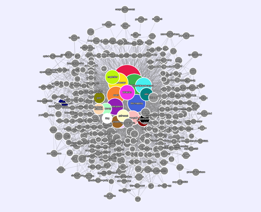
Let's go back to basics on this issue :) For me, visualizing tags is a way to visually depict associated tags, e.g. tags that appear together on the same content. For great example, see the color-coded clusters in @skilfullycurled 's visualization above. Clustering tags are important because they visually connect the website's presentation of community activity closer to what the Public Lab community culturally refers to as "research areas", or perhaps "topics" --> this is my actual goal with this entire issue. Here's some background information: on our tags page (https://publiclab.org/tags) we write "We use tags to group research by topic" and encourage people to browse tags (currently only sorted by recent activity). This is an important way that we name, link to, and/or promote people to find and engage with topics. The Dashboard itself emphasizes recent activity. The Dashboard now features a "recently used tags" bar -- which is an important but partial step to the goal of seeing "research areas" or "topics". To move forward, I am not interested in navigating by a graphic tag visualization (so 2007!), however, the clusters of activity provide an important additional way of connecting/navigating to topics. To achieve the goal, by which i mean the ability for the tags page to show which are the most interconnected tags, to communicate the breadth of connected topics in a research area, to navigate/connect to a research area, and to subscribe appropriately we do not necessarily need color-coded swooping arrows. Let's think about how to achieve these goals. We might also consider mirroring publiclab.org/tags at publiclab.org/topics to make the language more accessible. |
|
Cool, thanks Liz! To try for one stab at a narrower feature towards this goal, what if tag pages (floating new name: topic pages...!?!) had a list of "Related topics", something like:
Where "related" means that (acknowledging that there are different ways to measure this, and that we want some "computationally efficient" way) these are the tags which most commonly appear on pages that already have the primary tag. So for the topic Small follow-up if the above sounds good -- would it be all right to do this solely for the most recent 20-30 pages? Even if this is just a starting point, that would make this easier to implement without worrying about it causing overall website slowness. There could be more complex ways around this, but this is the easiest way to get started. |
|
I cross-posted at https://publiclab.org/questions/tommystyles/10-20-2017/need-your-feedback-on-tag-pages -- what do you think about moving discussion over there until there are specific discrete coding steps (mini projects for code contributors) we can make? |
|
ok great! let's go over to that discussion and come back once we have
doable steps.
…--
+1 336-269-1539 / @lizbarry <http://twitter.com/lizbarry> / lizbarry.net
On Wed, Nov 15, 2017 at 9:54 PM, Jeffrey Warren ***@***.***> wrote:
I cross-posted at https://publiclab.org/questions/tommystyles/10-20-
2017/need-your-feedback-on-tag-pages -- what do you think about moving
discussion over there until there are specific discrete coding steps (mini
projects for code contributors) we can make?
—
You are receiving this because you were mentioned.
Reply to this email directly, view it on GitHub
<#1502 (comment)>,
or mute the thread
<https://github.com/notifications/unsubscribe-auth/AAJ2n8PdvpH0GQ_wBU-Utp4xfL7XDmuJks5s26PpgaJpZM4OOvLP>
.
|
|
Hey @sagarpreet-chadha! The visualization is just an image so there's no API (yet! wink) however I can provide you with the list of edges from that particular graph. The most "raw" file formats would be csv and json. Both formats should work with a graph either "programmatically" (iGraph, networkx, d3.js) or with a GUI (Gephi, Cytoscape). Apparently you can't upload files on github. I tried to upload them to the Public Lab research note but it's not working. @jywarren is there a way to upload files to a research note? If not, @sagarpreet-chadha, can you make a post in the plots-dev googlegroup (you can sign up here if you're not already)? Let's wait to see what @jywarren says because it would be great to have them directly in the research note. Here's what you can look forward to though: plots_tag_communities_edges_w_props_9_16.csv: : list of unique edges with calculated properties, in particular the weight of the edge. The weight translates to the number of times the tags occurred together. plots_tag_communities_nodes_w_props_9_16.csv: list of nodes with calculated properties. Most relevant to the image on the website the "modularity class" which tells you to which community each node belongs. plots_tag_communities_9_16.json: I don't find json as useful but I know some people prefer it. I think the json file also includes properties for the visualization that's on the website (i.e. RGB color of each node). |
|
Update: removed plots_tag_communities_edgelist_9_16.csv from list of files above. This file is of limited use because the duplicate edges had already been merged into unique edges with weights. Without the properties, this edge list will only allow you to build a graph with edge weights of 1. I'll look for the original file with the duplicates. |
|
Thank you @skilfullycurled for your reply ! I was actually trying to build the visualization graph using javascript library (d3.js or vis.js) so that it could be easily added to publiclab.org website . These libraries require the data in the form of :
And for edges : Well json would be great otherwise i can create it , or maybe create a Javascript object directly (in this way no need of parsing the JSON file) . I have created a dummy graph (we can play with the nodes and the edges here 😄 ): What do you think ? @ebarry , @jywarren , @skilfullycurled |

|
Ah. That would be awesome! Okay. To further this conversation, we'll need to leave "API-land" and move into into how the visualization in Gephi works and the best way to translate those features into javascript. Can I trouble you to start this as a question? Something like, "How can I translate the tag visualization created in Gephi into a javascript version?" Also, shoot me an email at benj.sugar@organizers.publiclab.org so I can share the files. I'll remove my email once you do. |
|
Actually i think we may not need to leave API-land -- the existing API is pretty robust these days. I'm curious @skilfullycurled how you generated those edges -- could they be generated fresh from a list of all tags and the nodes they've been used on? That is a reasonable query for us to generate, if cached. We could add it to the API at https://github.com/publiclab/plots2/tree/master/app/api/srch and document it at https://github.com/publiclab/plots2/blob/master/doc/API.md If it is enough data, the query could be something like: r = []
Tag.select(:name, :tid).each do |t|
nids = t.nodes.select(:nid, :status).where(status: 1).collect(&:nid)
r << [t.name, nids] if nids.length > 0
end
r # later, r.to_jsonI just ran that on production and it took about 15 seconds. If we cache that daily, I think it's manageable, and we might be able to improve it further. |
|
Also you can share files at http://gist.github.com -- could that work? |
|
So, using the JSON generated from my query,
Here's an excerpt: |
|
FWIW there may be some even more efficient query like this but this is pretty decent, although doesn't return fully what's above: Tag.select('term_data.tid, term_data.name, community_tags.nid, community_tags.tid')
.includes(:node_tag)
.references(:node_tag)Although this wouldn't tell us if the node was published (vs. spam) unless we also mixed |
|
Hi , i have just few questions here , Thank you 😄 ! |
|
And i also agree with not leaving the API -land :) |
|
Arg! Okay. Let's not pile on, please. No one wants to stay in API-land more than I do (well, perhaps with the exception of @ebarry ). In my understanding the building of API-land had all but been delayed indefinitely due to concerns over website sluggishness (see extension of conversation here). But now @jywarren is saying it isn't as big a deal anymore, so good times on that end. Since using Github can be a barrier to accessible information (not everyone has access, knows how to use), I think (er...thought) having conversations that aren't about "getting things done" in the codebase were better relegated to the website where everyone can learn from them. These aren't community norms I set (see @jywarren's own comment above) but I do think they are good ones. |
|
Oops, sorry @skilfullycurled I hadn't remembered your last comment on that thread -- https://publiclab.org/questions/tommystyles/10-20-2017/need-your-feedback-on-tag-pages#answer-556-comment-17709 -- where you suggested:
I'll ping in back over there, but I think that with all the work on the API, code cleanup and outreach, we could do a daily or weekly cached version of such a query, and be OK with 10-15 seconds total compute time per week. The rest would be run locally in the browser. Repeating this over there. |
|
@jywarren I'll need to get back to you on some of your questions. I'll post my jupyter notebook later. In the meantime, see here for a brief explanation of how the graph is created from the tag pairs. For exact code, see here. @sagarpreet-chadha (and anyone else who's interested) you can see how a d3.js graph was created from the tag data by checking out the repo for tagoverflow which was the inspiration for this project. Regarding the community detection, if you look in the tagoverflow repository you'll find that the author implemented their own algorithm. Since that time, others have been implemented such as jLouvain, netClustering a CNM implementation (d3 example). With a limit of 256 tags, they community detection is probably fine in browser. |
|
So as not to overwhelm the publiclab.org discussion with lots of data, here's a link to the format of data TagOverflow uses: It makes like 15 calls to fetch what tags relate to a given tag (in the above example, "python") |
|
So the difference between that and the data I generated above is that my query lists the node ids, but hasn't used them to establish "relatedness". But of course @skilfullycurled's Jupyter notebook does this! Cool, thanks for sharing! |
|
@sagarpreet-chadha, I posted a question that asked and answered your questions above: https://publiclab.org/questions/bsugar/01-25-2018/how-was-the-tag-graph-visualization-made I'm not trying to be "passive aggressive" about my request, but I think people could benefit from this aspect of the conversation being public. So I guess that makes it "aggressive aggressive". ; ) All kidding aside, happy to answer any questions! |
|
So this issue now needs breaking up into:
also want to revisit that we're now viewing a specified # of tags (please don't test this to it's limits unless it's on https://stable.publiclab.org -- i've tried up to 1000 tags and it loads fine but no more than that please on the production server, even once) And we are limited to links between them with each tag reporting a max of 10 tags that it has occurred alongside. This isn't comprehensive, but seemed a feasible balance of optimization vs. thoroughness. |
|
@jywarren, is this still the latest commit? I because I wanted to see the json coming from the endpoint /tag/graph.json and it sent me all of the tags. Based on the code in that commit, I would have expected 250 to be the hard limit (my Ruby readability note withstanding). |
|
@jywarren never mind, I didn't realize the graph was now in the production server, I was using stable.publiclab.org. |
|
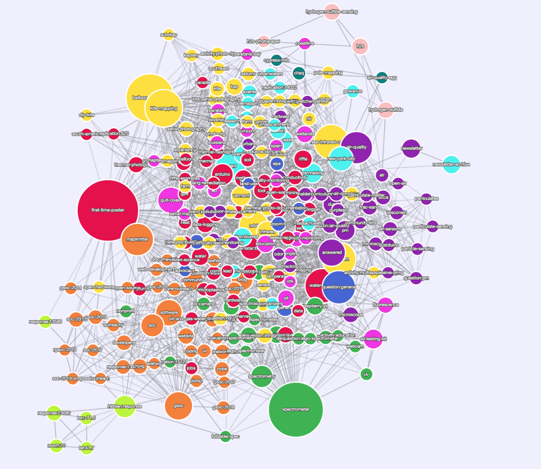
Okay. I just spent a fair amount of time exploring this, and 'm getting a better feeling for how the graph is working.
I'll take a look and think on it. I think the question that needs to be answered here is what do we want to be gleaned from the graph? For example, if we're primarily interested in a visitor being able to see which tags are associated which ones, then the circle layout or concentric circle might be the best, boring as though they may be. If I had to take a guess (informed, but still a guess) as to why the CoSE isn't yielding as great a result it would be because, in looking at the data, as you reach a certain node count, the counts begin to all be the similar. So, if CoSE is repelling the nodes based only on node weight, then it's possible there is an equal amount of repulsion between them. When I use repulsion here, I mean all of the things that go into repulsion, for example, it's gravity setting as well. In that case, it could be that there aren't enough iterations of the algorithm or the repulsion factors don't cause/allow for enough spreading.
When you have a moment, can you point me to the commit with the latest JavaScript on this? I can get it through the browser but only in that form where it doesn't have any structure and is just one single line. As soon as I do I can see more. I looked at the jLouvain example, and it doesn't appear to have a setting for how many communities you want which might be a part of the problem. Typically Louvain offers a "best number" but sometimes it's not the best. The python implementation that jLouvain is based on does have this parameter but it may not have made it over. |
|
There we are: |
|
|
|
Oh i thought i'd left another comment... where'd it go? hang on... |
|
Anyways i was going to say that I think I've figure out some of the layout issues but judge for yourselves: https://publiclab.org/stats/graph?limit=50 https://publiclab.org/stats/graph?limit=100 |
|
Here's the JS for the community detection: https://github.com/publiclab/plots2/blob/master/app/views/tag/graph.html.erb#L263 And here's the layout configuration, which we could tweak a lot to try out: plots2/app/views/tag/graph.html.erb Lines 95 to 179 in e26c6a3 |
|
First, I want to apologize that I can't help out with the heavy lifting on the coding end. It's easy for one just to suggest things but I realize that they also have to be implemented by people and it's not lost on my that I am not helping in that regard. There are a number of possibilities as to why the jLouvain isn't performing well. @jywarren, I think you're already solving one of them which is that there weren't enough colors. Still, I checked in the console for the communities and each node is a different community which to me implies that the algorithm isn't finding a good place to stop. Typically, there is a parameter for how many communities/sensitivity/resolution you’d like to have and then you play with it until you get something that looks about right. See this this issue in the jLouvain repository. Someone wrote a very simple fix which could be implemented. I’m not sure quite how it works in terms of what it returns: ideally it returns an entire community detection result for each element in the array? That’d be awesome, and probably solve the problem of each node being it’s own community. More later… |
|
Relaying a question from @shapironick who was wondering in another channel if in a future edition there might be varying thinness and thickness in the connection lines to show how closely related any two particular tags are? Thanks! |
|
that's a great idea. I think at this point we need to close this and open a
new issue with a checklist of possible refinements to the display, and
it'll be much easier for newcomers (less context and history required to
participate) to come in and start implementing them. I'm almost tempted to
spin it out into a new repository which is /just this graph/, since it
doesn't otherwise interconnect with the PL codebase, but for sake of
community cohesion let's keep it in plots2.
Liz, would you be able to start the new issue and kick off with a checklist?
…On Wed, Feb 6, 2019 at 11:17 AM Liz Barry ***@***.***> wrote:
Relaying a question from @shapironick <https://github.com/shapironick>
who was wondering in another channel if in a future edition there might be
varying thinness and thickness in the connection lines to show how closely
related any two particular tags are? Thanks!
—
You are receiving this because you were mentioned.
Reply to this email directly, view it on GitHub
<#1502 (comment)>,
or mute the thread
<https://github.com/notifications/unsubscribe-auth/AABfJ9nxysbBtCAYHEW2tA8UwNH9zelFks5vKv_hgaJpZM4OOvLP>
.
|
|
Yay! @shapironick! Right now, the database query only sends the top-n tags and the count of those tags site wide. In the future, in order to have edge weights, we'd need to make a change on the back end to either send all of the tags to the front end so the interconnecting counts could be aggregated, or they need to be aggregated on the back end. Alternatively, on the front end we calculate some network edge property (e.g., some centrality: degree, closeness, betweenness, etc.). |
|
Very cool! No presh on that idea +1 to starting a new issue this one is epic and awesome tho! |
|
Right now in the data we're passing to the graph code, i think we do see when one tag (say, tag A) is linked to tag B, and we see a second connection if tag B links back to tag A. But that doesn't really tell us much. Refactoring to provide "weight" is interesting... i could imagine a few ways to do this too. I agree, we could either pass in all the Great follow-up refinement. Once we have the checklist we can prioritize a bit and gradually improve this. Thanks! |
|
Oh look, this made it into the historical record ;) : https://publiclab.org/wiki/community-development#2019 |
|
While looking into this for a possible Summer of Code project this upcoming summer, I found the community detection bug, which was subtle -- data was in a nested object like |
|
|

|
That's just with our test data; full fix will be visible in the stable server once we merge it and it rebuilds; probably 30m or so. |
|
Nice there we go:
https://stable.publiclab.org/tags (remember this will go down for 10m each time we merge a new change) |
This is a request for someone with access to editing special pages to add this visualization of tags from the beginning of time to November 2016 to the top of publiclab.org/tags
https://www.dropbox.com/s/s78g3ufhsav5xzo/plots_tag_graph_256_filtered.png?dl=0

CC:
@gretchengehrke
@skilfullycurled
The text was updated successfully, but these errors were encountered: