Implement new design of beatmapset info page #7828
Comments
|
Found first problem, how to handle very large diff like this?
|

|
Can you explain what the issue is there? |
|
In figma, the difficulty icons are like this
They are at the bottom of the section before the difficulty name in one line only. But when the difficulties are very large enough, the icons become two lines.
I want to confirm is this expected to become two lines or there should be something to do to handle such a large diffs. |

|
It looks fine, although I have no idea what those four weird dots are to the left. You may want to clarify with @arflyte what they are before proceeding. Also, please make sure to implement the design changes in small pieces, not one huge PR. |
|
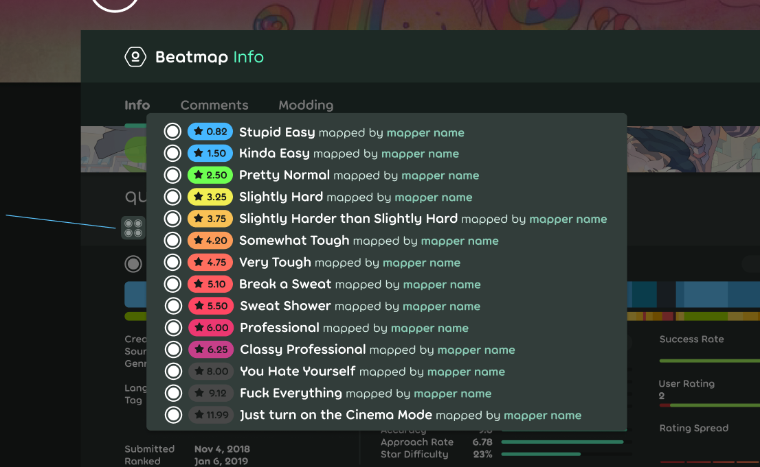
It appears to be a button showing a pop-up next to it containing all the difficulties in an extended form:
|
|
Is there a reason that the density and points of failure section stretches the whole width and is generally quite large? To me, this makes the impression that it is one of the most important things, while I don't think it's any more important than the graphs on the right. So if I could suggest one thing, it would be to put those two graphs to right as well. You could leave the current height of the container unchanged and have some additional space for the other stats and metadata (maybe to display more tags or simply to make it less crowded there). |
|
It's fine where it is. It's intentionally giving breathing space to the pieces above and below it. |
|
@arflyte, current points of failure chart has two data - fail and exit points, both with their own values. I don't see how it can map to one-valued chart on the new one apart of merging them both as single value. Also, what's the value gradient? What the chart is about isn't clear either in the new design (especially as we don't have density data for the chart above it - not that it'll help much either). It'll look like a weird horizontal line. |


|
Hmm, I fail to realise that it's actually two charts in one. I only focused on the fail points. The value gradient is relative to the highest fail and 0. I think I have to split the line into two lines for this to make sense. |
But what's the colour...? Just pick a random green and random red then make a gradient of them? 🤔 |
Design : https://www.figma.com/file/HDSXf4LPPV7hnD5wrWYG4jix/Web%2FBeatmap-Info?node-id=0%3A1
I will implement it and post the update and question here if there's something not clear with the design.
The text was updated successfully, but these errors were encountered: