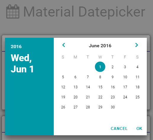
Javascript datepicker inspired by Google material design.
Javascript datepicker inspired by Google material design. Simple and easy to use the library. Just include the js and css file and use it. I've build this to use with my current project and here I share the source code. This is build on plain javascript.
Use bower to install the package or download zip and put it in your project. To use bower use below command :
bower install -g material-datepicker
- font-awesome
- roboto-fontface (Optional) - This is only to give the datepicker more material look with the roboto font.
Include these two css files in your page.
<!-- REQUIRED -->
<link rel="stylesheet" href="bower_components/font-awesome/css/font-awesome.css">
<link rel="stylesheet" href="bower_components/material-datepicker/css/material-datepicker.css">

<!-- OPTIONAL -->
<link rel="stylesheet" href="bower_components/roboto-fontface/css/roboto-fontface.css">

<!-- REQUIRED -->
<script type="text/javascript" src="bower_components/material-datepicker/js/material-datepicker.js"></script>
Now that you already load all the required file, you can start using the datepicker anywhere in your code.
For example :
var datepicker = new MaterialDatepicker(); // init
datepicker.show(); // show
// OR
datepicker.hide(); // hideTo construct simple datepicker, simply use new MaterialDatepicker(). But you can also provide option to the datepicker by passing the options to the constructor.
| Option Name | Data Type | Accepted Value | Default Value | Required | Description |
|---|---|---|---|---|---|
| orientation | string | landscape,portrait | landscape | No | Orientation for the datepicker |
| debugMode | boolean | true,false | false | No | Flag either to display the debug line in the console or not |
| closeOnBlur | boolean | true,false | true | No | Flag either to close the datepicker when user click outside the datepicker |
| responsive | boolean | true,false | false | No | Flag to enable responsive view for the datepicker. |
| theme | string | Theme | cyan | No | Theme appearance for the datepicker. See Theme for the options. |
| colors | object | Theme | {} | No | Custom color for the theme. See Theme for the options. |
For example :
var options = {
    orientation : 'landscape', // Show in landscape mode when viewing in wider screen (Optional)
    debugMode : true, // show verbose log to the browser console (Optional)
    closeOnBlur : true, // close when click outside datepicker (Optional)
    responsive : true // enable responsive view for the datepicker (Optional)
    theme : 'custom', // change appearance for the theme  (Optional)
    colors : { // custom colors for the theme  (Optional)
    	primaryColor : '#607D8B',
		secondaryColor : '#FFFFFF',
		primaryTextColor : '#212121',
		secondaryTextColor : '#FFFFFF',
		headerTextColor : '#FFFFFF',
		selectedYearTextColor : '#263238'
    }
};
var datepicker = new MaterialDatepicker(options);3 basic methods available to be use are as per below.
-
.show(options[Optional])- This method is used to show the datepicker. This method also accept optional two options which described in the table below :Options Data Type Default Value Required Description onDateSelected function - No Callback to be trigger when user select the date and click OK button initialDate date Current date No Initial date to be pre-select when the datepicker is visible -
.hide()- Hide the datepicker. This method does not accept any option. -
.on(eventName, callback)- This method is used to bind event to custom callback. Refer events for detail.
This datepicker support multiple events based on the table below.
| Event Name | Description |
|---|---|
| md.before.show | Event fire before the dialog is visible. |
| md.after.show | Event fire after the dialog is visible. |
| md.before.hide | Event fire before the dialog is hidden. (Note that this will also be call when cancel button is clicked.) |
| md.after.hide | Event fire after the dialog is hidden. (Note that this will also be call when cancel button is clicked.) |
| md.before.cancel | Event fire before the dialog is cancel. |
| md.after.cancel | Event fire after the dialog is cancelled. |
To bind a specific event that you require, use below function.
datepicker.on(eventName, callback);
For example :
datepicker.on("md.before.show", function(e){
    console.log("Before datepicker is shown...");
});There are many pre-defined theme available to be choose. To apply the theme, simply add the theme attribute to the option in the constructor. For example :
var options = {
	theme : 'blueGrey'
};
Below is a list of available theme for the datepicker.
- blueGrey
- grey
- brown
- deepOrange
- orange
- amber
- green
- teal
- lightBlue
- indigo
- deepPurple
- purple
- pink
- blue
- red
- cyan
In addition, you can customize the theme based on your webpage's color palette. To do so, use custom as a theme value and provide the color that you want as per below.
var options = {
	theme : 'custom',
	colors : {
		primaryColor : '#607D8B',
		secondaryColor : '#FFFFFF',
		primaryTextColor : '#212121',
		secondaryTextColor : '#FFFFFF',
		headerTextColor : '#FFFFFF',
		selectedYearTextColor : '#263238'
	}
};| Attributes | Data Type | Default Value | Required | Example | Description |
|---|---|---|---|---|---|
| primaryColor | string | - | No | #607D8B | Use in the header section, OK and Cancel button, month selection arrow and date selection indicator |
| secondaryColor | string | - | No | #FFFFFF | Use only in the content section. If the orientation is landscape, content is the right panel and if the orientation is portrait, the content is the bottom panel. |
| primaryTextColor | string | - | No | #000000 | Use throughout all text in the datepicker. |
| secondaryTextColor | string | - | No | #FFFFFF | Use for text in active state with darker background. |
| headerTextColor | string | - | No | #FFFFFF | Use by the year and month/date label in the header section |
| selectedYearTextColor | string | - | No | #263238 | Use in the year container for currently selected year |
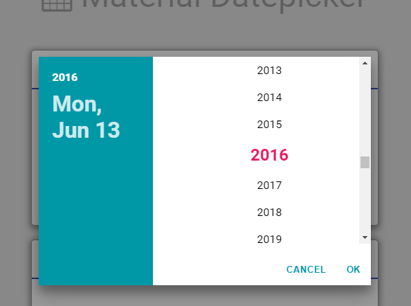
Not responsive (Now only support desktop view)Only landscape datepicker supported. (portrait view still under development)
The source code for this project is 100% by me but the design for the datepicker is copied from another material project because I need it in plain javascript and not with react.js.
I refer to the datepicker in this project :- Material-UI
The MIT License (MIT)

Copyright (c) 2016 Mohd Khairul Ikhwan bin Kamarudin

Permission is hereby granted, free of charge, to any person obtaining a copy
of this software and associated documentation files (the "Software"), to deal
in the Software without restriction, including without limitation the rights
to use, copy, modify, merge, publish, distribute, sublicense, and/or sell
copies of the Software, and to permit persons to whom the Software is
furnished to do so, subject to the following conditions:

The above copyright notice and this permission notice shall be included in all
copies or substantial portions of the Software.

THE SOFTWARE IS PROVIDED "AS IS", WITHOUT WARRANTY OF ANY KIND, EXPRESS OR
IMPLIED, INCLUDING BUT NOT LIMITED TO THE WARRANTIES OF MERCHANTABILITY,
FITNESS FOR A PARTICULAR PURPOSE AND NONINFRINGEMENT. IN NO EVENT SHALL THE
AUTHORS OR COPYRIGHT HOLDERS BE LIABLE FOR ANY CLAIM, DAMAGES OR OTHER
LIABILITY, WHETHER IN AN ACTION OF CONTRACT, TORT OR OTHERWISE, ARISING FROM,
OUT OF OR IN CONNECTION WITH THE SOFTWARE OR THE USE OR OTHER DEALINGS IN THE
SOFTWARE.