FullSwipe is a component for React-Natives iOS or Android platforms. It allows a swipable menu similar to iOS's mail application. FullSwipe is able to have up to four menu items below the 'cover', with functions on each item press, each swipe (open and close), and labels or pictures on each item and the cover. Almost everything is customizable (look at the props below) and I'm working on more.
- Opacity through RGB
- Functions on swipeOpen, swipeClose, cover click, and each icon click.
- Up to 4 icons underneath.
- Use an icon or text on the cover
- title
- optional string/int
- Title for the cover
- iconSource
- optional uri (overrides 'title')
- Overrides title on the cover.
- height
- optional int
- backgroundColor
- optional int/string
- Background color for the cover. You can use RGB for opacity.
- menuItems
- optional array of objects (see menuItem props) (use rgba for opacity)
- Up to four. See below.
- menuBackgroundColor
- optional int/string (use rgba for opacity)
- Background color for the 'underneath' menu.
- fontSize
- optional string
- For the cover
- fontFamily
- optional string
- For the cover
- borderRadiusRight
- optional string
- Changes both the top and bottom border radius
- borderRadiusLeft
- optional string
- Changes both the top and bottom border radius
- onPress
- optional function
- Function to run when the cover is clicked instead of swiped.
- onSwipeOpenAction
- optional function - preformed on 'open' swipe
- Function runs when cover swiped open
- onSwipeCloseAction
- optional function - preformed on 'close' swipe
- Function runs when cover swiped closed
- title
- optional string/int
- Title for each icon or spot
- titleColor
- optional string
- Change the font color.
- icon
- optional uri
- Does not override the text, sits above.
- onPress
- optional function
- function to run on click.
import FullSwipeComponent from './FullSwipe/FullSwipeComponent'
const wallpaper = 'http://wallpaper.pickywallpapers.com/1280x1024/clean-blurry.jpg';
const reactIcon = 'http://frostney.github.io/talks/react-native/slides/images/react-logo.png';
const gitIcon = 'https://fleep.io/blog/wp-content/uploads/2014/07/github_icon.png';
const goGopher = 'https://camo.githubusercontent.com/f04a7348c3f516c528405b48eccc96d3ad1abdeb/68747470733a2f2f7261772e6769746875622e636f6d2f676f6c616e672d73616d706c65732f676f706865722d766563746f722f6d61737465722f676f706865722d736964655f636f6c6f722e706e67';
const jsIcon = 'http://i.stack.imgur.com/Mmww2.png';
const listOfItems = [
{
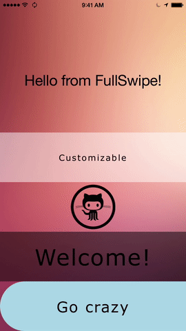
title: "Customizable",
backgroundColor: 'rgba(255,255,255,.5)',
menuBackgroundColor: 'rgba(255,255,255,.2)',
fontFamily: 'Verdana',
onPress: () => {
console.log("Hello")
},
onSwipeOpenAction: () => {
console.log("Open function ran!")
},
onSwipeCloseAction: () => {
console.log("You swiped close and your function ran")
},
menuItems: [
{
title: 'Use Text',
onPress: () => {
console.log(`Hello from Hello`)
}
},
{
icon: reactIcon,
onPress: () => {
console.log(`Hello from Hello`)
}
},
{
title: "< Or icons",
onPress: () => {
console.log(`Hello from Hello`)
}
},
{
title: "Or both",
icon: reactIcon,
onPress: () => {
console.log(`Hello from Hello`)
}
}
]
},
{
iconSource: gitIcon,
alignIconLeft: true,
title: "Hello",
fontSize: 45,
backgroundColor: 'rgba(0,0,0,0)',
menuBackgroundColor: 'rgba(255,255,255,.2)',
fontFamily: 'Verdana',
onPress: () => {
console.log("Hello")
},
onSwipeOpenAction: () => {
console.log("Open function ran!")
},
onSwipeCloseAction: () => {
console.log("You swiped close and your function ran")
},
menuItems: [
{
icon: reactIcon,
title: "React Native",
onPress: () => {
console.log(`Hello from Hello`)
}
},
]
},
{
title: "Welcome!",
fontSize: 45,
backgroundColor: 'rgba(0,0,0,.5)',
menuBackgroundColor: 'rgba(255,255,255,.5)',
fontFamily: 'Verdana',
onPress: () => {
console.log("Hello")
},
onSwipeOpenAction: () => {
console.log("Open function ran!")
},
onSwipeCloseAction: () => {
console.log("You swiped close and your function ran")
},
menuItems: [
{
icon: goGopher,
title: "Go gopher!",
onPress: () => {
console.log(`Hello from Hello`)
}
},
{
icon: jsIcon,
title: "JS Rocks"
}
]
},
{
title: "Go crazy",
fontSize: 30,
borderRadiusLeft: 50,
backgroundColor: 'lightblue',
menuBackgroundColor: 'rgba(255,255,255,.5)',
fontFamily: 'Verdana',
onPress: () => {
console.log("Hello")
},
onSwipeOpenAction: () => {
console.log("Open function ran!")
},
onSwipeCloseAction: () => {
console.log("You swiped close and your function ran")
},
menuItems: [
{
icon: goGopher,
title: "Go gopher!",
onPress: () => {
console.log(`Hello from Hello`)
}
},
{
icon: jsIcon,
title: "JS Rocks"
}
]
}
];
var FullSwipe = React.createClass ({
getInitialState: function () {
return {
text: 'Hello from FullSwipe!',
}
},
onPress: function () {
console.log("Button pressed");
},
swipeOpenUpdate: function () {
this.setState({text: "You just swiped open!"})
},
swipeCloseUpdate: function () {
this.setState({text: "And now it closed."})
},
render: function () {
const CompiledList = listOfItems.map((item, it) => (
<FullSwipeComponent
key={it}
title={item.title}
height={item.height}
menuItems={item.menuItems}
menuBackgroundColor={item.menuBackgroundColor}
fontSize={item.fontSize}
fontFamily={item.fontFamily}
backgroundColor={item.backgroundColor}
backgroundImage={item.backgroundImage}
iconSource={item.iconSource}
alignIconLeft={item.alignIconLeft}
borderRadiusLeft={item.borderRadiusLeft}
borderRadiusRight={item.borderRadiusRight}
onPress={item.onPress}
onSwipeOpenAction={this.swipeOpenUpdate}
onSwipeCloseAction={this.swipeCloseUpdate}
/>
));
return (
<Image style={styles.container}
source={{uri:wallpaper}}>
<View style={[styles.backdropView, {paddingBottom: 400}]}>
<Text style={styles.welcome}>{this.state.text}</Text>
</View>
<View style={[{position: 'absolute', bottom: 0}]}>
{CompiledList}
</View>
</Image>
);
}
});
var styles = StyleSheet.create({
container: {
flex: 1,
justifyContent: 'center',
alignItems: 'center',
backgroundColor: 'rgba(0,0,0,0)',
resizeMode: "cover",
},
welcome: {
fontSize: 30,
textAlign: 'center',
margin: 10,
},
instructions: {
textAlign: 'center',
color: '#333333',
marginBottom: 5,
},
backdrop: {
paddingTop: 60,
width: 320,
height: 120
},
backdropView: {
height: 120,
width: 320,
backgroundColor: 'rgba(0,0,0,0)',
},
headline: {
fontSize: 30,
fontWeight: 'bold',
fontFamily: 'Avenir Next',
textAlign: 'center',
backgroundColor: 'rgba(0,0,0,0)',
color: 'white'
}
});TODO: Unit tests and background image