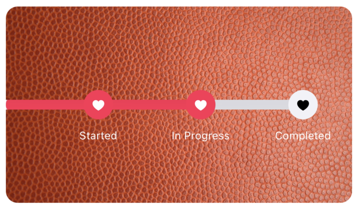
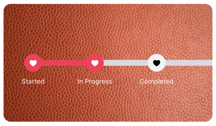
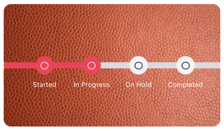
DotBar is a progress bar with dots. It creates dots in the progress bar where you can mark the checkpoints of the progress and let user to see what checkpoints the user has completed.
Using Cocoapods
Install with CocoaPods by adding the following to your Podfile:
pod 'DotBar'
After installing the pods using pod install in your terminal, you can use the DotBar using storyboards or directly into your code.
You can create an instance of DotBar and add it in your UIViewController using view.addSubview(:_)
import DotBar

class ViewController: UIViewController {

	lazy var dotBar: DotBar = {
	let dotbar = DotBar()

	dotBar.dotColor = .systemgray6
	dotBar.dotActiveColor = .systemGreen

	dotBar.dotColor = .systemGray6
	dotBar.dotActiveColor = .systemGreen
	dotBar.dotIconColor = .black
	dotBar.dotIconActiveColor = .white
	dotBar.labelColor = .white
	dotBar.strings = [
            "Started",
            "In Progress",
            "On Hold",
            "Completed"
        ]
        dotBar.dots = 4
        dotBar.hideFirst = false
        dotBar.leftPadding = 40
        dotBar.hideLast = false
        dotBar.rightPadding = 40
        dotBar.dotImage = UIImage(systemName: "circle")!
		return DotBar()
	}()
}dotColor is a type of UIColor which defines the dot color and progress bar color when the progress bar or dots are inactive.
dotIconColor is a type of UIColor which defines the inactive state color for the icon in the dot (if any).
dotActiveColor is a type of UIColor which defines the dot color and progress bar color when the progress bar and dots are active.
dotIconActiveColor is a type of UIColor which defines the active state color for the icon in the dot (if any),
labelColor is text label color for the text shown below the dots.
dots is a type of Int that renders the number of dots. Default value is 5 dots.
strings of type array of String [String] defines the labels.
Please Note:
dotsandstrings.countshould be same otherwise it'll throw runtime error.
hideFirst and hideLast are boolean values that represent if we have to show the leading or trailing of the progress bar.
leftPadding and rightPadding are CGFloat values that defines the padding for leading and trailing ends. This only works when hideFirst or hideLast values are set to true
dotImage is a type of UIImage that is being shown on all the dots. Preferred to set a SF Symbol Image here.
setProgress(toDot:) is used to set the progress to the dotNumber this ranges from 0 to dots the progress bar is automatically drawn till the number of dot passed.
setProgress(for: to:) takes two arguments first one is the progress bar number and second is to draw that progress bar from 0 to 100
- Download the repo.
- Open the
DotBar.xcodeproj - Enjoy!
Below are some of the examples of DotBars
Kishore Narang, contact@kishorenarang.com kishorenarang.com
DotBar is available under the MIT license. See the LICENSE file for more info.


