jQuery plugin for making Bootstrap 4 Tabs scroll horizontally rather than wrap.
It's dependent on Bootstrap 4 and jQuery 3.
It uses CSS3 2D Transforms for the scroll movement, so be sure to check your browser compatibility.
Disclaimer: This is a port of my original Bootstrap 3 plugin, jquery-bootstrap-scrolling-tabs, modified to work with Bootstrap 4. I wrote that original plugin many years ago when I needed to support IE8, so it was not written with modern JavaScript features. Because I didn't think a complete rewrite would be worthwhile, I kept most of the original code, just updating it to handle the slightly different Bootstrap 4 element structure and replacing the jQuery animations with CSS Transforms. So please don't judge me too harshly for the somewhat outdated JavaScript code and coding style—it's painful for me to look at, too.
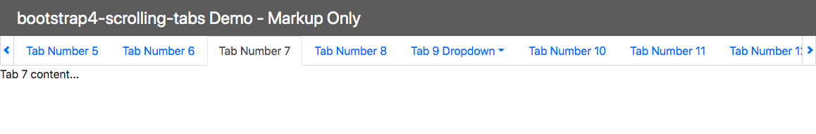
Here's what they look like:
And here are CodePens showing them working with:
Or if you prefer StackBlitz:
There are also optional features available:
- Reverse Scroll
- Force Scroll to Tab Edge
- Disable Scroll Arrows on Fully Scrolled
- Enable Horizontal Swiping for Touch Screens
- Enable Right-to-Left Language Support
- Width Multiplier
- Handle Delayed Scrollbar
- Tab Click Handler
- Custom Scroll Arrow classes
- Custom Scroll Arrow content
- Custom Tab LI content
- Tab LI and Anchor Post-Processors
If you're using Bootstrap 4 Tabs (nav-tabs) and you don't want them to wrap if the page is too narrow to accommodate them all in one row, you can use this plugin to keep them in a row that scrolls horizontally without a scrollbar.
It adjusts itself on window resize (debounced to prevent resize event wackiness), so if the window is widened enough to accommodate all tabs, scrolling will deactivate and the scroll arrows will disappear. (And, of course, vice versa if the window is narrowed.)
If your nav-tabs markup looks like this:
<!-- Nav tabs -->
<ul class="nav nav-tabs" role="tablist">
  <li class="nav-item"><a class="nav-link active" href="#tab1" role="tab" data-toggle="tab">Tab Number 1</a></li>
  <li class="nav-item"><a class="nav-link" href="#tab2" role="tab" data-toggle="tab">Tab Number 2</a></li>
  <li class="nav-item"><a class="nav-link" href="#tab3" role="tab" data-toggle="tab">Tab Number 3</a></li>
  <li class="nav-item"><a class="nav-link" href="#tab4" role="tab" data-toggle="tab">Tab Number 4</a></li>
  <li class="nav-item"><a class="nav-link" href="#tab5" role="tab" data-toggle="tab">Tab Number 5</a></li>
</ul>

<!-- Tab panes -->
<div class="tab-content">
  <div role="tabpanel" class="tab-pane fade show active" id="tab1">Tab 1 content...</div>
  <div role="tabpanel" class="tab-pane fade show" id="tab2">Tab 2 content...</div>
  <div role="tabpanel" class="tab-pane fade show" id="tab3">Tab 3 content...</div>
  <div role="tabpanel" class="tab-pane fade show" id="tab3">Tab 4 content...</div>
  <div role="tabpanel" class="tab-pane fade show" id="tab3">Tab 5 content...</div>
</div>
you can wrap the tabs in the scroller like this:
$('.nav-tabs').scrollingTabs();
If your tabs are data-driven rather than defined in your markup, you just need to pass your tabs array to the plugin and it will generate the tab elements for you.
So your tabs data should look something like this (note that the tab titles can contain HTML):
var myTabs = [
  { paneId: 'tab01', title: 'Tab <em>1</em> of 12', content: 'Tab Number 1 Content', active: true, disabled: false },
  { paneId: 'tab02', title: 'Tab 2 of 12', content: 'Tab Number 2 Content', active: false, disabled: false },
  { paneId: 'tab03', title: 'Tab 3 of 12', content: 'Tab Number 3 Content', active: false, disabled: false },
  { paneId: 'tab04', title: 'Tab 4 of 12', content: 'Tab Number 4 Content', active: false, disabled: false },
  { paneId: 'tab05', title: 'Tab 5 of 12', content: 'Tab Number 5 Content', active: false, disabled: false }
];
You would then need a target element to append the tabs and panes to, like this:
<!-- build .nav-tabs and .tab-content in here -->
<div id="tabs-inside-here"></div>
Then just call the plugin on that element, passing a settings object with a tabs property pointing to your tabs array:
$('#tabs-inside-here').scrollingTabs({
  tabs: myTabs
});
Each tab object in the array must have a property for
- the tab title (text or HTML)
- the ID of its target pane (text)
- its active state (bool)
Optionally, it can also have a boolean for its disabled state.
If you want the plugin to generate the tab panes also, include a content property on the tab objects.
If your tab objects have a content property but you don't want the plugin to generate the panes, pass in plugin option ignoreTabPanes: true when calling the plugin.
$('#tabs-inside-here').scrollingTabs({
  tabs: myTabs,
  ignoreTabPanes: true
});
By default, the plugin assumes those properties will be named title, paneId, active, disabled, and content, but if you want to use different property names, you can pass your property names in as properties on the settings object:
$('#tabs-inside-here').scrollingTabs({
  tabs: myTabs, // required,
  propTitle: 'myTitle', // required if not 'title'
  propPaneId: 'myPaneId', // required if not 'paneId'
  propActive: 'myActive', // required if not 'active'
  propDisabled: 'myDisabled', // required if not 'disabled'
  propContent: 'myContent' // required if not 'content'
});
So, for example, if your tab objects used the property name label for their titles instead of title, you would need to pass property propTitle: 'label' in your settings object.
$('#tabs-inside-here').scrollingTabs({
  tabs: myTabs,
  propTitle: 'label'
});
On tabs data change, just call the plugin's refresh method to refresh the tabs on the page:
$('#tabs-inside-here').scrollingTabs('refresh');
On tabs data change, if you want the active tab to be set based on the updated tabs data (i.e., you want to override the current active tab setting selected by the user), for example, if you added a new tab and you want it to be the active tab, pass the forceActiveTab flag on refresh:
$('#tabs-inside-here').scrollingTabs('refresh', {
  forceActiveTab: true
});
By default, if there are tabs hidden off the right side of the page, you would click the right scroll arrow to slide those tabs into view (and vice versa for the left scroll arrow, of course, if there are tabs hidden off the left side of the page).
You can reverse the direction the tabs slide when an arrow is clicked by passing in option reverseScroll: true:
$('.nav-tabs').scrollingTabs({
  reverseScroll: true
});
This might be the more intuitive behavior for mobile devices.
If you want to ensure the scrolling always ends with a tab edge aligned with the left scroll arrow so there won't be a partially hidden tab, pass in option scrollToTabEdge: true:
$('.nav-tabs').scrollingTabs({
  scrollToTabEdge: true
});
There's no way to guarantee the left and right edges will be full tabs because that's dependent on the the width of the tabs and the window. So this just makes sure the left side will be a full tab.
If you want the left scroll arrow to disable when the tabs are scrolled fully left (the way they would be on page load, for example), and the right scroll arrow to disable when the tabs are scrolled fully right, pass in option disableScrollArrowsOnFullyScrolled: true:
$('.nav-tabs').scrollingTabs({
  disableScrollArrowsOnFullyScrolled: true
});
Note that if you have the reverseScroll option set to true, the opposite arrows will disable.
To enable horizontal swiping for touch screens, pass in option enableSwiping: true when initializing the plugin:
$('.nav-tabs').scrollingTabs({
  enableSwiping: true
});
This will enable swiping for any browser that supports touch events.
To enable support for right-to-left languages, pass in option enableRtlSupport: true when initializing the plugin:
$('.nav-tabs').scrollingTabs({
  enableRtlSupport: true
});
With this option enabled, the plugin will check the page's <html> tag for attribute dir="rtl" and will adjust its behavior accordingly.
If you want the tabs container to be less than the full width of its parent element, pass in a widthMultiplier value that's less than 1. For example, if you want the tabs container to be half the width of its parent, pass in option widthMultiplier: 0.5:
$('.nav-tabs').scrollingTabs({
  widthMultiplier: 0.5
});
If you experience a situation where the right scroll arrow wraps to the next line due to a vertical scrollbar coming into existence on the page after the plugin already calculated its width without a scrollbar present, pass in option handleDelayedScrollbar: true:
$('.nav-tabs').scrollingTabs({
  handleDelayedScrollbar: true
});
This would occur if, for example, the bulk of the page's content loaded after a delay, and only then did a vertical scrollbar become necessary.
It would also occur if a vertical scrollbar only appeared on selection of a particular tab that had more content than the default tab.
This is not enabled by default because, since a window resize event is not triggered by a vertical scrollbar appearing, it requires adding an iframe to the page that listens for resize events because a scrollbar appearing in the parent window does trigger a resize event in the iframe, which then dispatches a resize event to the parent, triggering the plugin to recalculate its width.
You can pass in a callback function that executes any time a tab is clicked using the tabClickHandler option.
The callback function is simply passed as the event handler to jQuery's .on(), so the function will receive the jQuery event as an argument, and 'this' inside the function will be the clicked tab's anchor element.
$('.nav-tabs').scrollingTabs({
  tabClickHandler: function (e) {
    var clickedTabElement = this;
  }
});
You can pass in custom values for the class attributes for the left- and right scroll arrows using options cssClassLeftArrow and cssClassRightArrow.
$('.nav-tabs').scrollingTabs({
  cssClassLeftArrow: 'fa fa-chevron-left',
  cssClassRightArrow: 'fa fa-chevron-right'
});
By default, those span elements do not have a class defined.
Using different icons might require you to add custom styling to the arrows to position the icons correctly; the arrows can be targeted with these selectors:
This is what the arrows' markup looks like:
<!-- Left Arrow -->
<div class="scrtabs-tab-scroll-arrow scrtabs-tab-scroll-arrow-left">
  <span class="{{cssClassLeftArrow}}"></span>
</div>

<!-- Right Arrow -->
<div class="scrtabs-tab-scroll-arrow scrtabs-tab-scroll-arrow-right">
  <span class="{{cssClassRightArrow}}"></span>
</div>
You can pass in custom values for the left- and right scroll arrow HTML using options leftArrowContent and rightArrowContent. This will override any custom cssClassLeftArrow and cssClassRightArrow settings.
For example, if you wanted to use svg icons, you could set them like so:
$('.nav-tabs').scrollingTabs({
  leftArrowContent: [
    '<div class="custom-arrow">',
    '  <svg class="icon icon-point-left">',
    '    <use xlink:href="#icon-point-left"></use>',
    '  </svg>',
    '</div>'
  ].join(''),
  rightArrowContent: [
    '<div class="custom-arrow">',
    '  <svg class="icon icon-point-right">',
    '    <use xlink:href="#icon-point-right"></use>',
    '  </svg>',
    '</div>'
  ].join('')
});
You would then need to add some CSS to make them work correctly if you don't give them the default scrtabs-tab-scroll-arrow classes. This plunk shows it working with svg icons:
http://plnkr.co/edit/2MdZCAnLyeU40shxaol3?p=preview
When using this option, you can also mark a child element within the arrow content as the click target if you don't want the entire content to be clickable. You do that my adding the CSS class scrtabs-click-target to the element that should be clickable, like so:
$('.nav-tabs').scrollingTabs({
  leftArrowContent: [
    '<div class="scrtabs-tab-scroll-arrow scrtabs-tab-scroll-arrow-left">',
    '  <button class="scrtabs-click-target" type="button">',
    '    <i class="custom-chevron-left"></i>',
    '  </button>',
    '</div>'
  ].join(''),
  rightArrowContent: [
    '<div class="scrtabs-tab-scroll-arrow scrtabs-tab-scroll-arrow-right">',
    '  <button class="scrtabs-click-target" type="button">',
    '    <i class="custom-chevron-right"></i>',
    '  </button>',
    '</div>'
  ].join('')
});
When using data-driven tabs, to specify custom HTML for the tabs' LI elements, you can pass in option tabsLiContent.
It must be a string array, each entry being an HTML string that defines the tab LI element for the corresponding tab (i.e., same index) in the tabs array.
These entries will override the default <li class="nav-item">.
So, for example, if you had 3 tabs and you needed a custom tooltip attribute on each one, your tabsLiContent array might look like this (although you would probably build the array dynamically using the myTabs data):
$('#tabs-inside-here').scrollingTabs({
  tabs: myTabs,
  tabsLiContent: [
    '<li class="nav-item" tooltip="Custom TT 1" class="custom-li"></li>',
    '<li class="nav-item" tooltip="Custom TT 2" class="custom-li"></li>',
    '<li class="nav-item" tooltip="Custom TT 3" class="custom-li"></li>'
  ]
});
This plunk demonstrates its usage (in conjunction with tabsPostProcessors):
http://plnkr.co/edit/ugJLMk7lmDCuZQziQ0k0
To perform additional processing on the tab LI and/or Anchor elements after they've been created, you can pass in option tabsPostProcessors.
This is an array of functions, each one associated with an entry in the tabs array. When a tab element has been created, its associated post-processor function will be called with two arguments: the newly created $li and $a jQuery elements for that tab.
This allows you to, for example, attach a custom click handler to each anchor tag.
$('#tabs-inside-here').scrollingTabs({
  tabs: myTabs,
  tabsPostProcessors: [
    function ($li, $a) { console.log("Tab 1 clicked. $a.href: ", $a.attr('href')); },
    function ($li, $a) { console.log("Tab 2 clicked. $a.href: ", $a.attr('href')); },
    function ($li, $a) { console.log("Tab 3 clicked. $a.href: ", $a.attr('href')); }
  ]
});
This plunk demonstrates its usage (in conjunction with tabsLiContent):
http://plnkr.co/edit/ugJLMk7lmDCuZQziQ0k0
To prevent a flash of the tabs on page load/refresh before they get wrapped
inside the scroller, you can hide your .nav-tabs and .tab-content with
some CSS (display: none).
The plugin will automatically unhide the .nav-tabs when they're ready,
and you can hook into the ready.scrtabs event (which gets fired when
the tabs are ready) to unhide your .tab-content:
$('.nav-tabs')
  .scrollingTabs()
  .on('ready.scrtabs', function() {
    $('.tab-content').show();
  });
The scrolling container should automatically refresh itself on window resize, but to manually force a refresh you can call the plugin's refresh method:
$('.nav-tabs').scrollingTabs('refresh');
On window resize, the scrolling container should automatically scroll to the active tab if it's offscreen, but you can also programmatically force a scroll to the active tab any time (if, for example, you're programmatically setting the active tab) by calling the plugin's scrollToActiveTab method:
$('.nav-tabs').scrollingTabs('scrollToActiveTab');
Customize the SCSS by including jquery.bs4-scrolling-tabs.scss and overriding the following variables:
$scrtabs-tabs-height- The height of the tabs.$scrtabs-border-color- The tabs border color.$scrtabs-foreground-color- The text color.$scrtabs-background-color-hover- The background color of the tabs when hovered over.
Any options that can be passed into the plugin can also be set on the plugin's defaults object:
$.fn.scrollingTabs.defaults.tabs = myTabs;
$.fn.scrollingTabs.defaults.forceActiveTab = true;
$.fn.scrollingTabs.defaults.scrollToTabEdge = true;
$.fn.scrollingTabs.defaults.disableScrollArrowsOnFullyScrolled = true;
$.fn.scrollingTabs.defaults.handleDelayedScrollbar = true;
$.fn.scrollingTabs.defaults.reverseScroll = true;
$.fn.scrollingTabs.defaults.widthMultiplier = 0.5;
$.fn.scrollingTabs.defaults.enableSwiping = true;
$.fn.scrollingTabs.defaults.enableRtlSupport = true;
The plugin triggers event ready.scrtabs when the tabs have been wrapped in
the scroller and are ready for viewing:
$('.nav-tabs')
  .scrollingTabs()
  .on('ready.scrtabs', function() {
    // tabs ready, do my other stuff...
  });

$('#tabs-inside-here')
  .scrollingTabs({ tabs: tabs })
  .on('ready.scrtabs', function() {
    // tabs ready, do my other stuff...
  });
To destroy the plugin, call its destroy method:
$('#tabs-inside-here').scrollingTabs('destroy');If you were wrapping markup, the markup will be restored; if your tabs were data-driven, the tabs will be destroyed along with the plugin.
MIT License.