Skip to content
New issue

Have a question about this project? Sign up for a free GitHub account to open an issue and contact its maintainers and the community.

By clicking “Sign up for GitHub”, you agree to our terms of service and privacy statement. We’ll occasionally send you account related emails.

Already on GitHub? Sign in to your account

Search box visual tweaks #11105

Merged
6 commits merged into from Sep 9, 2021
Merged

Search box visual tweaks #11105

6 commits merged into from Sep 9, 2021

Conversation

ghost
Copy link

@ghost ghost commented Sep 1, 2021

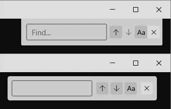
Made some changes to the search box:

  • Adjusted spacing inside the box
  • Detached the search box from the titlebar (as explained here)
  • The search box is now 8px further to the left, in case the scrollbar is always enabled
  • Made some controls use default properties, so that they'll adjust nicely to the 2.6 styles

Other: the search box and command palette now use OverlayCornerRadius

Before/After:
image

gabrielconl added 3 commits September 1, 2021 11:54
@zadjii-msft
Copy link
Member

@cinnamon-msft for the design sign off, but I sure think it looks cool.

<showerthought> Plus, if it's detached, then we could add a little handle somewhere and allow the user to just like, drag it wherever they want in the Terminal. That would solve the whole "dock to top" vs "dock to bottom" debate! I'm absolutely not saying you should do this now though. That's just a crazy idea.</showerthought>

@DHowett
Copy link
Member

DHowett commented Sep 1, 2021

I like it!

@cinnamon-msft
Copy link
Contributor

I dig it. :) The only thing I'm not too keen on is that the close button is larger than the rest of the buttons. Is that just the default properties being applied?

@DHowett
Copy link
Member

DHowett commented Sep 1, 2021

I suspect that that is "correct" -- the close button is not a search option!

@cinnamon-msft
Copy link
Contributor

Right.. but I haven't found other search dialogs that have a larger close button compared to the other options :/

@ghost
Copy link
Author

ghost commented Sep 1, 2021

It was inspired by the InfoBar, which has a larger button that has the same space on top, right and bottom.
image

Would either of these look better?
A) consistent 8px menu padding
image

B) equal spacing around the close button
image

@cinnamon-msft
Copy link
Contributor

I think I like option A better. 😄

@ghost
Copy link
Author

ghost commented Sep 2, 2021

I looked into getting some more default properties for the menu. Would that be ok for this PR?
image

@ghost
Copy link
Author

ghost commented Sep 2, 2021

The brushes can be done in a different PR, because it will take a bit longer. I wanted to use the default ones from menus, but in light mode it's hard to see which button is selected.

Is the design ok as it is now?

Copy link
Member

@zadjii-msft zadjii-msft left a comment

Choose a reason for hiding this comment

The reason will be displayed to describe this comment to others. Learn more.

Checked this out locally - looks good to me, thanks!

@zadjii-msft
Copy link
Member

<aside> It'd be cool if there was a shadow underneath the search dialog, like there is for the command palette. Almost certain there's an existing issue for this...

@zadjii-msft zadjii-msft added the Area-User Interface Issues pertaining to the user interface of the Console or Terminal label Sep 2, 2021
@zadjii-msft zadjii-msft mentioned this pull request Sep 2, 2021
20 tasks
@zadjii-msft zadjii-msft added the Needs-Second It's a PR that needs another sign-off label Sep 7, 2021
@zadjii-msft zadjii-msft self-assigned this Sep 7, 2021
@zadjii-msft
Copy link
Member

@msftbot make sure @cinnamon-msft signs off on this one

@DHowett
Copy link
Member

DHowett commented Sep 7, 2021

I wonder how we got a merge conflict o_O

@zadjii-msft
Copy link
Member

I wonder how we got a merge conflict o_O

It was the spellcheck PR 🤷 I think I merged it but I'm afraid that the GH conflict resolve tool secretly botched the xaml formatting. Guess we'll see...

@zadjii-msft zadjii-msft added the AutoMerge Marked for automatic merge by the bot when requirements are met label Sep 9, 2021
@ghost
Copy link

ghost commented Sep 9, 2021

Hello @zadjii-msft!

Because this pull request has the AutoMerge label, I will be glad to assist with helping to merge this pull request once all check-in policies pass.

p.s. you can customize the way I help with merging this pull request, such as holding this pull request until a specific person approves. Simply @mention me (@msftbot) and give me an instruction to get started! Learn more here.

@ghost ghost merged commit 54ed295 into microsoft:main Sep 9, 2021
@ghost
Copy link

ghost commented Oct 20, 2021

🎉Windows Terminal Preview v1.12.2922.0 has been released which incorporates this pull request.:tada:

Handy links:

This pull request was closed.
Sign up for free to join this conversation on GitHub. Already have an account? Sign in to comment
Labels
Area-User Interface Issues pertaining to the user interface of the Console or Terminal AutoMerge Marked for automatic merge by the bot when requirements are met Needs-Second It's a PR that needs another sign-off
Projects
None yet
Development

Successfully merging this pull request may close these issues.

None yet

3 participants