Proposal: Update the corner radii of common controls to be consistent with web and app style direction #524
Comments
|
This should be a wider project than just the rounded corners on buttons etc as used by Fabric.
Xbox will continue to have different requirements, but with a new set of Xbox consoles on the way, perhaps the Microsoft Design teams can work together to align everything in time for WinUI 3.0 and Xbox Next. Fabric seems to be getting a lot of focus at the moment, what with it's cross platform and PWA use cases. So perhaps Fabric becomes the blueprint - at least for the Compact Density, and move from 2px to 4px as a minimum measurement - and then you extrapolate the touch affordances and fill out the missing control states.
The ThemeShadows will need to account for the rounded corners. And Acrylic surfaces should probably include inner and outer borders to ensure they appear elevated from the backgrounds.
|


|
@mdtauk As requirement number 4 states, there's a plan to rationalize this change with Xbox. That said, this specific feature is limited to rounded corner only to keep the work clearly scoped. Please feel free to open separate requests for other design suggestions you have. BTW, I don't quite understand your feedback on inner and outer borders for Acrylic surfaces? Is it the Xbox design you are mentioning since we currently do not use two borders as you specify. |
|
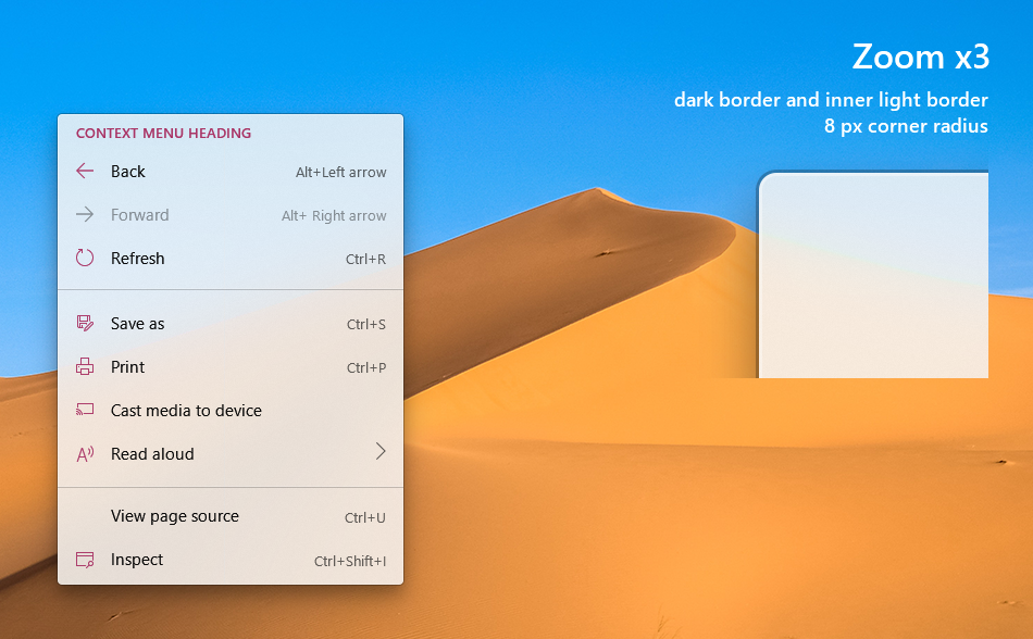
@chigy Sure with the Xbox, that is its own thing. But the point is the rounded corners need to work on all the relevant controls. I am not aware of the internal figma design specs the Fluent Team may or may not have agreed on - but it needs to be more than Buttons. Fluent Web uses a 2px corner radius for its rounded corners, but Fluent XAML has tended to use 4px as a base measurement. Then there is the CompactDensity templates which would probably use the same metrics as FluentWeb? I made a comparison image of Xbox Fluent and Fabric shared controls, and how different they look. So there is more than the rounded corners that needs to be done whilst these control templates are being looked at.
|

|
@mdtauk , For you to get an impression this is only about button, I must not have speced clearly... Rest assured, it is not. See the requirements number 1 and their sub items. This is about all of the controls. I have not had chance to publish design file but the corner radius we are planning are indeed 2px (4px for overlay UI). I actually do work very closely with Fabric team (i.e. Fluent Web) and we are evaluating these changes together. That said, making them match exactly the same is not our goal, but we do need to be coherent and feel part of the family when users see them side by side. See requirement number 4.
It is in the works but we are doing this one by one/case by case basis. We are careful in making changes that makes sense not to change things for the sake of change. |
|
@chigy Thank you, thank you, thank you! I would love if you were able to share these designs with the community, not only because we all want to see where the controls and UI are going, but also so when the changes are implemented we can point out inconsistencies, as well as ensure future control proposals will feel at home! Fabric Web as well as Fluent Web do seem to be ahead of the pack, and XAML as well as WPF and WinForms/Visual Styles should follow! |
|
@chigy @mdtauk See my response here. Just seeing the UI concepts "to know where Fluent Design is going" or to point out inconsistencies in my opinion isn't enough. I elaborate on this point further in the linked issue above, but long story short I want there to be an active back-and-forth between the users and the Fluent Design (FD) team even when it comes to Design proposals. @mdtauk I keep seeing you raise the point of updating the WPF/WinForms controls to match FD. I'm opposed to that as you will have WinUI if you want to ship a non-UWP app with Win10 native look & feel and the team(s) at MS only have finite resources which are best spent on making UWP/WinUI THE definite Windows Presentation platform. |
|
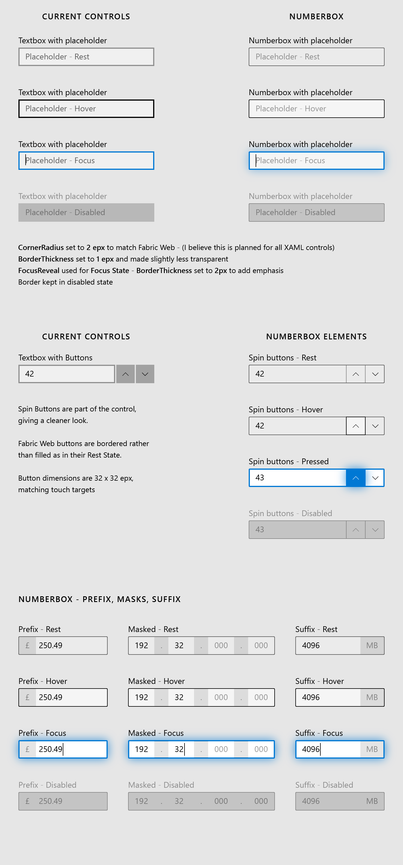
I posted this image in the Numberbox proposal, but it may have some relevance to the TextBox controls being updated.
The BorderThickness, FocusReveal on Focused State, Border on Disabled State. The "Spin buttons" style could apply to the search button, password reveal button, clear text button. |
|
The shadow around the border/control elements in focused state looks way too strong to me. Why do they even need shadows at all? Current version (just border color changing) is totally fine. Shadows might suggest the control (element) is being elevated to the foreground, which might make sense in 3D environments but certainly isn't needed for classic desktop environments and, one could argue, add some distraction. |
The Glow around the control when focused, is the FocusVisualKind.Reveal and is controlled by the system. I had to approximate how it looks because I don't have the metrics to match the opacity and size exactly. Take my use of it as an indication that I think the glow will make it's focus much clearer, than just changing the border colour.
|

|
@mdtauk , respectively, could you please limit conversation in this issue to rounded corner? I really would like to get feedback on rounded corner specifically and I am afraid this conversation is getting too confusing for those who might have just come here for that purpose. That said, what you are showing looks to me like a Reveal Focus behavior. We looked into making the focus state stronger and did some user research and we confirmed they are way too strong just as @Felix-Dev mentions in his response. |
|
@chigy If the research shows that Reveal Focus on text control focus is too much, I will accept that. My examples do include the rounded corners, All be it with some slight changes to the border, which fit with the "... consistent with web and app style direction" part of the proposal. |
|
@mdtauk and @Felix-Dev , I've now uploaded visual comps of the changes being proposed. |
|
@chigy is there any possibility of reconsidering the border thickness of the text controls, combo boxes, check and radio controls. Fabric Web opted for 1 epx thickness and I think this makes the controls more elegant, especially with the new rounded corners. At present they feel a little bulky. Text boxes in compact mode would greatly benefit. But when focused the border can be thicker Buttons use the background fill with 20% opacity by default. In Fabric Web, they use a 1 epx border and no fill. I think this may be a better solution, and would also allow buttons in a textbox control to fit nicely. The NumberBox with spin buttons proposal illustrates this combination of Button and Text Field
Perhaps if the team is unwilling to make this style the new default, then a style/template can be included for it. |

|
Anecdotal and unprofessional feedback on the topic of rounded corners. |
 jevansaks
moved this from Front Burner
to Code Complete, needs Docs/Samples
in Feature tracking
chigy
added
area-UIDesign-External
jevansaks
moved this from Front Burner
to Code Complete, needs Docs/Samples
in Feature tracking
chigy
added
area-UIDesign-External
sorry for only replying now. They really are getting rid of tiles! :( It's an interesting decision as Android only allows adaptive icons now, in a similar way to iOS while Windows is switching to free-form icons. "Adaptive" icons look better on splash screens because they have a monochrome icon so you don't need to have a blinding white splash screen. On the other hand, free-form icons look a lot better as they give devs more control over the icon and it suits the desktop platform (stuff like the titlebar, taskbar) as well as win32 apps. The Office icon itself doesn't look like Word or PowerPoint's icons. With these changes, I feel like Microsoft is losing its identity |
|
@Poopooracoocoo I am still holding out hope that there will be an option to use tiles instead of icons, even if icons are the new default in the new shell. |
|
@Poopooracoocoo and @mdtauk , please submit feedback on Feedback Hub for tiles discussions since WinUI team has no involvement in tiles nor have any knowledge of the plans. |
I have submitted feedback about keeping the tiles - there is a collection with lots of upvotes. Feedback Hub is not as good as GitHub as there is little to no feedback or discussion contributions from the Windows Dev teams |
chigy
added
area-UIDesign
|
Hello, how to disable the roundings? It is looking ugly when round button has round tooltip. |
 msft-github-bot
added
the
needs-triage
msft-github-bot
added
the
needs-triage
|
@kikisaints @chigy Is there a way to disable the rounded corner for say a specific element like @mklemarczyk is asking for ? |
msft-github-bot
removed
the
needs-triage
@mklemarczyk Have you tried setting the CornerRadius value to 0 in the control's style? You may have to do it in the App.xaml for it to affect all ToolTip controls. |
msft-github-bot
added
the
needs-triage
@mklemarczyk , have you seen our guidance doc? |
msft-github-bot
removed
the
needs-triage
|
@mklemarczyk You can use ToolTip.CornerRadius property or the OverlayControlResource as two options to change the corner radius of a tooltip control. The This sets corner radius to 0 for every tooltip in the app. Alternatively, you can use Beware that this not only sets the corner radius of tooltip controls app-wide but also all other controls which use this resource (like ContentDialog and controls consuming popups like ComboBox). That is... in theory as overriding the resource does not seem to affect these controls even though it should (ToolTip works). |
msft-github-bot
added
the
needs-triage
 StephenLPeters
removed
the
needs-triage
StephenLPeters
removed
the
needs-triage
|
There's so much back-and-forth that it is hard to know what was decided with regards to other inputs and corner radius, but very quickly, after migrating a UWP project to use WinUI 3 exclusively I noticed that only buttons had a corner radius applied (along with the other changes like enhanced reveal, etc) but my other input controls (e.g. combobox) were left with the metro look (darker/thicker border and 90° angles). Is this intentional, a WIP, or a bug? Also, to get the combobox to match the buttons I wound up needing to use a corner radius of 3epx although everything I'm seeing online says that the new default corner radius is 4epx? |
msft-github-bot
added
the
needs-triage
If you are seeing a difference between WinUI2 and WinUI3 with regards to the styles, can you please open a new issue ? It might be a bug with regard to the merge of styles from WinUI2 into WinUI3. |
msft-github-bot
removed
the
needs-triage
 and others
Proposal: Update default control styles with rounded corners and make them easy to customize
Corner Radius (aka Rounded Corner) How-To document PR is created.
This will be added to docs.microsoft.com as a documentation.
It will be a new page under https://docs.microsoft.com/en-us/windows/uwp/design/style/.
Ask to community:
I am trying out writing a little more "background explanation (WHY)" that our customers have expressed we provide with our documentation in some of our focus groups. I would like feedback as this does not follow normal documentation pattern.
Are those extra information useful/helpful, not relevant, other info missing, etc.?
Summary
Update default control styles with rounded corners and make them easy to customize. Developers should not have to retemplate the controls to "unround" the corners or round them further.
Rationale
Problems today:
XAML controls are inconsistent with how web and mobile apps are evolving – this highlights the inconsistency across app ecosystem on Windows when these UI are used intermixed with each other.
There are many different levels of corner rounding in the market today but the way XAML controls are architected require those developers who wants to update to retemplate all the controls, locking them to a version of the control that will not be able to take advantage of future updates as easily.
Functional Requirements
Important Notes
There are three categories of changes being proposed (requirement number 1.1, 1.2, and 1.3) and here are mock up of those.
Here are relevant visual comp files: https://github.com/microsoft/microsoft-ui-xaml-specs/tree/user/chigy/roundedcorner/active/RoundedCorner/ImageFiles
Courtesy of @mrlacey , we have this easier to view version of the above file folder: https://github.com/mrlacey/microsoft-ui-xaml-specs/blob/RoundedCornerVisualizations/active/RoundedCorner/ImageFiles/index.md
Form type controls (req 1.1)
• Button
• CheckBox
• ComboBox
• DropDownButton
• Slider
• SplitButton
• ToggleButton
• ToggleSplitButton
• Flipview
• GridView
• ListView
• TreeView
• ContentDialog
• AutoSuggestBox
• PasswordBox
• RichEditBox
• TextBox
• DatePicker
• CalendarDatePicker
• Tab control
Popup/transient menu type controls (req 1.2)
• CalendarDatePicker
• DatePicker
• TimePicker
• Flyout
• TeachingTip
• ToolTip
• DropDownButton
• SplitButton
• Slider
• AutoSuggestBox
• CommandBarFlyout
• MenuFlyout
• ComboBox
• ColorPicker
• MediaPlayerElement
• ContentDialog
• MenuBar
• ToggleSplitButton
Bars (req 1.3)
• NavigationView
• Pivot
• ScrollIndicator
• ProgressBar
• Slider
• ColorPicker
• MediaPlayerElement
• WebView (not a part of XAML change)
User Feedback
Windows 10 Reddit Thread
Open Questions
The text was updated successfully, but these errors were encountered: