
To check RStudio Cloud, shinyapp.io, Global CRAN Mirror, Rpubs, and Package Manager connectivity, visit: https://status.rstudio.com/
This project aims to examine COVID-19 (novel coronavirus) trends throughout the five boroughs of New York City, from August 2020 to 2022, via dynamic, user-controlled choropleth maps. Measurements are COVID-19 cases per 100,000 NYC residents, tests per 100,000 NYC residents, and percent positives of NYC residents.
Percent positives indicate the percentage of NYC residents who tested for COVID-19 with a positive molecular test. Modified ZCTA (ZIP Code Tabulation Area) are shown instead of ZCTA, whereby unusually small ZCTAs consolidate to MODZCTAs for better regional comparisons. ZCTA-to-MODZCTA conversion tables are available in the NYC Health Coronavirus Data Repository. Data from the repository is mapped and aggregated weekly (7-day rolling averages) from the NYC Department of Health, per ZIP codes (MODZCTA), and categorized by weekly 'ending in' dates. https://github.com/nychealth/coronavirus-data
Caitlin Gilbert, a Rockefeller Graduate Fellow and PhD candidate at the Rockefeller Univerity (New York, NY), for her work, contributions, and tutorials related to the creation of this R code and R Shiny Application.
The data was downloaded directly from the GitHub NYC Health Coronovirus repository, including geographical data, percent positivity rates, case rates, and test rates. These datasets were all cleaned and reshaped, to create one massive data frame to be utilized. Additionally, my dataset of MODZCTA (ZIP codes), neighborhoods, and boroughs was also loaded, better identifying affected areas within NYC for further analysis.
Using MODZCTA as the shared item among all datasets, case rates, percent positives, test rates, neighborhoods, and boroughs were left-joined via MODZCTA (ZIP codes) and geo joined by the shapefile. Afterward, dates were reformated for users to search by a week-ending date, as new data is available from the repository on an aggregated weekly basis.

A quick examination of the case rate data reveals it is severely right-skewed. This is due to the first datasets recorded being nearly at the height of the COVID-19 pandemic in the summer of 2020, with cases decreasing as more people practiced social distancing and vaccine availability increased throughout 2021.
After preparing .RDS and .HTML files, a user-friendly interface (UI) was created with information and user input-oriented to the left, and NYC's geographical map on the right, with three easily-navigable tabs overhead: Case Rate, Test Rate, and Percent Positives. Server logic was defined to be a reactive function and dependent on user input, isolated per week instead of calling the entire data frame. Therefore, rendered leaflet outputs were created for cases, tests, and percent positives, respectively, before publishing.
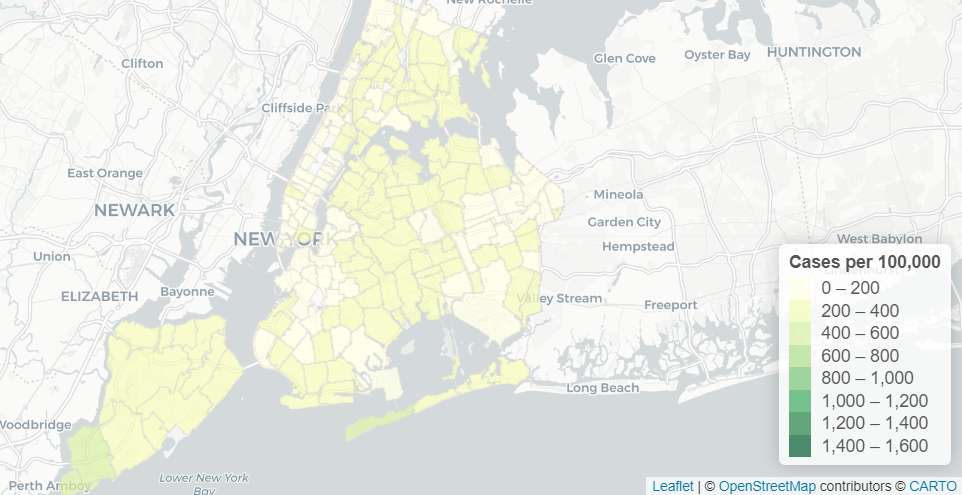
- For the week ending 01-09-2021, at the height of the second COVID-19 wave in NYC after the 2020 holiday season, the following three snapshots were taken of percent positives, test rates, and case rates respectively:
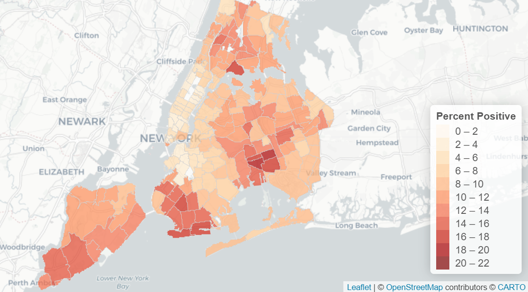
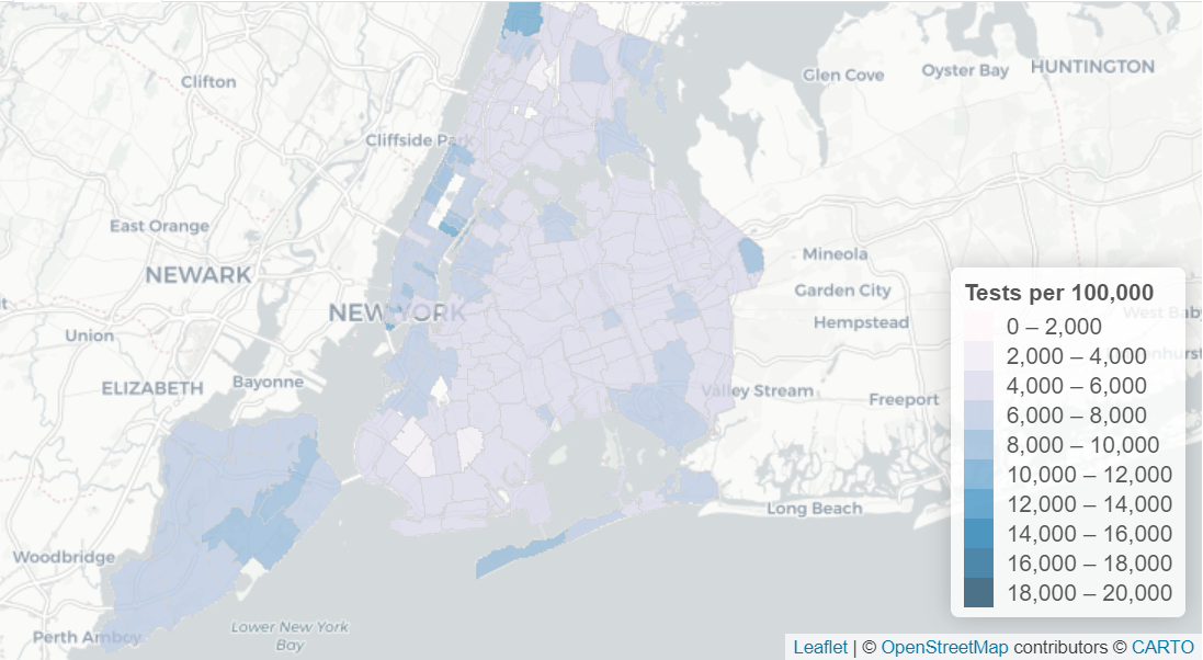

- Noticeable hotspots were in the Bronx, Southwestern Queens, Southwestern Brooklyn, and Staten Island,
- Cases increased predominantly in the outer boroughs, faster than Manhattan,
- Yet, testing substantially increased in more affluent areas of NYC, most noticeably in Manhattan below 135th St, Staten Island, and the Riverdale section of the Bronx.
- For the week ending 04-03-2021, about a month before the publishing of the Shiny App, and amid COVID-19 vaccination efforts in New York State, the following three snapshots were taken of percent positives, test rates, and case rates respectively:


- Noticeable hotspots were in Southwestern Queens, Southwestern Brooklyn, and Staten Island, similar to the areas observed during the week ending 01-09-2021,
- Cases increased almost exclusively in the outer boroughs, faster than Manhattan,
- Testing seems to expand beyond Manhattan to encompass more of Staten Island, Brooklyn, western and southeastern Queens, and portions of the eastern Bronx.
During the height of the second wave of the COVID-19 pandemic, the outer boroughs bore the brunt of infections, especially Staten Island, southwestern Brooklyn, the Bronx, and large portions of Queens. Since Manhattan was generally unaffected, there could be socio-economic, and possibly political, correlations by examing the relationships between case rates, test rates, and percent positives, particularly on the week ending 01-02-2021. For this week, Staten Island had a high case rate and percent positives, which subsequentially had the highest test rate, along with Manhattan.
After exploring the NYC Department of Health dataset, and its data visualization results, it is worth examining connections between the geographic, social, economic, and political factors that may affect COVID-19 infection rates throughout NYC. Although media outlets have widely broadcasted that COVID-19 should not be politicized, the results I have found could beget further analysis to ensure openness in identifying COVID-19 hotspots. This includes increasing public awareness and promoting equality of vaccine distribution, regardless of any demography.