
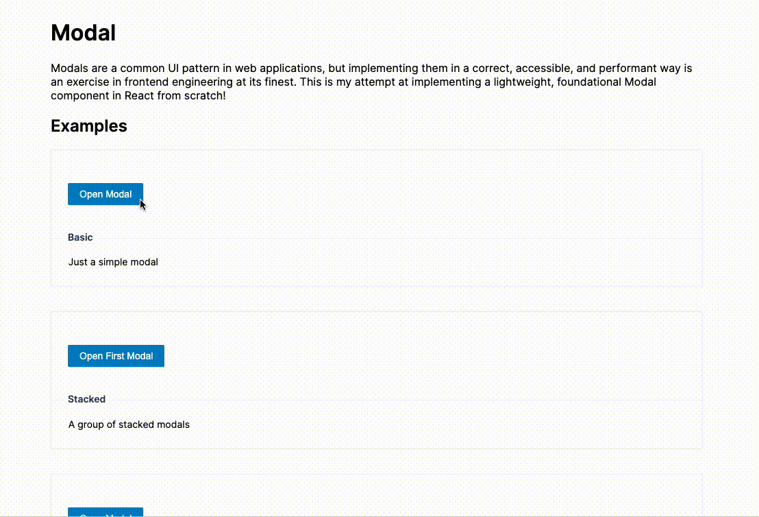
An implementation of a lightweight, foundational Modal component in React from scratch. The features include:
- Focus management
- Background
scroll-lockingwhen modal is opened - Tab navigation
- Stacking modals
- Accessibility
- Mobile responsiveness
| Prop | Type | Required | Default Value | Description |
|---|---|---|---|---|
| animate | boolean | false | true | Should modal animate when opening and closing |
| cancelButtonText | string | false | Cancel |
Text for default cancel button |
| desctroyOnClose | boolean | false | false | Should remove modal from dom when closed |
| escapable | boolean | false | true | Should close modal when ESC key is pressed |
| footer | ReactNode | false | Custom footer | |
| header | ReactNode | false | Custom Header | |
| lazy | booleam | false | false | Only add modal to DOM when visible is true |
| maskClosable | boolean | false | true | Should close modal if the mask is clicked |
| okButtonText | string | false | OK |
Text for default OK button |
| title | string | false | Title for header | |
| visible | boolean | true | Whether the modal is opened or not | |
| width | string | false | Custom width for modal |
| Event | Description |
|---|---|
| onCancel | The modal is closed or the Cancel button is clicked |
| onOk | The OK button is clicked |
| onOpened | The modal is opened |
Running the app
yarn
yarn dev