Circulito provides a highly customizable way to draw and animate circular wheel/donut/pie charts for visualizing data.
- Display circular wheel/donut/pie charts with customizable sections.
- Easily visualize data by providing amounts or percentages and corresponding colors.
- Gradient decoration on sections and background.
- Interactive sections:
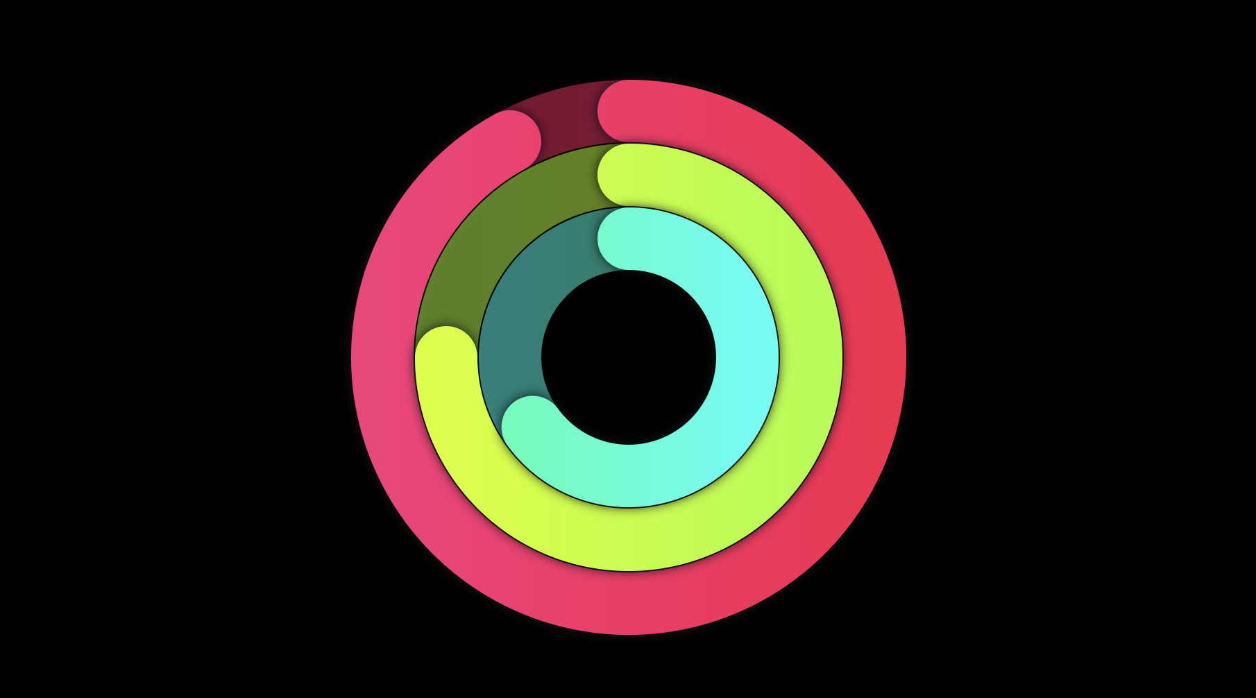
hoverandonTapevents. - Multiple levels allowed when added Circulito as a child.
- Animated sections.
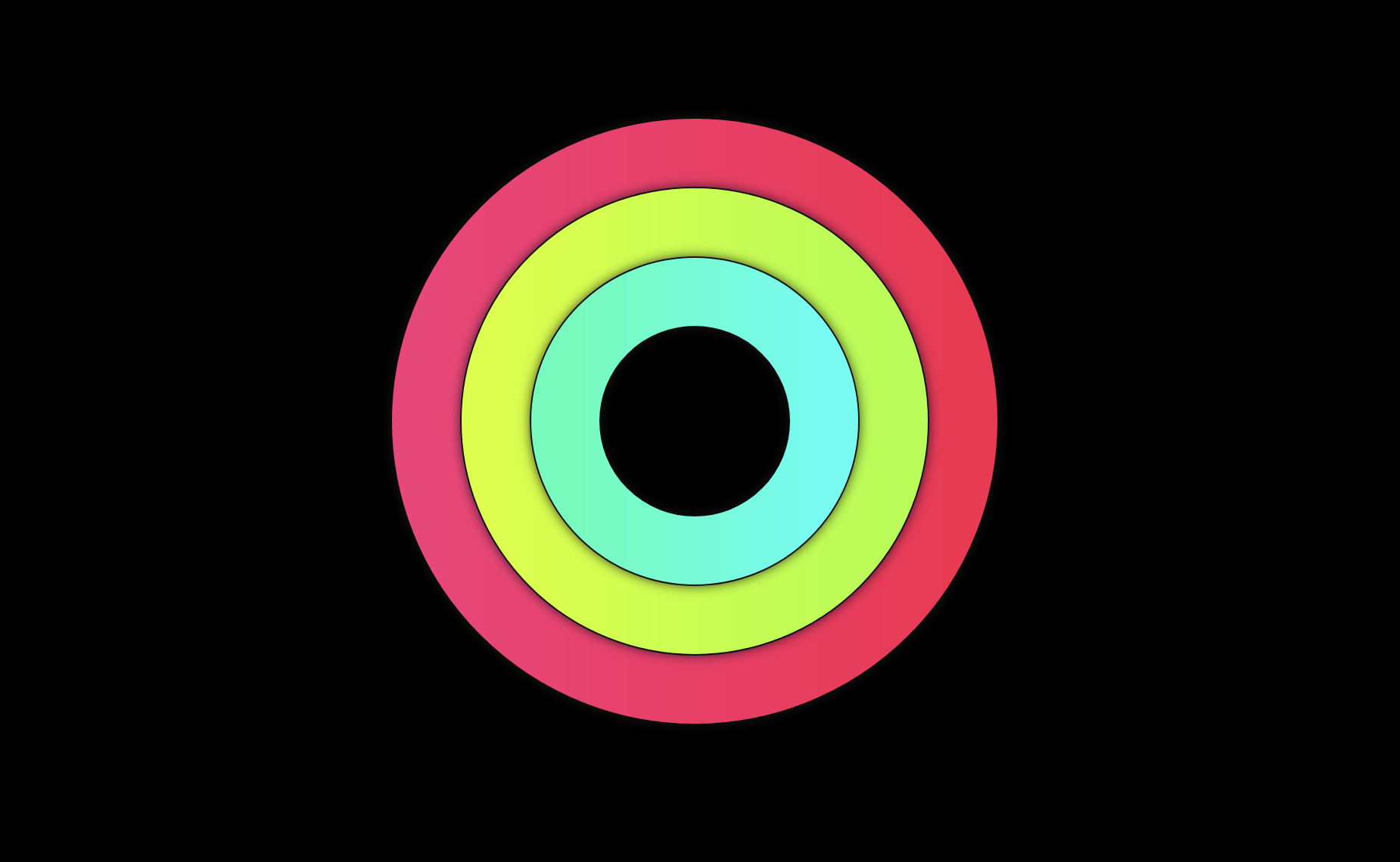
Some of the things you can do with Circulito are:
- Donut and Pie Charts.
- Dynamic charts with animated sections.
- Countdowns.
- Apple-like Fitness rings.
Online example:
Check out the online example at circulito.kega.dev to see it in action.
Add the package to your pubspec.yaml file:
dependencies:
circulito: ^1.0.2Use the Circulito widget in your Flutter app. Properties maxSize and sections are required:
Circulito(
    maxSize: 480,
    sections: [
        // One single section at 50%.
        CirculitoSection(
          value: 0.5,
          decoration: const CirculitoDecoration.fromColor(Colors.amber),
        )
    ],
);
Customization:
Circulito(
maxSize: 480,
padding: 20.0,
key: GlobalKey(),
strokeWidth: 150,
isCentered: true,
onHoverExit: () {},
startPoint: StartPoint.left,
animation: CirculitoAnimation(),
background: CirculitoBackground(),
strokeCap: CirculitoStrokeCap.round,
direction: CirculitoDirection.clockwise,
sectionValueType: SectionValueType.amount,
childStackingOrder: ChildStackingOrder.behindParent,
sections: [
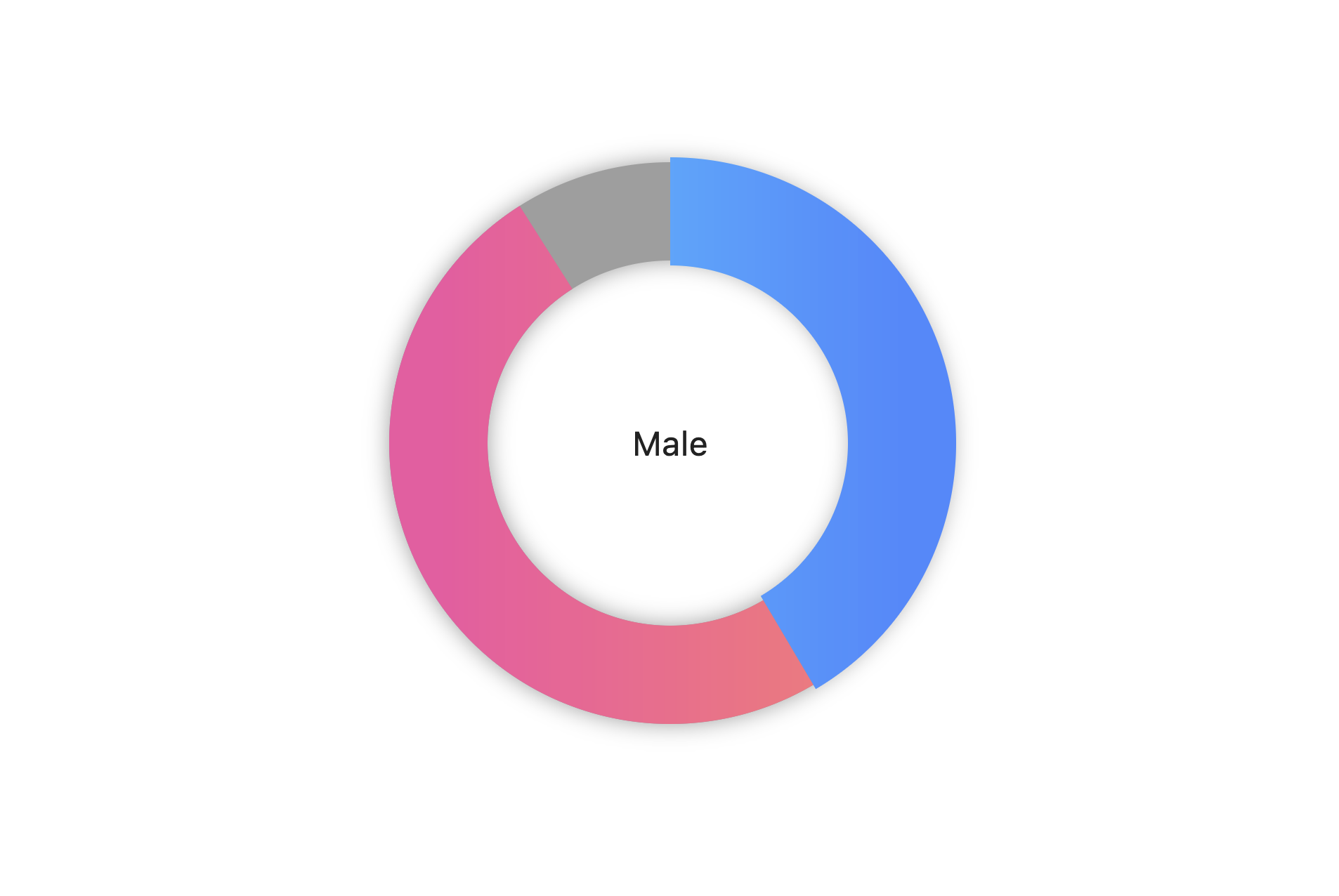
// Male percentage.
CirculitoSection(
value: 750,
decoration: const CirculitoDecoration.fromColor(
Colors.blue,
hoverColor: Colors.blueAccent,
),
),
// Female percentage.
CirculitoSection(
value: 997,
decoration: const CirculitoDecoration.fromColor(
Colors.pink,
hoverColor: Colors.pinkAccent,
shadow: CirculitoShadow(),
border: CirculitoBorder(
color: Colors.white,
size: 3.0,
),
),
),
],
child: const Text('Genders'),
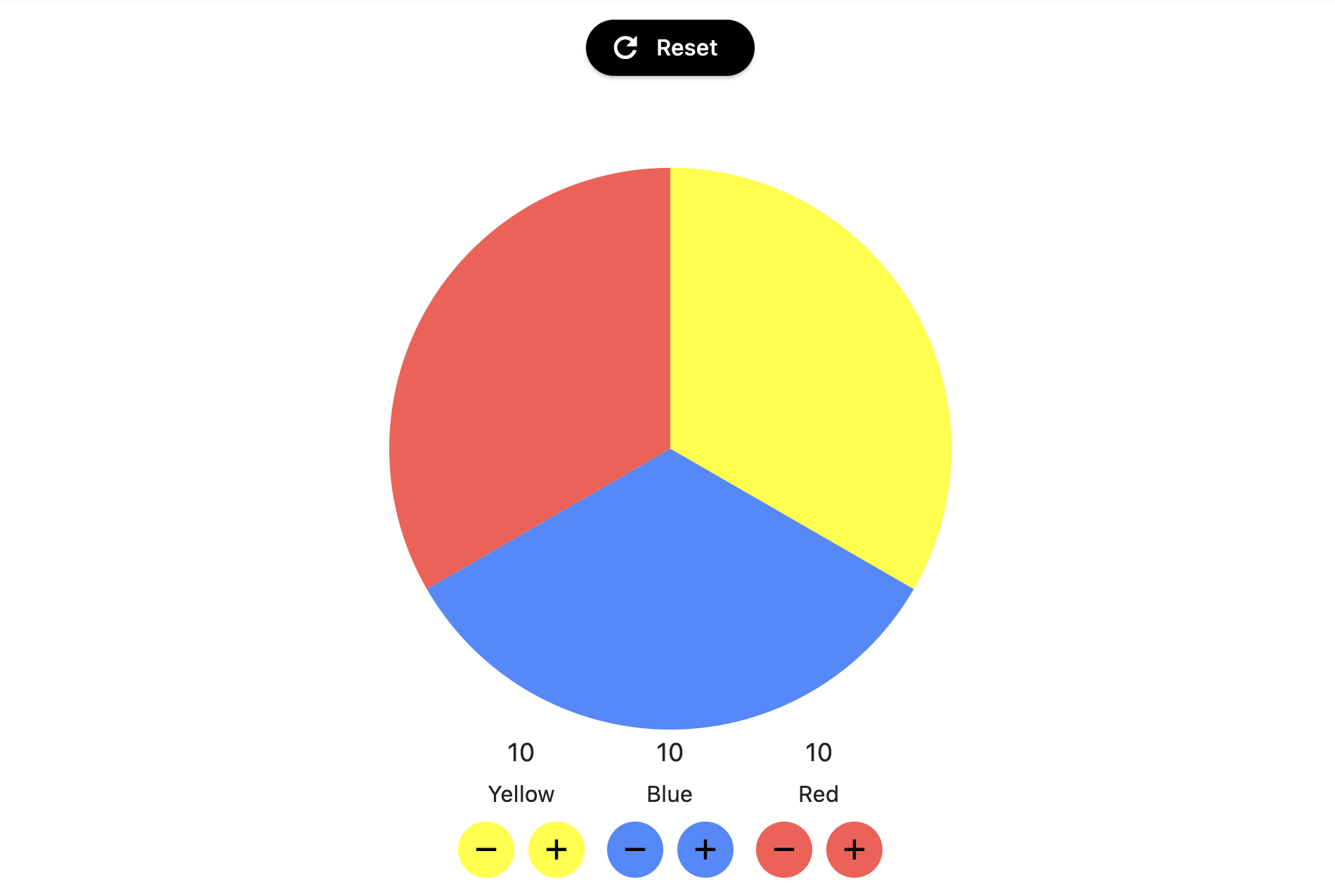
);If you want to use amount values instead of percentages just add sectionValueType property. The library will automatically calculate the percentages.
Circulito(
  sectionValueType: SectionValueType.amount,
  sections: [
      CirculitoSection(
        value: 535, // Amount values instead of percentages.
        color: Colors.blue,
      ),
    //...other sections with amount values.
  ]

  // ...other Circulito properties.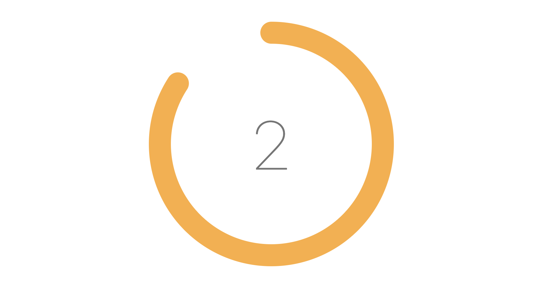
);To add Animation simply add animation property:
Circulito(
  animation: CirculitoAnimation(),
  // ...other Circulito properties.
);
You can also customize duration and curve of the animation like this:
Circulito(
  animation: CirculitoAnimation(
    duration: 200,
    curve: Curves.easeInOut,
  ),
  // ...other Circulito properties.
);The decoration property is required for both the background and sections in Circulito to display something on the screen. While the background has a default value of grey when using CirculitoBackground(), you can customize the decoration with either a color or a gradient.
Circulito(
    background: CirculitoBackground(
        // Implement decoration on background with color.
        decoration: CirculitoDecoration.fromColor(
            Colors.white,
            hoverColor: Colors.grey,
        ),
    ),
    sections: [
        CirculitoSection(
            value: 0.5,
            // Implement decoration on a section with gradient.
            decoration: CirculitoDecoration.fromGradient(
                const LinearGradient(colors: [Colors.green, Colors.yellow]),
            ),
      ),
  ]
  // ...other Circulito properties.
);Add Shadow to the decoration for sections or background using shadow property:
decoration: const CirculitoDecoration.fromColor(
    Colors.grey,
    // Default grey shadow.
    shadow: CirculitoShadow(),
),
You can also customize the color, spreading and style of the shadow.
decoration: CirculitoDecoration.fromColor(
    Colors.grey,
    // Customized shadow.
    shadow: CirculitoShadow(
        spreading: 16.0,
        blurStyle: BlurStyle.normal,
        color: Colors.blueGrey.withOpacity(.3),
    ),
),Add Border to the decoration for sections or background using border property:
decoration: const CirculitoDecoration.fromColor(
    Colors.grey,
    // Default black border.
    border: CirculitoBorder(),
),
You can also customize the color and size of the border.
decoration: CirculitoDecoration.fromColor(
    Colors.grey,
    // Customized border.
    border: CirculitoBorder(
        size: 8.0,
        color: Colors.blueGrey,
    ),
),To add Interactivity to sections or background just need to add onHover or
onTap properties to each CirculitoSection widget or CirculitoBackground widget:
Circulito(
  sections: [
      CirculitoSection(
        ...// required properties
        onHover: _doHoverAction,
        onTap: _doTapAction,
      ),
  ]
  // ...other Circulito properties.
);| Name | Type | Description |
|---|---|---|
animation |
Animation |
The animation to be applied to the wheel. |
background |
CirculitoAnimation? |
The background of the wheel to be painted. |
child |
Widget |
The widget to be shown over the wheel. |
direction |
CirculitoDirection |
Determines the direction of the wheel. |
isCentered |
bool |
Whether the widget should be centered or not inside the parent widget. |
maxSize |
double |
The maximum size the widget can grow inside its parent. |
padding |
double? |
The padding to be applied to the widget. |
sections |
List<CirculitoSection> |
A list of CirculitoSection objects representing each chart section. |
sectionValueType |
SectionValueType |
Type of the value of each section (amount or percentage) |
startPoint |
StartPoint |
Determines the start point of the wheel. |
strokeCap |
CirculitoStrokeCap |
The type of cap to use for the stroke (round or butt). |
strokeWidth |
double |
The width of the stroke that defines the chart's outline. |
This project is licensed under the MIT License - see the LICENSE file for details.
