Materials for and from my presentation to the Qlik Healthcare Dev Group September Gathering 2017-09-14
See the original presentation here
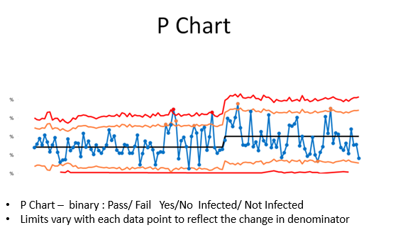
- See attached powerpoint for examples of these charts
- Most charts are built in a similar manner - but the method of calculating SD varies for each one
- Don't use the build in standard deviation function
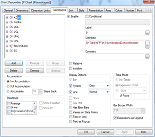
In QlikView your final chart properties will look something like this.
These chart expressions also work in Sense.
Assuming you are using the sample data, we will need to specify the 'Type' variable in the set analysis. This may not be necessary with your real life data
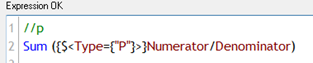
//p
Sum ({$<Type={"P"}>}Numerator/Denominator)
Use a slider (available within Sense as part of the Qlik dashboard extensions, or within QlikView), define a variable vNumCLPoints, and assign it to the slider.
For SPC, typically between 11 and 25 data points forms a good basis for initial control limits
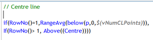
=// Centre line
if(RowNo()=1,RangeAvg(below(p,0,$(vNumCLPoints))),
If(RowNo()> 1, Above((Centre))))
This expression starts at row 1 and calculates the average of the first n rows - where n is the number of points returned by the slider you have set up above. From row 2 onwards it refers back to the row imediately above.
This is very much like typing a formula in cell A1 in Excel, then typing =A1 in cell A2, before dragging the formula downwards.
In short - we are locking the centre line to the average of these first n rows.
Now the key to getting this working properly - calculating the standard deviation.
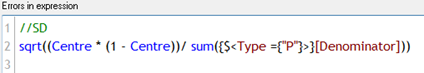
=//SD
sqrt((Centre * (1 - Centre))/ sum({$<Type ={"P"}>}[Denominator]))
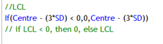
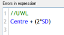
There are Upper and Lower Control limits, and Upper and Lower Warning Limits.
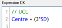
// UCL Centre + (3*SD)
//LCL If(Centre - (3SD) < 0,0,Centre - (3SD)) // if LCL < 0, then 0, else LCL
=//UWL Centre + (2 * SD)
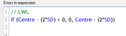
// LWL If (Centre - (2SD) < 0, 0, Centre - (2SD))
For the lower control and warning limits, if the value is less than 0, then we plot 0, else the calculated limits
This is optional. You might like to style the control limits to denote the control period by alternating between solid ( control period) and dashed (outside control period)
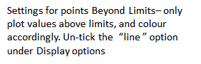
You may also want to highlight points outside the limits.
The following expressions should help -
//Chart Line Style Attribute if(RowNo() <= vNumCLPoints, '', '')
Repeat for each control limit as required
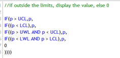
=//if outside the limits, display the value, else 0
IF(p > UCL,p, IF((p < LCL),p, IF((p > UWL AND p < UCL),p, IF((p < LWL AND p > LCL),p, 0 ))))
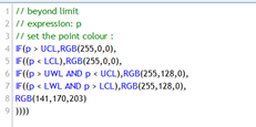
// beyond limit
IF(p > UCL,RGB(255,0,0),
IF((p < LCL),RGB(255,0,0),
IF((p > UWL AND p < UCL),RGB(255,128,0),
IF((p < LWL AND p > LCL),RGB(255,128,0),
RGB(141,170,203)
))))