QUESTION:
For this assignment, you should pick a specific country in the African data, and focus on creating relevant visualizations for that specific country: https://github.com/tristantao/ebola
Step 1. Aggregation The individual datasets are separately prepared (for example): https://github.com/tristantao/ebola/tree/master/liberia_data You'll need to either aggregate the individual CSVs into a single workable dataset.
Step 2. Visualization Build visualizations for the aggregated data. There are different visualizations you can build (a line graph is a good start). Also, there are different variables you can visualize (Total death/s in confirmed cases, New Case/s (Probable), total confirmed cases, and a lot more). Think about which variables might be interesting / meaningful. You're also free to find additional data (geographical data etc), but make sure you cite your sources!
There are some sample visualizations here: http://www.bbc.com/news/world-africa-28755033
Step 3. Conclusion So you got the data and built some visualizations. Now interpret it! Note a few things about the graph. Can you conclude anything? Is the worst over? Maybe it's yet to come? Or not enough data? Let us know your thoughts.
ANSWER:
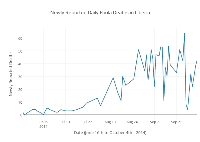
The number of daily deaths attributed to Ebola in Liberia peaked near the end of September at just over 60 deaths in a day. However, there was still alot of variability of daily deaths in September, there is no clear evidence of a downward trend from the data.
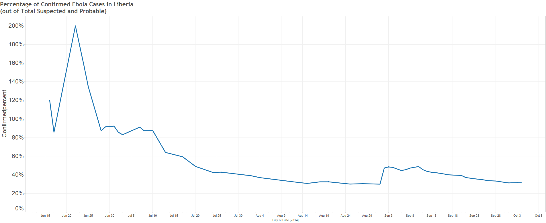
In the beginning of the crisis in June, there was little info about Ebola and there were more confirmed cases then actual suspected or probable cases (higher than 100% of confirmed cases were suspected or probable before confirmation). However, as the awareness of Ebola increased we can see the downward trend and it stabilized around the 35-50% range starting in July. For example, on Sept 3rd, 50% of Total Suspected or Probable Ebola cases ended up actually being confirmed as Ebola.
In conclusion, it appears the worst may not be over as the amount of daily deaths peaked relatively recently in September and there is no strong negative trend. It also appears that a lot more that can be done to correctly suspect Ebola in the first case (to get near 100% accuracy) so doctors can use their limited time to deal with patients who actually do have the disease.