Multiple Asset Photos | Videos selecting package for Expo SDK 41+. For users who use React native and managed workflow + Styled Components.
Simple How to Video => https://youtu.be/xcMcVZTw6xA
Demo Snack => https://snack.expo.io/@natysoz/expo-images-picker-example
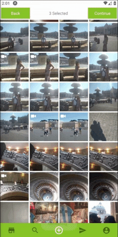
- Permission requests built in.
- Getting Multi Assets from the device.
- Support Both landscape and portrait.
- Simple Indicator for the selected Assets.
- Custom Indicator for the selected Assets.
- Using custom navbar component.
- Allow selecting multiply Photos or Videos.
- Optimized , using react hooks , memo and callback to fully optimize performances.

- Install with
or
$ npm install --save expo-images-picker
$ yarn add expo-images-picker
- import to the top of your file like
import { AssetsSelector } from 'expo-images-picker'
- install @expo-vectors package and send icons as props to the widget
import { Ionicons } from '@expo/vector-icons'
- Use the imported as Following =>
<AssetsSelector
    options={{
        /* Add only when u want to Manipulate Assets.
          manipulate: {
          width: 512,
          compress: 0.7,
          base64: false,
          saveTo: 'jpeg',
        },*/
        assetsType: ['photo', 'video'],
        maxSelections: 5,
        margin: 3,
        portraitCols: 4,
        landscapeCols: 5,
        widgetWidth: 100,
        widgetBgColor: bgColor,
        selectedBgColor: mainColor,
        spinnerColor: mainColor,
        videoIcon: {
            Component: Ionicons,
            iconName: 'ios-videocam',
            color: 'white',
            size: 20,
        },
        selectedIcon: {
            Component: Ionicons,
            iconName: 'ios-checkmark-circle-outline',
            color: 'white',
            bg: 'white',
            size: 20,
        },
        defaultTopNavigator: {
            selectedText: 'Selected',
            continueText: 'Finish',
            goBackText: 'Back',
            midTextColor: 'red',
            buttonStyle: validViewStyleObject,
            textStyle: validTextStyleObject,
            backFunction: goBack,
            doneFunction: (data) => onDone(data),
        },
        noAssets: CustomNoAssetsComponent,
    }}
/>
##[📚 Params]
-
assetsTypeCould be 'video' , 'photo' or an array with both ['photo','video']. -
maxSelectionsMaximum number of assets selection. -
marginMargin the Grid items by Pxs. -
portraitColsNumber of columns in portrait Mode.by default4. -
landscapeColsNumber of columns in landscape Mode, by default6. -
widgetWidthWidget container width , by default100. -
widgetBgColorWidget background color expect to get Hex color. -
spinnerColorLoading spinner color.
-
You can Resize , Compress and Base64 your assets with the following
**Note that using
manipulatemight result with crash or slow loading times on older phones.
manipulate works only with "photo" Assets.
-
widthManipulate image width (optional). -
heightManipulate image height (optional). -
compressCompress 0.1 Super low quality 1.0 leave as is (high quality). -
base64Will add an extra field on response with an image as Base64 string. -
saveToManipulate File extension , can be "jpeg" or "png". -
*All fields are optional , in order to resize and keep images Ratio its recommend sending only width or height, and it will resize using this axis only.
selectedIcon
ComponentSend in the Library you want to use ,LikeIonicons.iconNameSend in the name property for the icon, Like'ios-checkmark-circle-outline'.colorSend in the color property for the icon,Likewhite.bgThe Fill color of selected component, Like#ffffff50.sizeSend in the size property for the icon, Like22.
- You can control the colors , texts of the default nav with the following:
defaultTopNavigator
continueTextText for next Button , by defaultContinue.goBackTextText for Back Button , by defaultBack.midTextColorMiddle text override color default asblack.buttonTextStyleText Style Object , design the text inside the buttons.buttonStyleView Style Object, design the button itself.backFunctionSend in a function to go back to your screen.doneFunctionSend in a function to go back and send the returned data.
noAssets:
ComponentSend your custom Component that display no assets .
CustomTopNavigator:
ComponentSend in your Custom nav bar.propsSend any props your Custom Component needs.
- usage With Custom Component
the onFinish type: onFinish: ()=>void
<AssetsSelector
    options={{
        ...otherProps,
        CustomTopNavigator: {
            Component: CustomNavImageSelection,
            props: {
                backFunction: true,
                text: translator(T.PICK_IMAGES),
                doneFunction: (data: Asset[]) => onDone(data),
            },
        },
    }}
/>