New issue
Have a question about this project? Sign up for a free GitHub account to open an issue and contact its maintainers and the community.
By clicking “Sign up for GitHub”, you agree to our terms of service and privacy statement. We’ll occasionally send you account related emails.
Already on GitHub? Sign in to your account
Support Candlestick charts for histograms #516
Comments
|
Hope to add more advanced chart display options after summer when I have will work full time on grafana |
|
+1 |
|
Any word on new chard types? I'm also interested in candlestick charts. |
|
this looks pretty neat, though i don't understand what it has to do with histograms. |
|
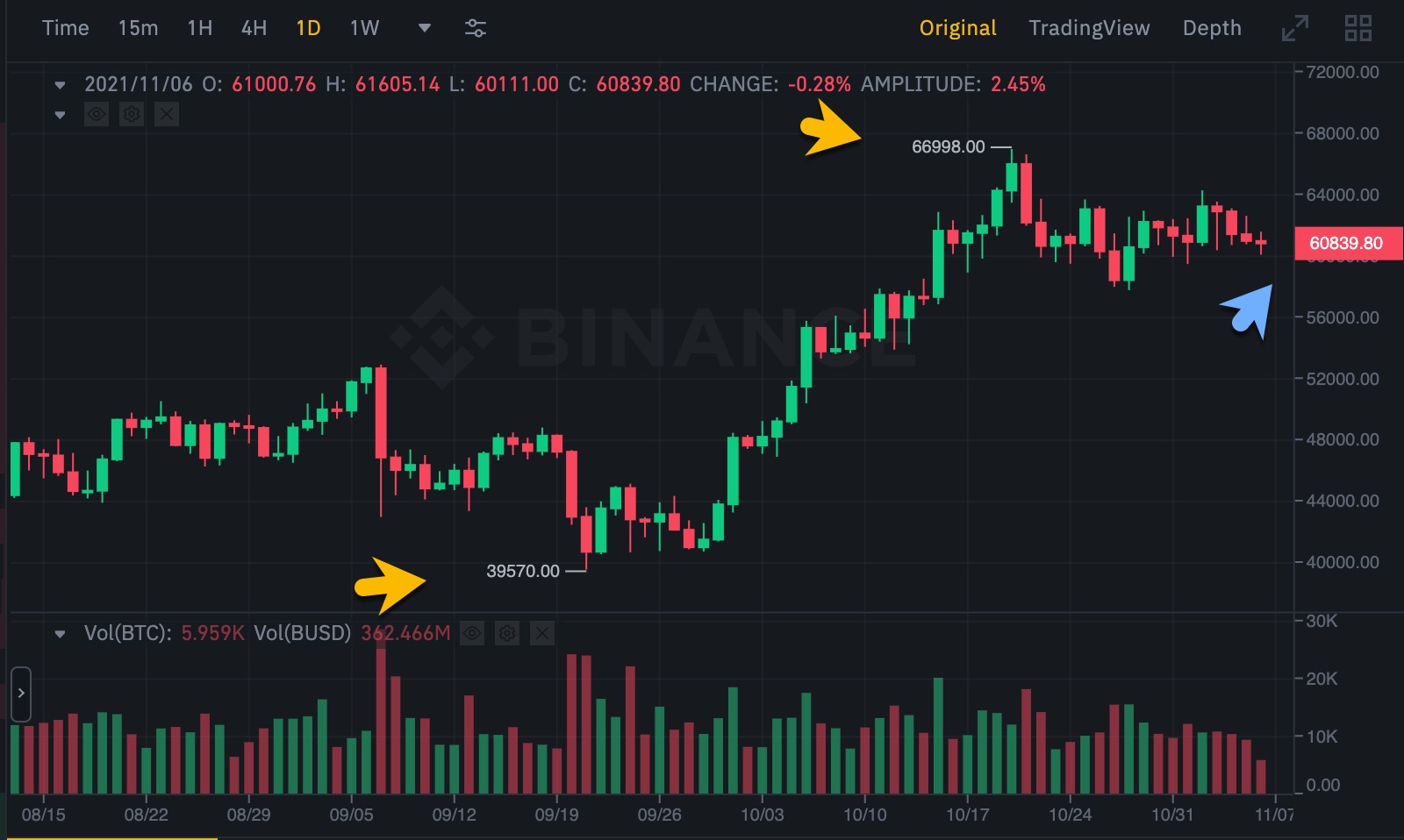
@Dieterbe yeah, I don't think they're related to histograms. OHLC Candlestick charts are widely used in financial markets. Supporting them in Grafana opens up yet a new use case. |
|
For the example given (min max median) box plus are better, more generalised to statistics and more obvious in terms of the data series. +1 for box plots in one form or other |
|
+1 for candle stick charts. |
|
👍 I agree with @netixen, we use them for performance comparisons. |
|
+1 |
|
There appears to be a flot candlestick plugin available.
http://www.flotcharts.org/plugins/
I wonder how hard it would be to integrate... hmm...
|
|
+1 |
1 similar comment
|
+1 |
|
+1. I'd love to be able to write a datasource to interface with a financial exchange and to create graphs in Grafana to show OHLC candlestick graphs. |
|
+1 |
|
I'd like to see candlesticks -we use a lot of "time to process" data so it would be good to have a "Min" / "Max" view over time |
|
+1 |
2 similar comments
|
+1 |
|
+1 |
|
Guys, github has a reactions feature: https://github.com/blog/2119-add-reactions-to-pull-requests-issues-and-comments. There are potentially numerous people subscribed to the issue, and "+1" comments are just spam. |
|
+1 |
|
any update on candle charts? |
|
I'm confused. @ilgizar Is this still a standalone feature or included in the main build and just not in the documentation? Is it stable? |
|
@bdonnahue I closed my PR, and designed this as separate plugin. https://github.com/ilgizar/ilgizar-candlestick-panel Is it beta version, but workful. |
|
I think the groundwork needed for this this will also allow for adding confidence interval bands to line charts. Are there plans to absorb the linked plugin into the project? |
|
Any news ? |
|
@yati-sagade Candlestick charts may be not quite suitable for showing confidence interval bands. The latter one has probabilistic nature and represents estimated error because of incompleteness of data while the true value is uncertain. |
|
+1 |
|
Any updates? Very useful and long-awaited feature! |
|
Maybe we can hope to have this feature with this work ? -> #21835 |
|
we just merged the alpha Market Trend panel in #40909. it currently expects the datasource / query to do the necessary windowing/aggregation into (OHLC/V), but we'll be adding raw price data aggregation in the frontend via a candlestick transform, or panel setting, or data format auto-detection (still TBD). for those who have stuck around long enough to see this land, feedback / testing is very welcome :) there is a related request for box/whisker plots [1], which is a close relative and will likely happen in the next few months. [1] #3227 |
|
This issue has been automatically marked as stale because it has not had activity in the last year. It will be closed in 30 days if no further activity occurs. Please feel free to leave a comment if you believe the issue is still relevant. Thank you for your contributions! |


Histograms diagrams are supported by graphite but there is no nice way to display the key data in one chart. The only way to display this right now is by only using the point diagram type. A better way to display things like min/max, median and mean and stddev in one chart, see https://en.wikipedia.org/wiki/Candlestick_chart.
The text was updated successfully, but these errors were encountered: