Last Updated AT FRIDAY - SEPTEMBER 27, 2014. Thank you Romin Irani for the hints on the outdated code!
This codelab was developed by Marcus Gabilheri to be used in the GDG OSU Stillwater I/O Extended event. Feel free to use or modify this codelab for your own purpose. If you find a bug leave an issue and I will fix as soon as possible. The code works but in the tutorial I might have left something.
- JDK - Java Development Kit
- Android Studio 0.8.x Beta installed
- Device with the Android Wear app installed
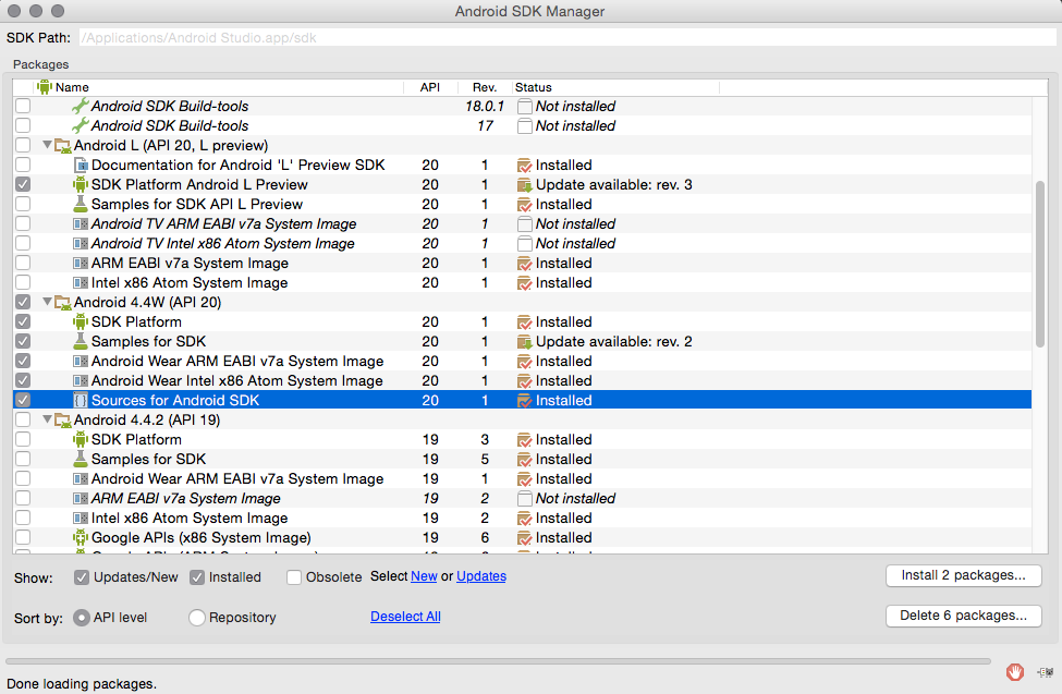
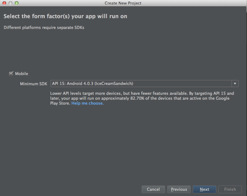
- Android 4.4W API 20
- Android Wear Emulator
- The Android Wear SDK Docs
Android Studio Beta 0.8.2 Already come with some pre-built in emulator definitions that we will use as a base for our own emulators.
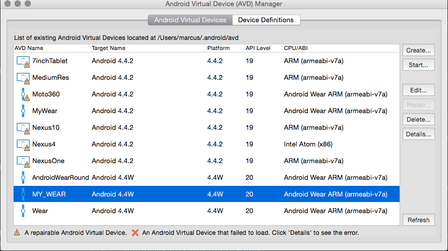
- Start the Emulator with the AVD Manager
- Start the Android Wear App on your device and click in connect.
- Navigate to android-studio/sdk/platform-tools folder and use the following command:
adb -d forward tcp:5601 tcp:5601(This command should be used every time you connect your phone to the computer. Or every time you restart the emulator). If for some reason you still can not connect both devices try usingadb devicesand ensure that both devices are connected.
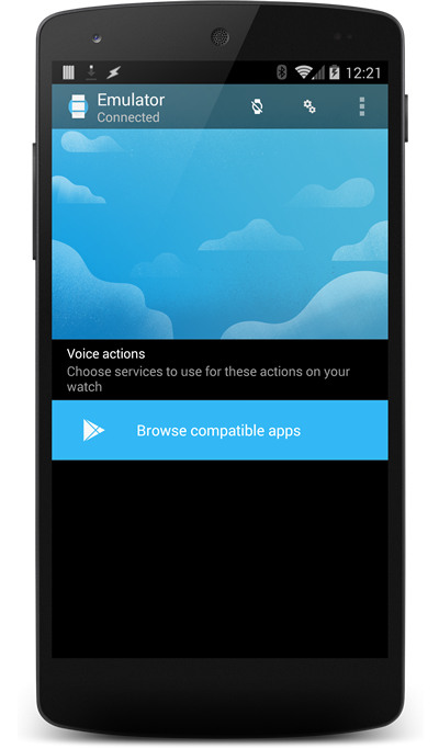
Not Connected :(
Connected :)
-
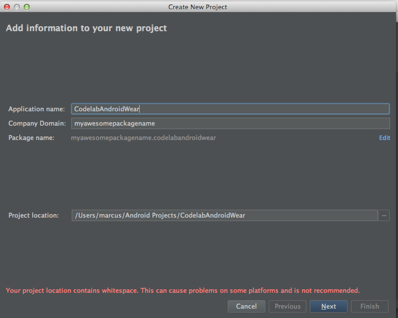
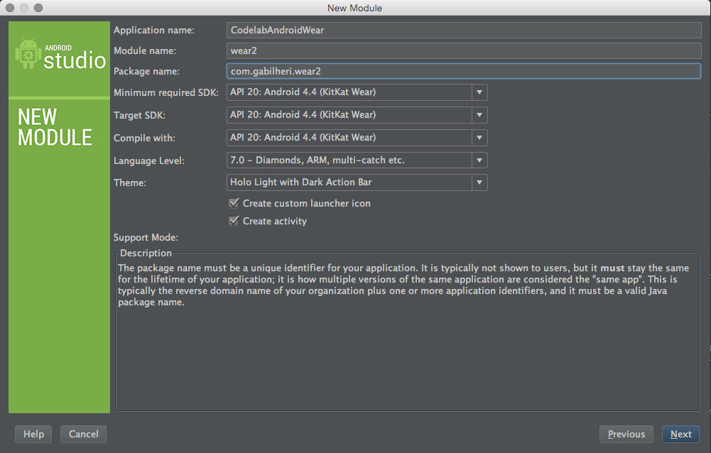
Select Android Wear Module
-
Use SDK 20 for all the options. Give it the same name as Your app and name the module wear.
-
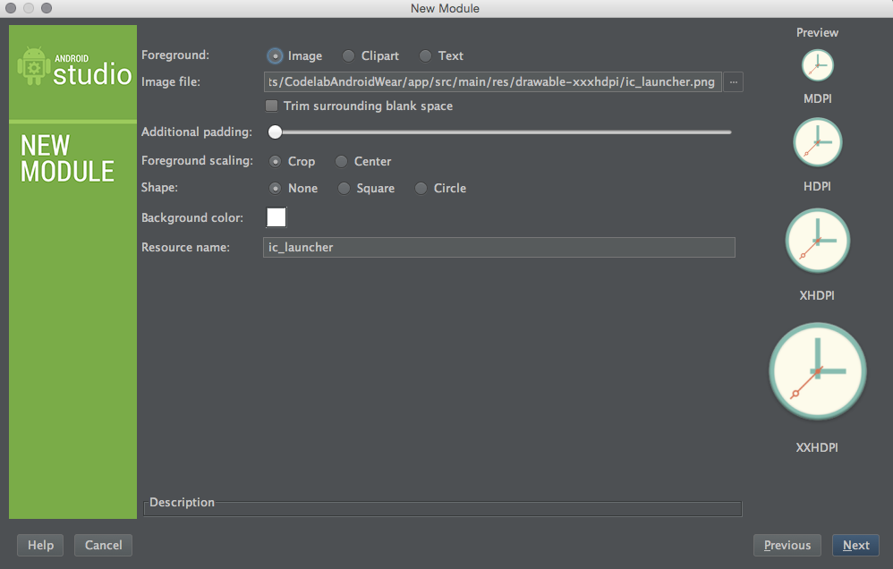
Use the Same Icon as our app...
-
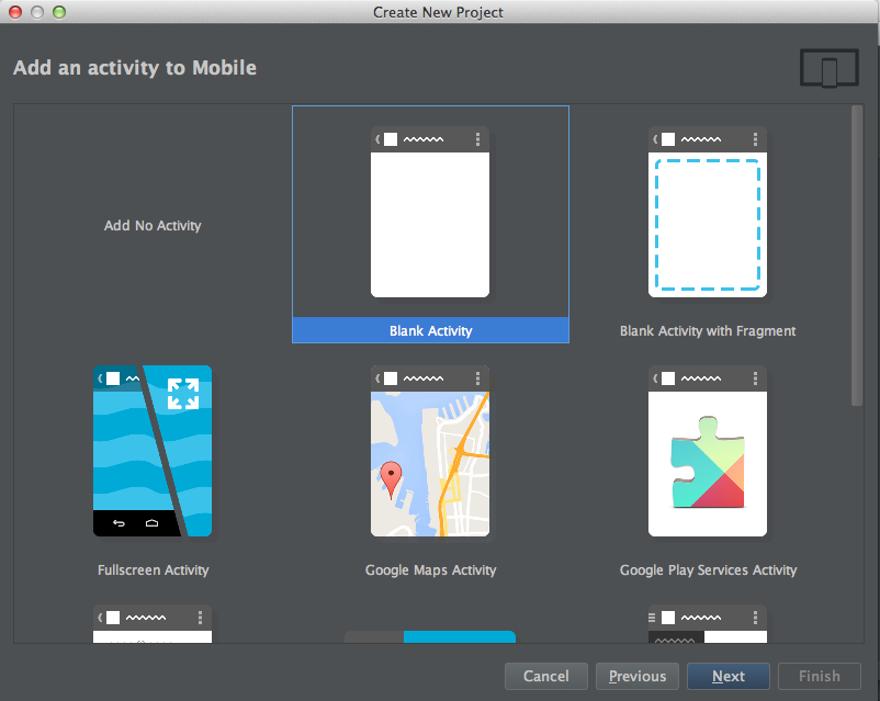
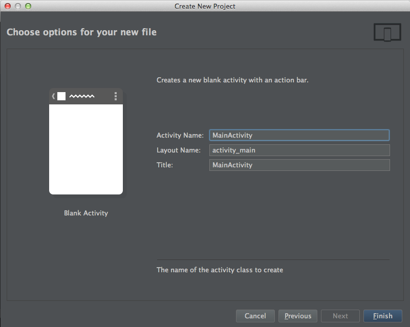
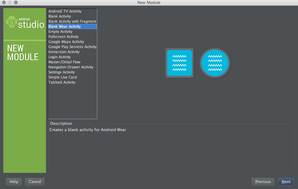
Create a new Blank Wear Activity and name it WearActivity (just to keep our sanity when we have multiple windows open)
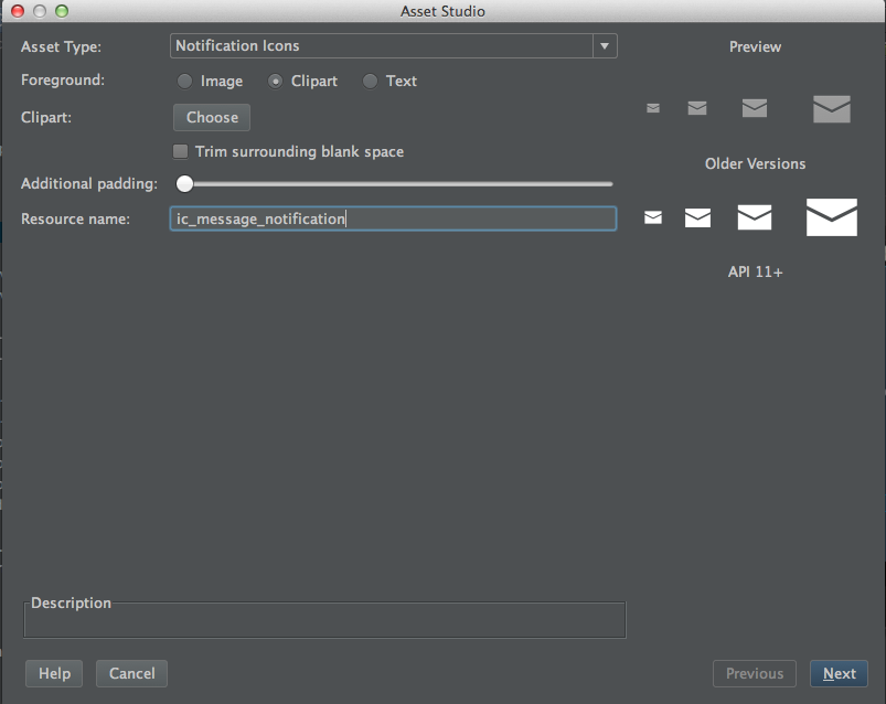
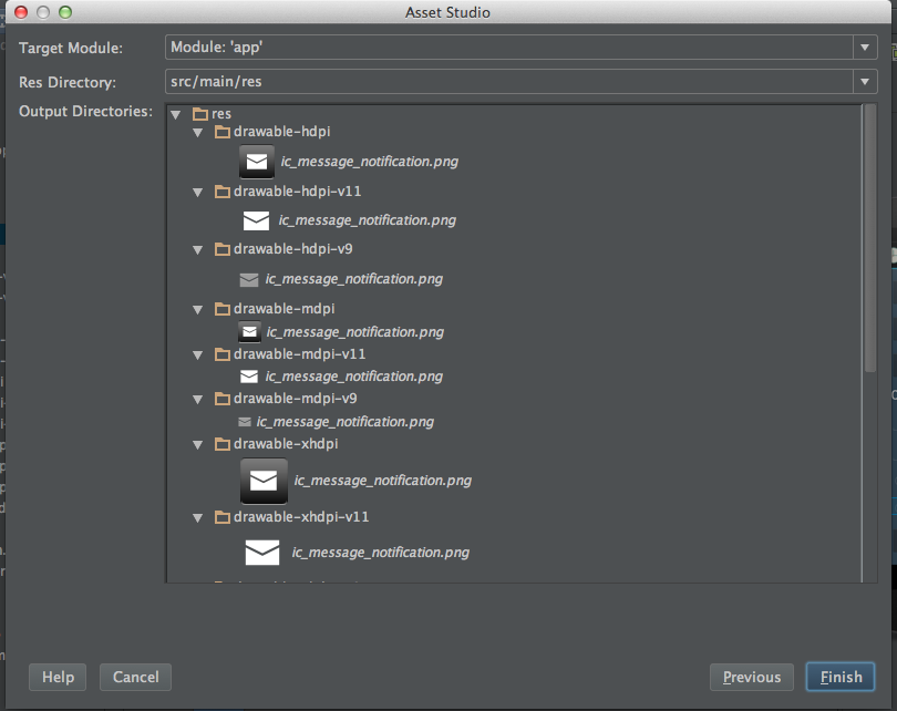
3. Check that your name and the destination is right and click in Finish. Android studio will generate all the necessary sizes for the notificiation icon as well the necessary folders.
The android wear notifications by default have an icon embed to it. So let's change the icon so our notifications are even more unique!
- Grab the app icon from from here our use any other image you want.
- Repeat the same process of adding the notification Icon but this time select Launcher Icons. Ps: Do not change the name this time. If we leave ic_launcher as the name it will override our standard icon.
- Click in Finish and now we are all set!
Adding Necessary imports to our build.gradle. The gradle file will tell Android Studio which libraries are available to use. If you wish to learn more about Gradle I suggest to look at Romin Irani Gradle Tutorial which will explain in detail what gradle is and does.
Inside the module app open the file build.gradle. The path should be app/build.gradle. Be sure to change the build.gradle file inside the module app. A common mistake for most novices with gradle is to change the other build.gradle files.
// app/build.gradle

apply plugin: 'com.android.application' // This tells gradle that we should use the Android Plugin

android {
    // The version of android to which we are compiling for
    compileSdkVersion 19
    // The build tools that we are using. If you get a error open SDK Manager and download the build tools.
    // By the time you do this tutorial the buildToolsVersion will probably be updated...
    // I suggest to just use the one that was set by default for you by the Android SDK.
    buildToolsVersion "19.1.0"

    defaultConfig {
        applicationId "myawesomepackagename.codelabandroidwear" // The package name of your app, do not change this
        minSdkVersion 15 // The minimum SDK version that you wish to support
        targetSdkVersion 19 // The target SDK version (usually the same as compileSdkVersion
        versionCode 1 // The version code used by the Play Store to keep track of the revisions
        versionName "1.0" // The version code that the User seems on the Play Store
    }
    buildTypes {
        release {
            runProguard false
            proguardFiles getDefaultProguardFile('proguard-android.txt'), 'proguard-rules.pro'
        }
    }
}

dependencies {

    compile 'com.google.android.gms:play-services:5.0.77' // Google Play Services API's
    // Support libraries is used to support older versions of Android
    // Most of the linbraries that we will be  using for the Wearable notifications comes from this support libraries.
    compile 'com.android.support:support-v4:20.0.0'
    compile fileTree(dir: 'libs', include: ['*.jar']) // This compiles all the .jar inside libs folder
}
So this might be a big chunk of code... if you alredy know Android XML layout feel free to copy and paste it. If not take a moment to go through each one of the elements!
<LinearLayout
    xmlns:android="http://schemas.android.com/apk/res/android"
    xmlns:tools="http://schemas.android.com/tools"
    android:layout_width="match_parent"
    android:layout_height="match_parent"
    android:paddingLeft="@dimen/activity_horizontal_margin"
    android:paddingRight="@dimen/activity_horizontal_margin"
    android:paddingTop="@dimen/activity_vertical_margin"
    tools:context=".MainActivity"
    android:orientation="vertical"
    android:background="#34495e"
    >
    <Button
        android:id="@+id/simpleNotification"
        android:text="Simple Notification"
        android:layout_width="match_parent"
        android:layout_height="wrap_content"
        android:layout_marginBottom="@dimen/activity_vertical_margin"
        android:onClick="sendNotification"
    />
    <Button
        android:id="@+id/bigNotification"
        android:text="Big View Notification"
        android:layout_width="match_parent"
        android:layout_height="wrap_content"
        android:layout_marginBottom="@dimen/activity_vertical_margin"
        android:onClick="sendNotification"
    />
    <Button
        android:id="@+id/bigNotificationWithAction"
        android:text="Big Notification With Action"
        android:layout_width="match_parent"
        android:layout_height="wrap_content"
        android:layout_marginBottom="@dimen/activity_vertical_margin"
        android:onClick="sendNotification"
    />
    <TextView
        android:text="Custom Notification"
        android:textAppearance="?android:attr/textAppearanceLarge"
        android:layout_width="match_parent"
        android:layout_height="wrap_content"
        android:layout_marginBottom="@dimen/activity_vertical_margin"
        />
    <EditText
        android:id="@+id/notificationTitle"
        android:hint="Notification Title"
        android:layout_width="match_parent"
        android:layout_height="wrap_content"
        android:layout_marginBottom="@dimen/activity_vertical_margin"
        />
    <EditText
        android:id="@+id/notificationMessage"
        android:hint="Notification Message"
        android:layout_width="match_parent"
        android:layout_height="wrap_content"
        android:layout_marginBottom="@dimen/activity_vertical_margin"
    />
    <RadioGroup
        android:id="@+id/iconGroup"
        android:layout_width="match_parent"
        android:layout_height="wrap_content"
        android:orientation="horizontal"
        android:layout_marginBottom="@dimen/activity_vertical_margin">
        <RadioButton
            android:id="@+id/icon1"
            android:drawableRight="@drawable/ic_wear_notification"
            android:layout_width="wrap_content"
            android:layout_height="wrap_content"
            android:layout_marginRight="@dimen/activity_horizontal_margin"
        />
        <RadioButton
            android:id="@+id/icon2"
            android:drawableRight="@drawable/ic_notification_2"
            android:layout_width="wrap_content"
            android:layout_height="wrap_content"
            android:layout_marginRight="@dimen/activity_horizontal_margin"
        />
        <RadioButton
            android:id="@+id/icon3"
            android:drawableRight="@drawable/ic_notification3"
            android:layout_width="wrap_content"
            android:layout_height="wrap_content"
            android:layout_marginRight="@dimen/activity_horizontal_margin"
            />
    </RadioGroup>
    <RadioGroup
        android:id="@+id/hideIconGroup"
        android:layout_width="match_parent"
        android:layout_height="wrap_content"
        android:orientation="horizontal"
        android:layout_marginBottom="@dimen/activity_vertical_margin"
        >
        <RadioButton
            android:id="@+id/hideIcon"
            android:text="Hide Icon"
            android:layout_width="wrap_content"
            android:layout_height="wrap_content"
            android:layout_marginRight="@dimen/activity_horizontal_margin"
            />
        <RadioButton
            android:id="@+id/showIcon"
            android:text="Show Icon"
            android:layout_width="wrap_content"
            android:layout_height="wrap_content"
            android:layout_marginRight="@dimen/activity_horizontal_margin"
            />
    </RadioGroup>
    <Button
        android:id="@+id/sendCustomNotification"
        android:text="Send Custom Notification"
        android:layout_width="match_parent"
        android:layout_height="wrap_content"
        android:onClick="sendNotification"
    />
</LinearLayout>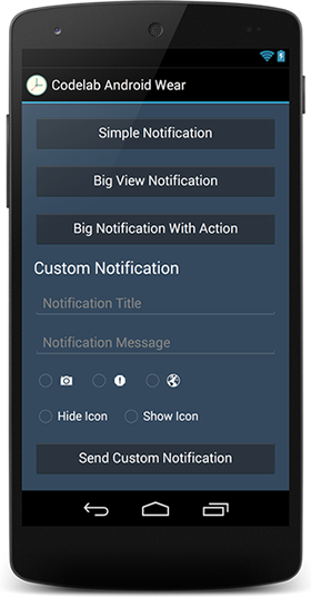
If your layout doesn't looks like this is because of the Style. Open the file res/values/styles.xml and change:
<style name="AppTheme" parent="android:Theme.Holo.Light.DarkActionBar">To... :
<style name="AppTheme" parent="android:Theme.Holo">Android wear let's us extend the experience of our applications by sending a notification to the wear device. The Notifications API also let's us add Actions to the notification. Example: In a TODO app we could send a notification to the user that is time for the task to be done and add actions such as "View Map" , "Complete Task", "Snooze", etc.. We can add a "unlimited" (try to limit your actions to a reasonable number of 3 or 4 maximum, you don't want your user to scroll forever to get to an action...) number of actions.
######So enough has been said let's get our hands dirty!
In our XML buttons we defined the xml android:onClick="sendNotification" method.
So in our MainActivity let's define the sendNotificationMethod:
// Define the method to send the notifications with the same name from the Android onClick from the XML Layout
public void sendNotification(View view) {
    //Now let's add a switch to catch the button that has been clicked
    // We also add a case for each of the buttons.
    switch(view.getId()) {
        case R.id.simpleNotification:
            break;

        case R.id.bigNotification:
            break;

        case R.id.bigNotificationWithAction:
            break;

        case R.id.sendCustomNotification:
            break;
    }
}Add the following instance variables to your class.
public class MainActivity extends Activity {
    private EditText mCustomTitle, mCustomMessage; // Edit text boxes for the custom notification
    private RadioGroup mCustomIconGroup, showHideIconGroup; // Radiogroups with the Icon and settings for the custom notification
    private int mCustomIcon; // The variable that will hold the ID of the custom icon to show
    private boolean showIcon = false; // boolean that will tell if wear should show the app icon or not
    private String LOG_TAG = "WEAR"; // Our LogCat tag for debugging purposes
...Inside onCreate we instantiate our UI elements and add retrieve information about which element is checked.
    @Override
    protected void onCreate(Bundle savedInstanceState) {
        super.onCreate(savedInstanceState);
        setContentView(R.layout.activity_main);

        // Custom Title and Message for custom Notification
        mCustomTitle = (EditText) findViewById(R.id.notificationTitle);
        mCustomMessage = (EditText) findViewById(R.id.notificationMessage);

        // RadioGroup for the customIcon
        mCustomIconGroup = (RadioGroup) findViewById(R.id.iconGroup);
        mCustomIconGroup.setOnCheckedChangeListener(new RadioGroup.OnCheckedChangeListener() {
            // The name of the ICONS will change based on how you named it....
            @Override
            public void onCheckedChanged(RadioGroup group, int checkedId) {
                switch (group.getCheckedRadioButtonId()) {
                    case R.id.icon1:
                        mCustomIcon = R.drawable.ic_wear_notification;
                        break;
                    case R.id.icon2:
                        mCustomIcon = R.drawable.ic_notification_2;
                        break;
                    case R.id.icon3:
                        mCustomIcon = R.drawable.ic_notification3;
                        break;
                }
            }
        });

        // RadioGroup to determine if App Icons should be shown or not.
        showHideIconGroup = (RadioGroup) findViewById(R.id.hideIconGroup);
        showHideIconGroup.setOnCheckedChangeListener(new RadioGroup.OnCheckedChangeListener() {
            @Override
            public void onCheckedChanged(RadioGroup group, int checkedId) {
                switch (group.getCheckedRadioButtonId()) {
                    case R.id.showIcon:
                        showIcon = true;
                        break;
                    case R.id.hideIcon:
                        showIcon = false;
                        break;
                }
            }
        });
    }
Let's visit our java sendNotification() method again and some common code for our notifications.
We will add this before the switch so all the variables can be shared between the notifications.
// Define the method to send the notifications with the same name from the Android onClick from the XML Layout
public void sendNotification(View view) {
// Common elements for all our notifications
int notificationId = 001; // id- An identifier for this notification unique within your application.
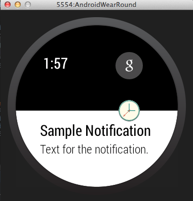
String eventTitle = "Sample Notification"; // Title for the notificaiton
String eventText = "Text for the notification."; // Text for the notificaiton
String intentExtra = "This is an extra String!"; // Extra String to be passed to a intent
// A large String to be used by the BigStyle
String eventDescription = "This is supposed to be a content that will not fit the normal content screen"
+ " usually a bigger text, by example a long text message or email.";
// Build intent for notification content - This will take us to our MainActivity
Intent viewIntent = new Intent(this, MainActivity.class);
PendingIntent viewPendingIntent = PendingIntent.getActivity(this, 0, viewIntent, 0);
// Specify the 'big view' content to display the long
// event description that may not fit the normal content text.
NotificationCompat.BigTextStyle bigStyle = new NotificationCompat.BigTextStyle();
// We instantiate as null because they will be changing based on which button is pressed
NotificationCompat.Builder mBuilder = null;
Notification mNotification = null;
// Get an instance of the NotificationManager service
NotificationManagerCompat notificationManager = NotificationManagerCompat.from(this);
switch(view.getId()) {
case R.id.simpleNotification:
break;
case R.id.bigNotification:
break;
case R.id.bigNotificationWithAction:
break;
case R.id.sendCustomNotification:
break;
}
}Now it's time to build the notification we want to display based on the user input. You can use anything you want to build and send notifications. Can be game scores, alarm clocks, etc.. Let's keep it simple for this codelab and get input directly from the user.
Let's modify our switch cases for each one of our base cases.
This is the simplest form of a notification with 4 elements.
- A drawable for the notification. We use one of the drawables created by the asset manager.
- A title for the notification
- A message to be displayed
- The intent that should be opened by this notification.
case R.id.simpleNotification:
    mBuilder = new NotificationCompat.Builder(this) // Instantiate the builder with our context.
            .setSmallIcon(R.drawable.ic_wear_notification) // set the icon
            .setContentTitle(eventTitle) // set the title
            .setContentText(eventText) // set the text
            .setAutoCancel(true)  // This flag makes the notification disappear when the user clicks on it!
            .setContentIntent(viewPendingIntent); // and finally the intent to be used
    break;
Now after the switch we add the following code to display or notification:
// This code goes after the switch because is common to all our notifications.
// Build the notification and issues it with notification manager.
notificationManager.notify(notificationId, mBuilder.build());
Log.d(LOG_TAG, "Normal Notification");- Now let's try it out!! Runt he App and click on the first button. The notification should be displayed on your phone like this:
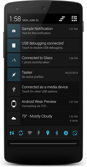
- The notifications should also appear on the device like this:
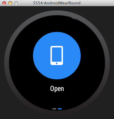
- The intent will be displayed with a Open Button:
Most of the contents of the big notification are the same. There are a few different things to pay attention here.
- the Large Icon. The large icon is displayed behind the notificaiton as a background. The difference to the small icon is that we will be using BitmapFactory.decodeResource() decode a png file.
- The setContentTitle and setContentText will be overriden by the bigStyle.bigText and bigStyle.setBigContentTitle.
case R.id.bigNotification:
bigStyle.bigText(eventDescription); // bigText will override setContentText
bigStyle.setBigContentTitle("Override Title"); // bigContentTitle Override the contentTitle
mBuilder = new NotificationCompat.Builder(this)
.setSmallIcon(R.drawable.ic_wear_notification)
.setLargeIcon(BitmapFactory.decodeResource(getResources(), R.drawable.ic_sample_codelab))
.setContentTitle(eventTitle) // This is unnecessary for the big notification if you use bigText
.setContentText(eventText) // Unnecessary if setBigContentTitle is Overriden
.setContentIntent(viewPendingIntent)
.setAutoCancel(true)
.setStyle(bigStyle);
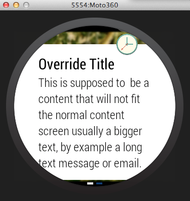
break;The notification in the wear device should look somewhat like this:
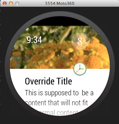
Since the text is set as a big text it can now expand itself to allow the user to scroll and read the text inside.
For this Action we will create another activity. Our goal is to start another activity from the intent and set a message + show the picture that is set as the largeIcon.
- Create the new Activity:
- Right click any folder inside your app package -> New -> Activity -> Blank Activity
- Give it a name : SecondActivity
- Set up the XML layout elements:
<LinearLayout xmlns:android="http://schemas.android.com/apk/res/android"
    xmlns:tools="http://schemas.android.com/tools"
    android:layout_width="match_parent"
    android:layout_height="match_parent"
    android:paddingLeft="@dimen/activity_horizontal_margin"
    android:paddingRight="@dimen/activity_horizontal_margin"
    android:paddingTop="@dimen/activity_vertical_margin"
    android:paddingBottom="@dimen/activity_vertical_margin"
    android:background="#34495e"
    android:orientation="vertical"
    tools:context="myawesomepackagename.codelabandroidwear.SecondActivity">

    <TextView
        android:id="@+id/extraMessage"
        android:text="@string/hello_world"
        android:layout_width="wrap_content"
        android:layout_height="wrap_content" />

    <ImageView
        android:id="@+id/extraPhoto"
        android:layout_width="wrap_content"
        android:layout_height="wrap_content"
        />
</LinearLayout>- Instantiate the XML elements in your activity.
@Override
protected void onCreate(Bundle savedInstanceState) {
    super.onCreate(savedInstanceState);
    setContentView(R.layout.activity_second);
    TextView mTextView = (TextView) findViewById(R.id.extraMessage); // TextView to retrieve the message
    ImageView mImageView = (ImageView) findViewById(R.id.extraPhoto); // ImageView to retrieve the picture
}- Get the intent information and set the data for the elements
// Get the intent information
Intent extraIntent = getIntent();

// Get the intent information based on the names passed by your notificaiton "message" and
mTextView.setText(extraIntent.getStringExtra("message")); // Retrieve the text and set it to our TextView
mImageView.setImageResource(extraIntent.getIntExtra("photo", 0)); // The zero is a default value in case the intent extra is empty.- Now that our Second Activity is set and ready to receive some data we procede to build our notificaiton.
case R.id.bigNotificationWithAction:
    // Create the new intent that is gonna receive the information from our action.
    Intent photoIntent = new Intent(this, SecondActivity.class); // Intent pointing to our second activity
    photoIntent.putExtra("message", intentExtra); // Set the extra message that will open in the next activity
    photoIntent.putExtra("photo", R.drawable.ic_sample_codelab); // Send the photo to the next activity

    PendingIntent photoPending = PendingIntent.getActivity(this, 0, photoIntent, 0); // set a new pending intent
    bigStyle.setBigContentTitle("Mr. Flowers"); // title for the Big Text
    bigStyle.bigText("Check out this picture!! :D"); // Message in the Big Text
    mBuilder = new NotificationCompat.Builder(this)
            .setSmallIcon(R.drawable.ic_wear_notification) // Small icon for our notification
            .setLargeIcon(BitmapFactory.decodeResource(getResources(), R.drawable.ic_sample_codelab)) // The PNG picture
            .setContentIntent(viewPendingIntent) // This will be the default OPEN button.
            .addAction(R.drawable.ic_photo, "See Photo", photoPending) // This is our extra action. With an Extra Icon and pointing to the other PendingIntent
            .setAutoCancel(true)
            .setStyle(bigStyle); // Add the bigStyle
    break;
The Action button with our Custom Icon to view the photo:
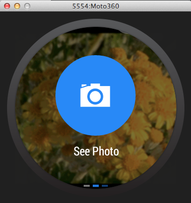
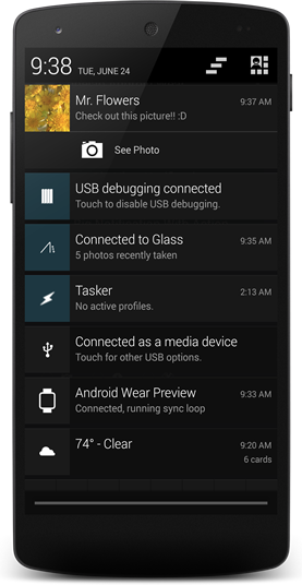
And this is how the same notification looks in the cellphone
Our custom notification will let the user set a title, a message, select the Icon to display in the notification and will give an option if the user wants to show or not the App Icon.
case R.id.sendCustomNotification:
    mBuilder = new NotificationCompat.Builder(this)
                        .setSmallIcon(mCustomIcon)
                        .setContentTitle(mCustomTitle.getText().toString())
                        .setContentText(mCustomMessage.getText().toString())
                        .setAutoCancel(true)
                        .setContentIntent(viewPendingIntent);

                // This is an example of the NEW WearableNotification SDK.
                // The WearableNotification has special functionality for wearable devices
                // By example the setHintHideIcon hides the APP ICON from the notification.
                // This code is now Up to date thanks to Romin Irani!! Thanks!
                NotificationCompat.WearableExtender wearableExtender = new NotificationCompat.WearableExtender(mBuilder.build());
                wearableExtender.setHintHideIcon(!showIcon);
                wearableExtender.extend(mBuilder);
                break;
Give it a try now and play with the different notifications!!!
In this tutorial we are not going to use the Watch Stub faces. We open the file wear_activity and replace the code that is already there with:
    <?xml version="1.0" encoding="utf-8"?>
    <android.support.wearable.view.GridViewPager
        xmlns:android="http://schemas.android.com/apk/res/android"
        xmlns:tools="http://schemas.android.com/tools"
        android:id="@+id/gridPager"
        android:layout_width="match_parent"
        android:layout_height="match_parent"
        android:keepScreenOn="true"
        tools:context=".WearActivity"
     />
This code will place a empty GridViewPager adapter. This Grid View Pager will be them populated from the Java Code using a FragmentGridPagerAdapter
Creating the GridPage -> This will be a very simple Class that will hold the data for each Page of our GridPagerAdapter
GridPage.java
 public class GridPage  {
     private String mTitle;
     private String mText;
     private int mIcon;
     private int mBackground;
     /**
      * Constructor for the GridPage
      * @param mTitle
      *          Title for the card
      * @param mText
      *          Text for the card
      * @param mIcon
      *          Icon that will be on the right of the title
      * @param mBackground
      *          The Background image to be used by the fragment. The card will overlay on top of the background.
      */
     public GridPage(String mTitle, String mText, int mIcon, int mBackground) {
         this.mTitle = mTitle;
         this.mText = mText;
         this.mIcon = mIcon;
         this.mBackground = mBackground;
     }
     public String getTitle() {
         return mTitle;
     }
     public String getText() {
         return mText;
     }
     public int getIcon() {
         return mIcon;
     }
     public int getBackground() {
         return mBackground;
     }
 }
As you can see this is just a very simple class that will hold the Data for the Page and return when we need it.
Creating the GridRow -> Grid Row is a very simple class also that will hold a ArrayList of GridPages
The GridRow will also have handy methods for:
- Adding new Pages
- Getting the size of the row
- Setting the pages
- Getting the desired page
    public class GridRow  {
        ArrayList<GridPage> mPages = new ArrayList<GridPage>();
        public GridRow() {}
        public GridRow(ArrayList<GridPage> mPages) {
            this.mPages = mPages;
        }
        public GridPage getPage(int index) {
            return mPages.get(index);
        }
        public void addPage(GridPage mPage) {
            mPages.add(mPage);
        }
        public int getSize() {
            return mPages.size();
        }
        public ArrayList<GridPage> getPagesArray() {
            return mPages;
        }
        public void setPages(ArrayList<GridPage> mPages) {
            this.mPages = mPages;
        }
}There's a few things to notice here.
- We override the getBackground() to set the background for each of the pages.
- We override the getRowCount() so the adapter know where to look for its size
- getColumnCount() Will return the number of columns in a specific row. also used internally by the adapter.
- The getFragment() is the one that will Create a new CardFragment with the information from our GridPage
public class GridPagerAdapter extends FragmentGridPagerAdapter {
private Context mContext;
private ArrayList<GridRow> mRows;
public GridPagerAdapter(Context mContext, FragmentManager fm) {
super(fm);
this.mContext = mContext;
initAdapter();
}
/**
* This method is used for demonstration only. In a real app the data and the adapters would
* probably come from somewhere else.
*/
private void initAdapter() {
mRows = new ArrayList<GridRow>();
GridRow row1 = new GridRow();
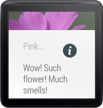
row1.addPage(new GridPage("Pink Flower", "Wow! Such flower! Much smells!", R.drawable.ic_info, R.drawable.flower1));
row1.addPage(new GridPage("Flower?", "Much Pretty! Such nature!", R.drawable.ic_info, R.drawable.flower2));
row1.addPage(new GridPage("Red Flower!", "Yes! I know nothing about flowers!", R.drawable.ic_launcher, R.drawable.flower3));
GridRow row2 = new GridRow();
row2.addPage(new GridPage("Flowers!", "This is row 2!!!", R.drawable.ic_info, R.drawable.flower4));
row2.addPage(new GridPage("Row 2 Col 2..", "ZzzzZzZZzzZZZz", R.drawable.ic_info, R.drawable.flower1));
GridRow row3 = new GridRow();
row3.addPage(new GridPage("THIS IS SPA... ops Row 3!", "Yes rows can have different sizes.", R.drawable.ic_info, R.drawable.flower3));
mRows.add(row1);
mRows.add(row2);
mRows.add(row3);
}
@Override
public Fragment getFragment(int row, int col) {
GridPage page = mRows.get(row).getPage(col);
CardFragment cardFragment = CardFragment.create(page.getTitle(), page.getText(), page.getIcon());
return cardFragment;
}
/**
* This method is Overriden so we can set a Custom Background for each element.
* @param row
* @param column
* @return
*/
@Override
public ImageReference getBackground(int row, int column) {
GridPage page = mRows.get(row).getPage(column);
return ImageReference.forDrawable(page.getBackground());
}
@Override
public int getRowCount() {
return mRows.size();
}
@Override
public int getColumnCount(int row) {
return mRows.get(row).getSize();
}
}Now it's time to finally connect our adapter to the activity. Inside WearActivity place this following snippet.
private GridViewPager mPager;

    @Override
    protected void onCreate(Bundle savedInstanceState) {
        super.onCreate(savedInstanceState);
        setContentView(R.layout.activity_wear);
        mPager = (GridViewPager) findViewById(R.id.gridPager);
        mPager.setAdapter(new GridPagerAdapter(this, getFragmentManager()));
    }
And.. if everything went OK you should now see in your watch a card that looks kinda like this: Go ahead and try swiping up, down, left and right to see what happens
Any questions, suggestions email me! marcus@gabilheri.com