Performing quantitative analysis (using Python/Pandas) on different Investment Management firm portfolios, algorithmic portfolios and portfolios based on the S&P 500 to determine which is performing the best across areas such as returns, Sharpe ratios (risk-to-reward), and other volatility metrics. Data based on a 4-year timeframe from 2015-2019. Investment Management Firm portfolios analyzed include Soros Fund Management LLC, Paulson & Co. Inc., Tiger Global Management LLC and Berkshire Hathaway LLC. These metrics are then visualized using matplotlib.
While the Investment Management Firm dataset and the Algorithmic dataset already had "daily returns" data before being loading into the notebook, the S&P 500 dataset had only "returns" as the data. Therefore, it was necessary to convert this to "daily returns" by using the ".pct_change()" function:
# Calculate S&P 500 daily returns using .pct_change() function:
sp500_daily_returns = sp500_history_df.pct_change()

# Rename column:
sp500_daily_returns.columns = ["S&P 500 Daily Returns"]

# Drop nulls:
sp500_daily_returns.dropna(inplace=True)
After loading in the separate dataframes and cleaning the data, I concatenated them into one dataframe to make working with the numbers easier:
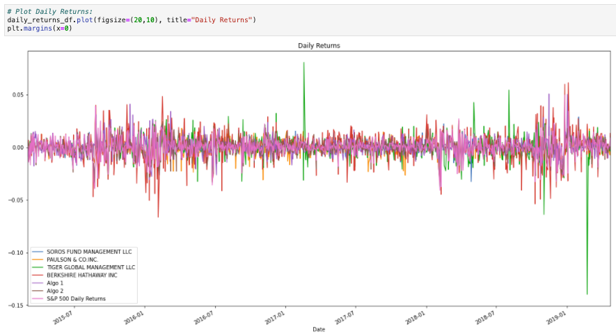
Based on the above graph, on a day-to-day basis, the S&P 500 at-large is less volatile than any of the individual portfolios, which makes sense. Tiger Global Management is the most volatile portfolio, with swings much larger than any other; it may significantly outperform the S&P 500 at times, but at other times, it significantly underperforms the S&P 500. Berkshire Hathaway also appears to display some volatility, at times outperforming the S&P 500, but not to the extent of Tiger Global.
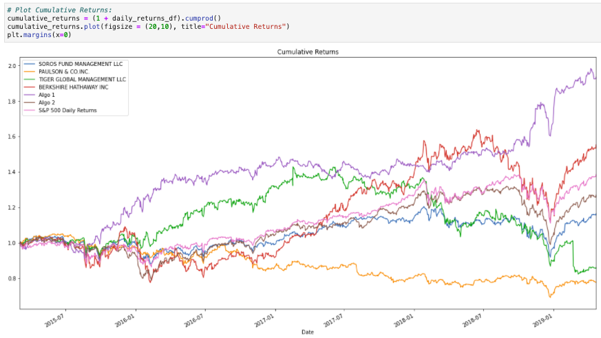
Based on the above graph, during this 4-year stretch from 2015-2019, Algorithm 1 performed the best and led to the most cumulative returns: it started to separate itself in early 2019. This is followed by Berkshire Hathaway, and in third, the S&P 500. Paulson & Co. Inc. had the worst cumulative returns over the 4-year period; in fact, Paulson and Tiger Global Management were the only portfolios to finish in the red.
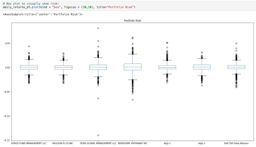
The largest spread in the above box plot is for the portfolio of Berkshire Hathaway Inc. The smallest spread in the above box plot is for the portfolio of Paulson & Co. Inc. It should be noted that although Tiger Global Management does not have the largest spread, it does have the greatest outliers.
Before moving forward, it was necessary to calculcate each portfolios' Standard Deviation using the ".std()" function, along with the annualized Standard Deviation:
# Calculate the standard deviation for each portfolio:
daily_std_df = pd.DataFrame(daily_returns_df.std()).rename(columns = {0:"Standard Deviation"})

# Calculate the annualized standard deviation (252 trading days):
annualized_std_df = daily_std_df * np.sqrt(252)
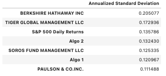
We see here that both Tiger Global Management and Berkshire Hathaway have higher annualized standard deviations than S&P 500 returns.
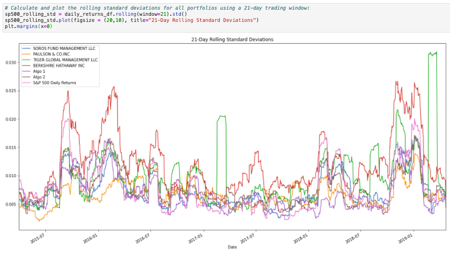
What we see in the above graph is that in general, all portfolios tend to see an increase in risk at the same time risk increases in the S&P 500. However, the magnitude of these increases vary greatly; for instance, Berkshire Hathaway and Tiger Global Management have a few large spikes in rolling standard deviations, indicating increased risk, while the S&P 500 only sees slight increases in risk during the same timeframe.
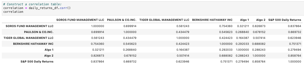
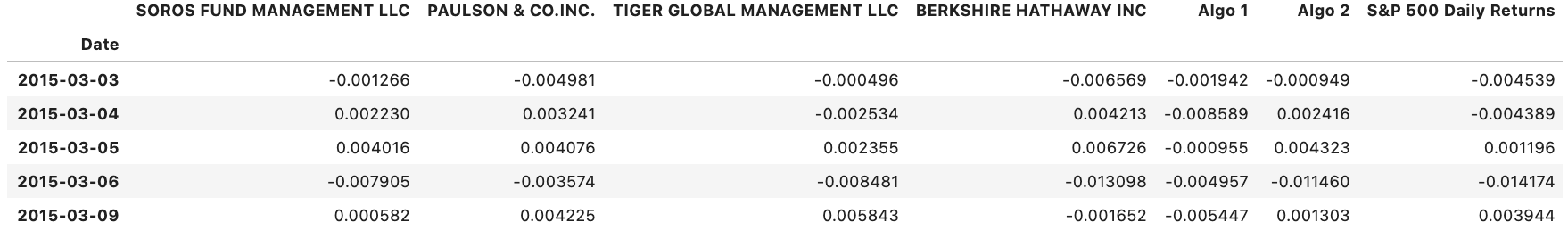
Based on the above correlation table, Algo 2 most closely resembles the returns of the S&P 500 at an 85.9% correlation, followed closely by Soros Fund Management at 83.8%. Algo 1 least resembles the returns of the S&P 500, only correlating at 27.9%.
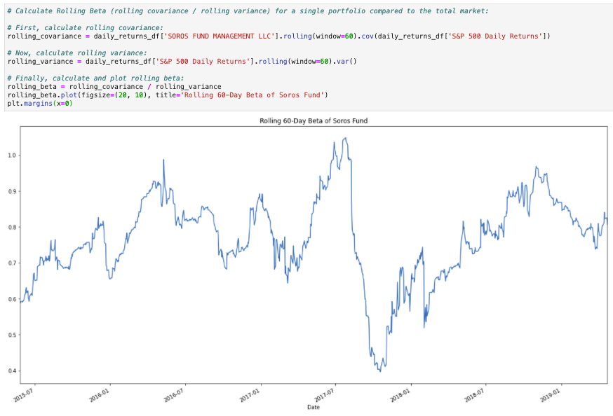
The above Rolling Beta plot of the Soros Fund tells us about the volatility of the portfolio. A beta of 1 indicates that the security's price tends to move with the market; a beta greater than 1 indicates that the security's price tends to be more volatile than the market; a beta of less than 1 means it tends to be less volatile than the market. We see that in general, the Soros Fund tends to be less volatile than the overall market, staying at a rolling beta of less than 1 for the vast majority of the 4-year period (rolling beta goes above 1 for a short time in early 2017). This indicates that the portfolio is not in fact sensitive to movements in the S&P 500. This is in line with the calculations we saw above, in which the Soros Fund was on the low-end of standard deviation scores.
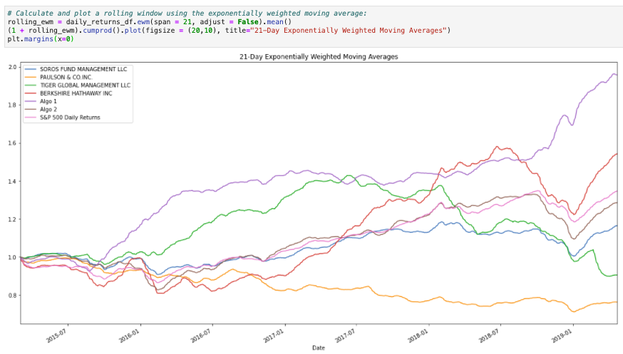
When plotting the exponentially-weighted moving average with a 21 day half-life, we see that Algo 1 tends to react more significantly to recent price changes than does any other portfolio.
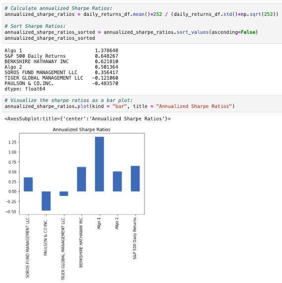
On the basis of Sharpe Ratios, Algo 1 outperformed both the market as a whole as well as the Investment Mangement Firm portfolios. Algo 2, however, underperformed the market as a whole, as well as Berkshire Hathaway. Both Algo 1 and Algo 2 outperformed Soros Fund Managment, Paulson & Co. and Tiger Global Management.
At this point, I wanted to load in my own hypothetical portfolio and compare it to the portfolios I evaluated above. I used Google Finance within Google Sheets to load in 1 year's worth of stock data for 3 stocks - Apple (AAPL), Google/Alphabet (GOOG), and Costco (COST). After loading in the 3 dataframes and concatenating, all columns containing closing prices instead of returns, it was necessary to convert to daily returns and add to the original dataframe, which contained the other portfolios:
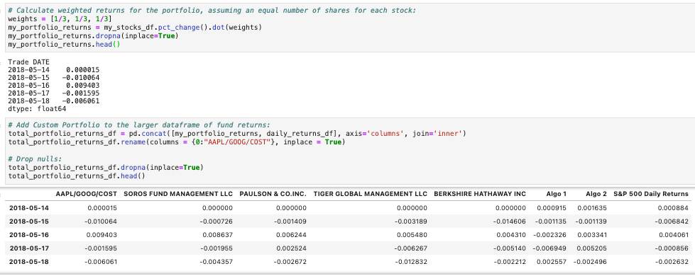
Now, I could re-run my portfolio analysis to see how my equally-weighted custom portfolio of Apple, Google and Costco compared to the other portfolios:
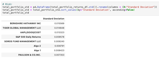
As we saw the first time we ran the Standard Deviation table, Tiger Global Management LLC and Berkshire Hathaway Inc. have higher standard deviations than, and are therefore riskier than, the S&P 500. This table also includes my custom portfolio, however, and we see here that my custom portfolio of AAPL/GOOG/COST likewise has a higher standard deviation than, and is therefore riskier than, the S&P 500. This makes sense, as a portfolio of 3 stocks compared to a portfolio of 500 has much less diversification and therefore is much riskier.
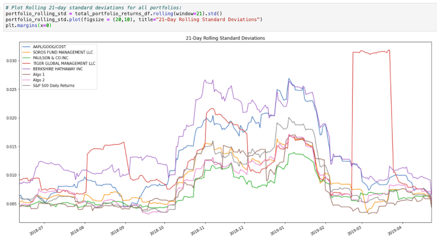
As we saw the first time we ran the 21-Day Rolling Standard Deviation plot, all portfolios tend to see an increase in risk at the same time risk increases in the S&P 500. However, the magnitude of these increases vary greatly; for instance, Tiger Global Management has a few large spikes in rolling standard deviation, indicating increased risk, while the S&P 500 only sees slight increases in risk during the same timeframe. My custom portfolio of AAPL/GOOG/COST appears to be on the high end of the scale, certainly always above the rolling standard deviation of the S&P 500.
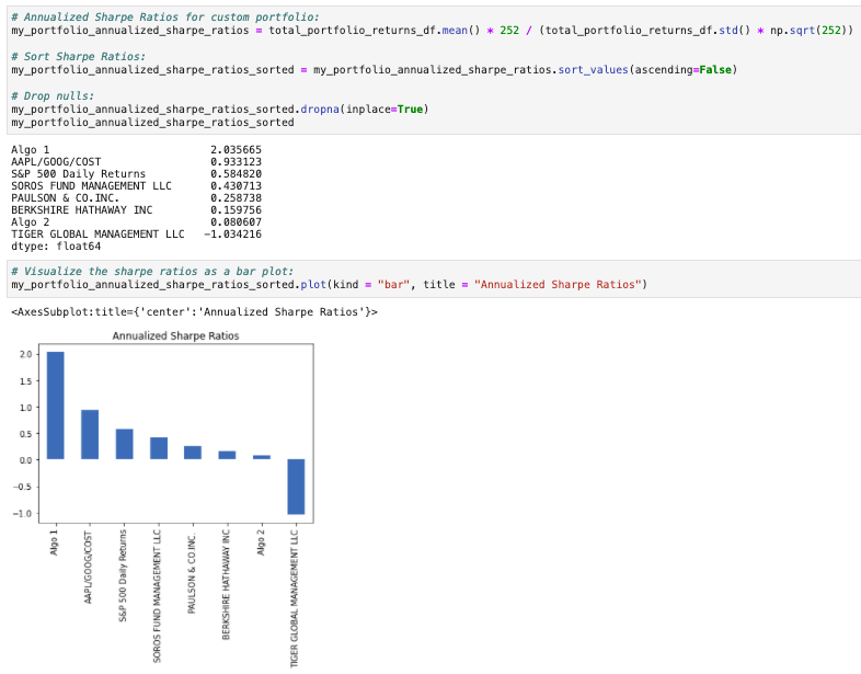
On the basis of Sharpe Ratios, Algo 1 outperformed both the market as a whole as well as the Investment Mangement Firm portfolios. My custom portfolio of AAPL/GOOG/COST came in 2nd, just in front of the S&P 500.

Based on the above correlation table, the returns of AAPL/GOOG/COST most closely resemble the returns of the S&P 500 at 87.2% correlation; they least closely resemble the returns of Algo 1 at only 26.1%.