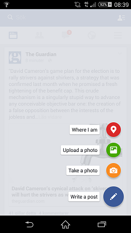
A FloatingActionButton displays the primary action in an application. It is a round icon button that’s elevated above other page content. Floating action buttons come in a default and mini size.
Floating action buttons provide quick access to important or common actions within an app. They have a variety of uses, including:
- Performing a common action, such as starting a new email in a mail app.
- Displaying additional related actions.
- Update or transforming into other UI elements on the screen.
The following code shows how the FloatingActionButton should appear in your layout file:
<android.support.design.widget.FloatingActionButton
        android:id="@+id/fab"
        android:layout_width="wrap_content"
        android:layout_height="wrap_content"
        android:layout_gravity="end|bottom"
        android:src="@drawable/ic_my_icon"
        android:contentDescription="@string/submit"
        android:layout_margin="16dp" />
You can then apply an View.OnClickListener to handle FAB taps. For example, the following code displays a Snackbar when the user taps the FAB:
FloatingActionButton fab = findViewById(R.id.fab);
fab.setOnClickListener(new View.OnClickListener() {
    @Override
    public void onClick(View view) {
        Snackbar.make(view, "Here's a Snackbar", Snackbar.LENGTH_LONG)
                .setAction("Action", null).show();
    }
});