This is the repository behind the BVN styleguide. It's job is to allow the whole world to see how we use our assets.
If you would like to make a contribution then there are two ways:
- If it's a simple change, something like a typo, then you can just use the GitHub interface to submit a pull request.
- If it's more complicated then follow the instructions below.
Most of the instructions below are for Windows. If you are lucky enough to be using a unix machine then you are probably smart enough to figure it out on your own.
- Install Git-for-windows
- Install Github desktop
You need to get the project from GitHub before you can work locally:
- Open GitHub for desktop,
- Press the "+" sign at the top left,
- Select "clone",
- Pick the repository to work on and press clone,
- Select location on your computer to create the files, press OK.
- Download and install Ruby 32bit or 64bit. Tick "Add Ruby executables to your PATH"
- Download Ruby Dev Kit 32Bit or 64bit. Extract at 'C:\RubyDevKit'
- Move/copy 'gemfile' from cloned GitHub folder (styleguide) into 'C:\RubyDevKit'
- Open cmd.exe and run the following lines separately (NOTE: The software Avast is know to have problems with installing gems, disable before installing Ruby gems.):
    cd C:\RubyDevKit
    ruby dk.rb init
    ruby dk.rb install
    gem install jekyll
    gem install bundler
    gem install rdiscount
    bundle install
- Install Python v2.7.11 32bit or 64bit At "Customize Python", click on 'Add python.exe to path' and choose 'Entire feature will be installed on local drive'
- Download pip.py and move it into 'C:\Python27'.
- Open cmd.exe and run the following lines separately:
    cd C:\Python27
    python -m pip install Pygments
- In depth guide for troubleshooting: Windows Mac and Linux
There are some compatibility issues with ruby and jekyll for windows operating systems. If you are running on Linux or Mac OS, ignore this stage.
- Reference file directories do not need any "../" indicating a move out of folder. It works as a local host in windows but will not work in GitHub.
- There are occasions where the GitHub gem would not be installed into ruby. Use 'Git Bash' as the command prompt.
Sublime Text 3 is an excellent editor for SVG, markdown and html.
- "Create a new branch" within GitHub (desktop application).
- Change branch to the new assigned branch.
- Make changes to files and sync (pull and push) changes.
- "Create pull request," add the title and description.
- On github.com, navigate to pull requests and select the submitted pull request.
- Check for any error/warnings before merging the pull request.
- Press “Merge pull request,” Press “Confirm merge.”
- Clean up branch if necessary.
To test your Jekyll files on you computer before syncing:
- Navigate to your folder file in GitBash. (NOTE: You can press 'shift + right click' to open GitBash and cmd.exe with the folder, skipping the 'cd C:/...' line)
- Run line in GitBash:
bundle exec jekyll serve
NOTE: if you receive a message similar to:
C:/Ruby200-x64/lib/ruby/gems/2.0.0/gems/bundler-1.11.2/lib/bundler/spec_set.rb:94:in 'block in materialize': Could not find minitest-5.8.4 in any of the (Bundler::GemNotFound)
Run bundle install again.
NOTE: Continue if receive similar message:
Configuration file: D:/BVN/styleguide/_config.yml
            Source: D:/BVN/styleguide
       Destination: D:/BVN/styleguide/_site
      Generating...
                    done.
  Please add the following to your Gemfile to avoid polling for changes:
    gem 'wdm', '>= 0.1.0' if Gem.win_platform?
 Auto-regeneration: enabled for 'D:/BVN/styleguide'
Configuration file: D:/BVN/styleguide/_config.yml
    Server address: http://0.0.0.0:4000/
  Server running... press ctrl-c to stop.
- Navigate in chrome or Firefox to:
http://localhost:4000/styleguide/
- Adjust changes as above before pushing the changes.
Synchronising your files with GitHub will allow you to work on a project with multiple people and keep track of every change. Sync at regular intervals to keep local and server files up to date.
- Press "Sync" in the top right to receive changes to files
- Commit a change to officially note the changes to Github: Insert a summary and press "Commit to ..."
- Press "Sync" in the top right to upload and receive files.
<span class="highlight-red">= changes the text colour to red, rbg(255, 0, 0)<span class="transform-to-uppercase">= Transforms the text to all capital letters (e.g. Finnish -> FINNISH)_CONTENT_= Changes CONTENT into Italics__CONTENT__= Changes CONTENT into Bold- CONTENT= Makes content into dot-points
The style guide is easily edited by changing the content files within the page folder which needs reviewing. The _includes folder on the main directory is sorted into pages, find the folder relating to the page in which you want to adjust. Inside the folder are markdown files, use the _posts folder to find the page to change and open the file. This will show the order of arrangement. Opening a markdown file will be based of text to edit. Save changes and check to see if your changes are appropriate via localhost:4000.
The format of the style guide is simplistic, each page of the style guide has a markdown file in the _posts folder. Below is an example of the 2015-11-30-logo.markdown file:
{% include logo/geometrical-form.markdown %}

{% include logo/clear-space.markdown %}

{% include logo/size.markdown %}
The page will search for the following file and insert the information, which will contain the information to fill out the page. For example, the logo page will gather the information in the logo/geometrical-form.markdown file and THEN the logo/clear-space.markdown etc. The page will fill from the top-down.
Each page layout is similar to the image below:
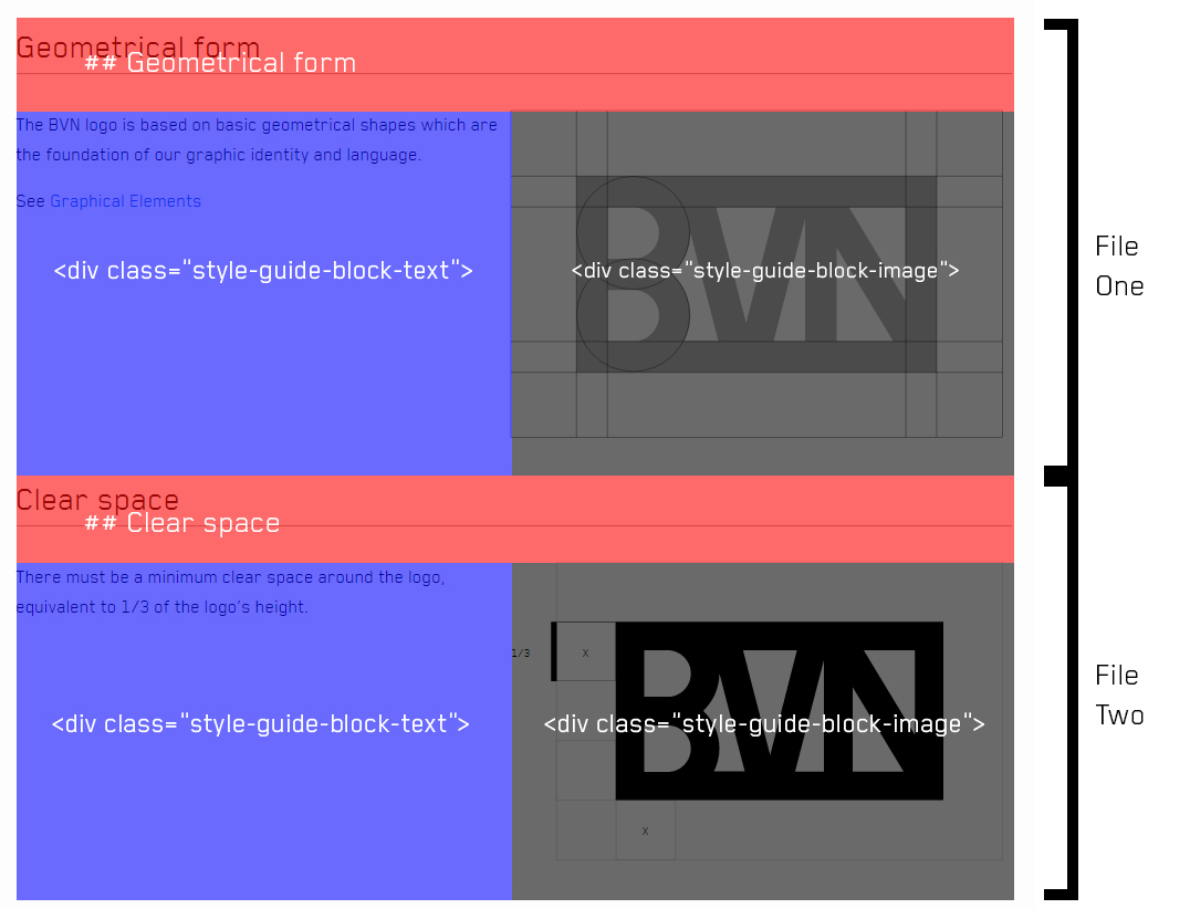
"style-guide-block-image" = block width 50% (See Logo page)
Images are stored within each respective file. Use the include function to place an image e.g.
{% include logo/images/text-bot.svg %}
The CART guide is overall more difficult when compared against the Styleguide. Just like the Styleguide, each pages content is divided into its own content. However each section is differently designed to match the identical style in the printed version.
Each CART page is different and required their unique format.
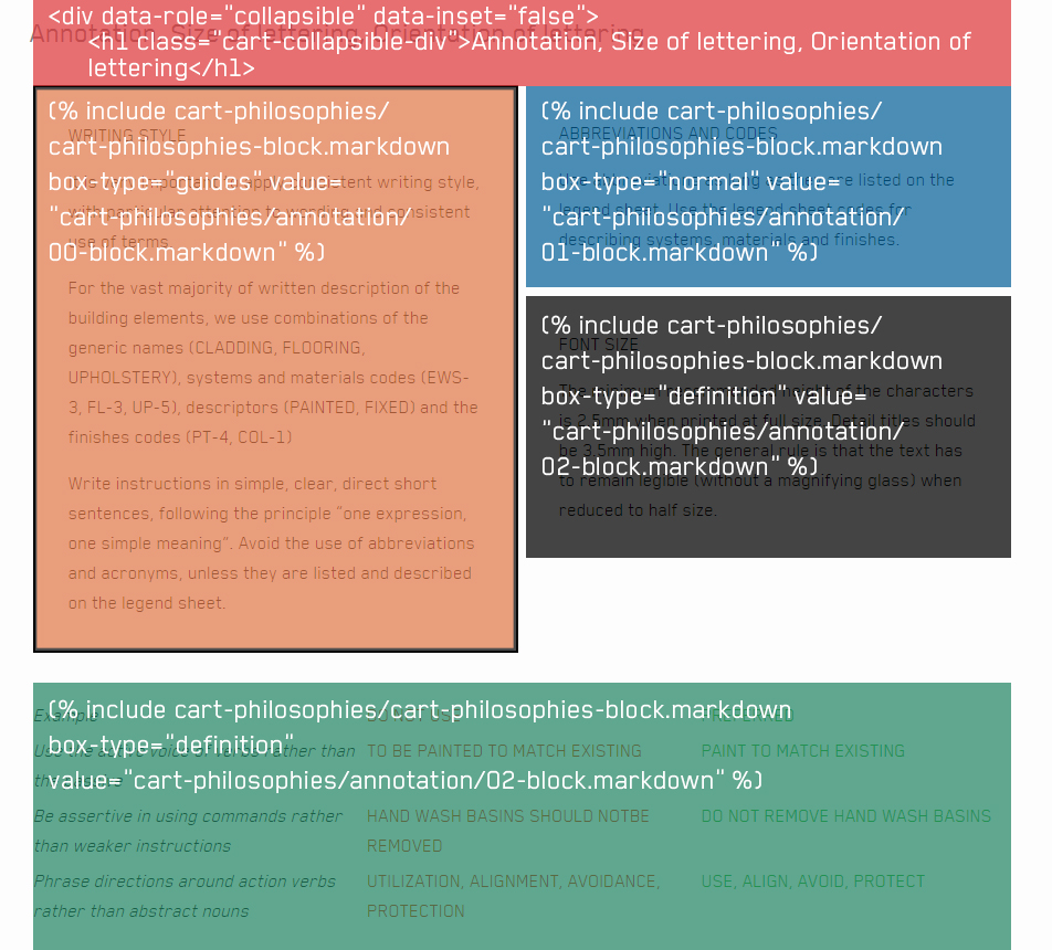
The CART Philosophies page is made up of several markdown file, each individually representing a topic. CART Philosophies also uses masonry.js to automatically stack all the blocks. All the files are hidden within collapsible divs and they expand the content when opened. THe JavaScript automatically stacks the box layouts so they are automatically handled, adding more boxes will be sorted automatically! The style must be kept to be used, for example:
  <div data-role="collapsible" data-inset="false">
    <h1 class="cart-collapsible-div">TITLE</h1>

    <div class="cart-philosophies-wrapper">
    ...
    </div>

  </div>
<div class="cart-philosophies-wrapper"> is used to hold all boxes within a collapsiable div, it is necessary for the Javascript to run. Within the "cart-philosophies-wrapper", there are directions to each respective folder containing the content of the page. The directory looks identical to this:
  {% include cart-philosophies/cart-philosophies-block.markdown box-type="normal" value="cart-philosophies/codes/00-block.markdown" %}

  {% include cart-philosophies/cart-philosophies-block.markdown box-type="table" value="cart-philosophies/codes/01-block.markdown" %}
The value should be changed to suit the folder and block number.There are different box-type each with different variables:
normal= Plain box with no boarder or shadingdefinition= Shaded grey box with no borderguides= Plain box with a black bordertable= Maximum width, best for table formatsguides-table= Combination of both guides (border) and table (width)
Tables are made up of different column properties, editing the content is easy however editing the format is hard. They can be changed within _sass/_cart-philosophies.scss. Each table has different properties and can be identified by the classes. Table format looks identical to this:
  <div class="cart-philosophies-grid-wrapper" markdown="1">
    <span class="cart-philosophies-grid-codes-one-of-three">**CODE**</span>
    <span class="cart-philosophies-grid-codes-two-of-three">**BUILDING ELEMENT**</span>
    <span class="cart-philosophies-grid-codes-three-of-three">**LEGEND SHEET DESCRIPTION POINTER**</span>
  </div>
This page uses masony.js. It allows the page to stack blocks automatically to remove white space by stacking all boxes automatically. The Javascript is found at: _includes/cart-philosophies/masonry-script.markdown
The files are located at _includes/alphabet and the content for the letters are within _includes/alphabet/alphabet-markdown. There is a markdown file for each letter of the BVN alphabet and their content. The content is formatted into a grid, content is inserted into the grid by cell. The image below explains:
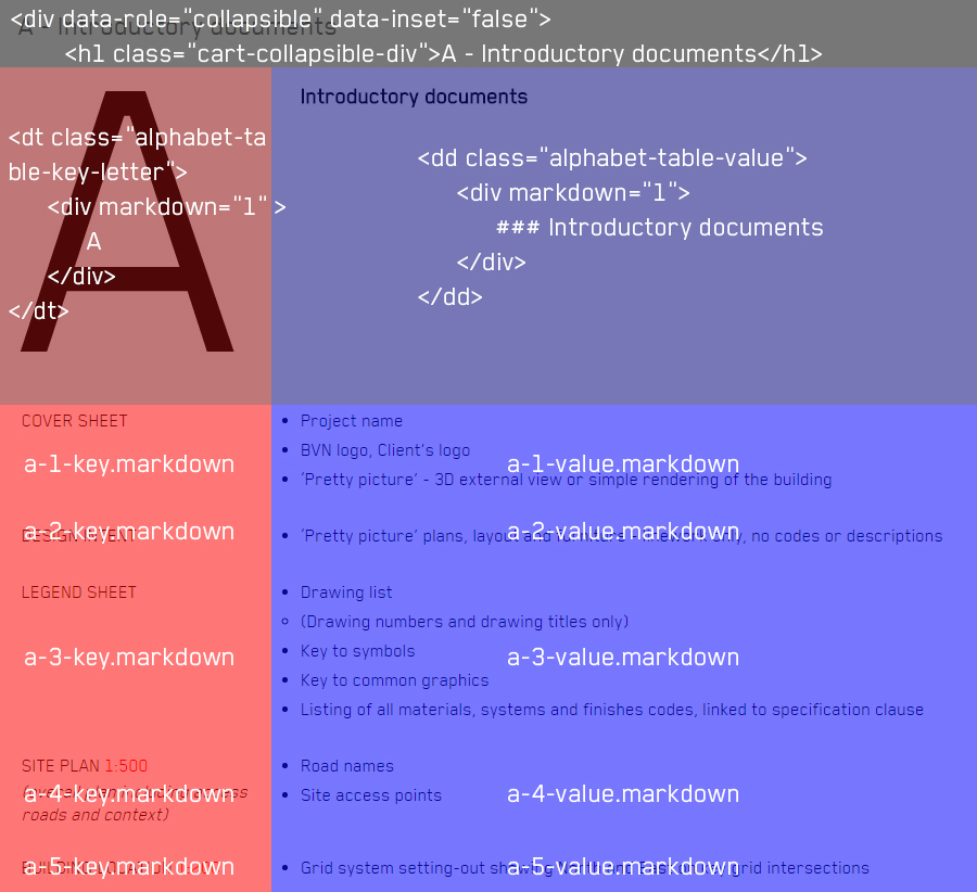
<dt class="alphabet-table-key-letter">= Row cell is the capital letter of the designated letter<dd class="alphabet-table-value">= Cell right of the capital letter<dt>= Left column<dd>= right column
Below is the content framework for the collapsible alphabet page. It is important to keep this format for each letter:
  <div data-role="collapsible" data-inset="false">
    <h1 class="cart-collapsible-div">A - Introductory documents</h1>
    <dl>
      ...
    </dl>
  </div>
Content must be changed in the appropriate file at: _includes/alphabet/alphabet-markdown. To add a row, Copy and paste this format:
<dt>
<div markdown="1">
{% include alphabet/alphabet-markdown/# LETTER#/# LETTER#-# NUMBER#-key.markdown %}
</div>
</dt>
<dd>
<div markdown="1">
{% include alphabet/alphabet-markdown/# LETTER#/# LETTER#-# NUMBER#-value.markdown %}
</div>
</dd>
Replace # LETTER# and # NUMBER# with the appropriate figure, then insert new markdown files into the appropriate letter.
Similarly to Alphabet, the Building Components pages have tables that use the <dl> tag to construct the format. It is divided into multiple pages to help reduce pre-loading weight.
The pages are constructed at /building-components-pages however the content for the pages is located at includes/building-components
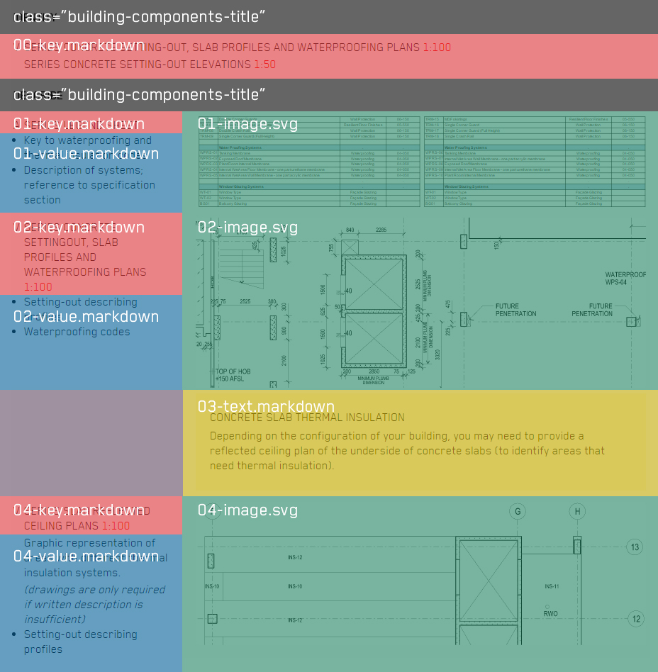
Use the following to insert a title block, demonstrated by the black box above:
<div markdown="1" class="building-components-title">
<span class="transform-to-uppercase">CONTENT</span>
</div>
To add another content row copy the format and replace # TOPIC# # LETTER# and # NUMBER# with the appropriate figure, then insert new markdown files into the appropriate fields:
{% include building-components/table-layout-block.markdown letter="# LETTER#" key="building-components/# TOPIC#/# NUMBER#-key.markdown" value="building-components/# TOPIC#/# NUMBER#-value.markdown" %}
{% include building-components/table-layout-image.markdown image="building-components/# TOPIC#/# NUMBER#-image.svg" %}
A row consist of three parts with two columns: Left column contains both the Key and Value, Right column contains the image or text.
- The 1st
{% include %}is the building components text for the left hand column, consisting of two rows. The top row is thekeyand the bottom row is thevalue(2nd can be left blank, however must exist). The letter is inserted on the top left of the first row, it can be left blank " ". - The 2nd
{% include %}outlines the framework size for the images. Images have the maximum width of320pxto make all images the same size. For text, replacetable-layout-image.markdownwithtable-layout-text.markdownand reference the markdown file.
NOTE: If there is no image or text needed to match the text, you can remove the second statement. The sequence of ascending numbers also continues.
To make the any block extend width, use the following instead:
{% include building-components/table-layout-initial.markdown letter="# LETTER#" key="building-components/# TOPIC#/# NUMBER#-key.markdown" value="building-components/# TOPIC#/# NUMBER#-value.markdown" %}
NOTE: Using a the second image include will place the image below text.
We use Waffle to prioritise issues, to see what we think needs to be worked on next go to the board
