Home
- Add
pod 'AMPopTip'to yourPodfile - Run
pod install - Run
open App.xcworkspace
- Add
github "andreamazz/AMPopTip" - Run
carthage update - Add
AMPopTip.frameworkin your project
The API is fairly straight forward, you can show and hide the popover at any time.
You must specify the text that you want to display alongside the popover direction, its max width, the view that will contain it and the frame of the view that the popover's arrow will point to.
let popTip = PopTip()
popTip.show(text: "Hey! Listen!", direction: .up, maxWidth: 200, in: view, from: someView.frame)
You can also display the popover in the center, with no arrow, in this case the from can be the whole view:
popTip.show(text: "Hey! Listen!", direction: .none, maxWidth: 200, in: view, from: view.frame)Please note that the frame you are intended to provide needs to refer to the absolute coordinate system of the view you are presenting the popover in. This means that if you are presenting the popover in a view, pointing to a nested subview, you'll need to convert its frame using UIKit's convertRect(_:toView:). Read the reference here.
You can provide a custom view that will be wrapped in the PopTip and presented.
let customView = UIView(frame: CGRect(x: 0, y: 0, width: 100, height: 100))
// Configure your view
popTip.show(customView: customView, direction: .down, in: view, from: someView.frame)You can hide the popover by calling:
popTip.hide()Or you can specify the duration of the popover:
popTip.show(text: "Hey! Listen!", direction: .up, maxWidth: 200, in: view, from: someView.frame, duration: 3)You can also let the user dismiss the popover by tapping on it:
popTip.shouldDismissOnTap = trueYou can add a block that will be fired when the user taps the PopTip...
popTip.tapHandler = { popTip in
  print("\(popTip) tapped")
}
... when the popover is shown...
popTip.appearHandler = { popTip in
  print("\(popTip) appeared")
};
... or when the popover is dismissed:
popTip.dismissHandler = { popTip in
  print("\(popTip) dismissed")
}You can choose which animation should be performed when the popTip is displayed:
popTip.entranceAnimation = .scale;Available animations:
PopTipEntranceAnimation.scale,
PopTipEntranceAnimation.transition,
PopTipEntranceAnimation.none,
PopTipEntranceAnimation.customYou can provide your own animation block when using PopTipEntranceAnimation.custom:
popTip.entranceAnimationHandler = { [weak self] completion in
  guard let `self` = self else { return }
  self.popTip.transform = CGAffineTransform(rotationAngle: 0.3)
  UIView.animate(withDuration: 0.5, animations: {
    self.popTip.transform = .identity
  }, completion: { (_) in
    completion()
  })
}
This sample makes the PopTip rotate on entrance. Make sure to call the completion block when the animation is done. Also note that the animation is fired as soon as the PopTip is added as subview.
Action animations are subtle animations that can be performed to get the user's attention. Set your preferred animation:
popTip.actionAnimation = .bounce()Available animations:
PopTipActionAnimation.bounce,
PopTipActionAnimation.float,
PopTipActionAnimation.pulse,
PopTipActionAnimation.none
The animation is fired as soon as the popover enters the scene and completes its entrance animation, if startActionAnimationOnShow is set to true.
You can pass a custom value as an associated value to customize the action animation:
popTip.actionAnimation = .bounce(16) // This will bounce for 16px instead of the default value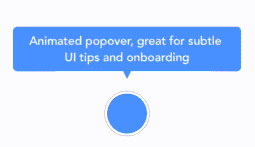
The arrow is centered by default, and moves to avoid the edge of the screen. You can manually change the offset from the center using the bubbleOffset property.
Use the appearance proxy to customize the popover before creating the instance, or just use its public properties:
textColor = <#UIColor#>;
textAlignment = <#NSTextAlignment#>
bubbleColor = <#UIColor#>
borderColor = <#UIColor#>
borderWidth = <#CGFloat#>
cornerRadius = <#CGFloat#> // Popover's border radius
rounded = <#Bool#> // If set to YES the radius will equal frame.height / 2
offset = <#CGFloat#> // Offset between the popover and the origin
padding = <#CGFloat#>
edgeInsets = <#UIEdgeInsets#>
arrowSize = <#CGSize#>
animationIn = <#TimeInterval#>
animationOut = <#TimeInterval#>
delayIn = <#TimeInterval#>
delayOut = <#TimeInterval#>
entranceAnimation = <#PopTipEntranceAnimation#>
actionAnimation = <#PopTipActionAnimation#>
actionAnimationIn = <#TimeInterval#>
actionAnimationOut = <#TimeInterval#>
actionDelayIn = <#TimeInterval#>
actionDelayOut = <#TimeInterval#>
edgeMargin = <#CGFloat#>
bubbleOffset = <#CGFloat#> // Offset between the bubble and the arrow