
You should be reaaaaally familiar with Slack at this point, but just to make it more clear, Slack is a cloud-based set of team collaboration tools and services or in simpler terms, it is a chatting program.
We use the app almost every day to keep our communications with our classmates and the Ironhack team, so we know perfectly the chat interface but today we are going to clone their landing page. Here you can visit the website and check what are we going to do. 😜
We want to practice our new Flexbox skill, so we are going to implement the "responsiveness" of the landing page. No worries, we will show you what we need!
- Fork this repo
- Clone this repo into your
~/code/labs - Include both the client and server applications in your submission.
- Upon completion, run the following commands
git add .
git commit -m "done"
git push origin master
- Navigate to your repo and create a Pull Request
The starter_code contains the basic structure of an HTML & CSS project to start working. You will also find and images folder where all the images you will need for the project are stored.
In the HTML you find all the text needed! Focus on give it some style!
Mobile first right? 😉
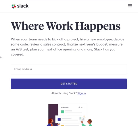
Firs, we are going to clone the mobile design of the webpage! 📱 Oh! Remember to use flexbox, because it will be really helpful later on when we need to adapt it to different screen-size!
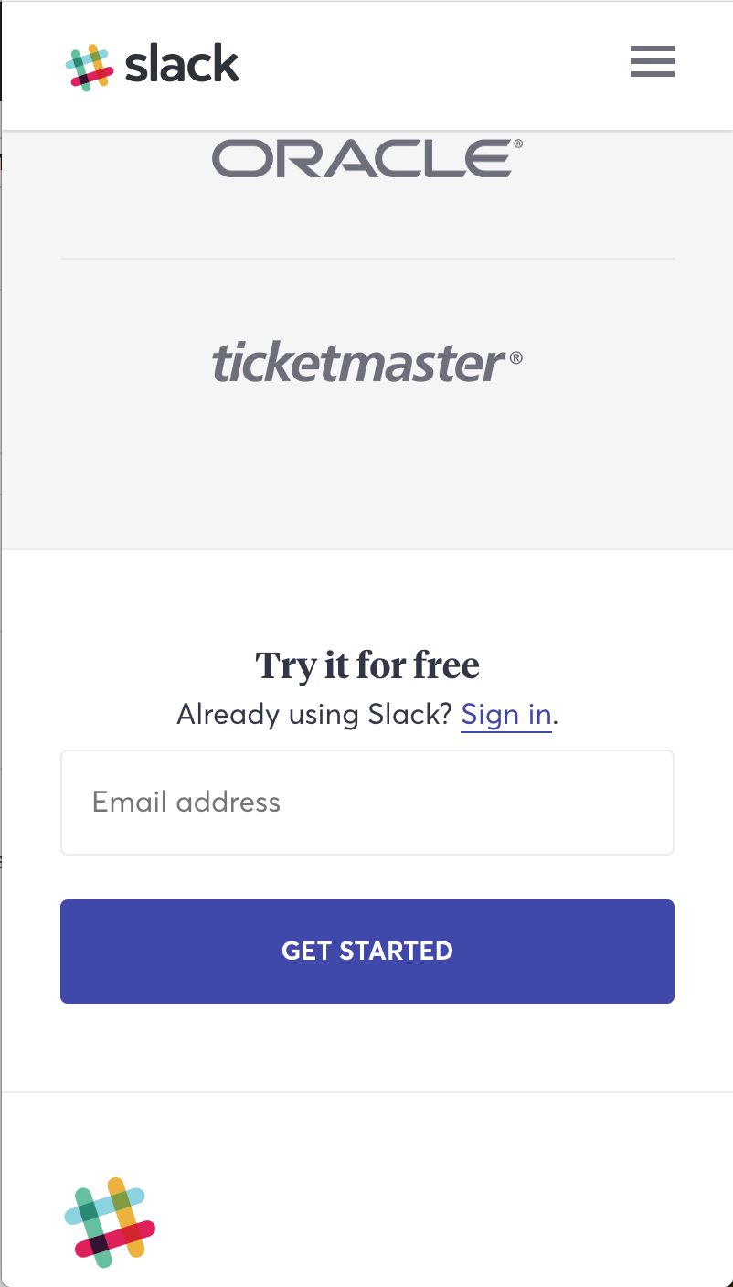
After doing your magic, you should have something like this:


Let's start growing our screen size. Focus on small screens (iPads, tablets or bigger smartphones). Notice we have some changes. You need to work on the following ones:
-
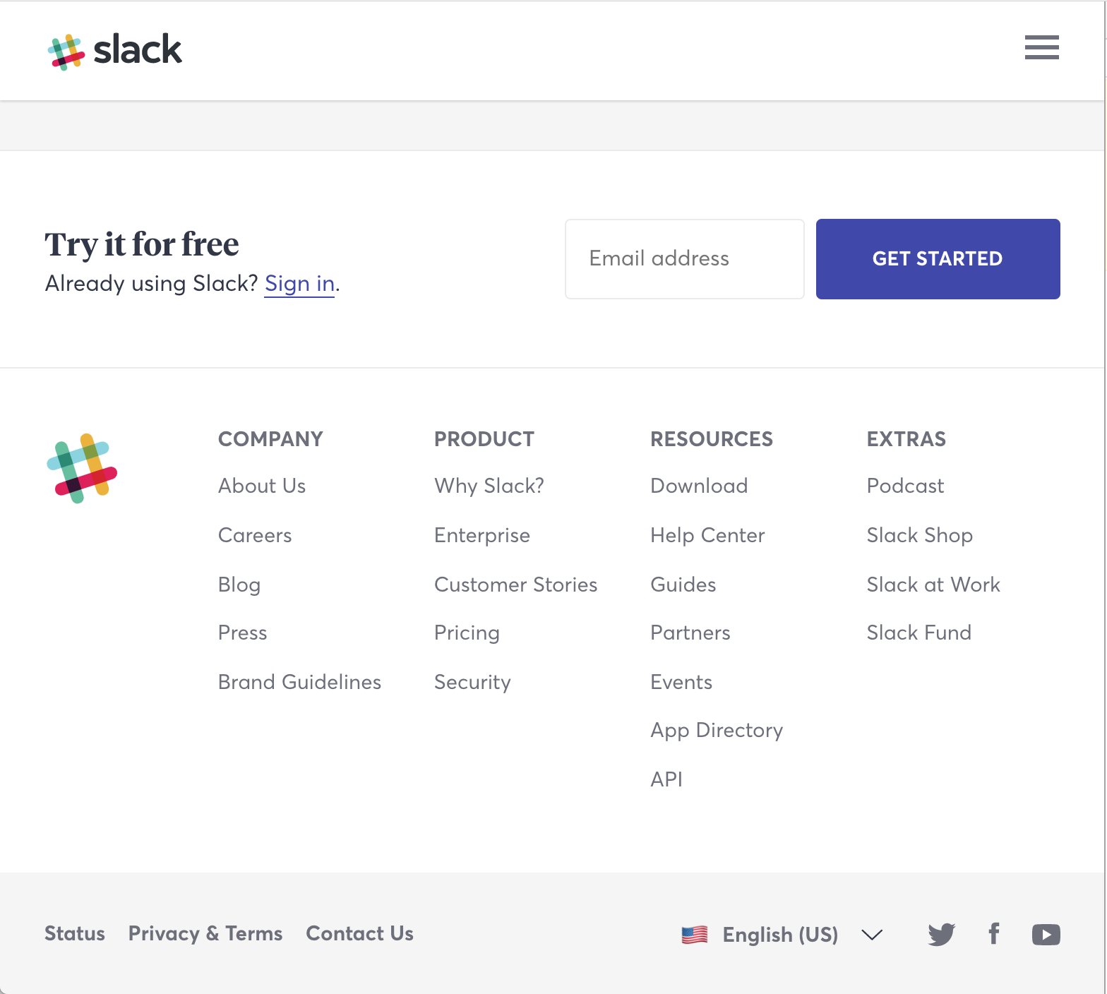
The buttons and inputs stop occupying 100%.
-
Now we have 2 companies logos on each row.
-
The subfooter goes from 2 columns, to display all the 4 columns in the same row.
-
The footer goes from 3 different rows of content to a simple row displaying some info at the left and some to the right.


The easiest change we will have. You should display 3 logos per row on the "You're in good company" section. Easy peasy!

Last one! Some small changes and we are done!
-
Our nav-bar starts to show all the menu links, so go ahead, remove the collapse icon and add the list.
-
On the top of the webpage, the image is displayed in line with the "Where work happens" text. If you are using
flex-box(you must 😉 ), this should be super easy!


