The umap-prediction-visualizer is a prototype visual analytics dashboard to visualize and explore the training process of the UMAP ML method for the given data. This application serves as a proof-of-concept with several analytical goals:
- compare the UMAP space distribution of reference (training) and live data
- spot changes and inconsistencies in the live data over time
- see the distribution and mutual separation of the categories in time and (UMAP) space
At the initialization, the application loads two datasets - lists of reference and live data. Each reference (training) data point has X, and Y coordinates defined by the UMAP clustering method and the reported category. Live data consists of the x, and y coordinates, the category, and the timestamp in which the data were collected.
The application layout consists of several sections with several interactions. The user can define his temporal, spatial (UMAP space), and categorical filters, which will be propagated across components.
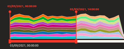
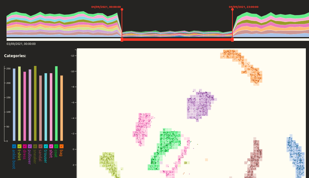
The timeline section provides a stacked area chart and shows the distribution of various category classifications in live data over time. The bottom part functions as an interactive input slider allowing the user to define the focus time range. The focus time range is then visually highlighted in the stacked area chart, and the boundary points are labeled on top of the section. This temporal selection is then linked to the other sections.
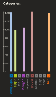
The legend section has several functions. First, it is a guideline to identify category groups with colors. Above the list of categories, a histogram shows the distribution of category predictions in live data over the selected time. A highlighted portion of the bar depicts the data selected within the UMAP space(see Scatter plot section). Users can also turn on and off categories based on their interests.


This is the primary section of the dashboards. The main function of the scatter plot is to display the live data of selected categories and time on top of the reference data. The scatterplot shows the reference data in the form of a heatmap - the functional UMAP space is first divided into bins of a given X and Y size. For each bin, the particular reference data points are identified. The cell is then colored based on the dominant category of the identified points. The opacity of the bin color depicts the number of data points of the dominant category. The heatmap is then covered by the circle symbols representing the live data points in the selected category and time. The use of the combination of two visualization methods, heatmap and circle symbols, improves the potential of visual comparison. The scatter plot allows the interaction of selecting a subset of live data points by drawing a rectangle. The rectangle drawing is activated by clicking the canvas. A second click confirms the selection, and a third click deactivates it.

In this section, every selected category within the data is represented by a small panel. This panel consists of a small scatter plot showing the distribution of all live data points labeled within this category, while those within the temporal selection (see Timeline section) are highlighted red. The scatterplot visualizes the distribution of reference data with contour maps. This method models the density of the data points in the continuous space through concentric lines. Moreover, the distribution of data points in UMAP space dimensions (x, y) is displayed within the following violin charts, which compare the reference data (right side) with the live data (left side), and the selected temporal live subset (left side, highlighted). The panel composition should provide a visual comparison of the spatial distribution of reference data, live data, and the selected time subset.

The provided data described in the Data section serve as a use-case scenario to test the application's capabilities. After the application is initialized, we can spot two significant irregularities within the timeline. First, the quantity of live data points drops on the fourth of September, and second, there is an overrepresentation of two categories (pullover, sandals) on the sixth of September.

Selecting the fourth of September, we can see that despite the overall drop in data point numbers, all the categories are represented equally, and the live data overlay the heatmap cells of the same category, which implies the consistency of the model prediction. Also, after selecting the data point clusters by rectangle within the scatter plot, it shows a very homogeneous composition. The small quantity of live data may have been caused by a smaller inflow of data for that day, technical problems in processing, or a stricter filter for input data.

Moving the temporal filter to the sixth of September, we can instantly spot two inconsistencies between the reference and live data in the scatter plot. Both categories that were previously identified as overrepresented within the selected time window are forming separate spatial clusters not corresponding to the reference data heatmap.
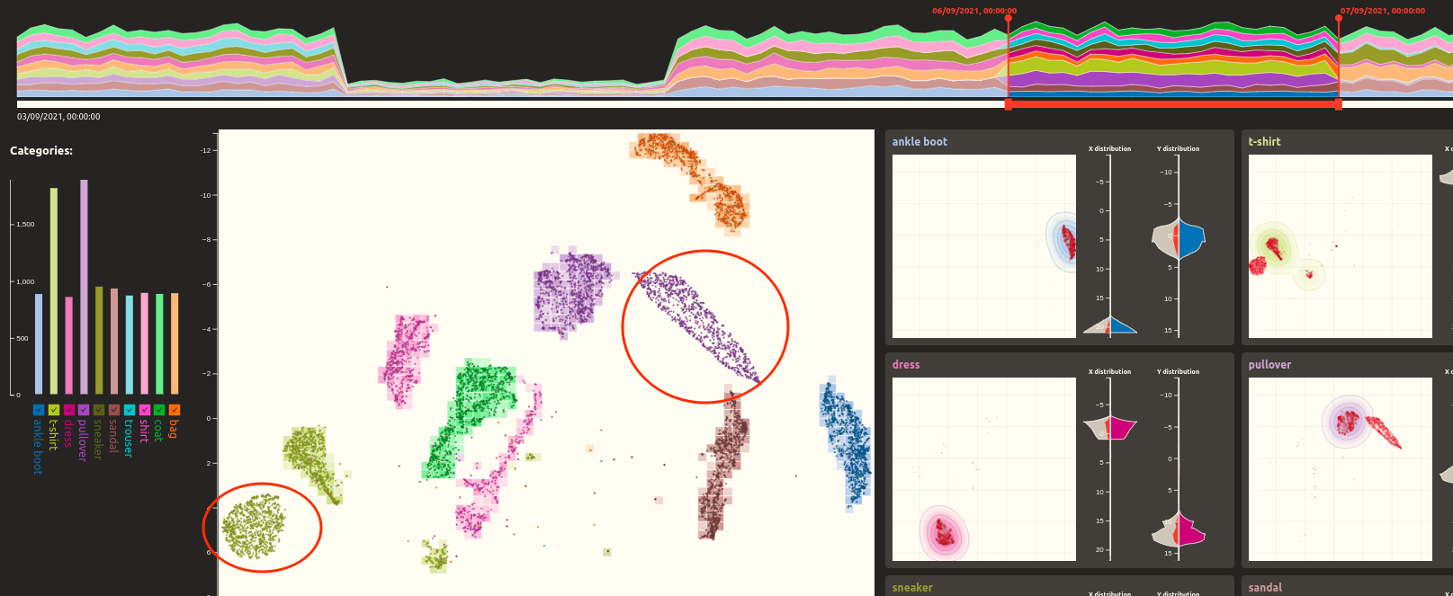
We can confirm these findings in the category panels. Here we identify the accumulation of points outside the reference points' density contours. Plus, in the violin charts, we recognise that the reference and live data's X and Y coordinate distributions are not entirely fitting. At the same time, the area of selected (red) data points presents a strong deviation from the reference data.


This substantial deviation may mean that the other live data of those two categories fit well with the reference data, which is easily proven by moving the temporal filter to the different time windows.

This deviation of the live data subset from the reference data may mean that (i) the training subset was chosen incorrectly, omitting certain subspaces, or (ii) the live data came with a new category that was not considered in the training process, or (iii) there is a specific problem considering the application of UMAP method to a subset of data within the identified time window.
The application runs on react-create-app, Typescript, Recoil, and SCSS. D3 and vanilla HTML5 Canvas were used for the visualization components.
While this application is, for now, only a proof-of-concept, there are numerous issues to be fixed and functionalities to be implemented. To list a few:
- refactor the memoized information within the components and provide a cleaner flow of the state values
- optimize the rendering functions with potentially extensive data points input
- add more data views, including more statistical insights (e.g., a chart showing the error rate of the live data over time)
- offer the option to load and work with custom data