Skip to content
New issue

Have a question about this project? Sign up for a free GitHub account to open an issue and contact its maintainers and the community.

By clicking “Sign up for GitHub”, you agree to our terms of service and privacy statement. We’ll occasionally send you account related emails.

Already on GitHub? Sign in to your account

Ux 603 New Radio component #261

Merged
merged 35 commits into from Dec 4, 2019
Merged
Show file tree
Hide file tree
Changes from 12 commits
Commits
Show all changes
35 commits
Select commit Hold shift + click to select a range
bf7fa17
Add readme and setup initial state
tristanjasper Oct 31, 2019
ad69545
adding canDeselect
tristanjasper Nov 1, 2019
6ca72ec
minor cleanup
tristanjasper Nov 1, 2019
52c81a1
move onclick to input
tristanjasper Nov 1, 2019
affbc8f
Merge branch 'master' into ux-603-radio-component
tristanjasper Nov 12, 2019
d59d097
Merge branch 'master' into ux-603-radio-component
tristanjasper Nov 15, 2019
2266270
cleanup
tristanjasper Nov 15, 2019
ce38f1e
Merge branch 'master' into ux-603-radio-component
tristanjasper Nov 19, 2019
141a64d
adding grouping
tristanjasper Nov 20, 2019
ec0b2c7
Merge branch 'master' into ux-603-radio-component
tristanjasper Nov 20, 2019
0f9aea1
adjust to support api on radio group element
tristanjasper Nov 21, 2019
cc9a443
Merge branch 'master' into ux-603-radio-component
tristanjasper Nov 21, 2019
4d3391c
better readme example
tristanjasper Nov 21, 2019
56e7e9c
readme cleanup
tristanjasper Nov 25, 2019
055fa5f
Merge branch 'master' into ux-603-radio-component
tristanjasper Nov 27, 2019
50db165
use nanoid
tristanjasper Nov 27, 2019
9d77e50
move props into inputProps
tristanjasper Nov 27, 2019
2d5aabc
adding name and fix onchange
tristanjasper Nov 28, 2019
e78df4d
fix focus colour
tristanjasper Nov 28, 2019
04d0335
change to a11y
tristanjasper Nov 28, 2019
d5d7436
Merge branch 'master' into ux-603-radio-component
tristanjasper Nov 29, 2019
b81d563
adding name and value to props
tristanjasper Nov 29, 2019
b6b39a0
add ways to selections
tristanjasper Nov 30, 2019
061b369
use value on select
tristanjasper Nov 30, 2019
4cae770
removed isSelectedProp
tristanjasper Dec 2, 2019
d5bf522
use context instead of cloning
tristanjasper Dec 2, 2019
4fe25c0
ux-603-update readme
tristanjasper Dec 2, 2019
9dfba7c
Merge branch 'master' into ux-603-radio-component
tristanjasper Dec 2, 2019
215deb4
remove function
tristanjasper Dec 2, 2019
42d1ca8
Merge branch 'master' into ux-603-radio-component
tristanjasper Dec 2, 2019
622137f
Change back to use cloneElement
tristanjasper Dec 4, 2019
3a8dcad
Merge branch 'master' of github.com:acl-services/paprika into ux-603-…
tristanjasper Dec 4, 2019
665cfcd
Merge branch 'master' into ux-603-radio-component
tristanjasper Dec 4, 2019
f5a10d6
Use react.children
tristanjasper Dec 4, 2019
a6452cc
change function title
tristanjasper Dec 4, 2019
File filter

Filter by extension

Filter by extension


Conversations
Failed to load comments.
Jump to
Jump to file
Failed to load files.
Diff view
Diff view
31 changes: 31 additions & 0 deletions packages/Radio/README.md
@@ -0,0 +1,31 @@
## Radio

The `<Radio>` component displays a radio input and label text beside it. When clicked it selects the input and deselects any other radio input in its group. It can also have an indeterminate state which can be used to group checkboxes.

### Installation

`> npm install --save @paprika/radio`
or
`> yarn add @paprika/radio`

### Usage

```js
import Radio from "@paprika/radio";

<Radio onChange={handleChange} checkState={checkedStateValue>
tristanjasper marked this conversation as resolved.
Show resolved Hide resolved
Radio 1
</Radio>;
```

### Props

- a11yText
- children
- isDisabled
- isChecked
- canDeselect
- onClick
- size ("small, "medium", "large")

[More detail about these props](https://github.com/acl-services/paprika/blob/master/packages/Checkbox/src/Radio.js)
29 changes: 29 additions & 0 deletions packages/Radio/package.json
@@ -0,0 +1,29 @@
{
"name": "@paprika/radio",
"version": "0.0.1",
tristanjasper marked this conversation as resolved.
Show resolved Hide resolved
"description": "Radio component",
"author": "@paprika",
"license": "MIT",
"main": "lib/index.js",
"repository": {
"type": "git",
"url": "https://github.com/acl-services/paprika/tree/master/packages/radio"
},
"publishConfig": {
"access": "public"
},
"dependencies": {
"@babel/runtime-corejs2": "^7.3.1",
"@paprika/helpers": "^0.2.3",
"@paprika/icon": "^0.2.0",
"@paprika/stylers": "^0.2.2",
"@paprika/tokens": "^0.1.9",
"prop-types": "^15.7.2",
"uuid": "^3.3.2"
},
"peerDependencies": {
"react": "^16.8.4",
"react-dom": "^16.8.4",
"styled-components": "^4.2.0"
}
}
91 changes: 91 additions & 0 deletions packages/Radio/src/Radio.js
@@ -0,0 +1,91 @@
import React from "react";
import PropTypes from "prop-types";
import uuid from "uuid/v4";
tristanjasper marked this conversation as resolved.
Show resolved Hide resolved
import { ShirtSizes } from "@paprika/helpers/lib/customPropTypes";
import CheckIcon from "@paprika/icon/lib/Check";
import radioStyles from "./Radio.styles";
import Group from "./components/Group";

const propTypes = {
a11yText: PropTypes.string,
children: PropTypes.node,
isChecked: PropTypes.bool,
isDisabled: PropTypes.bool,
canDeselect: PropTypes.bool,
onClick: PropTypes.func.isRequired,
size: PropTypes.oneOf(ShirtSizes.DEFAULT),
};
tristanjasper marked this conversation as resolved.
Show resolved Hide resolved

const defaultProps = {
a11yText: null,
isChecked: false,
canDeselect: false,
children: null,
isDisabled: false,
size: ShirtSizes.MEDIUM,
};

const Radio = props => {
const { a11yText, children, isChecked, canDeselect, isDisabled, size, onClick, ...moreProps } = props;

const radioId = React.useRef(uuid()).current;
const inputRef = React.useRef(null);

const styleProps = {
tristanjasper marked this conversation as resolved.
Show resolved Hide resolved
hasLabel: !!children,
size,
};

const handleKeyDown = event => {
if (
// Prevent scrolling the page with a spacerbar keypress
event.key === " " ||
// Prevent submitting forms in IE/Edge with and enter keypress
event.key === "Enter"
) {
event.preventDefault();
}
};

const handleKeyUp = event => {
const isTriggerKey = event.key === " "; // space key
if (!isDisabled && isTriggerKey) {
onClick(event);
}
};

const inputProps = {};
if (a11yText) inputProps["aria-label"] = a11yText;
return (
<div data-pka-anchor="radio" css={radioStyles} {...styleProps} {...moreProps}>
<input
onChange={() => {}}
tristanjasper marked this conversation as resolved.
Show resolved Hide resolved
onClick={onClick}
checked={isChecked}
Copy link
Contributor

Choose a reason for hiding this comment

The reason will be displayed to describe this comment to others. Learn more.

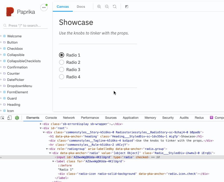
I'm a little unsure why, but with this checked attribute, I don't see it being added to the DOM. But if I use defaultChecked instead, it works as expected. Maybe it's a React thing, like className or htmlFor... 🤷‍♂️

Copy link
Contributor Author

Choose a reason for hiding this comment

The reason will be displayed to describe this comment to others. Learn more.

image
Is showing for me?

Copy link
Contributor

Choose a reason for hiding this comment

The reason will be displayed to describe this comment to others. Learn more.

Ah yes, on initial load, the first <input> does have checked. But when you change it, the DOM doesn't change. I think it may be related to the other warning you were seeing:
#261 (comment)

Copy link
Contributor

Choose a reason for hiding this comment

The reason will be displayed to describe this comment to others. Learn more.

It's the difference between attributes and properties described in facebook/react#13525 (comment) under "DOM Properties Are Not Just "Attributes in JS". Looks like in this case React manipulates the property, not the attribute, so you see no change in the inspector.
radio

Copy link
Contributor Author

Choose a reason for hiding this comment

The reason will be displayed to describe this comment to others. Learn more.

Yeah strange, I see what you mean now. Bit of a puzzler as to why the dom element isn't updating correctly and showing the attribute changes....

Copy link
Contributor Author

Choose a reason for hiding this comment

The reason will be displayed to describe this comment to others. Learn more.

Ok thanks @alexzherdev

Copy link
Contributor Author

Choose a reason for hiding this comment

The reason will be displayed to describe this comment to others. Learn more.

@mikrotron So i'm not sure its a problem that the dom element attributes are not updated, testing with voiceover i can still hear it announce that the radio button is selected, so I think this is fine?

disabled={isDisabled}
id={radioId}
onKeyUp={handleKeyUp}
onKeyDown={handleKeyDown}
ref={inputRef}
type="radio"
{...inputProps}
Copy link
Contributor

Choose a reason for hiding this comment

The reason will be displayed to describe this comment to others. Learn more.

This seems a bit odd here, maybe all the props should actually go up above on line 56?

/>
<label onKeyUp={handleKeyUp} className={canDeselect ? "deselectable" : ""} htmlFor={radioId}>
{children}

{canDeselect ? (
<CheckIcon className="radio-icon" aria-hidden data-pka-anchor="radio.icon.check" />
Copy link
Contributor

Choose a reason for hiding this comment

The reason will be displayed to describe this comment to others. Learn more.

Can we export the classes from Radio.styles.js and apply directly instead of using classNames?

Same for the <div> check below.

Copy link
Contributor Author

Choose a reason for hiding this comment

The reason will be displayed to describe this comment to others. Learn more.

Tried taking this a step further and making some changes as suggested but quickly find it getting a little messy and not necessarily easier to understand. I think perhaps that could do with some refactoring in a secondary Pr but take a look at the in progress branch i have - 297f960 as I was having some issues with the disabled state

Copy link
Contributor

Choose a reason for hiding this comment

The reason will be displayed to describe this comment to others. Learn more.

I think you're on the right track there. Maybe once you merge this one I'll take that branch and try finesse it into a viable PR.

) : (
<div className="radio-icon radio-solid-background" data-pka-anchor="radio.icon.check" />
)}
</label>
</div>
);
};

Radio.displayName = "Radio";
Radio.propTypes = propTypes;
Radio.defaultProps = defaultProps;
Radio.Group = Group;

export default Radio;
196 changes: 196 additions & 0 deletions packages/Radio/src/Radio.styles.js
@@ -0,0 +1,196 @@
import { css } from "styled-components";
import { toInt, fontSizeValue, lineHeightValue, z } from "@paprika/stylers/lib/helpers";
import { boxSizingStyles, visuallyHidden } from "@paprika/stylers/lib/includes";
import { ShirtSizes } from "@paprika/helpers/lib/customPropTypes";
import tokens from "@paprika/tokens";

const getLabelLeftPadding = (radioSize, hasLabel) => {
return hasLabel ? `${toInt(radioSize) + toInt(tokens.space)}px` : radioSize;
};

const smallRadioSize = tokens.radio.sizeSm;
const mediumRadioSize = tokens.radio.sizeMd;
const largeRadioSize = tokens.radio.sizeLg;

const getHalfSizeCss = sizeCss => `${toInt(sizeCss) / 2}px`;
const smallRadioHalfSize = getHalfSizeCss(smallRadioSize);
const mediumRadioHalfSize = getHalfSizeCss(mediumRadioSize);
const largeRadioHalfSize = getHalfSizeCss(largeRadioSize);

const styles = {
Copy link
Contributor

Choose a reason for hiding this comment

The reason will be displayed to describe this comment to others. Learn more.

A lot of this file is copied from the <Checkbox>. I don't mind the copy pasta as phase one, but do you have any ideas yet for how to DRY this up in a later PR perhaps?

Copy link
Contributor Author

Choose a reason for hiding this comment

The reason will be displayed to describe this comment to others. Learn more.

Not yet but I'll give it some thought in the next refactor where I remove any classes being applied on elements....

[ShirtSizes.SMALL]: {
baseFontSize: {
fontSize: `${fontSizeValue(-1)}px`,
},
radioStyles: {
height: smallRadioSize,
width: smallRadioSize,
borderRadius: smallRadioHalfSize,
},
radioIconBackgroundStyles: {
borderRadius: "4px",
height: "8px",
top: "4px",
width: "8px",
},
radioIconStyles: {
fontSize: `${fontSizeValue(-4)}px`,
height: smallRadioSize,
left: smallRadioHalfSize,
},
labelStyles: hasLabel => {
return {
minHeight: smallRadioSize,
padding: `0 0 0 ${getLabelLeftPadding(smallRadioSize, hasLabel)}`,
};
},
},
[ShirtSizes.MEDIUM]: {
baseFontSize: {
fontSize: `${fontSizeValue()}px`,
},
radioStyles: {
height: mediumRadioSize,
width: mediumRadioSize,
borderRadius: mediumRadioHalfSize,
},
radioIconBackgroundStyles: {
borderRadius: "6px",
height: "10px",
top: "5px",
width: "10px",
},
radioIconStyles: {
fontSize: `${fontSizeValue(-2)}px`,
height: mediumRadioSize,
left: mediumRadioHalfSize,
},
labelStyles: hasLabel => {
return {
minHeight: mediumRadioSize,
padding: `1px 0 0 ${getLabelLeftPadding(mediumRadioSize, hasLabel)}`,
};
},
},
[ShirtSizes.LARGE]: {
baseFontSize: {
fontSize: `${fontSizeValue()}px`,
},
radioStyles: {
height: largeRadioSize,
width: largeRadioSize,
borderRadius: largeRadioHalfSize,
},
radioIconBackgroundStyles: {
borderRadius: "6px",
height: "12px",
top: "6px",
width: "12px",
},
radioIconStyles: {
fontSize: `${fontSizeValue()}px`,
height: largeRadioSize,
left: largeRadioHalfSize,
},
labelStyles: hasLabel => {
return {
minHeight: largeRadioSize,
padding: `3px 0 0 ${getLabelLeftPadding(largeRadioSize, hasLabel)}`,
};
},
},
};

const radioStyles = css`
${boxSizingStyles};
${({ size }) => styles[size].baseFontSize};
line-height: ${({ hasLabel }) => (hasLabel ? lineHeightValue(-1) : "0")};
margin: ${tokens.space} 0;
position: relative;

input[type="radio"] {
${visuallyHidden};

&:focus + label::before {
box-shadow: ${tokens.highlight.active.noBorder.boxShadow};
border-color: ${tokens.highlight.active.noBorder.borderColor};
tristanjasper marked this conversation as resolved.
Show resolved Hide resolved
}

& + label {
cursor: pointer;
display: inline-block;
margin: 0;
${({ size, hasLabel }) => styles[size].labelStyles(hasLabel)};
position: relative;
}

& + label::before,
& + label > .radio-icon {
position: absolute;
top: 0;
}

& + label::before {
background: ${tokens.color.white};
border: 2px solid ${tokens.border.color};
content: "";
left: 0;
${z(1)};
${({ size }) => styles[size].radioStyles};
}

& + label:hover::before {
border: 2px solid ${tokens.color.black};
}

& + label > .radio-icon {
color: ${tokens.color.black};
${({ size }) => styles[size].radioIconStyles};
opacity: 0;
pointer-events: none;
transform: translateX(-50%);
transition: opacity 0.15s ease-out;
${z(2)};
}

& + label > .radio-solid-background {
background-color: ${tokens.color.black};
${({ size }) => styles[size].radioIconBackgroundStyles};
}

&:checked {
& + label.deselectable:hover:before {
background: ${tokens.color.blackLighten60};
}
& + label::before {
border: 2px solid ${tokens.color.black};
}
}

&:checked + label > [data-pka-anchor="radio.icon.check"] {
opacity: 1;
}

&:disabled {
& + label,
& ~ .radio-icon {
cursor: not-allowed;
opacity: 0.5;
transition: none;
}
&:checked {
& + label:hover::before {
border: 2px solid ${tokens.color.black};
}
& + label.deselectable:hover:before {
background-color: inherit;
}
}
& + label:hover::before {
border: 2px solid ${tokens.color.blackLighten60};
}
}
}
`;

export default radioStyles;