This repo and README is a work in progress, more details to come.
Template Links: Week 1 | Week 2 | Week 3 | Week 4
Table of Contents
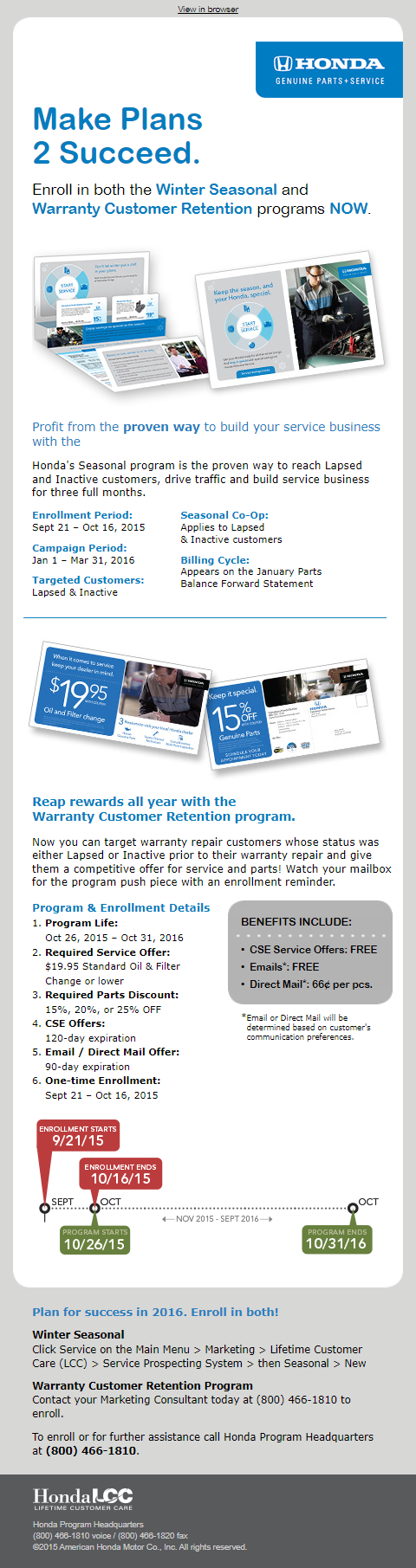
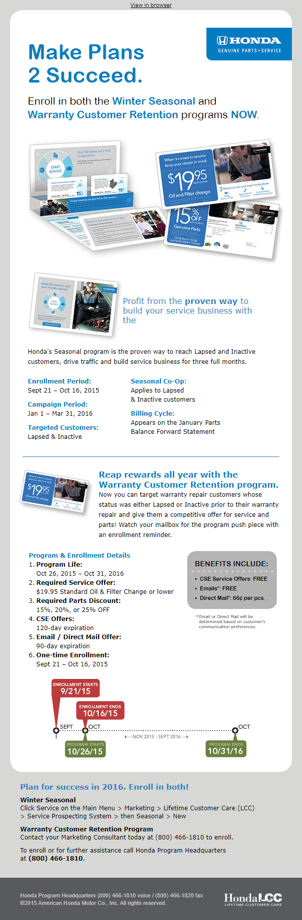
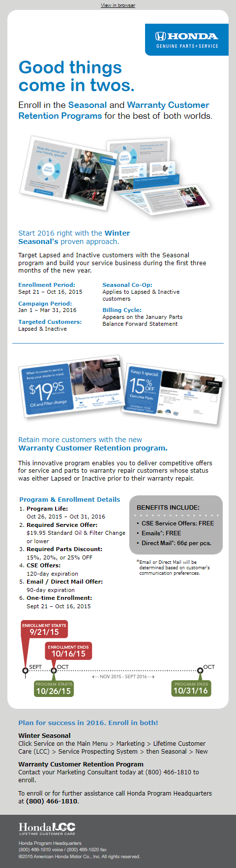
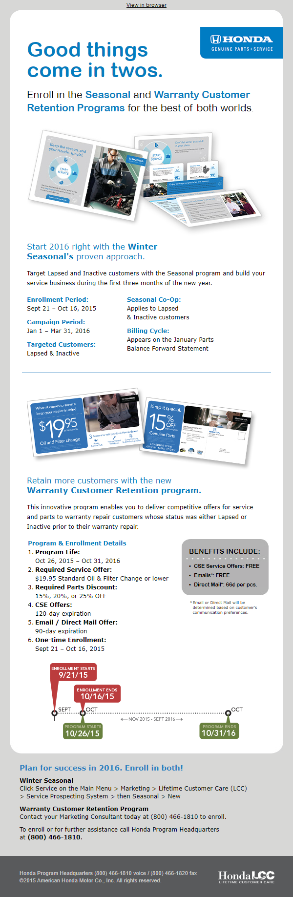
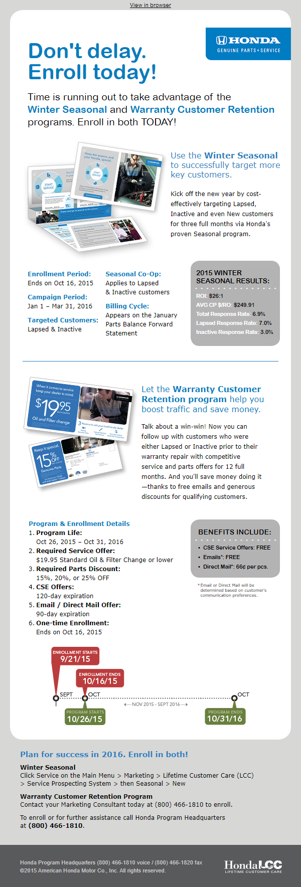
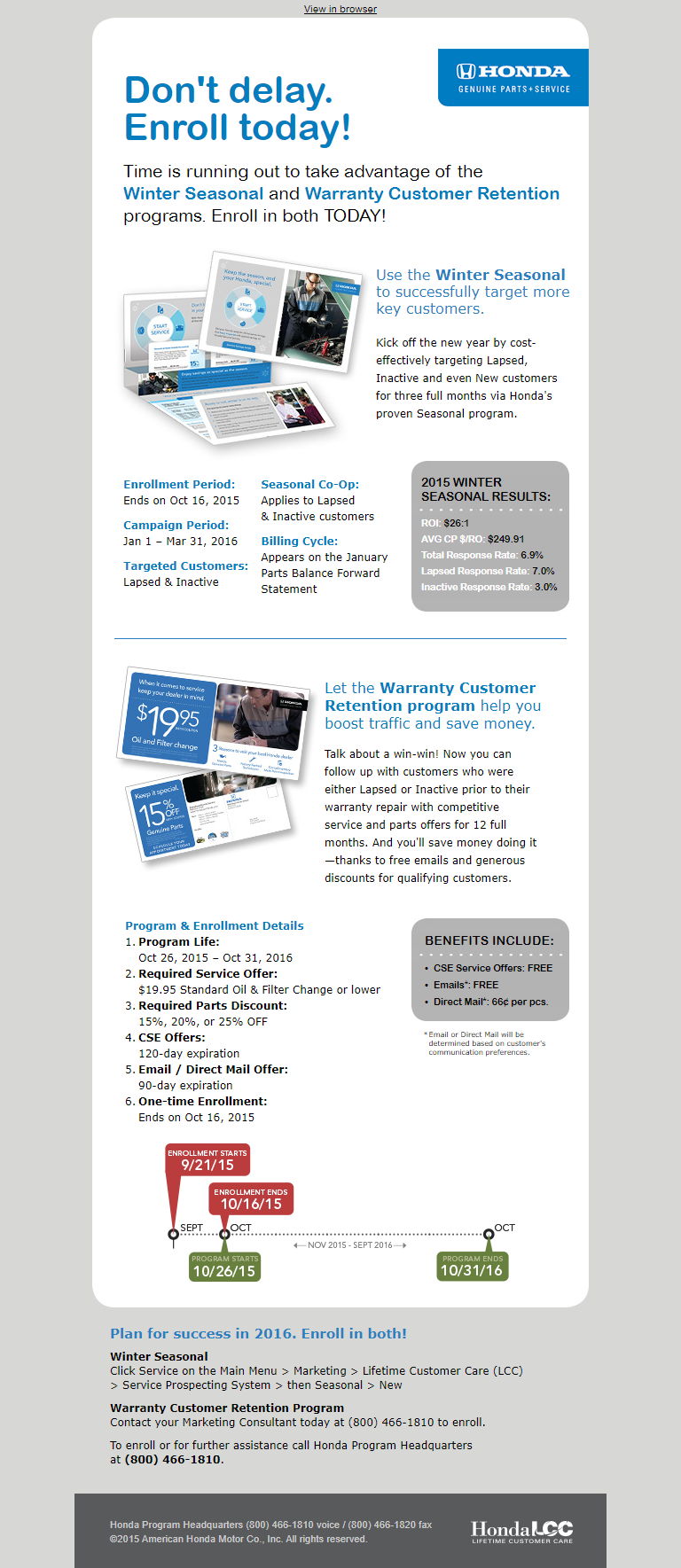
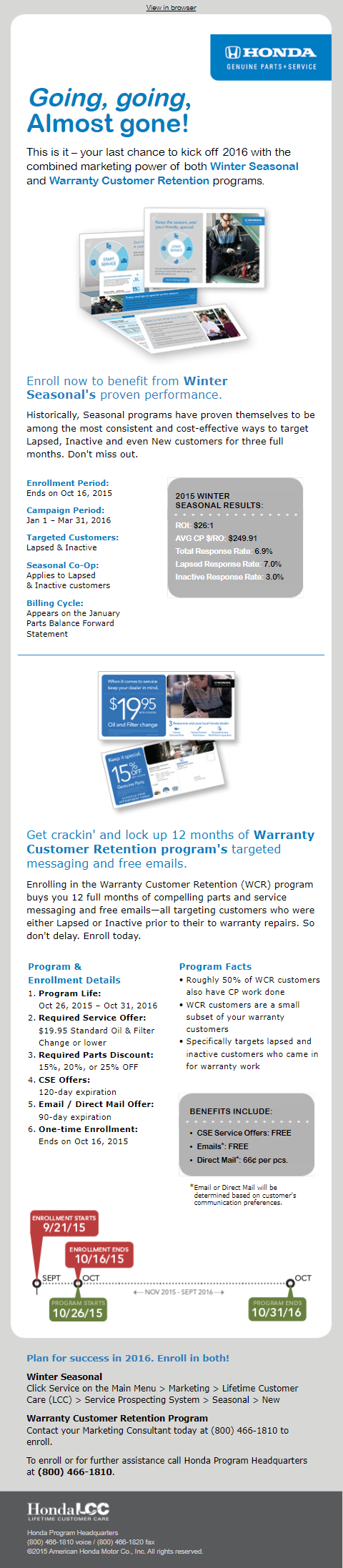
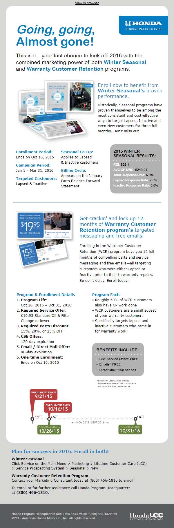
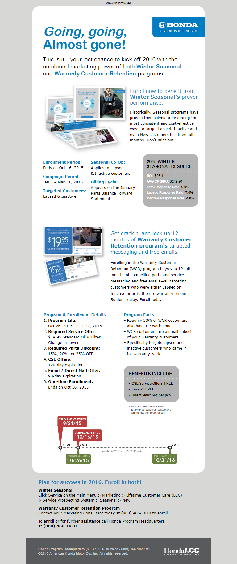
These weekly B2B emails were sent over the course of four weeks to participating Honda dealerships to entice dealers to enroll in both Honda Corporate's Winter Season and the Warranty Customer Retention program.
- Email content default width: 600px.
- Hard coded responsive break points of 320px and 480px (due to time constraits).
- More details to come.
More details to come that talk about features and techniques used in email production.
Font stack/family details. More details to come.
This content is a work in progress
-
Same image is not used and resized for all layouts.
- Improves user experience, pages load faster.
- Images don't appear shrunk on smaller screens.
-
Design control: Crop image at various sizes depending on user agent/device display size.
- One image optimized for both landscape and portrait dimensions.
These HTML techniques will be seen in devices that support them without impacting those that don't. This approach is called graceful degradation.
Example 1:
The logo (170 x 65px, 8kb) used for 600px display layout is shrunk down for mobile devices:
Example 2:
Using this technique, I use a resized version of the same image (120 x 46px, 5kb) for mobile devices:
More modern email browsers/apps that support this code will render the logo as seen in the second example, while all others default to example one.
More details to come.
Example 1:
The program timeline graphic used for 600px display layout shrunk for mobile devices:

Example 2:
Modified image to account for smaller screen display:
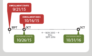
- Prevent dates from appearing as links in iOS.
- Non-breaking spaces (phone numbers don't appear on two separate lines).
- More details to come.
To view responsive layouts, there are three options:
- View screenshots various screen widths.
- Use web browser's DevTools to simulate different layouts.
- Manually resize browser.
The following are screenshots of each template at various screen widths.
| Week 1 | 320px | 480px | 600px | 768px |
|---|---|---|---|---|
| Week 2 | 320px | 480px | 600px | 768px |
| Week 3 | 320px | 480px | 600px | 768px |
| Week 4 | 320px | 480px | 600px | 768px |
To open the browser's DevTools, press F12 or Control+Shift+I (Windows, Linux) or ⌘+Option+I (macOS).
Note that simulations only give an approximation of the mobile or device user experience while using a web browser.
How to use DevTool: Chrome | Firefox | Microsoft Edge | Safari
Note that using a web browser only gives an approximation of the mobile or device user experience in a web browser.