Welcome to the Next.js Enterprise Boilerplate, an open-source template for enterprise projects! It's loaded with features that'll help you build a high-performance, maintainable, and enjoyable app. We've done all the heavy lifting for you, so sit back, relax, and get ready to conquer the world with your incredible app! 🌍

With this template, you get all the awesomeness you need:
- 🏎️ Next.js - Fast by default, with config optimized for performance (with **App Directory **)
- 💅 Tailwind CSS - A utility-first CSS framework for rapid UI development
- ✨ ESlint and Prettier - For clean, consistent, and error-free code
- 🛠️ Extremely strict TypeScript -
With
ts-resetlibrary for ultimate type safety - 📊 Bundle analyzer plugin - Keep an eye on your bundle size
- 🧪 Jest and React Testing Library - For rock-solid unit and integration tests
- 🎭 Playwright - Write end-to-end tests like a pro
- 📕 Storybook - Create, test, and showcase your components
- 🌬️ Smoke Testing and Acceptance Tests - For confidence in your deployments
- 📝 Conventional commits git hook - Keep your commit history neat and tidy
- 🔍 Observability - Open Telemetry integration for seamless monitoring
- 🎯 Absolute imports - No more spaghetti imports
- ⚕️ * *Health checks ** - Kubernetes-compatible for robust deployments
- 🧩 Radix UI - Headless UI components for endless customization
- 💎 CVA - Create a consistent, reusable, and atomic design system
- 🤖 Renovate BOT - Auto-updating dependencies, so you can focus on coding
- 🩹 Patch-package - Fix external dependencies without losing your mind
- 📈 Components coupling and cohesion graph - A tool for managing component relationships
- 🚀 GitHub Actions - Pre-configured actions for smooth workflows, including Bundle Size and performance stats
- 🤖🧠 Automated ChatGPT Code Reviews - Stay on the cutting edge with AI-powered code reviews!
- 💯 Perfect Lighthouse score - Because performance matters
- 🚢 Semantic Release - for automatic changelog
- 💻 T3 Env - Manage your environment variables with ease
- Next.js Enterprise Boilerplate
To get started with this boilerplate, follow these steps:
- Fork & clone repository:
## Don't forget to ⭐ star and fork it first :)
git clone https://github.com/<your_username)/next-enterprise.git- Install the dependencies:
yarn install --frozen-lockfile- Run the development server:
yarn dev-
Open http://localhost:3000 with your browser to see the result.
-
This project uses a git hook to enforce conventional commits. To install the git hook, run the following command in the root directory of the project:
brew install pre-commit
pre-commit install -t commit-msgEasily deploy your Next.js app with Vercel by clicking the button below:
This boilerplate uses TypeScript for type safety and better developer experience. To learn more about TypeScript, check out the official documentation.
This Project uses await-to-js to handle async/await errors. It's a great way to handle errors in async functions without using try/catch blocks. Example (Before and After):
// Before
try {
    const user = await getUser()
    const posts = await getPosts(user.id)
    const comments = await getComments(posts[0].id)
    console.log(comments[0])
} catch (err) {
    console.error(err)
}

// After
const [err, user] = await to(getUser())
if (err) console.error(err)

const [err, posts] = await to(getPosts(user.id))
if (err) console.error(err)

const [err, comments] = await to(getComments(posts[0].id))
if (err) console.error(err)

console.log(comments[0])We put the Icons in the /public/icons folder. To use them, we utilize the nextJS Image component.
import Image from 'next/image'

...

<Image src = "/icons/nextjs.svg"
alt = "NextJS Logo"
width = {500}
height = {500}
/>The following scripts are available in the package.json:
dev: Starts the development server with colorized outputbuild: Builds the app for productionstart: Starts the production serverlint: Lints the code using ESLintlint:fix: Automatically fixes linting errorsprettier: Checks the code for proper formattingprettier:fix: Automatically fixes formatting issuesanalyze: Analyzes the bundle sizes for Client, Server and Edge environmentsstorybook: Starts the Storybook serverbuild-storybook: Builds the Storybook for deploymenttest: Runs unit and integration testse2e:headless: Runs end-to-end tests in headless modee2e:ui: Runs end-to-end tests with UIformat: Formats the code with Prettierpostinstall: Applies patches to external dependenciespreinstall: Ensures the project is installed with Yarncoupling-graph: Generates a coupling and cohesion graph for the components
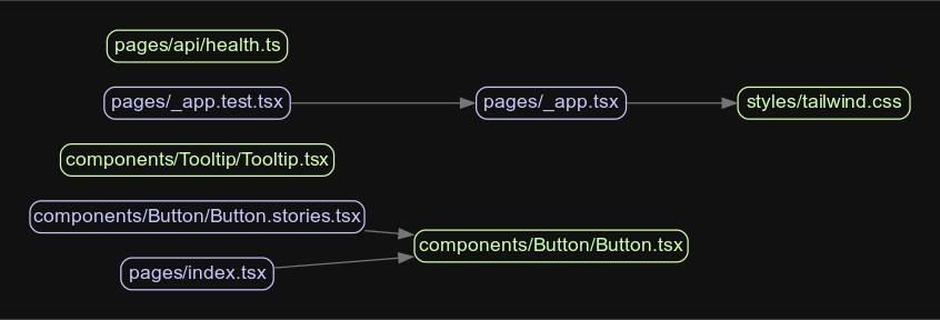
The coupling-graph script is a useful tool that helps visualize the coupling and connections between your project's
internal modules. It's built using the Madge library. To generate the graph, simply
run the following command:
yarn coupling-graphThis will create a graph.svg file, which contains a graphical representation of the connections between your
components. You can open the file with any SVG-compatible viewer.
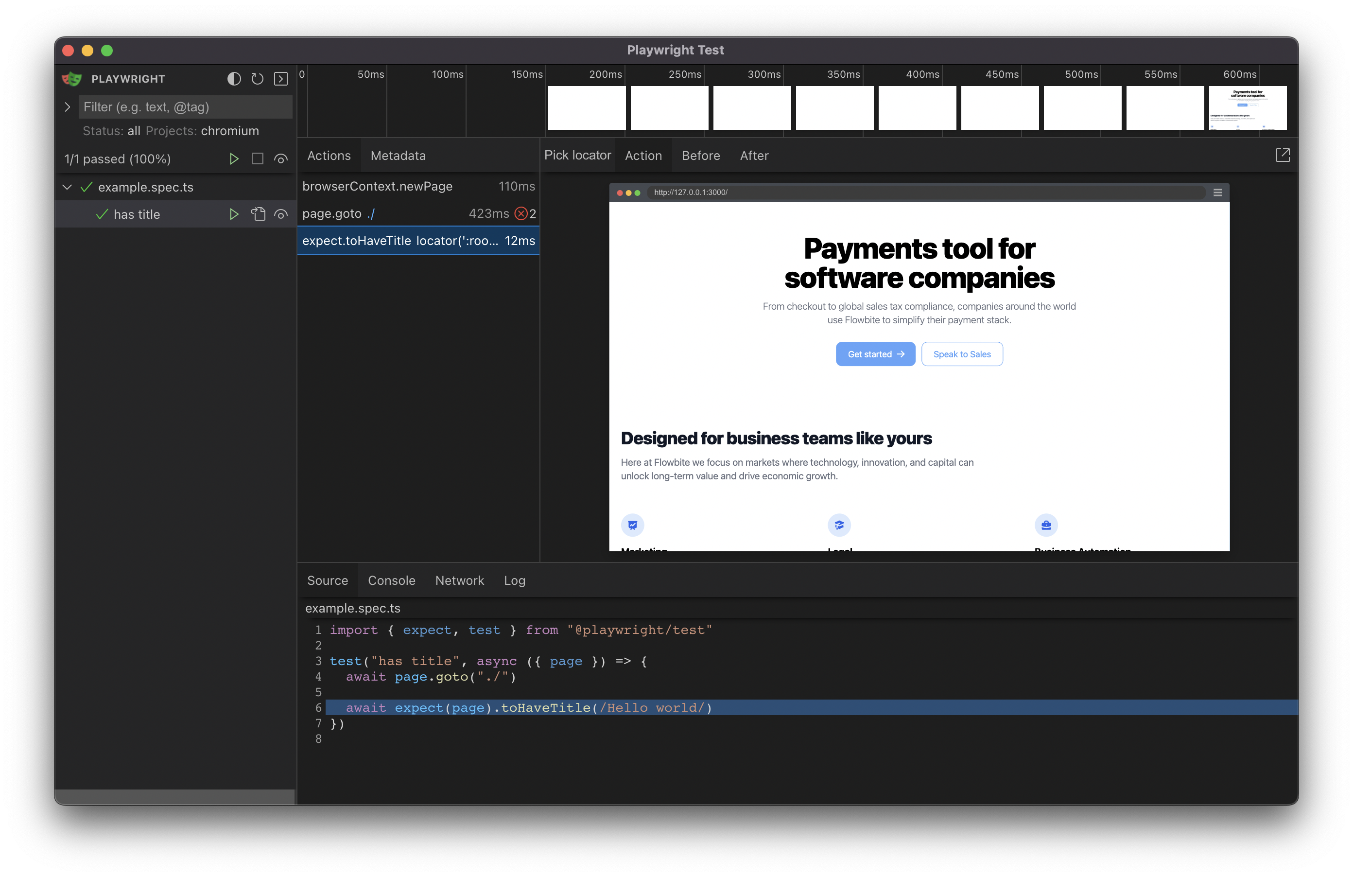
This boilerplate comes with various testing setups to ensure your application's reliability and robustness.
- Unit and integration tests: Run Jest tests using
yarn test - End-to-end tests (headless mode): Run Playwright tests in headless mode with
yarn e2e:headless - End-to-end tests (UI mode): Run Playwright tests with UI using
yarn e2e:ui
To write acceptance tests, we leverage
Storybook's play function.
This allows you to interact with your components and test various user flows within Storybook.
/*
 * See https://storybook.js.org/docs/react/writing-stories/play-function#working-with-the-canvas
 * to learn more about using the canvasElement to query the DOM
 */
export const FilledForm: Story = {
    play: async ({canvasElement}) => {
        const canvas = within(canvasElement)

        const emailInput = canvas.getByLabelText("email", {
            selector: "input",
        })

        await userEvent.type(emailInput, "example-email@email.com", {
            delay: 100,
        })

        const passwordInput = canvas.getByLabelText("password", {
            selector: "input",
        })

        await userEvent.type(passwordInput, "ExamplePassword", {
            delay: 100,
        })
        // See https://storybook.js.org/docs/react/essentials/actions#automatically-matching-args to learn how to setup logging in the Actions panel
        const submitButton = canvas.getByRole("button")

        await userEvent.click(submitButton)
    },
}In this boilerplate, we use Storybook's out-of-the-box support for smoke testing to verify that components render
correctly without any errors. Just run yarn test-storybook to perform smoke testing. Remember to write stories in JSX
or TSX format only. Smoke testing and a lot of other functionalities dont work well with MDX stories.
This boilerplate uses Tailwind CSS for styling and CVA for creating a powerful, easy-to-use design system. If you want to learn more about the setup, check out this fantastic video by Vercel:

While CSS-in-TS libraries such as Stitches and Vanilla Extract are great for building type-safe UI components, they might not be the perfect fit for everyone. You may prefer more control over your stylesheets, need to use a framework like Tailwind CSS, or simply enjoy writing your own CSS.
Creating variants using traditional CSS can be a tedious task, requiring you to manually match classes to props and add types. CVA is here to take that pain away, allowing you to focus on the enjoyable aspects of UI development. By providing an easy and type-safe way to create variants, CVA simplifies the process and helps you create powerful design systems without compromising on the flexibility and control of CSS.
CVA provides a structured way to handle class variants in components. It's particularly useful for creating component libraries or scalable UI elements.
-
Import CVA:
import { cva, type VariantProps } from 'class-variance-authority';
-
Define Your Component with Variants:
Create a base style for your component and define variants for different styles.
const button = cva(
  // Base classes
  ['base-class-1', 'base-class-2'],
  {
    variants: {
      size: {
        small: ['size-small'],
        large: ['size-large']
      },
      color: {
        primary: ['color-primary'],
        secondary: ['color-secondary']
      },
    },
    defaultVariants: {
      size: 'large',
      color: 'primary'
    },
  }
);
-
Create Component Props:
Use
VariantPropsto include the variant types in your component props.interface ButtonProps extends VariantProps<typeof button> { // Your additional props here }
twMerge is a utility function for merging Tailwind CSS classes, ensuring that similar classes are overridden
correctly.
-
Import twMerge:
import { twMerge } from 'tailwind-merge';
-
Merge Classes in Component:
Use
twMergeto merge base classes with dynamic ones based on props.const MyComponent = ({ className, ...props }) => { const mergedClasses = twMerge('base-class', className); return <div className={mergedClasses} {...props}></div>; };
Here's a quick example of how you can use both CVA and twMerge together:
import {cva, type VariantProps} from 'class-variance-authority';
import {twMerge} from 'tailwind-merge';

const button = cva(
    ['base-class'],
    {
        variants: {
            size: {
                small: ['size-small'],
                large: ['size-large']
            },
            color: {
                primary: ['color-primary'],
                secondary: ['color-secondary']
            },
        },
        defaultVariants: {
            size: 'large',
            color: 'primary'
        },
    }
);

interface ButtonProps extends VariantProps<typeof button> {
    additionalProp?: string;
}

const Button = ({className, ...props}: ButtonProps) => {
    return <button className = {twMerge(button(props), className
)
}
    {...
        props
    }
    />;
};- Consistency: Stick to predefined variants for consistency across components.
- Documentation: Document your variants and their usage within your component library.
- Performance: Be mindful of the number of variants; excessive variants can lead to performance issues.
We hope this guide helps you get up to speed with CVA and twMerge. Feel free to reach out to the team for any clarifications or assistance. Happy coding!
This Project comes with a the Flowbite design system. Flowbite is a beautiful, modern, and responsive UI kit that's built with Tailwind CSS. It's a great starting point for creating your own design system. We use various elements from Flowbite in the Project, including the navbar, footer, and buttons. You can find the full documentation for Flowbite here.
This Project uses the @tailwindcss/typography plugin to style the
typography. It's a great way to add beautiful typography to your app without writing any CSS. You can find the full
documentation for @tailwindcss/typography here.
We use it to style the markdown files in the Blog section.
While this boilerplate doesn't include a specific state management library, we believe it's essential for you to choose the one that best suits your project's needs. Here are some libraries we recommend for state management:
Zustand is a small, fast, and scalable state management library. It's designed to be simple and intuitive, making it a great choice for small to medium-sized projects. It's also optimized for bundle size, ensuring minimal impact on your app's performance.
Jotai is an atom-based state management library for React that focuses on providing a minimal and straightforward API. Its atom-based approach allows you to manage your state in a granular way while still being highly optimized for bundle size.
Recoil is a state management library developed by Facebook, specifically designed for React applications. By utilizing atoms and selectors, Recoil allows you to efficiently manage state and derived state. Its key benefit is the ability to update components only when the state they're subscribed to changes, reducing unnecessary re-renders and keeping your application fast and efficient. Recoil also offers great developer experience with built-in debugging tools.
Choose the library that best fits your requirements and project structure to ensure an efficient state management solution for your application.
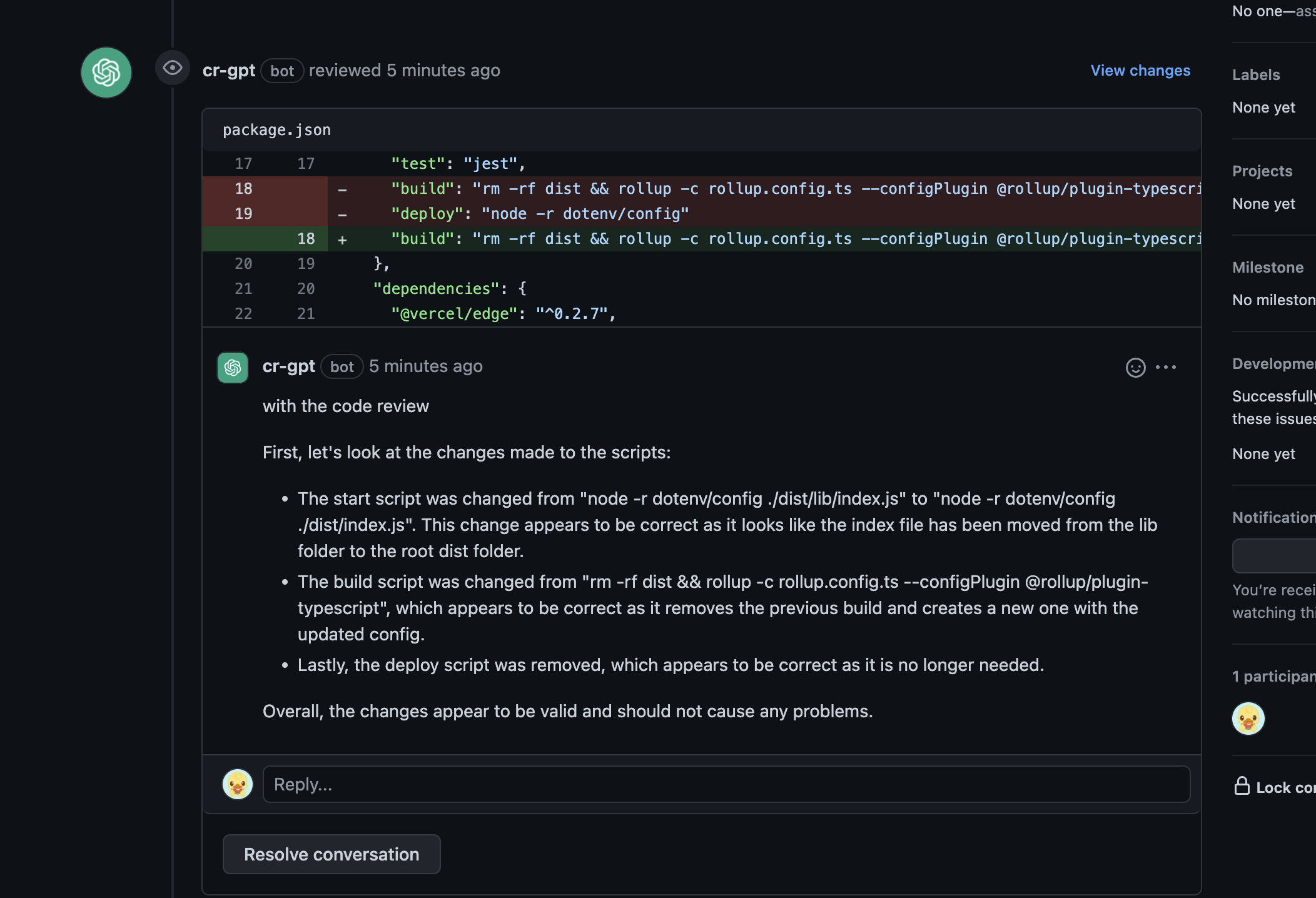
We've integrated the innovative ChatGPT Code Review for AI-powered, automated code reviews. This feature provides real-time feedback on your code, helping improve code quality and catch potential issues.
To use ChatGPT Code Review, add an OPENAI_API_KEY environment variable with an appropriate key from the OpenAI
platform. For setup details, refer to
the Using GitHub Actions section in the
documentation.
T3 Env is a library that provides environmental variables checking at build time, type validation and transforming. It ensures that your application is using the correct environment variables and their values are of the expected type. You’ll never again struggle with runtime errors caused by incorrect environment variable usage.
Config file is located at env.mjs. Simply set your client and server variables and import env from any file in your
project.
export const env = createEnv({
    server: {
        // Server variables
        SECRET_KEY: z.string(),
    },
    client: {
        // Client variables
        API_URL: z.string().url(),
    },
    runtimeEnv: {
        // Assign runtime variables
        SECRET_KEY: process.env.SECRET_KEY,
        API_URL: process.env.NEXT_PUBLIC_API_URL,
    },
})
If the required environment variables are not set, you'll get an error message:
❌ Invalid environment variables: { SECRET_KEY: [ 'Required' ] }The Website includes a Blog section, for this the site uses Gray-Matter
to parse the markdown files and MDX to render the markdown files as React components.
Each Blog post is a markdown file located in content/blog and has the following frontmatter:
The file located under content/blog/index.mdx is the Blog page itself, it uses the BlogPost component to render the
list of posts.
It Parses each markdown file and renders the BlogPost under the corresponding URL.
Contributions are always welcome! To contribute, please follow these steps:
- Fork the repository.
- Create a new branch with a descriptive name.
- Make your changes, and commit them using the Conventional Commits format.
- Push your changes to the forked repository.
- Create a pull request, and we'll review your changes.
If you're looking for help or simply want to share your thoughts about the project, we encourage you to join our Discord community. Here's the link: https://blazity.com/discord. It's a space where we exchange ideas and help one another. Everyone's input is appreciated, and we look forward to welcoming you.
This project is licensed under the MIT License. For more information, see the LICENSE file.
 Bart Stefanski 💻 |
 Jakub Jabłoński 🚇 |
|||||
 Add your contributions
|
||||||