This TA represents a collection of diverse Splunk visualizations packed all into one app. The advantage of this is the ease of installation and management of all visualizations through one TA.
The Repository contains all Data in /opt/splunk/etc/apps/Splunk_TA_common-viz. The installed versions of the visualizations are listed below.
Install this TA on all Search Heads you want to use with more than the standard Visualizations.
Visualizations make it easier to analyze and interact with data during investigations or within dashboards and reports.
The right visual goes a long way to understanding the results of the analysis of your most complex data.
With rich visualization you can easily find the right diagram to make your results known across your organization—in the boardroom or in the war room.
Splunkbase contains a wide array of Splunk-built visuals, and a development framework that makes it simple for customers and partners to create new visuals and make them available to the community.
Take a deeper look to https://docs.splunk.com/Documentation/SplunkLight/7.3.6/References/Datavisualizationlibrary
Data-Indexes:             All indexes, This is an addon for the Visualisations
Summary Indexes:          all related tstats indexes
Application Owner:        SwissTXT Security
Application Developper:   Patrick Vanreck
Roles:                    Search Head's and Search Head Cluster.
AD Group Mappings:        Defined by own Role Model
- Who is this app for?
- How does the app work?
- Limits
- Status of Active/Inactive Visualization addons
- How to use the Visualization addons
- Animated_Chart_Viz
- Arc_Globe_Visualisation
- Bullet Graph - Custom Visualization
- Calendar Custom Viz
- Calendar Heat Map
- Carousel Viz
- Circlepack Viz
- Clock Viz
- Cluster Map Viz
- Custom Radar Chart Visualization
- Custom Viz - Donut
- Custom Viz - Markdown Renderer
- Custom Viz - Scatterplot Matrix
- Dendrogram Viz
- Departures Board Viz
- Event Timeline Viz
- Flow Map Viz
- Force Directed App For Splunk
- Heat Map Viz
- Horizon Chart
- Link Analysis App For Splunk
- Missile Map
- Network Diagram Viz
- Number Display Viz
- Parallel Coordinates Viz
- Performance Analysis
- Punchcard - Custom Visualization
- Region Chart Viz
- Sankey Diagram Viz
- Semicircle Donut Chart Viz
- Status Indicator Viz
- Sunburst Viz
- Timeline Viz
- Treemap - Custom Visualization
- Deprecated Visualization addons
- Release Notes
- Support
This app is for anyone who wants to display seVersional metrics on a small area of a dashboard.
This app provides a visualization that you can use in your own apps and dashboards.
To use it in your dashboards, simply install the app, and create a search that provides the values you want to display.
- The visualization is bound by the follwoing limits:
- Total results: 1000
Once you have installed the TA, you can delete all other additionally installed visualization Addons like timeline visualization.
Compare the List shown in chapter Active Visualization addons and remove all additional installed.
After uninstalling all old visualization addons, you may need to adapt the path of the visualization in the dashboards. Otherwise Splunk cannot find the correct path where the Visualisation is installed.
In our case the path where the new app Splunk_TA_common-viz is installed.
Here an example what to migrate in case that you used the timeline visualization in the past.
Search From: timeline.timeline
...
....
<option name="timeline.timeline.axisTimeFormat">MINUTES</option>
<option name="timeline.timeline.colorMode">categorical</option>
<option name="timeline.timeline.maxColor">#dc4e41</option>
<option name="timeline.timeline.minColor">#53a051</option>
<option name="timeline.timeline.numOfBins">3</option>
<option name="timeline.timeline.tooltipTimeFormat">MINUTES</option>
<option name="timeline.timeline.useColors">1</option>
...
Migrate/Change To: Splunk_TA_common-viz.timeline
...
....
<option name="Splunk_TA_common-viz.timeline.axisTimeFormat">MINUTES</option>
<option name="Splunk_TA_common-viz.timeline.colorMode">categorical</option>
<option name="Splunk_TA_common-viz.timeline.maxColor">#dc4e41</option>
<option name="Splunk_TA_common-viz.timeline.minColor">#53a051</option>
<option name="Splunk_TA_common-viz.timeline.numOfBins">3</option>
<option name="Splunk_TA_common-viz.timeline.tooltipTimeFormat">MINUTES</option>
<option name="Splunk_TA_common-viz.timeline.useColors">1</option>
...You'll need to restart your Splunk daemon after this change.
This TA contains a collection of Visualization addons for Splunk 8.0.x to 8.2.x Enterprise Versions. The following List below shows which Visualization addons are integred and their Versionsion.
List of the Active Visualization addons within this release.
- Animated Chart Viz version 1.0.0
- Arc Globe Visualisation version 1.0
- Bullet Graph - Custom Visualization version 1.4.0
- Calendar Custom Viz version 1.0.0
- Calendar Heat Map version 1.5.0
- Carousel Viz version 1.1.3
- Circlepack Viz version 1.1.4
- Clock Viz version 1.0.3
- Cluster Map Viz version 1.2
- Custom Radar Chart Visualization version 1.1.1
- Custom Viz - Donut version 1.0.3
- Custom Viz - Markdown Renderer version 1.0.3
- Custom Viz - Scatterplot Matrix version 1.1.0
- Dendrogram Viz version 1.0.3
- Departures Board Viz version 1.1.0
- Event Timeline Viz version 1.5.0
- Flow Map Viz version 1.4.1.1
- Force Directed App For Splunk version 3.1.0
- Heat Map Viz version 1.3.1
- Horizon Chart version 1.5.0
- Link Analysis App For Splunk
- Missile Map version 1.2.3
- Network Diagram Viz version 2.0.0
- Number Display Viz version 1.6.8
- Parallel Coordinates Viz version 1.5.0
- Performance Analysis version 1.3.0
- Punchcard - Custom Visualization version 1.5.0
- Region Chart Viz version 1.0.5
- Sankey Diagram Viz version 1.5.0
- Semicircle Donut Chart Viz version 1.2.3
- Status Indicator Viz version 1.4.0
- Sunburst Viz version 1.3.2
- Timeline Viz version 1.5.0
- Treemap - Custom Visualization version 1.4.0
The following List below shows which Visualization addons are not more integrated within this Versionsion.
- Donut Viz C3 version 1.02
- Jointjs Diagram version 1.0.5
- Network Topology Viz version 1.1
- Timewrap version 2.4
- WebGL Globe Viz - Version 2.0.1
The following List explains in short how to use the visualisation addons within this release.
Please refeer to the TA after installing it to see how each visualization is working in detail.
- Versionsion 1.0.0
- Autor: Daniel Spavin
- https://splunkbase.splunk.com/app/5465/
This app provides a visualization that you can use in your own apps and dashboards.
To use it in your dashboards, simply install the app, and create a search using timechart to provide the values to display.
Usecases for the Animated Chart Visualization:
- Displaying server status based on CPU, Memory, I/O, or Disk usage over time
- Showing customer satisfaction ratings over time
- Viewing a single metric by host over time
Animated Charts Viz is designed to use the output from | timechart. Use the following fields in the search:
_time(required) The time period for the event. If no time value is supplied, the first field is used for the slices.<category 1>(required) The name for the value, e.g host, and the actual value.<category 2>(optional) The name for the value, e.g host, and the actual value.<category 3>(optional) The name for the value, e.g host, and the actual value.
index=_internal earliest=-24h@h latest=now
| timechart span=15m count by sourcetype
Tokens are generated each time you click an item.
This can be useful if you want to populate another panel on the dashboard with a custom search, or link to a new dashboard with the tokens carying across.
| Name | This is the name of the selected item. | Default value: $ac_name_token$ |
| Value | This is the value of the selected item you clicked. | Default value: $ac_value_token$ |
| Time Slice | This is the current time slice of the visualisation. | Default value: $ac_time_token$ |

- Version 1.0
- Autor: Lachlan McEwen
- https://splunkbase.splunk.com/app/4867/
This app is for dashboard designers who want to compare relative sizes of metrics in an infographic style pictorial chart.
This app provides a visualization that you can use in your own apps and dashboards.
To use it in your dashboards, simply install the app, and create a search that provides the values you want to display.
- Displaying server status based on CPU, Memory, I/O, and Disk usage
- Showing user or customer ratings in a scale
- Comparing the ratio of good vs bad results or outcomes
- Showing the comparative size of events related to eachother
label(required, defaults to the first field): The label for a group of related items.value(required, defaults to teh second field): The value for a unique group.icon(optional): This selects the icon to use in the pictorial chart.color(optional): Used to set the color of the icon in the chart. Options can be overwritten, so if type or color is set multiple times in the search results, the last value will be used.
| makeresults count=5
| streamstats count as id
| eval icon=case(id==1, "frown", id==2, "flushed", id==3, "grin", id==4, "grin-stars",id==5, "grin-hearts")
| eval label=case(id==1, "Unhappy", id==2, "Unsure", id==3, "Happy", id==4, "Amazing",id==5, "Love It")
| eval value = id + random()%5
| sort id
| table label, value, icon
Tokens are generated each time you click an item.
This can be useful if you want to populate another panel on the dashboard with a custom search, or link to a new dashboard with the tokens carying across.
- Label text: This is the name of the selected group. Default value:
$pc_label_token$ - Value: This is the value of the selected group you clicked. Default value:
$pc_value_token$

- Version 1.4.0
- Author: Splunk Inc
- https://splunkbase.splunk.com/app/3144/
Use a bullet graph to show a key performance indicator (KPI) and its context.
A bullet graph can help you measure a current metric against contextual markers including past results or a target value.

- Version 1.0.0
- Author: Jason Conger
- https://splunkbase.splunk.com/app/3372/
The calendar custom visualization displays event counts on a calendar. 3 views are included by default:
- Month
- Week
- Day

- Version 1.5.0
- Author: Splunk Inc.
- https://splunkbase.splunk.com/app/3162/
This visualization shows a metric over a configured time span. The time span appears as a grid with cells for each result. Cells color indicates relative metric density.

- Version 1.1.3
- Author: Daniel Spavin
- https://splunkbase.splunk.com/app/4342/
This app is for anyone who wants to display several metrics on a small area of a dashboard.
This app provides a visualization that you can use in your own apps and dashboards.
To use it in your dashboards, simply install the app, and create a search that provides the values you want to display.
- Displaying current server metrics like CPU, Memory, I/O, and Disk usage
- Scrolling through a list of sales by category or date
- Showing related application metrics in a discreet dashboard panel
- Rotating through all open Priority 1 ticket numbers
- value (required): If you don't define a field called value, the first field will be used to display the value text.
- unit (optional): You can define a unit for the value, e.g. '$' or '%'. A value in the unit field will override the default unit configured in settings.
- caption (optional): A caption to display for this value. If you define a caption field, it will override the default caption configured in settings.
- range (optional): This is usually generated by the rangemap command. It is used to set the color for the slide.
| makeresults count=5
| streamstats count as id
| eval value=case(id==1,42.4, id==2,74, id==3,"2", id==4,"55",id==5,"622")
| eval unit=case(id==1,"%", id==2,"MB", id==3,"%", id==4,"Mbps",id==5,"Users")
| eval caption=case(id==1,"CPU Use", id==2,"Free Memory", id==3,"Free Disk Space", id==4,"Network Use",id==5,"Active Users")
| eval range=case(id==1,"low", id==2,"elevated", id==3,"severe", id==4,"low",id==5,"low")
| table value, unit, caption, range
Tokens are generated eacht time you click a slide. This can be useful if you want to populate another panel on the dashboard with a custom search, or link to a new dashboard with the tokens carying across.
Formatted Value: This is the 'value' field, that has undergone any formatting changes from the options, e.g. all-caps for text or decimal places and commas for numbers. Use this token to display to the user. Default value:$cv_formatted_value$Raw Value: This is the value as it was defined in the search results. Use this token in searches for exact matches of the raw data. Default value:$cv_raw_value$Caption: This is the 'caption' field. If you use the hostname of a server as the caption, you can create additional searches by using this value. Default value:$cv_caption$Unit: This is the 'unit' field, or the default value for unit. Use this token to help users make sense of the Formatted Value token. Default value:$cv_unit$

- Version 1.1.4
- Author: Chris Younger
- https://splunkbase.splunk.com/app/4574/
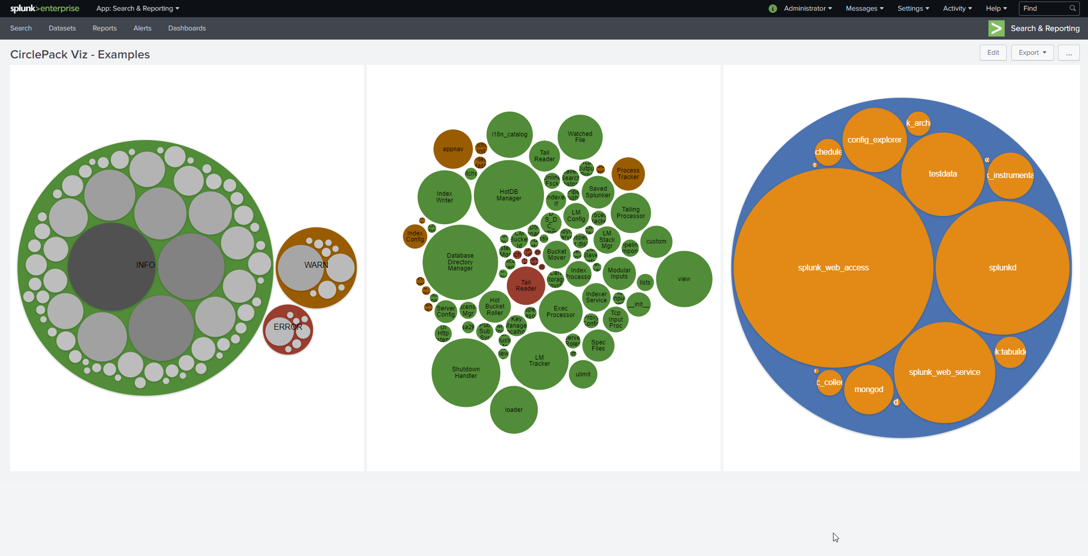
Circle packing / Pack layout / bubble chart visualization built with D3. Optional click-to-zoom and plenty of color themes.
The typical search uses stats command like so:
index=* | stats count BY index sourcetype source
Sidenote: a much faster search to do the same thing is
|tstats count where index=* BY index sourcetype source
Note that stats does not return rows when the group BY field is null. Convert nulls to be an empty string like this:
index=_internal
| eval component = coalesce(component,"")
| eval log_level = coalesce(log_level,"")
| stats count BY sourcetype component log_level
Add more fields after the "BY" keyword to increase the depth
- Version 1.0.3
- Author: Chris Younger
- https://splunkbase.splunk.com/app/4407/
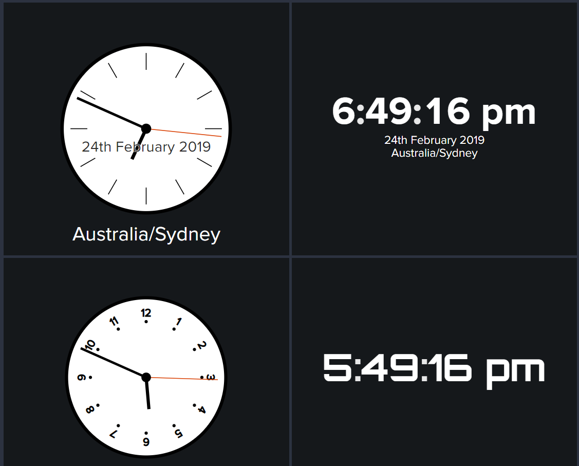
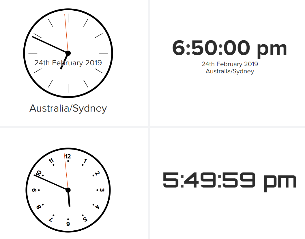
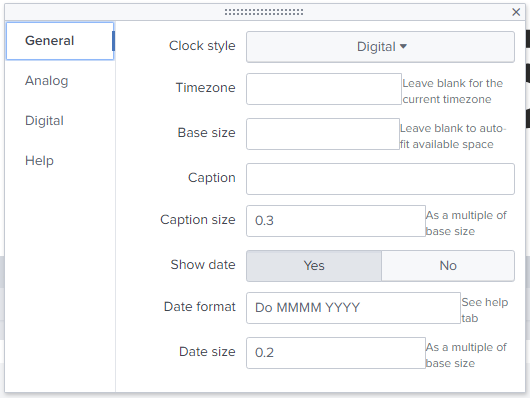
A simple digital or analog Clock vizualisation for your dashboards. Useful when your Splunk dashboards are on a big TV.
To use this vizualisation, you should use the following search:
|makeresults
- Version 1.2
- Author: Siegfried Puchbauer
- https://splunkbase.splunk.com/app/3122/
This app adds a custom cluster-map visualization to your Splunk instance.
It shows styled radiation icons in different colors for each cluster of geographical results, including the numerical value as a label.
The custom cluster map visualization displays numeric values on a map. Both cluster icon size and color are determined by the numeric value automatically.
The visualization expects search results produced by the geostats search command.
Results are postprocessed automatically using the geofilter command in order to retrieve results for the visible map area and zoom level.
Note: it does support a split-by clause, only a single numeric value by location can be processed.
sourcetype=access_combined | iplocation clientip | geostats count
sourcetype=gps_locations | fields lat lng signal_strength | geostats avg(signal_strength) latfield=lat longfield=lng maxzoomlevel=18

- Version 1.1.1
- Author: Scott Haskell
- https://splunkbase.splunk.com/app/3772/
Plot multivariate data on a two dimensional chart across axes.
- key: Key to graph
- axis: Axis to plot
- value: Value for key,axis pair
- keyColor: Append to each key,axis,value row to dynamically style the area color. Must be a hex value.
| makeresults
| eval key="current", "Business Value"=.37, Enablement=8.64, Foundations=2.56, Governance=1.68, "Operational Excellence"=4.992, "Community"=9.66
| untable key,"axis","value"
| eval keyColor="magenta"| append
    [| makeresults
    | eval key="better", "Business Value"=9.37, Enablement=2.64, Foundations=4.56, Governance=6.68, "Operational Excellence"=9.992, "Community"=9.66
    | untable key,"axis","value"
    | eval keyColor="#33FF55"
        ]

- Version 1.0.3
- Author: Aplura LLC
- https://splunkbase.splunk.com/app/3150/
The donut chart is a variation of the standard pie chart. This chart will display results as a percentage of the whole.
This chart has the ability to be displayed as either a two-dimensional or three-dimensional chart.
This chart provides some interactivity. Mouseover a section of the chart to display the associated results. Click on a slice to drill down into the raw results.
The donut chart has many different configuration options and is resizable. The options are split into sections related to each type of chart. The options are displayed like this:
- Configuration Option Name
- Valid Setting Options
- Description
-
Chart Type
- 2D, 3D
- Toggles between 2-dimensional and 3-dimensional
-
Min Percent
- <float>
- Controls the minimum percent of the total events before a result is included in the "Other" category.
-
Use Min Percent
- <boolean>
- Controls whether event counts are rolled into the "Other" category based on the min percent value.

- Version 1.0.3
- Author: Aplura LLC
- https://splunkbase.splunk.com/app/3148/
The Markdown Visualization allows you to specify a Markdown (md) or AsciiDoc (adoc) file to render in the browser as HTML.
Once configured, you can place a markdown_style.css file in the $APP_HOME/appserver/static folder of the app the visualization is configured to use.
The starting class is markdown. A sample has been provided.
| makeresults| makeresults | eval markdown = "## Heading 1"

- Version 1.1.0
- Author: Aplura LLC
- https://splunkbase.splunk.com/app/3149/
The scatterplot matrix visualization allows comparison between numeric sets of data, giving a rough idea if there is a linear correlation between multiple fields.
The scatterplot matrix consists of Rows and Columns of individual Scatterplots that plot an X and a Y value.
These values come from the fields sent from the search bar.
index=_internal component=Metrics group=per_sourcetype_thruput | bin _time span=1h | stats avg(kbps) as avg_kbps avg(eps) as avg_eps avg(ev) as avg_ev by series _time | fields - _time_index=_internal component=Metrics group=per_sourcetype_thruput | stats avg(kbps) as avg_kbps avg(kb) as kb avg(eps) as avg_eps avg(ev) as avg_ev by series|makeresults | eval data = "0,8;0,7;1,7;1,5;3,4;4,2,4,5;3,6;1,8;2,9", recs = split(data,";") | mvexpand recs | eval t = split(recs, ","), X = mvindex(t,0), Y = mvindex(t,1), series = "person" | fields series X Y | fields - _*

- Version 1.0.3
- Author: Chris Younger
- https://splunkbase.splunk.com/app/5153/
This visualisation expects a table of data with specific field names.
There are two main data formats, one with a column called "path" or a second format with fields "child" and "parent".
Additional optional columns are listed below.
-
path- this column/field should be forward-slash delimited, but you can change the delimiter in the formatting options. -
parent- this column/field is a unique name for this node's parent. it is optional. -
child- this column/field is a unique name for the node. -
color- a HTML color code or hex value to use for coloring the node -
drilldown- when a user clicks a node, the contents of this drilldown field will be set in a token called$dendrogram_viz_drilldown$ . See token section below. -
tooltip- content to show on the tooltip when a user hovers the node -
names- can be used to change node names. Should be the same 'depth' as the path.
Here is an example search that you can use with web data
index=web | stats count by uri_path | rename uri_path as path
Here is an example of how the "path" data format should look


- Version 1.1.0
- Author: Daniel Spavin
- https://splunkbase.splunk.com/app/4292/
The Departures Board Viz is a single value animated visualization in the style of airport departure boards.
Drop it into your own dashboards to display places, users, timestamps or any other important information in an eye catching and fun way
- This app is for anyone who wants a single-value panel display for both text and numerical search results.
- To use it in your dashboards, simply install the app, and create a search that provides the following fields:
_time,name,value,status
- (field 1): required: The first field will be used to display text on the visualization.
- (field 2): optional: An ID associated to the text. Will be used for the ID token each time the visualization changes.
- (remaining fields): optional: all remaining fields will be ingnored.
| makeresults count=10
| streamstats count as id
| eval text=case(id==1,"Canberra",id==2,"Wellington",id==3,"Washington",id==4,"London",id==5,"Tokyo",id==6,"Ottawa",id==7,"New Delhi",id==8,"Beijing",id==9,"Paris",id==10,"Berlin")
| table text, id
A sample data set is included with the app:
| inputlookup departures-board-cities-lookup.csv
Two tokens are generated by the visualization - one for the text which is displayed, and one for an associated id field. By default the tokens are called:
dbv_term: The currently displayed valuedbv_id: An ID field to assist further searches
Token names are customizable.

- Version 1.5.0
- Author: Daniel Spavin
- https://splunkbase.splunk.com/app/4370/
The Event Timeline Viz shows multiple events on an interactive timeline.
You can use the Event Timeline Viz to show the relationship between several time-based events in a dashboard panel or report.
The following fields can be used in the search:
-
label(required): A title for the event being displayed. -
start(required): A date and time indicating the start of the event -
end(optional): A data and time indicating the end of the event -
group(optional): A group name to categorise the events and display them together -
color(optional): This is usually generated by the rangemap command. It is used to set the color for the slide. Valid colors are: red, amber, green. If using rangemap, use 'range' instead of 'color'. Valid values include: low, elevated, severe, ok, warning, etc -
data(optional): A value to use for drilldowns, which is not displayed to the user, e.g. ID numbers, references, sources. The data field will be used to populate the$tok_et_data$ token.
- Displaying time-based events
- Comparing the duration and severity of incident tickets created over the past month
- Tracking production releases and version information over time
- Visualizing server metrics over hours or days
- Tracking Notable Events over time
| makeresults count=25
| eval start=_time-random()% 7*24*60*60
| streamstats count as id
| eval label=case(id%3=0,"Event A", id%5=0,"Event B", id%7=0,"Event C", id%11=0,"Event D",1=1,"Event E")
| eval range=if(random()%2=0,"low","severe")
| table start, label, range
This visualization generates the following tokens on click:
- Start field - defaults to:
$tok_et_start$ - End field - defaults to:
$tok_et_end$ - Data field - defaults to:
$tok_et_data$ - Label field - defaults to:
$tok_et_label$ - All Visible Events' Data field - defaults to:
$tok_et_all_visible$
Note: all token names are customisable in the visualization settings menu.

- Version 1.4.1.1
- Author: Chris Younger
- https://splunkbase.splunk.com/app/4657/
A visualization used to show the volume of traffic across links.
By default, this addon will normalise the traffic flows so the proportion of traffic can be shown, however this can be disabled.
Optionally show marching ants lines to indicate direction. Optionally allows embedded HTML which enables endless customisation. AKA force-directed or network graph.
This visualisation expects tabular data, with specific field names. There are two kinds of row data that should be supplied: links and nodes.
The link data is identified by having both a from and to field, or a path field. The path field is delimited by three hyphens "---" and can include hops through multiple nodes.
The node data will have a node field.
| from | to | good |
|---|---|---|
| users | loadbalancer | 3000 |
| loadbalancer | webserver1 | 1000 |
| loadbalancer | webserver2 | 1500 |
| loadbalancer | webserver3 | 500 |
Note that nodes are automatically created.

| path | good |
|---|---|
| users---loadbalancer---webserver1 | 1000 |
| users---loadbalancer---webserver2 | 1500 |
| users---loadbalancer---webserver3 | 500 |
Shared links will have the fields "good", "warn" and "error" automatically summed together
For the users and loadbalancer rows, a custom label is set, along with a font-awesome icon and the label is moved underneath.
| path | good | node | label | icon | height | labely |
|---|---|---|---|---|---|---|
| users---loadbalancer---webserver1 | 1000 | |||||
| users---loadbalancer---webserver2 | 1500 | |||||
| users---loadbalancer---webserver3 | 500 | |||||
| users---loadbalancer---webserver3 | 500 | |||||
| users | Users | user | 40 | 30 | ||
| loadbalancer | LoadBalancer | hdd | 40 | 30 |

Its an unsual concept to have a single search that produces two different sets of data, however this can be easily performed using append.
For example you can define all nodes and links in a lookup table and append it after all your search data like so:
existing search | append [ |inputlookup my_table_of_nodes_and_links.csv ]
- Version 3.1.0
- Author: Splunk Inc.
- https://splunkbase.splunk.com/app/3767/
This app was created to allow IT Operations administrators and the security team to visualize there networks, attack paths inside an environment, connections between objects.
The limits are endless. Some of the features that are supported in this app are:
- Customisation to Attract and Repel Forces
- Selectable Dark and White Theme
- Automatic Grouping and colouring of nodes
- Customisation to collision forces to avoid overlapping
index=firewall action=allowed | stats count by src_ip, dest_ip | table src_ip, dest_ip, countsourcetype=access_combined | stats count by src_ip,uri_path

- Version 1.3.1
- Author: Daniel Spavin
- https://splunkbase.splunk.com/app/4460/
The Heat Map Viz shows a grid of related measurements, with the color intensity relative to the metric value.
- Displaying server metrics like CPU, Memory, I/O, and Disk usage over time
- Comparing sales volume by category over time
- Showing related application metrics in a discreet dashboard panel
- Highlighting any metrics relative to other entities
The following fields can be used in the search:
_time(required): The easiest way to construct a search is to use the | timechart command, with a by clause.category fields(required): Each field name will become a label on the side, with the values being used to set the color based on thresholds. The order of the fields determines the order shown in the viz.
| gentimes start=-7 increment=4h
| eval "Server Availability"=random()%100, "Customer Satisfaction"=random()%100,"Server Performance"=random()%100, _time=starttime
| table _time, "Server Availability","Customer Satisfaction","Server Performance"
Tokens are generated each time you click a cell.
This can be useful if you want to populate another panel on the dashboard with a custom search, or link to a new dashboard with the tokens carrying across.
-
Value: This is the numeric field for the cell you clicked. Default value:
$hm_token_value$ -
Label: This is the field name for the cell you clicked. Default value:
$hm_token_label$ -
Time: This is the '_time' field for the selection. Default value:
$hm_token_time$

- Version 1.5.0
- Author: Splunk Inc.
- https://splunkbase.splunk.com/app/3117/
- http://docs.splunk.com/Documentation/HorizonChart/1.3.0/HorizonChartViz/HorizonChartReleaseNotes
A horizon chart shows metric behavior over time in relation to a baseline or horizon. You can track metric changes above and below a horizon for several data series in a one chart.

- Version 1.6.3
- Author: Mickey Perre
- https://splunkbase.splunk.com/app/4676/#/details
This app provides a seperate visualisation framework for doing force directed visualisation with additional functionality.
index=firewall action=allowed | stats count by src_ip, dest_ip | table src_ip, dest_ip, countsourcetype=access_combined | stats count by src_ip,uri_path
- line_label - To specify the line label of an edge
index=firewall action=allowed | stats count by src_ip, dest_ip, dest_port | rename dest_port as line_labelWill make the destination port the line label - line_color - To specify a color of an edge
index=firewall action=allowed | stats count by src_ip, dest_ip | eval line_color=if(count>10,"red","green"If count is greater than 10 make the line red else make it green. - remove - For huge graphs, it is often faster to remove all nodes off of the graph and start with only one node on the graph. All nodes that have any children can be expanded from here.
index=firewall action=allowed | stats count by src_ip, dest_ip | eval remove="192.168.1.1Remove all nodes from the graph except 192.168.1.1, if 192.168.1.1 is clicked the children will be re-added to the graph - preFilter - Allows you to prefilter your graph and remove all nodes that are connected to the node specified in the field. Delete all nodes from the graph that are not children of 192.168.1.1

- Version 1.2.3
- Author: Luke Monahan
- https://splunkbase.splunk.com/app/3511/
This visualisation will show connected arcs on a map. Each arc is defined by two geographic points, and can have a color assigned.
Additionally the arcs can be animated, with the pulsing animation being either at the start or the end of the arc.
The visualisation looks for fields of the following names:
start_lat: The starting point latitude (required)start_lon: The starting point longitude (required)end_lat: The ending point latitude (required)end_lon: The ending point latitude (required)color: The color of the arc in hex format (optional, default "#FF0000")animate: Whether to animate this arc (optional, default "false")pulse_at_start: When animated, set to true to cause the pulse to be at the start of the arc instead of the end (optional, default "false")weight: The line weight of the arc (optional, default 1).
The fields must be named in this way, but they are not order dependent.
An example dataset is distributed as a lookup to experiment with.
| inputlookup missilemap_testdata
The following options are available to customise:
- Lines
- Default color: The color to use for a line when no "color" field is present in the data (default: #65a637)
- Weight: The weight to use for a line when no "weight" field is present in the data (default: 1)
- Map
- Tile set: The map tiles to use
- Custom tile set: If you wish to use a tile set not in the preset list (e.g. http://tile.stamen.com/toner/{z}/{x}/{y}.png)
- Latitude: Starting latitude to load
- Longitude: Starting longitude to load
- Zoom: Starting zoom level to load

- Version 2.0.0
- Author: Daniel Spavin
- https://splunkbase.splunk.com/app/4438/
This app gives you a new way to visualize your data, allowing you to better communicate information in dashboards and reports.
After installing this app you will see Network Diagram Viz as an additional item in the visualization picker in Search and Dashboard.
The Network Diagram Viz lets you visualize how different monitored end-points relate to one another.
You can use the Network Diagram Viz to show the relationship between servers, services, or people in a dashboard panel or report.
As seen in the Splunk blog post: https://www.splunk.com/en_us/blog/security/visual-link-analysis-with-splunk-part-2-the-visual-part.html
- Displaying current server status based on CPU, Memory, I/O, and Disk usage
- Visually associating users with actions, e.g. purchases, crashes, errors
- Visualising the connection speeds between two hosts or services
- Showing how events are related to eachother
from(required): The unique name of the source entity.to(optional): The unique name of the destination entity.value(optional): Text to display as a tool tip. This text is also available as a token when the entity (from) is clicked.type(optional): This is used to display the entity on the dashboard (from). Use the list of icons available, Splunk server icons, or shapes.color(optional): Used to set the color of the text and icon (except for Splunk icons).linktext(optional): Text to display on the link between the from and to entities.
Options can be overwritten, so if type or color is set multiple times in the search results, the last value will be used.
This is useful if you wish to set the icon types and values via a lookup table at the end of your search.
| makeresults count=12
| streamstats count as id
| eval from=case(id=1,"Load Balancer",id=2,"Load Balancer",id=3,"Load Balancer", id=4,"Web 1",id=5,"Web 1", id=6, "Web 2",id=7,"Web 2", id=8,"Web 3",id=9,"Web 3",id=10,"App Server 1",id=11,"App Server 2",id=12, "Database Server")
| eval to=case(id=1,"Web 1",id=2,"Web 2",id=3,"Web 3", id=4,"App Server 1",id=5,"App Server 2", id=6, "App Server 1",id=7,"App Server 2", id=8,"App Server 1",id=9,"App Server 2",id=10,"Database Server",id=11,"Database Server",id=12, "")
| eval value=case(id=1,"Load Balancer",id=2,"Load Balancer",id=3,"Load Balancer", id=4,"Web 1",id=5,"Web 1", id=6, "Web 2",id=7,"Web 2", id=8,"Web 3",id=9,"Web 3",id=10,"App Server 1",id=11,"App Server 2",id=12, "Database Server")
| eval type=case(id=1,"sitemap",id=4,"server", id=6, "server",id=8,"server",id=10,"server",id=11,"server",id=12, "database")
| fields from, to, value, type
Tokens are generated each time you click a node.
This can be useful if you want to populate another panel on the dashboard with a custom search, or link to a new dashboard with the tokens carying across.
-
Node: This is the unique node name (e.g. the server name). Default value:
$nd_node_token$ -
Value: This is the value/tooltip as it was defined in the search results. Default value:
$nd_value_token$
To use it in your dashboards, simply install the app, and create a search that provides the values you want to display.

- Version 1.6.8
- Author: Chris Younger
- https://splunkbase.splunk.com/app/4537/
A collection of ultra-configurable, single-statistic visualizations for Splunk.
Includes the following styles: gauge, horseshoe, spinner, shapes (rectangle, hexagon, circle, ring, donut). Make dashboards come alive with animated number changes and subtle pulse animations.
This visualization can deal with most datasets you want to throw at it.
However for the most reliable results, use a search where the field names are exactly "value", "title" and "sparkline".
|stats sparkline(avg(SOME_VALUE)) as sparkline latest(SOME_VALUE) as value
For multiple items do this:
| rename SPLIT_CATEGORY as title | stats sparkline(avg(SOME_VALUE)) as sparkline latest(SOME_VALUE) as value BY title
The configured viz formatting can be overridden in data by havign specifically named fields.
Here is an example where the subtitle is supplied in the data:
| rename SPLIT_CATEGORY as title | stats sparkline(avg(SOME_VALUE)) as sparkline latest(SOME_VALUE) as value latest(SOME_VALUE2) as subtext BY title
another way of doing the same thing is like so:
| rename SPLIT_CATEGORY as title | stats sparkline(avg(SOME_VALUE)) as sparkline latest(SOME_VALUE) as value BY title | eval subtext = "something"
These are the fields that can be overridden in data:
| Field | Type | Description |
|---|---|---|
| value | Numeric | The value which will be used for threshold calculation and to set the gauge position or spinner speed. Viz will attempt to autoguess this field if not explicity supplied. |
| title | String | The title of the metric which will be shown as a text overlay. Viz will attempt to autoguess this field if not explicity supplied. |
| sparkline | sparkline array | The sparkline field to use as the area or line chart overlay. Viz will attempt to autoguess this field if not explicity supplied. |
| color | HTML color code | Set the base color, ignoring the thresholds. By using this field you can use any threshold logic you like in the search query |
| primarycolor | HTML color code | Similar to above but will only override the primary color. The threshold color can still be used by other components. The primary color is only used by the main element (the gauge, spinner or shape background) in the viz. |
| secondarycolor | HTML color code | As above. |
| text | String | If supplied, this field enables overriding what would be shown as the numeric value |
| subtitle | String | Override the subtitle value. Note that subtitle must be blank in the formatting options |
| min | Number | Overrides the "min" limit |
| max | Number | Overrides the "max" limit |


- Version 1.5.0
- Author: Splunk Inc.
- https://splunkbase.splunk.com/app/3137/
Use parallel coordinates to show multidimensional patterns in a data set. Dimensions appear on vertical axes. Lines representing events connect the different axes.
You can use a parallel coordinates visualization to help you detect patterns in data sets with multiple variables.
- Retail activity
- Credit card transactions
- Product manufacturing processes and components
Use data that that includes numerical fields or a limited number of dimension fields. Search results should include fewer than 15 dimensions to render the visualization.
To generate a parallel coordinates visualization, use this query syntax.
... | <stats_function> by <dimension_field1>[, <dimension_field2>, ... <dimension_fieldN>] [ | fields -count ]
Here is a parallel coordinates query tracking fat and calorie information for different food groups.
| inputlookup nutrients.csv | head 2500 | stats count by group, "fat (g)", "calories"

- Version 1.3.0
- Author: Daniel Spavin
- https://splunkbase.splunk.com/app/4258/
The Performance Analysis Visualization allows you to compare two related metrics over time in a tabular format.
Use cases include comparing your infrastructure and application health, showing performance and availability of synthetic monitoring scripts, and tracking build status vs code commits over time.
This app provides a visualization that you can use in your own apps and dashboards.
- Displaying both infrastructure and application health over time
- Showing both performance and availability of transactions from a selenium script (Application Performance Monitoring)
- Monitoring Application health and exceptions over the past day or week
- Tracking the number of code commits vs build status over time
_time(required): the time field for the events.name(required): The label for each row of the table. This usually represents the server name.value(required): The numeric value of the primary metric - e.g. CPU %. This will determine the colour of the cells.status(required): This represents the secondary metric - e.g. Application health. Status is used to create the icon or numeric value. Can be textual: GREEN / AMBER / RED, or numeric: 12.22. If you don't want to show a status, you can set this to "" (...| eval staus="" |...)warning_threshold(optional): This value determines when the cell background color changes from GREEN to AMBER. You can set a different warning_threshold for each name, or use the default settings.critical_threshold(optional): This value determines when the cell background color changes from AMBER to RED. You can set a different critical_threshold for each name, or use the default settings.
index=_internal earliest = -24h@h group=*| rename group as name, date_second as value, date_minute as status | table _time, name, value, status
A sample data set is included with the app:
| inputlookup sample-data.csv

- Version 1.5.0
- Author: Splunk Inc.
- https://splunkbase.splunk.com/app/3129/
Punchcards can visualize cyclical trends in your data.
This visualization shows circles representing a metric aggregated over two dimensions, such as hours of the day and days of the week.
Using a punchcard, you can see relative values for a metric where the dimensions intersect.
Documentation:
- Website or network activity
- Retail trend analysis
- Environmental or geological activity
Use this syntax to generate a punchcard.
... | <stats_function>[(metric_field)] [<stats_function>(color_field)] by <first_dimension> <second_dimension>
Here is a search that analyzes bicycle rental popularity by hours and days.
inputlookup bikeshare.csv | stats count by date_hour date_wday
index=_internal | head 100000 | stats count by date_hour sourcetype
index=_internal | head 100000 | stats count by date_minute sourcetype
index=_internal | head 100000 | stats count, avg(date_minute) by date_minute sourcetype

- Version 1.0.5
- Author: Chris Younger
- https://splunkbase.splunk.com/app/4911/
This visualisation should work with any data that works with the Splunk built-in line chart.
The first column (which is often "_time") will be the X-axis and subsequent columns will be rendered as lines (so they should be numeric values).
A column with the specific name "regions" should be supplied which defines the regions to draw behind the chart.
This is how the data should look:

Regions are drawn per-column vertically, from bottom to top. Horizontal regions can be drawn by setting the same region value on multiple columns. See the examples below.
The format for the region field is comma-seperated key-value pairs and best explained with examples:
| "regions" field | Result | | red | The most basic example that creates a region. A red column of data will be drawn from the bottom of the chart to the top of chart. Region colors can be specificed as valid HTML colours (RBG, Hex, named colours, etc..). | | Out of hours=#ccccc | Create a named region in a grey color for the chart column. This name will be seen on the tooltip when hovering the chart. | | green,1000,orange,1500,red | Create a green region from the bottom of the chart to 1000, an orange region from 1000 to 1500 and a red region from 1500 to the top of the chart. | | ,1000,Warning=orange,1500,Critical=red | Create a orange region from 1000 to 1500 and a red region from 1500 to the top of the chart. |
Especially useful for visualizing the adaptive thresholds that were set by ITSI (also works with ITSI static thresholds). Requires add-on Get ITSI Thresholds - custom command
index="itsi_summary" itsi_service_id=c2d8f443-fd65-4872-b3b8-1ac7757b57f6 kpiid=a672f70631ce28a0be31e1f2 indexed_is_service_max_severity_event=0
| timechart span=1h avg(alert_value) as alert_value
| getitsithresholds service=c2d8f443-fd65-4872-b3b8-1ac7757b57f6 kpi=a672f70631ce28a0be31e1f2
Over a 24 hour chart, show the hours that are important.
... search ...
| timechart span=1h avg(series1) as avg
| eval hour = strftime(_time, "%H")
| eval regions = if(hour > 17 OR hour < 9,"Out of hours=#009DD9","")
| fields - hour

Hardcoded simple static thresholds.
... search ...
| timechart span=1m avg(series1) as avg
| eval regions = "normal=#99D18B,5000,Warning=#FCB64E,7000,Error=#B50101"

Add a gray region to highlight the area of the chart that is less than 15 minutes old. Can easily be adapted to show a maintinance window.
... search ...
| timechart span=1h avg(series1) as avg
| eval regions = if(_time > (now() - 900),"Data still arriving=#aaaaaa","")

Calculate the historical average and standard deviation of the data. Then mark regions based on the standard deviations.
... search over 2 weeks of data ...
| timechart span=1h avg(FIELD) as avg stdev(FIELD) as stddev
| timewrap w series=short align=now
| where _time > now() - 86400
| eval regions = "3 standard deviations below=#B50101," + tostring(avg_s1 - stddev_s1 * 3) + ",2 standard deviations below=#FCB64E," + tostring(avg_s1 - stddev_s1 * 2) + ",normal=#99D18B," + tostring(avg_s1 + stddev_s1 * 2) + ",2 standard deviations above=#FCB64E," + tostring(avg_s1 + stddev_s1 * 3) + ",3 standard deviations above=#B50101"
| table _time avg_s0 avg_s1 regions

- Version 1.5.0
- Author: Splunk Inc.
- https://splunkbase.splunk.com/app/3112/
- http://docs.splunk.com/Documentation/SankeyDiagram/1.3.0/SankeyDiagramViz/SankeyReleaseNotes
Sankey diagrams show metric flows and category relationships. You can use a Sankey diagram to visualize relationship density and trends.
A Sankey diagram shows category nodes on vertical axes. Fluid lines show links between source and target categories. Link width indicates relationship strength between a source and target.
To generate a Sankey diagram, use this query syntax.
... | stats <stats_function>(<size_field>) [<stats_function>(<color_field>)] by <source_category_field> <target_category_field>

- Version 1.2.3
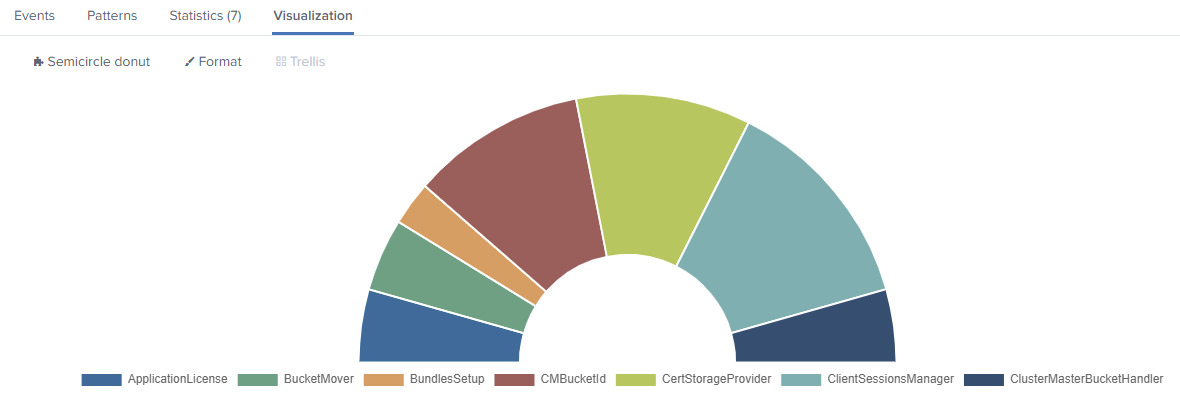
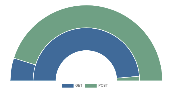
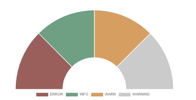
- Author: Chris Younger
- https://splunkbase.splunk.com/app/4378/
- https://github.com/ChrisYounger/semicircle_donut
A simple donut/pie chart that can be displayed as a semicircle and supports multiple series on a single chart.
index=_internal |stats count by log_level
index=_internal sourcetype=splunkd_ui_access| stats avg(spent) as spend avg(bytes) as bytes by method
index=_internal | eval len = len(_raw) |stats count by log_level | eval color = case(log_level=="ERROR", "#af575a", log_level=="WARN", "#ed995f", log_level=="INFO", "#4fa484", true(), "#cccccc")
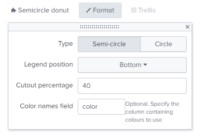
You then need to go into the "Format" options and type the field name "color".
- Version 1.4.0
- Author: Splunk Inc.
- https://splunkbase.splunk.com/app/3119/
- http://docs.splunk.com/Documentation/StatusIndicator/1.3.0/StatusIndicatorViz/StatusIndicatorReleaseNotes
Status indicators show a value and an icon. You can use a status indicator to provide information at a glance.
To generate a status indicator, use the following query syntax.
...| table <count> <icon_field> <color_field>
Aggregate the value you are tracking and use the table command to order field values.
Here is a status indicator query that specifies a static icon and color.
index=_internal
| head 100
| stats count
| eval count=count+random()%1000
| eval icon="exclamation-circle"
| eval color="#F58F39"
| table count icon color

- Version 1.3.2
- Author: Chris Younger
- https://splunkbase.splunk.com/app/4550/
This visualisation expects tabular data, with any amount of text/category columns, but the last column must be a numerical value.
Null or blank columns are allowed before the final column to create a more "sunburst-y" visualization.
The typical search uses stats command like so:
index=* | stats count BY index sourcetype source
Sidenote: a much faster search to do the same thing is
|tstats count where index=* BY index sourcetype source
Note that stats does not return rows when the group BY field is null. Use this one simple trick to convert nulls to be an empty string instead:
index=_internal | eval component = coalesce(component,"") | eval log_level = coalesce(log_level,"") | stats count BY sourcetype component log_level
Add more fields after the "BY" keyword to increase the depth of the sunburst
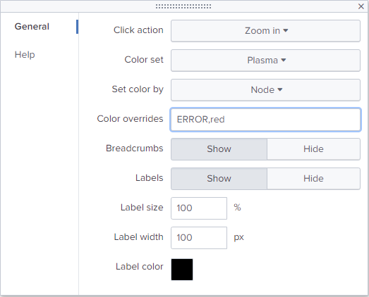
The "Color overrides" field accepts either a JSON object (in curly braces) or comma separated pairs.
For example to make sure that "INFO" values are green, WARN's are orange and ERROR's are red, set the value like so:
INFO,#1a9035,ERROR,#b22b32,WARN,#AF5300

- Version 1.5.0
- Author: Splunk Inc.
- https://splunkbase.splunk.com/app/3120/
A timeline visualization shows activity time intervals and discrete events for a resource set. Activity for each resource appears in a separate timeline lane.
- If an activity start time and duration are available for a particular resource, the timeline shows a duration interval as a horizontal bar in the lane.
- If only the start time is available, the timeline shows a circle at that time.

- Version 1.4.0
- Author: Splunk Inc.
- https://splunkbase.splunk.com/app/3118/
A treemap represents data patterns and hierarchy. Each treemap divides a single space into multiple rectangles to show data values and category relationships.
Use a treemap to visualize how a general metric divides across different areas or categories.
- Budgets and expenses**
- Data center server status
- University departments and courses offered
A treemap data set includes metric and category information for all events. Use events with fields representing the common metric value, child, and parent categories.
See the use case examples for more details.
To generate a treemap, write a query that returns events in the correct data format.
To generate a treemap visualization, use this query syntax.
... | stats <stats_function>(<metric_field>) [<stats_function>(<color_field>)] by <parent_category_field> <child_category_field>
| First | Second | Third | Fourth |
|---|---|---|---|
| Parent category | Child category | Rectangle size | Rectangle color |
Here is part of a query tracking files and directories.
... | stats sum(size) as size by parent_directory, child_directory

The following List below shows which Visualization addons are not more integrated within this Version.
The most of them uses python 2.7 or are only compatible until Splunk 7.3.x
- Version 1.02
- Author: Martin Zerbib
- https://splunkbase.splunk.com/app/3238/
- --> Archived!! Do not use anymore !!
- Version 1.0.5
- Author: Stéphane Lapie
- https://splunkbase.splunk.com/app/3379/
- --> Archived!! Do not use anymore !!
- Version 1.1
- Author: Michael Lin
- --> Archived!! Do not use anymore !!
- Version 2.4
- Author: David Carasso
- https://splunkbase.splunk.com/app/1645/
- --> Archived!! Do not use anymore !!
https://splunkbase.splunk.com/app/3674/
- --> Archived!! Do not use anymore !!
- Major Upgrade.
- Upgrading all Visualizations compatible with Splunk 8.0.x or 8.1.x
- Removing Visualizations not compatible with Splunk 8.0.x or 8.1.x
- Minor change to add Timewrap SA
- Minor change to pass AppInspect checks
- Added ability to create tokens on click
- Updated dashboard to show example token usage
- Made value text fit better on fixed-size slides
-Initial Versionsion
Support is not guaranteed and will be provided on a best effort basis. Please use Github to open issues or feature requests:
| Supported Splunk Versions | Unsupported or Deprecated |
|---|---|
| 8.2.x, 8.1.x, 8.0.x, 7.3.9, 7.3.6 | 7.3.5 and lower, 6.6.x, 6.5.x, 6.4, 6.3, 6.2, older |
This app is supported by Patrick Vanreck (SwissTXT). Contact us under: yoyonet-info@gmx.net.
- Find us under SECLAB Splunk App & TA Development
- Send questions to yoyonet-info@gmx.net
- Developped by Patrick Vanreck
Please find the license for this software here: https://github.com/Splunk-App-and-TA-development/Splunk-TA_Custom-Logo-and-Favicon/blob/main/LICENSE
Permission is hereby granted, free of charge, to any person obtaining a copy of this software and associated documentation files (the "Software"),
to deal in the Software without restriction, including without limitation the rights to use, copy, modify, merge, publish, distribute, sublicense,
and/or sell copies of the Software, and to permit persons to whom the Software is furnished to do so, subject to the following conditions:
The above copyright notice and this permission notice shall be included in all copies or substantial portions of the Software.