

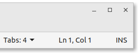
| focused window | mouse hover | mouse click |
|---|---|---|
 |
 |
 |
Mint-Yz GTK themes:
Don't miss the Mint-Yz-icons with the same color scheme !
This is a new pack of various colour themes. 9 different colors, in both light and dark variants. That makes 18 new GTK themes. This will change the look of your entire LinuxMint system. These 18 colour variations are all packed into one package. One download, one double-click, and then you can choose some new, fresh colors for your entire system.
This Mint-Yz is a fork from the standard, reliable Mint-Y theme. It is renamed "Mint-Yz" and is a separate package. Your good old Mint-Y will not be removed or changed. You can always switch back and forth from these Mint-Y and Mint-Yz colors and variants.
There is a lot of work into this new Mint-Yz. Over 200 commits. Build onto the latest stable Mint-Y, version 1.9.8. A lot of work got into creating, modifying, and testing those colors over and over again. But that's not only some new, nice colors here. There is much more than that here. There are also many subtle contrasts improvements. Making things more readable, and clearer. And then, there are also some subtle design improvements on top of all this. But not too much. You already like your Mint-Y theme, so this is just a bit different: this little "z" added to "Mint-Y", renaming it "Mint-Yz".
Note: The colors and design you see here reflect the latest changes made to this repository. It is the future you see here. See the images on the releases page for an exact match to the themes you are installing.
Check your system is not too old for this theme to work properly. This theme works well on Linux Mint 19.x and Linux Mint 20.x. (GTK 3.24)
Entirely tested and re-tested on LinuxMint Cinnamon 20.3, and quickly tested on Mint Mate 20.3 and Mint Xfce 20.3.
FIRST, Go to the LATEST RELEASE page. There, click on the mint-yz-theme_X.x.x.zip to download.
NEXT, CHOOSE ONE OF THE FOLLOWING METHODS TO INSTALL:
Method 1: automatic installer
- Extract (unzip) the zip you just downloaded
- Open this directory containing the files you extracted, and double-click on the INSTALLER.sh to "Run in Terminal"
Method 2: Command Line Interface (CLI)
Open your terminal and do this:
cd ~/Downloads # Go to where you downloaded your zip.
unzip -q mint-yz-theme*
sudo rm -rf /usr/share/themes/Mint-Yz-*
sudo cp -rf themes/* /usr/share/themes
Method 3: Graphical User Interface (GUI)
(Everyone has a different GUI, so I can't give you precise instructions this way... But it should be pretty simple...)
- Go to your Download directory
- Extract (unzip) this mint-yz-theme_X.x.x.zip
- Open /usr/share/themes as root (Be careful! Close this window when done!)
- Move or copy all the contents from the extracted themes directory into /usr/share/themes
FINALLY, Select your new themes in Menu > Preferences > Themes or Appearance.

If you changed your mind and want to remove this group of themes, there are many ways to do so. But first of all, make sure you are not using these Mint-Yz themes anymore. Open Menu > Preferences > Themes or Appearances, and select something else, such as Mint-Y or Mint-X, for your "Controls," "Desktop," and "Window borders."
Next, type this in your terminal:
sudo rm -rf /usr/share/themes/Mint-Yz-*
- First method : You can open your terminal and type:
apt remove mint-yz-theme - Second method : Or you can also open your Synaptic Package Manager, search (Ctrl+F) for
mint-yz-theme, mark for removal, and apply
Colors according to everyone's needs.
Subdued, flat or shining colors.
Sufficiently contrasted colors.

These colors have been chosen with the utmost care. They have been tested, modified, and re-tested again and again. Design isn't about making things pretty OR functional, it's about making things functional AND pretty.
Several factors were considered here. First, you need a good contrast between the color and the white text. But the WCAG requirements are sometimes too burdensome. I try to have at least a 3:1 color contrast. Well, eight out of nine Mint-Yz colors have at least that minimum of 3:1 color contrast. At least ! In comparison, the majority of the standard Mint-Y colors fail to this test.
A contrast ratio of 3:1 is the minimum level recommended by [ISO-9241-3] and [ANSI-HFES-100-1988] for standard text and vision. The 4.5:1 ratio is used in this provision to account for the loss in contrast that results from moderately low visual acuity, congenital or acquired color deficiencies, or the loss of contrast sensitivity that typically accompanies aging.
source: https://www.w3.org/TR/UNDERSTANDING-WCAG20/visual-audio-contrast-contrast.html
| Mint-Y colour contrast ratios | Mint-Yz colour contrast ratios |
|---|---|
| 2.4 Mint | 2.4 MintClassic = Mint |
| 4.5 Blue | 4.5 BlueBelize |
| 2.7 Grey | 4.5 Grey |
| 2.7 Teal | 3.0 MintGum |
| 0.0 (nothing) | 4.5 BlueElectron |
| 4.0 Purple | 6.3 Purple |
| 4.3 Red | 4.3 Red |
| 2.3 Orange | 2.6 Orange |
| 2.5 Aqua | 3.0 Aqua |
| 3.8 Pink | 3.1 Pink |
| 3.3 Brown | 0.0 (nothing) |
| 2.2 Sand | 0.0 (nothing) |
| 6 out of 11 colors lacks sufficient contrast | 1 out of 9 colors lacks sufficient contrast (1) |
(1) Not counting MintClassic because this one is mostly there for technical purposes.
And then there are also "gloss" issues that were taken into account. But don't overdo it here either: there is a difference between the background color for a full page versus the background color of a focused element. And, of course, beyond these technical considerations, the color must transmit some good vibrations...
To sum up, here i tried to create a mix of some subdued, flat, or shining colors. Something for each one of us. But please, don't ask me for a subdued orange or red... I could make it, of course, but then i don't call it "orange" or "red" anymore !
References:
https://colorable.jxnblk.com
https://marijohannessen.github.io/color-contrast-checker/
https://uxmovement.com/content/why-you-should-avoid-bright-saturated-background-colors/
https://uxmovement.com/content/why-you-should-never-use-pure-black-for-text-or-backgrounds/
https://flatuicolors.com/
| Variant | Category | Mint-Y | Mint-Yz |
|---|---|---|---|
| all | buttons and entries backgrounds | no contrast | subtle contrast |
| base | hovering on buttons | lighten (too subtle!) | darken 5% (better) |
| dark | base color vs background color | almost no difference | 2X difference |
| dark | check and radio buttons | almost invisible when empty | subtle outline |
| dark | check and radio buttons | dark foreground | white foreground (#F0F0F0) |
| dark | window title, unfocused/focused | not much difference | much more difference |
| all | terminal background color | Dark grey (#3F3F3F) | 6% darker (#303030) |


- Square window corners everywhere. I like round corners, but not when the top ones are round while the bottom ones are square. Additionally, on the official Mint-Y, the design keeps changing all the time. You get round top corners when the window is in the middle of the screen, and they turn square when you push tile. I don't like that. More over, there is a small rendering bug with Metacity round corners. All these problems are simply avoided by making all window corners square. Everywhere.
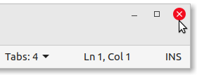
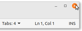
- No backgrounds on window close buttons. Round red background on hovering. That's nicer, and more logical. Before, with the default Mint-Y color, the close button was... green !? And we are also avoiding an old bug in the theme chooser !
- Accent color on active button background. That's a revert, setting it as it is on the old Mint-Y-Legacy. Things are more consistent that way, in my opinion. Small buttons such as radio and checkbox are coloured, and the same rule applies for bigger buttons, here on Mint-Yz.
- Subtle rounded corners on buttons and entries (3px -> 5px).
- Solid and coloured outlines on focused buttons and entries: more visible and nicer.
- No dashed outlines on other elements. This was unneeded and ugly. (Same as Mint-X here.)
- Message colors are better. That's for things like that green save button in the Xed text editor, or this red Logout button.
- And there are some small bug fixes. Et cetera.
This theme is based on the Mint-Y theme, which is based on the Arc theme:
https://github.com/linuxmint/mint-themes
https://github.com/horst3180/arc-theme