In this project, let's build a Prime Video by applying the concepts we have learned till now.
Click to view
Click to view
- Download dependencies by running
npm install - Start up the app using
npm start
Functionality to be added
The app must have the following functionalities
-
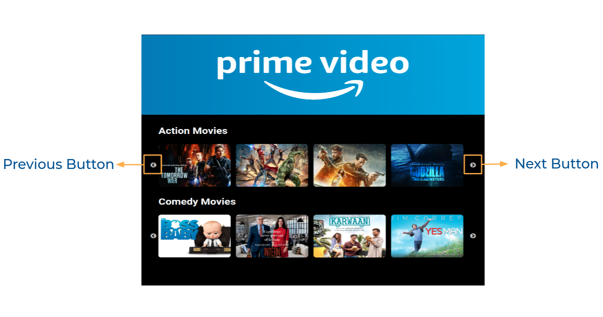
Action Movies List and Comedy Movies List should be displayed using React Slick
-
The
Appis provided withmoviesList. It consists of a list of movieItem objects with the following properties in each movieItem objectKey Data Type id String thumbnailUrl String videoUrl String categoryId String -
When the next button is clicked in any of the sliders, the next movie items thumbnail in the corresponding moviesList should be displayed
-
When the previous button is clicked in any of the sliders, the previous movie items thumbnail in the corresponding moviesList should be displayed
-
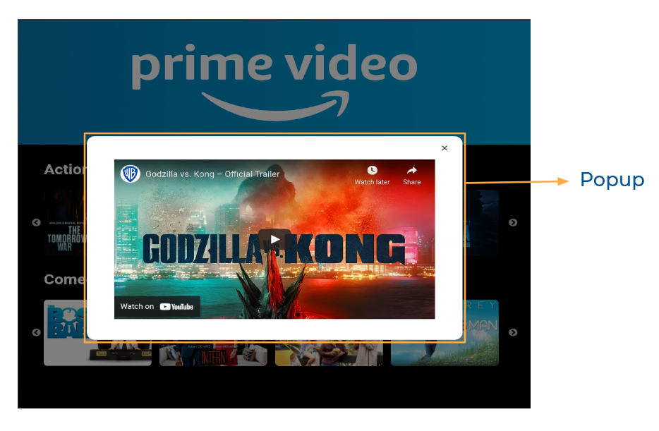
When you click on the thumbnail, then the popup should be opened,
- And corresponding video should be displayed using React player component from
react-player
- When the close button is clicked, then the popup should be closed - And corresponding video should be displayed using React player component from
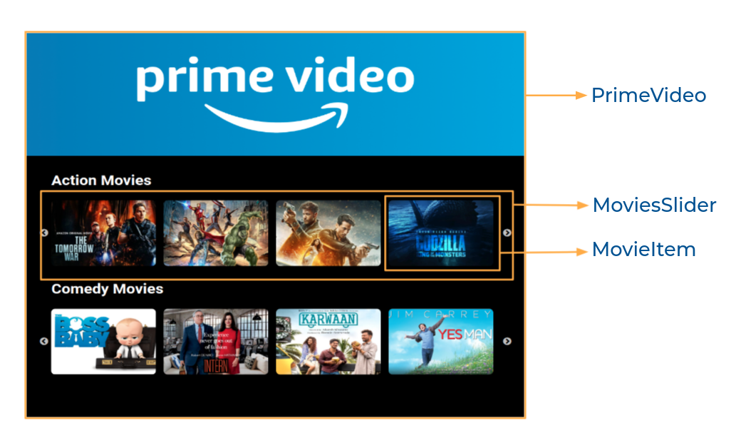
Components Structure
Implementation Files
Use these files to complete the implementation:
src/components/PrimeVideo/index.jssrc/components/PrimeVideo/index.csssrc/components/MoviesSlider/index.jssrc/components/MovieItem/index.jssrc/components/MovieItem/index.css
Click to view
-
To build this project, take a look at the React Slick, React Popup and React Video Player reading materials
-
To style popup content use
.popup-contentclass
<Popup
  modal
  trigger={
    //write code here
  }
  className="popup-content"
>
  //write code here
</Popup>Click to view
The following instructions are required for the tests to pass
- One frame of the slider should have 4 thumbnails
- The thumbnail images in the app should have alt as thumbnail
- The close button in the popup should have the
data-testidas closeButton IoMdClosefrom react-icons should be used for Close Icon in the Popup
Image URLs
- https://assets.ccbp.in/frontend/react-js/prime-video-img.png alt should be prime video
Colors
Font-families
- Roboto
- All components you implement should go in the
src/componentsdirectory.- Don't change the component folder names as those are the files being imported into the tests.
- Do not remove the pre-filled code
- Want to quickly review some of the concepts you’ve been learning? Take a look at the Cheat Sheets.