Following and sharing links on Mastodon from the web can be difficult. Mastodon doesn't (and probably can't/won't) provide a single share or follow button that can be placed on any web page. This is because every user could be on a different instance, and the button would never know which instance to use to log the user in and perform the action.
This package provides a few components for putting these types of links on your site. It works by opening a (very nice!) modal that prompts the user for their Mastodon instance URL. The input field is very forgiving and can handle just the domain (mastodon.social), the full URL (https://mastodon.social), and even URLs with random paths (https://mastodon.social/explore). Any of these formats will be parsed correctly and the user will be directed to their own instance (over HTTPS).
Each of the components is a wrapper that you can put around any button/link/icon/child component you want. When the user clicks that child, they'll see the prompt.
Dark mode is automatically supported if the user's browser is in dark mode.
The @mikebeas namespace is distributed on GitHub. You can add the following line to your project's .npmrc or to your global .npmrc file.
@mikebeas:registry=https://npm.pkg.github.com/
This will instruct npm to install packages in the @mikebeas namespace from GitHub Packages. Once the namespace is configured, you can install this package using npm i @mikebeas/mastodon-modal like you would any other package.
You can also install the package without modifying your configuration using:
npm i mikebeas/mastodon-modal
You can specify a version to install by using a GitHub tag, such as npm i mikebeas/mastodon-modal#v1.0.0.
However, note that using this configuration-free method will create an entry in your package.json that looks like this:
"dependencies": {
	"@mikebeas/mastodon-modal": "github:mikebeas/mastodon-modal"
}
instead of the expected/usual format:
"dependencies": {
	"@mikebeas/mastodon-modal": "^1.0.0"
}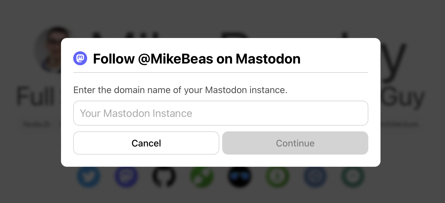
The FollowOnMastodon component redirects the user to the /authorize_follow intent on their home instance. It has the following props (all option
- component: function (required)
- This is a function
(open) => ReactNodewhereopenis a function you can call to open the modal. You can use this as an onClick handler or to programmatically open the modal at any time.
- This is a function
- username: string (required)
- This must be your full username, including the domain
- Leading @ is supported, but not required. If you don't include it, the component will add it for you. Both
@MikeBeas@mas.toandMikeBeas@mas.towill work with this button.
- usernameStyle: enum
- You can import UsernameStyles from the package and use the enum values provided to determine how your username will be displayed in the modal. The options are:
UsernameStyles.HANDLE(default): Displays as@MikeBeasUsernameStyles.HANDLE_NO_AT: Displays asMikeBeasUsernameStyles.FULL: Displays as@MikeBeas@mas.toUsernameStyles.HIDDEN: Displays no username in the modal
- You can import UsernameStyles from the package and use the enum values provided to determine how your username will be displayed in the modal. The options are:
- hideIcon: bool
- Set this to true to hide the Mastodon icon in the header of the modal
- hideRememberMe: bool
- By default, all modals show a "Remember my instance on this site" checkbox, which will remember the user's instance name across all instances of the modal on your site using localStorage. This is an opt-in selection for the user. If you wish to disable this functionality, you can use this prop to hide the checkbox. You can mix and match this prop on different instances of the share and follow modals, so if you only want one specific modal not to remember the user's selection, you can set this prop on only that modal.
Example showing all props in use:
import { FollowOnMastodon, UsernameStyles } from '@mikebeas/mastodon-modal';

const MyApp = () => (
	<FollowOnMastodon
		hideIcon
		hideRememberMe
		usernameStyle={UsernameStyles.HANDLE_NO_AT}
		username="@MikeBeas@mas.to"
		component={(open) => <YourComponent onClick={open} />}
	/>
)

export default MyApp;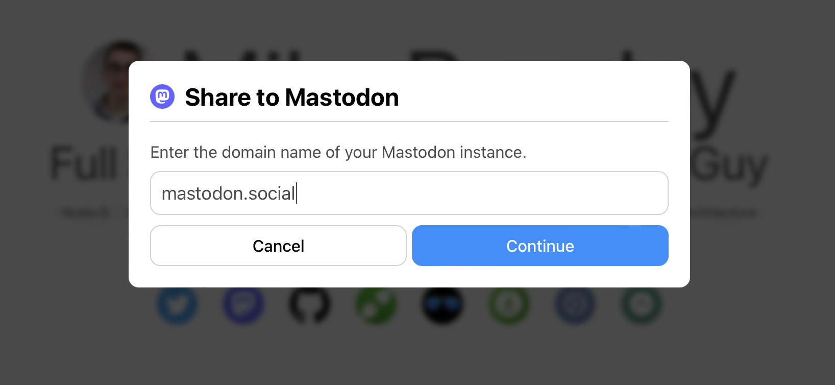
The FollowOnMastodon component redirects the user to the /share intent on their home instance. It has the following props (all optional unless specified):
- component: function (required)
- This is a function
(open) => ReactNodewhereopenis a function you can call to open the modal. You can use this as an onClick handler or to programmatically open the modal at any time.
- This is a function
- url: string|bool
- This controls what URL will be inserted into the sharing dialog. You can use it to override the window's URL to do things like link to the home page instead of some internal URL, add parameters showing the URL was shared to Mastodon, etc.
- If this is not provided,
window.location.hrefwill be used as the URL - If this is provided, you must provide a full URL so that it will be properly linked by Mastodon
- If you do not want to include any URL in the message, you can set this prop to
false
- message: string
- This will add an additional message to the share dialog before the URL. If not provided, no message will be added to the dialog. This message will be trimmed of whitespace before being added.
- hideIcon: bool
- Set this to true to hide the Mastodon icon in the header of the modal
- hideRememberMe: bool
- By default, all modals show a "Remember my instance on this site" checkbox, which will remember the user's instance name across all instances of the modal on your site using localStorage. This is an opt-in selection for the user. If you wish to disable this functionality, you can use this prop to hide the checkbox. You can mix and match this prop on different instances of the share and follow modals, so if you only want one specific modal not to remember the user's selection, you can set this prop on only that modal.
If no message is provided and the url prop is set to false, no post body will be added to the sharing dialog.
Example showing all props in use:
import { ShareOnMastodon } from '@mikebeas/mastodon-modal';

const MyApp = () => (
	<ShareOnMastodon
		hideIcon
		hideRememberMe
		url="https://www.mikebeas.com/?sharedVia=mastodon"
		message="Check out this website I found!"
		component={(open) => <YourComponent onClick={open} />}
	/>
)

export default MyApp;