封装的Android常用控件,比如:SleTextButton、SleImageButton、SleConstraintLayout、SleFrameLayout、SleLinearLayout、SleRelativeLayout等。使控件具备Shape、Selector等功能,省去编写shape或selector文件的繁琐步骤。另外支持N种颜色渐变,弥补原生shape文件只支持三种颜色(startColor/centerColor/endColor)的不足等。
Silhouette——更方便的Shape/Selector实现方案
首先祝大家新年快乐,开工大吉。
最新刚换了工作,大部分精力还是放到新工作上面,所以这次还是先给大家带来一个小而实用的库:Silhouette。另外,考虑到Kotlin越来越普及,作者在开发过程中也切实感受到Kotlin相较于Java带来的便利,后续的IM系列文章及项目考虑用Kotlin重写,而且考虑到由于工作业务需求过多可能出现断更的情况,所以打算一次性写完再放出来,避免大家学习不方便。
废话不多说,直接开始吧。
Silhouette意为“剪影”,取名并没有特别的含义,只是单纯地觉得意境较美。例如上一篇文章Shine——更简单的Android网络请求库封装的网络请求库:Shine即意为“闪耀”,也没有特别的含义,只是作者认为开源库起名较难,特意找一些比较优美的单词。
Silhouette是一系列基于GradientDrawable及StateListDrawable封装的组件集合,主要用于实现在Android Layout XML中直接支持Shape/Selector等功能。
我们都知道在Android开发中,不同的TextView及Button各种样式(形状、背景色、描边、圆角、渐变等)的传统实现方式是在drawable文件夹中编写各种shape/selector等文件,这种方式至少会存在以下几种弊端:
- shape/selector文件过多,项目体积增大;
- shape/selector文件命名困难,命名规范时往往会存在功能重复的文件;
- 功能存在局限性:例如gradient渐变色。传统shape方式只支持三种颜色过渡(startColor/centerColor/endColor),如果设计稿存在四种以上颜色渐变,shape gradient无能为力。再比如TextView在常态和按下态需要同时改变背景色及文字颜色时,传统方式只能在代码中动态设置等。
- 开发效率低;
- 难以维护等;
综上所述,我们迫切需要一个库来解决以上问题,Silhouette正具备这些能力。接下来,我们来具体看看Silhouette能做什么吧。
上面说到Silhouette是一系列组件集合,具体包含以下组件:
-
SleTextButton
基于AppCompatTextView封装;
具备定义各种样式(形状、背景色、描边、圆角、渐变等)的能力 ;
具备不同状态(常态、按下态、不可点击态)下文字颜色指定等。 -
SleImageButton
基于ShapeableImageView封装;
通过指定sle_ib_type属性使ImageView支持按下态遮罩层、透明度改变、自定义图片,同时支持CheckBox功能;
通过指定sle_ib_style属性使ImageView支持Normal、圆角、圆形等形状。 -
SleConstraintLayout
基于ConstraintLayout封装;
具备定义各种样式(形状、背景色、描边、圆角、渐变等)的功能。 -
SleRelativeLayout
基于RelativeLayout封装;
具备定义各种样式(形状、背景色、描边、圆角、渐变等)的功能。 -
SleLinearLayout
基于LinearLayout封装;
具备定义各种样式(形状、背景色、描边、圆角、渐变等)的功能。 -
SleFrameLayout
基于FrameLayout封装;
具备定义各种样式(形状、背景色、描边、圆角、渐变等)的功能。
-
项目结构
com.freddy.silhouette- config(配置相关,存放全局注解及公共常量、默认值等)
- ext(kotlin扩展相关,可选择用或不用)
- utils(工具类相关,可选择用或不用)
- widget(控件相关)
- button
- layout
由此可见,项目结构非常简单,所以Silhouette也是一个比较轻量级的库。
-
封装思路及原理
由于该库非常简单,实际上就是根据Shape/Selector进行自定义属性,从而利用GradientDrawable及StateListDrawable提供的API进行封装,不存在什么难度,在此就不展开讲了。下面贴一下代码片段,基本上几个组件的实现原理都大同小异,都是利用GradientDrawable及StateListDrawable实现组件的Shape及Selector功能:
private fun init() {
    val normalDrawable =
        getDrawable(normalBackgroundColor, normalStrokeColor, normalGradientColors)
    var pressedDrawable: GradientDrawable? = null
    var disabledDrawable: GradientDrawable? = null
    var selectedDrawable: GradientDrawable? = null
    when (type) {
        TYPE_MASK -> {
            pressedDrawable = getDrawable(
                normalBackgroundColor,
                normalStrokeColor,
                normalGradientColors
            ).apply {
                colorFilter =
                    PorterDuffColorFilter(maskBackgroundColor, PorterDuff.Mode.SRC_ATOP)
            }
            disabledDrawable =
                getDrawable(disabledBackgroundColor, disabledBackgroundColor)
        }
        TYPE_SELECTOR -> {
            pressedDrawable =
                getDrawable(pressedBackgroundColor, pressedStrokeColor, pressedGradientColors)
            disabledDrawable = getDrawable(
                disabledBackgroundColor,
                disabledStrokeColor,
                disabledGradientColors
            )
        }
    }
    selectedDrawable = getDrawable(
        selectedBackgroundColor,
        selectedStrokeColor,
        selectedGradientColors
    )
    setTextColor(normalTextColor)
    background = StateListDrawable().apply {
        if (type != TYPE_NONE) {
            addState(intArrayOf(android.R.attr.state_pressed), pressedDrawable)
        }
        addState(intArrayOf(-android.R.attr.state_enabled), disabledDrawable)
        addState(intArrayOf(android.R.attr.state_selected), selectedDrawable)
        addState(intArrayOf(), normalDrawable)
    }

    setOnTouchListener(this)
}

private fun getDrawable(
    backgroundColor: Int,
    strokeColor: Int,
    gradientColors: IntArray? = null
): GradientDrawable {
    // 背景色相关
    val drawable = GradientDrawable()
    setupColor(drawable, backgroundColor)

    // 形状相关
    (drawable.mutate() as GradientDrawable).shape = shape
    if (Build.VERSION.SDK_INT >= Build.VERSION_CODES.Q) {
        drawable.innerRadius = innerRadius
        if (innerRadiusRatio > 0f) {
            drawable.innerRadiusRatio = innerRadiusRatio
        }
        drawable.thickness = thickness
        if (thicknessRatio > 0f) {
            drawable.thicknessRatio = thicknessRatio
        }
    }

    // 描边相关
    if (strokeColor != 0) {
        (drawable.mutate() as GradientDrawable).setStroke(
            strokeWidth,
            strokeColor,
            dashWidth,
            dashGap
        )
    }

    // 圆角相关
    setupCornersRadius(
        drawable,
        cornersRadius,
        cornersTopLeftRadius,
        cornersTopRightRadius,
        cornersBottomRightRadius,
        cornersBottomLeftRadius
    )

    // 渐变相关
    (drawable.mutate() as GradientDrawable).gradientType = gradientType
    if (gradientCenterX != 0.0f || gradientCenterY != 0.0f) {
        (drawable.mutate() as GradientDrawable).setGradientCenter(
            gradientCenterX,
            gradientCenterY
        )
    }
    gradientColors?.let { colors ->
        (drawable.mutate() as GradientDrawable).colors = colors
    }
    var orientation: GradientDrawable.Orientation? = null
    when (gradientOrientation) {
        GRADIENT_ORIENTATION_TOP_BOTTOM -> {
            orientation = GradientDrawable.Orientation.TOP_BOTTOM
        }
        GRADIENT_ORIENTATION_TR_BL -> {
            orientation = GradientDrawable.Orientation.TR_BL
        }
        GRADIENT_ORIENTATION_RIGHT_LEFT -> {
            orientation = GradientDrawable.Orientation.RIGHT_LEFT
        }
        GRADIENT_ORIENTATION_BR_TL -> {
            orientation = GradientDrawable.Orientation.BR_TL
        }
        GRADIENT_ORIENTATION_BOTTOM_TOP -> {
            orientation = GradientDrawable.Orientation.BOTTOM_TOP
        }
        GRADIENT_ORIENTATION_BL_TR -> {
            orientation = GradientDrawable.Orientation.BL_TR
        }
        GRADIENT_ORIENTATION_LEFT_RIGHT -> {
            orientation = GradientDrawable.Orientation.LEFT_RIGHT
        }
        GRADIENT_ORIENTATION_TL_BR -> {
            drawable.orientation = GradientDrawable.Orientation.TL_BR
        }
    }
    orientation?.apply {
        (drawable.mutate() as GradientDrawable).orientation = this
    }
    return drawable
}
感兴趣的同学可以到官方文档了解GradientDrawable及StateListDrawable的原理。
自定义属性分为通用属性和特有属性。
-
通用属性
-
类型
属性名称 类型 说明 备注 sle_type enum 类型
mask:遮罩
selector:自定义样式
none:无默认值:mask
默认的mask为90%透明度黑色,可通过sle_maskBackgroundColors属性设置
若不指定为selector,则自定义样式无效 -
形状相关
属性名称 类型 说明 备注 sle_shape enum 形状
rectangle:矩形
oval:椭圆形
line:线性形状
ring:环形默认值:rectangle sle_innerRadius dimension|reference 尺寸,内环的半径 shape="ring"可用 sle_innerRadiusRatio float 以环的宽度比率来表示内环的半径 shape="ring"可用 sle_thickness dimension|reference 尺寸,环的厚度 shape="ring"可用 sle_thicknessRatio float 以环的宽度比率来表示环的厚度 shape="ring"可用 -
背景色相关
属性名称 类型 说明 备注 sle_normalBackgroundColor color|reference 常态背景颜色 / sle_pressedBackgroundColor color|reference 按下态背景颜色 / sle_disabledBackgroundColor color|reference 不可点击态背景颜色 默认值:#CCCCCC sle_selectedBackgroundColor color|reference 选中态背景颜色 / -
描边相关
属性名称 类型 说明 备注 sle_normalStrokeColor color|reference 常态描边颜色 / sle_pressedStrokeColor color|reference 按下态描边颜色 / sle_disabledStrokeColor color|reference 不可点击态描边颜色 / sle_selectedStrokeColor color|reference 选中态描边颜色 / sle_strokeWidth dimension|reference 描边宽度 / sle_dashWidth dimension|reference 虚线宽度 / sle_dashGap dimension|reference 虚线间隔 / -
圆角相关
属性名称 类型 说明 备注 sle_cornersRadius dimension|reference 总圆角半径 / sle_cornersTopLeftRadius dimension|reference 左上角圆角半径 / sle_cornersTopRightRadius dimension|reference 右上角圆角半径 / sle_cornersBottomLeftRadius dimension|reference 左下角圆角半径 / sle_cornersBottomRightRadius dimension|reference 右下角圆角半径 / -
渐变相关
属性名称 类型 说明 备注 sle_normalGradientColors reference 常态渐变背景色 支持在res/array下定义数组实现多个颜色渐变 sle_pressedGradientColors reference 按下态渐变背景色 支持在res/array下定义数组实现多个颜色渐变 sle_disabledGradientColors reference 不可点击态渐变背景色 支持在res/array下定义数组实现多个颜色渐变 sle_selectedGradientColors reference 选中态渐变背景色 支持在res/array下定义数组实现多个颜色渐变 sle_gradientOrientation enum 渐变方向
TOP_BOTTOM:从上到下
TR_BL:从右上到左下
RIGHT_LEFT:从右到左
BR_TL:从右下到左上
BOTTOM_TOP:从下到上
BL_TR:从左下到右上
LEFT_RIGHT:从左到右
TL_BR:从左上到右下/ sle_gradientType enum 渐变类型
linear:线性渐变
radial:圆形渐变,起始颜色从gradientCenterX、gradientCenterY点开始
sweep:A sweeping line gradient/ sle_gradientCenterX float 渐变中心放射点x坐标 注意,这里的坐标是整个背景的百分比的点,并不是确切点,0.2就是20%的点 sle_gradientCenterY float 渐变中心放射点y坐标 注意,这里的坐标是整个背景的百分比的点,并不是确切点,0.2就是20%的点 sle_gradientRadius dimension|reference 渐变半径 需要配合gradientType=radial使用,如果设置gradientType=radial而没有设置gradientRadius,将会报错 -
其它
属性名称 类型 说明 备注 sle_maskBackgroundColor color|reference 当sle_type=mask时,按钮按下状态的遮罩颜色 默认值:90%透明度黑色(#1A000000) sle_cancelOffset dimension|reference 用于解决手指移出控件区域判断为cancel的偏移量 默认值:8dp
-
-
特有属性
-
SleConstraintLayout/SleRelativeLayout/SleFrameLayout/SleLinearLayout
属性名称 类型 说明 备注 sle_interceptType enum 事件拦截类型
intercept_super:return super
intercept_true:return true
intercept_false:return falseLayout组件设置此值,可实现是否拦截事件,如果设置为intercept_true,事件将不传递到子控件,在某些场景比较实用 -
SleTextButton
属性名称 类型 说明 备注 sle_normalTextColor color|reference 常态文字颜色 / sle_pressedTextColor color|reference 按下态文字颜色 / sle_disabledTextColor color|reference 不可点击态文字颜色 / sle_selectedTextColor color|reference 选中态文字颜色 / -
SleImageButton
属性名称 类型 说明 备注 sle_ib_type enum 类型
mask:图片遮罩
alpha:图片透明度改变
selector:自定义图片
checkBox:CheckBox场景
none:无1.指定为mask时,自定义图片资源无效;
2.指定为alpha时,sle_pressedAlpha/sle_disabledAlpha生效;
3.指定为selector时,sle_normalResId/sle_pressedResId/sle_disabledResId生效;
4.指定为checkBox时,sle_checkedResId/sle_uncheckedResId/sle_isChecked生效;
5.指定为none时,图片资源均不生效,圆角相关配置有效sle_ib_style enum ImageView形状
normal:普通形状
rounded:圆角
oval:圆形默认值:normal sle_normalResId color|reference 常态图片资源 / sle_pressedResId color|reference 按下态图片资源 / sle_disabledResId color|reference 不可点击态图片资源 / sle_checkedResId color|reference 选中态checkBox图片资源 / sle_uncheckedResId color|reference 非选中态checkBox图片资源 / sle_isChecked boolean CheckBox是否选中 默认值:false sle_pressedAlpha float 按下态图片透明度 默认值:70% sle_disabledAlpha float 不可点击态图片透明度 默认值:30%
-
- 添加依赖
implementation "io.github.freddychen:silhouette:$lastest_version"
Note:最新版本可在maven central silhouette中找到。
- 使用
由于自定义属性太多,在此就不一一列举了。下面给出几种常见的场景示例,大家可以根据自定义属性表自行编写:
- 常态
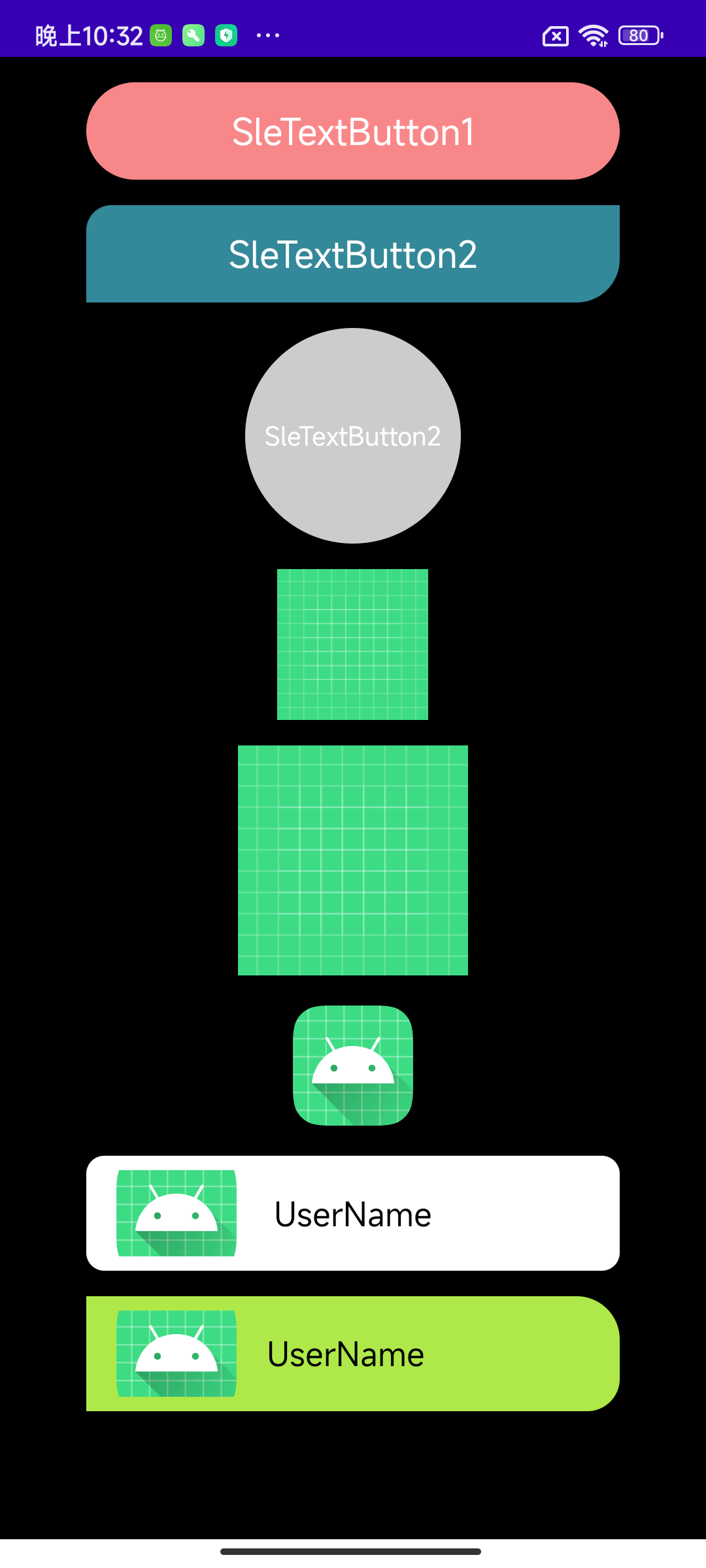
- 按下态
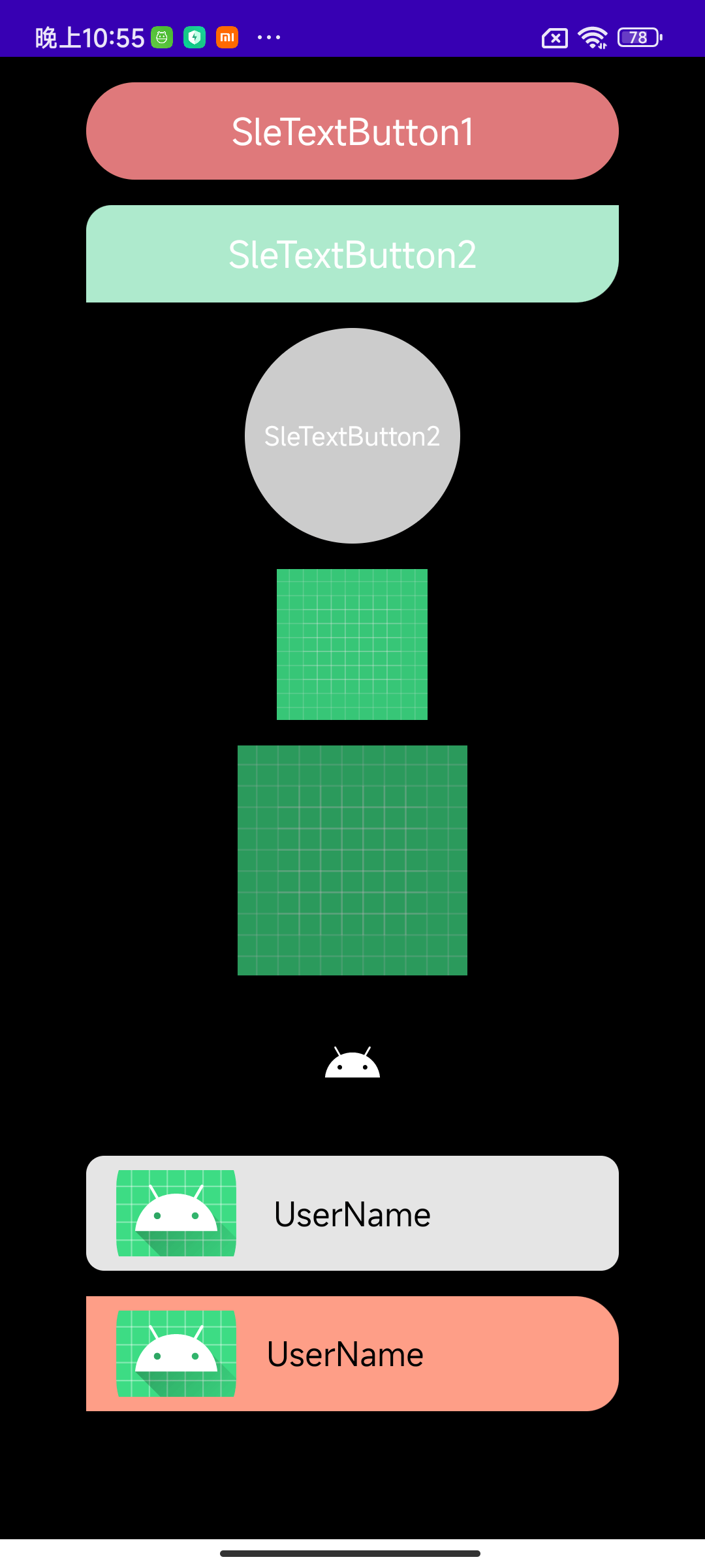
以上布局代码为:
<?xml version="1.0" encoding="utf-8"?>
<LinearLayout xmlns:android="http://schemas.android.com/apk/res/android"
    xmlns:app="http://schemas.android.com/apk/res-auto"
    android:layout_width="match_parent"
    android:layout_height="match_parent"
    android:background="@color/black"
    android:gravity="center_horizontal"
    android:orientation="vertical">

    <com.freddy.silhouette.widget.button.SleTextButton
        android:id="@+id/stb_1"
        android:layout_width="match_parent"
        android:layout_height="54dp"
        android:layout_marginHorizontal="48dp"
        android:layout_marginTop="14dp"
        android:gravity="center"
        android:text="SleTextButton1"
        android:textSize="20sp"
        app:sle_cornersRadius="28dp"
        app:sle_normalBackgroundColor="#f88789"
        app:sle_normalTextColor="@color/white"
        app:sle_type="mask" />

    <com.freddy.silhouette.widget.button.SleTextButton
        android:id="@+id/stb_2"
        android:layout_width="match_parent"
        android:layout_height="54dp"
        android:layout_marginHorizontal="48dp"
        android:layout_marginTop="14dp"
        android:gravity="center"
        android:text="SleTextButton2"
        android:textSize="20sp"
        app:sle_cornersBottomRightRadius="24dp"
        app:sle_cornersTopLeftRadius="14dp"
        app:sle_normalBackgroundColor="#338899"
        app:sle_normalTextColor="@color/white"
        app:sle_pressedBackgroundColor="#aeeacd"
        app:sle_type="selector" />

    <com.freddy.silhouette.widget.button.SleTextButton
        android:id="@+id/stb_3"
        android:layout_width="120dp"
        android:layout_height="120dp"
        android:layout_marginHorizontal="48dp"
        android:layout_marginTop="14dp"
        android:enabled="false"
        android:gravity="center"
        android:text="SleTextButton2"
        android:textSize="14sp"
        app:sle_cornersBottomRightRadius="24dp"
        app:sle_cornersTopLeftRadius="14dp"
        app:sle_normalBackgroundColor="#cc688e"
        app:sle_normalTextColor="@color/white"
        app:sle_pressedBackgroundColor="#34eeac"
        app:sle_shape="oval"
        app:sle_type="selector" />

    <com.freddy.silhouette.widget.button.SleImageButton
        android:id="@+id/sib_1"
        android:layout_width="84dp"
        android:layout_height="84dp"
        android:layout_marginTop="14dp"
        app:sle_ib_type="mask"
        app:sle_normalResId="@drawable/ic_launcher_background" />

    <com.freddy.silhouette.widget.button.SleImageButton
        android:id="@+id/sib_2"
        android:layout_width="128dp"
        android:layout_height="128dp"
        android:layout_marginTop="14dp"
        app:sle_ib_type="alpha"
        app:sle_normalResId="@drawable/ic_launcher_background" />

    <com.freddy.silhouette.widget.button.SleImageButton
        android:id="@+id/sib_3"
        android:layout_width="72dp"
        android:layout_height="72dp"
        android:layout_marginTop="14dp"
        app:sle_ib_type="selector"
        app:sle_normalResId="@mipmap/ic_launcher"
        app:sle_pressedResId="@drawable/ic_launcher_foreground" />

    <com.freddy.silhouette.widget.layout.SleConstraintLayout
        android:id="@+id/scl_1"
        android:layout_width="match_parent"
        android:layout_height="wrap_content"
        android:layout_marginHorizontal="48dp"
        android:layout_marginTop="14dp"
        android:paddingHorizontal="14dp"
        android:paddingVertical="8dp"
        app:sle_cornersRadius="10dp"
        app:sle_interceptType="intercept_super"
        app:sle_normalBackgroundColor="@color/white">

        <ImageView
            android:layout_width="72dp"
            android:layout_height="48dp"
            android:scaleType="centerCrop"
            android:src="@mipmap/ic_launcher_round" />

        <TextView
            android:layout_width="wrap_content"
            android:layout_height="wrap_content"
            android:text="UserName"
            android:textColor="@color/black"
            android:textSize="18sp"
            app:layout_constraintBottom_toBottomOf="parent"
            app:layout_constraintEnd_toEndOf="parent"
            app:layout_constraintStart_toStartOf="parent"
            app:layout_constraintTop_toTopOf="parent" />
    </com.freddy.silhouette.widget.layout.SleConstraintLayout>

    <com.freddy.silhouette.widget.layout.SleLinearLayout
        android:id="@+id/sll_1"
        android:layout_width="match_parent"
        android:layout_height="wrap_content"
        android:layout_marginHorizontal="48dp"
        android:layout_marginTop="14dp"
        android:gravity="center_vertical"
        android:paddingHorizontal="14dp"
        app:sle_type="selector"
        android:paddingVertical="8dp"
        app:sle_cornersTopRightRadius="24dp"
        app:sle_cornersBottomRightRadius="18dp"
        app:sle_interceptType="intercept_true"
        app:sle_pressedBackgroundColor="#fe9e87"
        app:sle_normalBackgroundColor="#aee949">

        <ImageView
            android:layout_width="72dp"
            android:layout_height="48dp"
            android:scaleType="centerCrop"
            android:src="@mipmap/ic_launcher_round" />

        <TextView
            android:layout_width="wrap_content"
            android:layout_height="wrap_content"
            android:layout_marginStart="14dp"
            android:text="UserName"
            android:textColor="@color/black"
            android:textSize="18sp"
            app:layout_constraintBottom_toBottomOf="parent"
            app:layout_constraintEnd_toEndOf="parent"
            app:layout_constraintStart_toStartOf="parent"
            app:layout_constraintTop_toTopOf="parent" />
    </com.freddy.silhouette.widget.layout.SleLinearLayout>
</LinearLayout>
Note:需要给组件设置setOnClickListener才能看到效果。
至于更多的功能,就让大家去试试吧,篇幅有限,就不一一列举了。有任何疑问,欢迎通过QQ群或微信公众号联系我。
| 版本号 | 修改时间 | 版本说明 |
|---|---|---|
| 0.0.1 | 2022.02.10 | 首次提交 |
| 0.0.2 | 2022.02.12 | 修改minSdk为19 |
终于写完了,Shape/Selector在每个项目中基本都会用到,而且频率还不算低。Silhouette原理虽然简单,但确实能解决很多问题,这些都是平时开发中的积累,希望对大家能有所帮助。欢迎大家star和fork,让我们为Android开发共同贡献一份力量。另外如果有疑问欢迎加入我的QQ群:1015178804,同时也欢迎大家关注我的公众号:FreddyChen,让我们共同进步和成长。
Copyright 2022, chenshichao

Licensed under the Apache License, Version 2.0 (the "License");
you may not use this file except in compliance with the License.
You may obtain a copy of the License at

   http://www.apache.org/licenses/LICENSE-2.0

Unless required by applicable law or agreed to in writing, software
distributed under the License is distributed on an "AS IS" BASIS,
WITHOUT WARRANTIES OR CONDITIONS OF ANY KIND, either express or implied.
See the License for the specific language governing permissions and
limitations under the License.