+ This is an ongoing project that needs constant revision so: contributions are welcome!How to contribute?
If you know a resource or an interesting topic that isn't listed below nor detailed enough feel free to fork the project and to create a new pull request.
Basic info
All the provided links have been reviewed following this system:
| 😍 | 😮 | 😉 |
|---|---|---|
| Awesome | Interesting | Good |
For some topics you will find the 🎁 icon indicating some fun practical resources1 to learn/understand faster the subject in question. Enjoy them and remember to support the authors if you can!
What can be found inside this project?
Articles that inspired this work:
- The self-taught UI/UX designer roadmap in 2021
- Atomic design by Brad Frost
- CSS architecture for design systems
🎁 Resources
The following table describes the positive and negative things associated2 with each listed color:
| Color | Positive feeling / things | Negative feeling / things |
|---|---|---|
| Red | Power, passion, energy and excitement | Anger, emergency and rage |
| Orange | Happiness, sunshine and joy | Aggressivity, ignorance and deceit |
| Yellow | Happiness, intelligence and optimism | Caution, criticism, laziness and jealousy |
| Green | Nature, growth, harmony and money | Greed and lack of experience |
| Blue | Peace, calm, stability, expertise, trust and dependability | Depression, coldness and passiveness |
| Purple | Royalty, sophistication, luxury, wealth, spirituality, creativity and healing | Gloominess and sadness |
| Black | Power, elegance, professionalism and depth | Death, unknown, mystery, grief, mourning and sorrow |
| White | Purity, innocence, cleanliness and safety | Coldness and distance |
Note: A color palette, in the digital world, refers to the full range of colors that can be displayed on a device screen or other interface. The color palette reveals a lot about the electronic design of the device or technology, and its visual capabilities for human users.
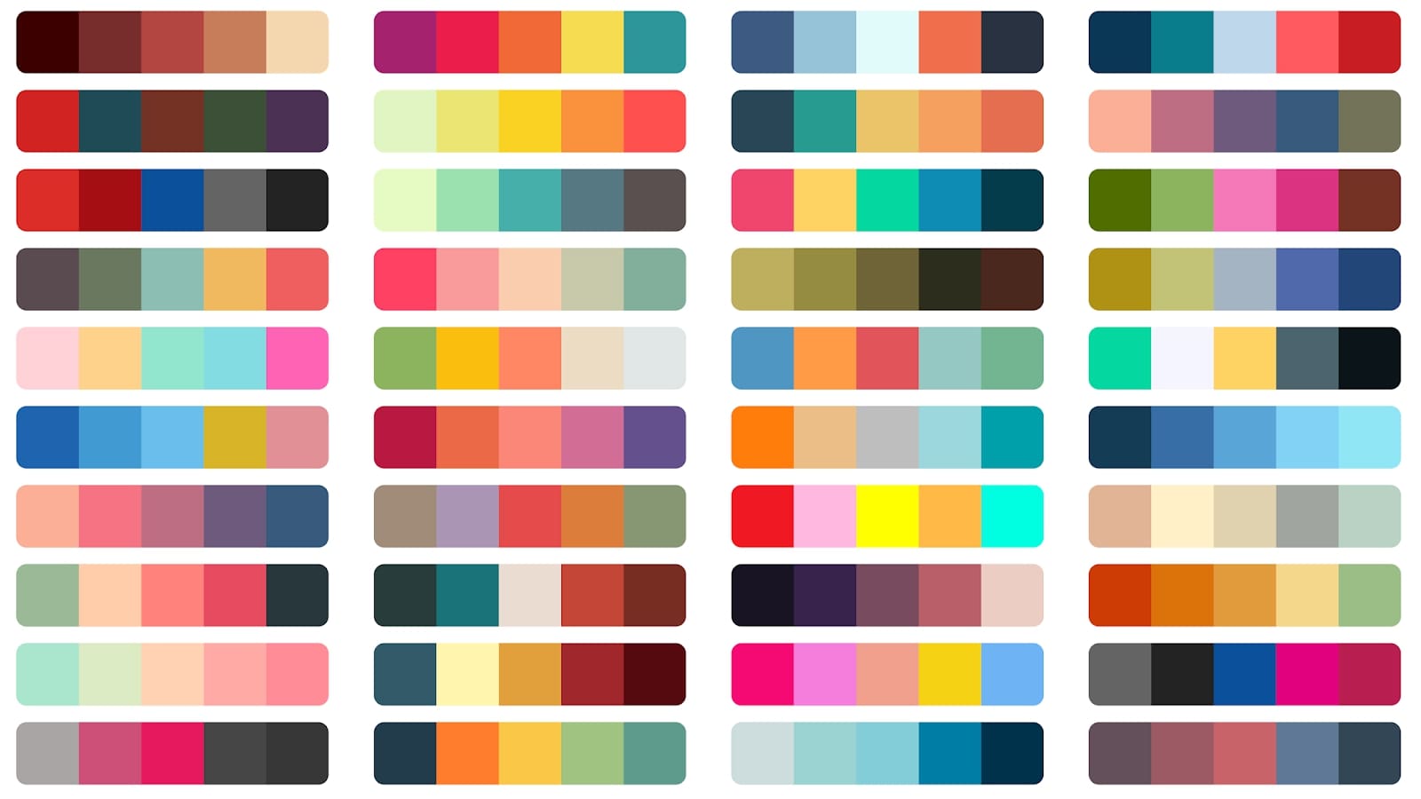
Here you can see various examples of web color palettes with dark and light colors, ranging from blue to green and a little bit of red.
Standard and styleguides should be learned, understood, and implemented at all times on a project, and any deviation must be fully justified.
Learn styleguides and standards:
- [😍] High-level advice and guidelines for writing sane, manageable, scalable CSS
- [😍] Schema.org - Create, maintain, and promote schemas for structured data on the internet
- [😮] IEC - Product symbols standards
Note: "Accessibility (often abbreviated to A11y — as in, "a", then 11 characters, and then "y") in web development means enabling as many people as possible to use websites, even when those people's abilities are limited in some way." - MDN web docs
Note: "The Web is fundamentally designed to work for all people, whatever their hardware, software, language, location, or ability. When the Web meets this goal, it is accessible to people with a diverse range of hearing, movement, sight, and cognitive ability." - W3C - Accessibility
🎁 Resources
Learn accessibility standards:
- [😍] MDN - ARIA Attributes
- [😍] MDN - WAI-ARIA Roles
- [😍] HTML : Importance of role for better voice-overs & accessibility
- [😮] a11y-101
- [😮] How to Create a “Skip to Content” Link for accessibility
- [😉] EAA Compliance for Websites: The Definitive Guide
- [😉] 7 Ways to Make Your Website More Accessible
Best practices
- Use a label with a
forattribute for all the inputs in a form and show input's relative examples in the placeholders. - Use a
<fieldset>element to wrap radio buttons and a<legend>one to describe the choice. - Use
<button>each time you want to have a button on the screen; try not to replace it with a generic<div>or other non specific elements. - Use
<nav>,<header>,<main>,<section>and<footer>to define landmark regions inside your layouts. - If you have a list of points/items in a page you should use
<ul>or<ol>element to wrap each item and<li>for every single child inside the list. font-sizedefined in rem is a better choice in terms of responsiveness and accessibility.- Structure each section with headings using only one
<h1>item per page and using consecutive headings numbers (<h2>,<h3>, ...) inside each section. - ARIA attributes could be used to fill the gap of accessibility features, interactions and roles (eg. if you use a
<span>instead of a<button>to add a button inside a page); But: Avoid using ARIA if a native HTML element can do the same job. aria-liveandaria-controlscan be used to alert screen readers that something, after a user action, has been updated inside the current page; (see MDN - aria-live & MDN - aria-controls to learn more).- Programmable focus management is used to direct screen readers, or users in general, to a page update: opening of a modal, update of a previously disabled button after an action was performed, ...
- Use a "Skip to main content" link with a tabindex of 0 to be the first focusable element in a page full of text to make the user flow directly into the content.
Note: "Not everyone likes decorative animations or transitions, and some users outright experience motion sickness when faced with parallax scrolling, zooming effects, and so on." - Thomas Steiner
🎁 Resources
- Easing functions
- bendc/easing.css
- Web Animation API - Browser support test
- Web Animation API - caniuse
- [😍] MDN - Web Animations API
- [😍] JavaScript Scroll Animation Tutorial: Web Animations API
- [😍] Animating Layouts with the FLIP Technique
- [😮] How to create high-performance CSS animations
- [😮] prefers-reduced-motion: Sometimes less movement is more
- [😉] The Web Animations API vs. CSS
- [😉] Orchestrating Complexity With Web Animations API
🎁 Resources
Note: A customer journey map is a diagram (or several diagrams) that depict the stages customers go through when interacting with a company product or platform.

Here you can see an example of a customer journey for an E-Commerce platform: the largest number of interactions are in the "Acquisition" stage. It also considers future user engagement touchpoints such as a newsletter.
- [😍] User Journey vs User Flow: What’s the Difference and Why You Need Both?
- [😍] How to understand, use, and build customer journey maps
- [😍] Don’t Make a Journey Map: 9 archetypes of good / bad, and how to decide what to use
- [😮] The Practice of Customer-Journey Management
- [😮] The Benefits and Disadvantages of Customer Journey Mapping
- [😉] Coursera - Creating User Journey Maps: A Guide
- [😉] Techtarget - customer journey map
Pros:
- Gives us insight into users’ needs and which features to prioritize
- Can be used as a communication tool across all the business teams
- Decreases customer churn and increases customer lifetime value
Cons:
- Needs to have very clear intent and a well defined scope level
- Needs cross-teams effort and support to be implemented
- Needs - "quite a lot of" - customers data to rely on
Note: Documenting is a fundamental act to make sure that project requirements are fulfilled and to establish traceability concerning what has been done, who has done it, and when it has been done.
😉 Hint: To keep a history of the changes made on a project you should create a CHANGELOG.md file and keep it in the root folder of the project itself.
- [😍] 15 Essential Project Documents
- [😍] Material UI (MUI) Official Website
- [😍] Storybook - How to document components
- [😮] Project Documentation and Its Importance in 2023
- [😮] 5 Ways to Document React Components in 2020
- [😉] My component library documentation page
Pros:
- Gives all the designers and frontend devs a full comprehensive guide to use and understand the best scenarios for each component
- Works as a dynamic database of assets, illustrations, components and compositions
Cons:
- Needs to be maintained constantly over time for each small change made by everyone in the dev or design team
- Can become too specific or complicated if there's lack of communication between the parts
Note: Without UX testing, it’s impossible to know if your products are really meeting the user’s needs and providing a positive experience.
- [😍] 15 Essential Project Documents
- [😮] Project Documentation and Its Importance in 2023
- [😮] How to test UI components?
There’s no better time than now to start thinking about how happy your customers, clients, or your staff (or whoever you’re surveying) really are.
Create a customer satisfaction survey:
- [😍] 4 steps to customer survey design
- [😍] Creating Customer Feedback Systems: A Step-By-Step Guide
- [😮] Gathering feedback on your design system
- Always put lables or tooltips next to or near by icons in UI;
- Best text input width should be 80 characters;
- When designing a mobile UI adjust text size according to user distance from display;
- For long dropdowns add a filter box to the top so users can type and find elements quicker;
- Don’t force the user to search through a whole list of options, show the most popular choices at the top of the list;
- Avoid dropdowns if you only have 3-5 options available, a better solution is to use Radio buttons;
- Use
margin-inline-endinstead ofmargin-rightto support rtl and ltr directions properties; - To make gradients look subtle and realistic, you can use just one color on both ends. Then make one of the ends brighter by increasing Brightness (around 5 points) and decrease Hue (5 to 10 points);
- In dark mode avoid darker objects as top-layers. Anything that’s "closer" to the user should be lighter to show depth;
- Brightness difference between background and container should be: within 12% for dark interfaces and 7% for light ones;
- When having two buttons on a row: if you read left-to-right place the main action on the right;
- When having two buttons on a column: place the main action on the bottom;
- Always align the checkboxes to the top or bottom of the first line of text;
- ...
Footnotes
-
If you are the creator/owner of a specific resource listed in this project and you wish to have the link removed you can open an issue with the invalid tag. Thank you in advance. ↩
-
Those are just a few of the possible associations. You can also find the same sentiment associated with more than one color. ↩