In July 2020, as the lockdown in the UK was relaxed, we wrote about the ways that life had changed in the past 3 months. Many of the items were taken from previous stories from the data unit, linked to below.
- Google COVID-19 Community Mobility Reports
- Repo: UK turns to delivery cream teas during lockdown
- Repo: Coronavirus: How GPs have stopped seeing most patients in person
- A&E Attendances and Emergency Admissions 2020-21
- NHS 111 Minimum Data Set 2020-21
- ONS: Furloughing of workers across UK businesses: 23 March 2020 to 5 April 2020
- Repo: Coronavirus delays cleaner air plans in cities
- DfE: Attendance in education and early years settings during the coronavirus outbreak: 23 March to 11 June 2020
- ONS: Coronavirus and the social impacts on Great Britain: 10 July 2020
- Hugh Coe, professor of atmospheric composition, the University of Manchester
- Spokesperson, The Royal College of GPs
- Spokesperson, Age UK
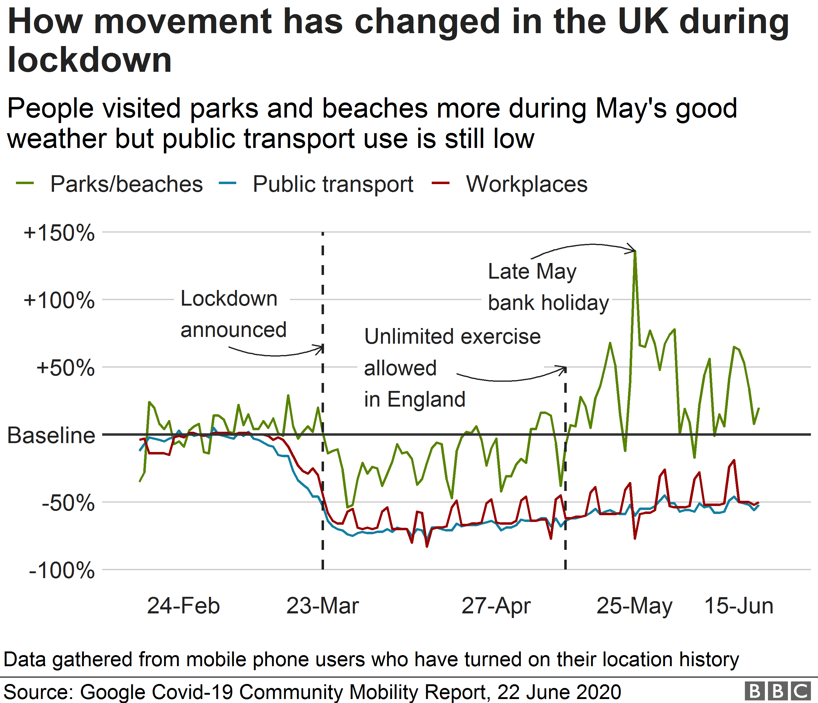
- Multiple line chart: use of beaches, public transport, workplaces compared to baseline, Feb-June 2020
- Multiple choropleth maps: % change in visits to beaches and parks compared to before coronavirus: End of March and Mid June
- Stacked area chart with dotted line: UK death registrations - Official Covid-19 deaths, other excess deaths and all other deaths (dotted line: 5-year average)
- Multiple line chart: Percentage of GP appointments by type, May 2019-May 2020
- Grouped column chart: A&E visits vs 111 calls, May 2019-May 2020
- Bar chart: Percentage of staff furloughed by sector
- Multiple line chart: Average daily nitrogen dioxide readings, March-June 2019 vs 2020
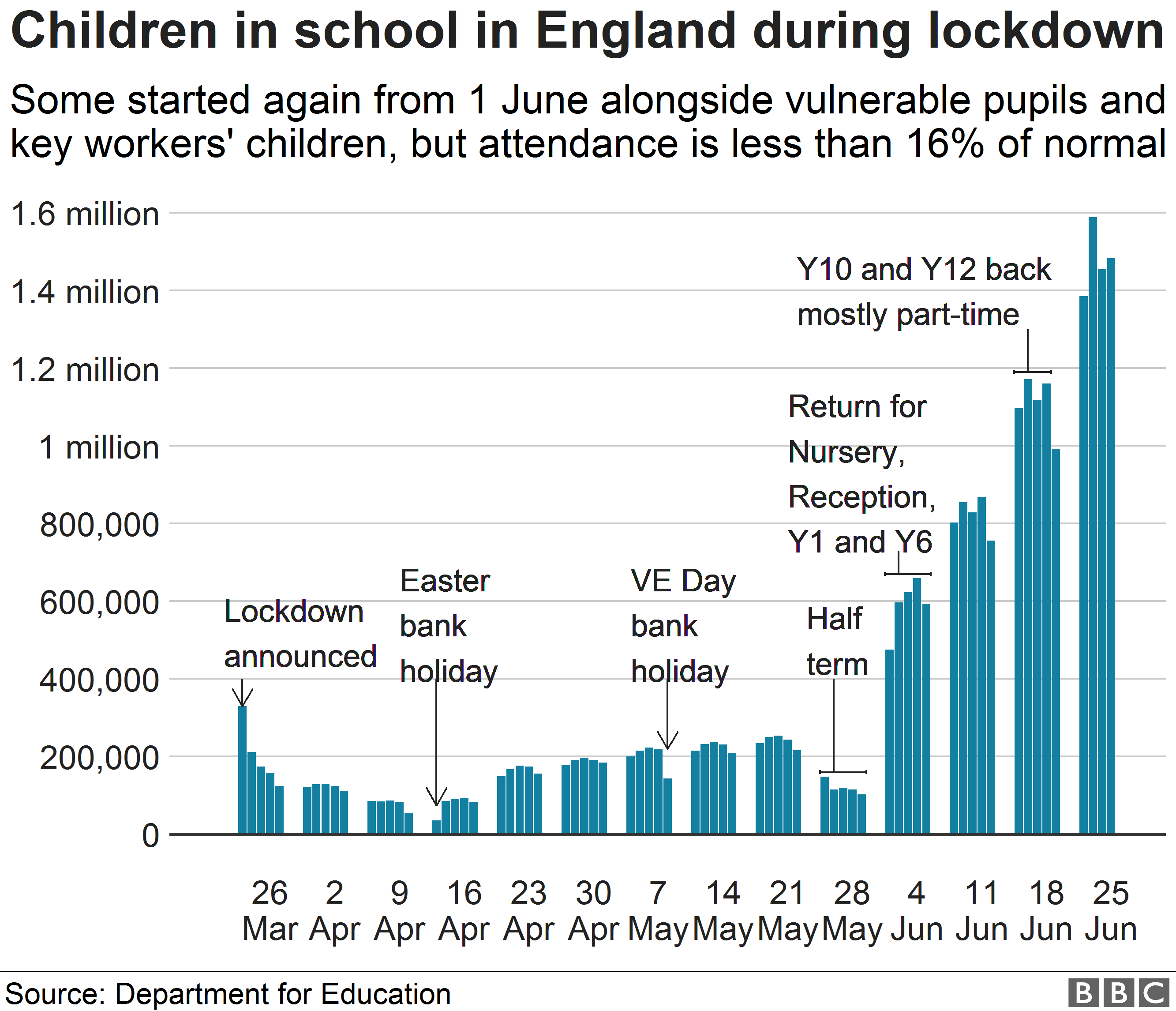
- Histogram: Children in school, March 26-June 25
- Line chart: Relative search interest on Google for 'delivery', July 2019-June 2020
- Bar chart: Percentage rise in delivery-related UK Google searches in the 3 months since March 23
- Bar chart: Percentage reporting impact, coping and reasons for leaving the house in an ONS survey about dealing with lockdown
- Multiple line chart: Percentage thinking life will return to normal within 6 months vs over a year, April-June 2020