Pokémon Graphics
Any Pokémon-specific graphics details are specified here, such as which graphics are displayed on each layer, palette assignment tables, and so on.
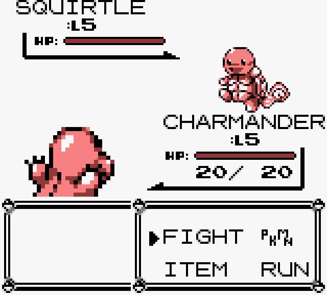
The majority of graphics in-battle is displayed on the window layer, not the background or sprite layers. The notable exceptions are as follows:
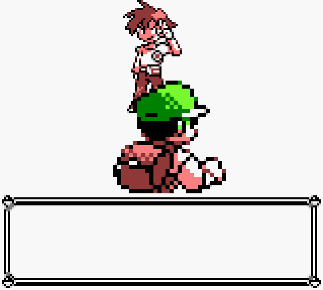
- The animation that plays when the wild Pokémon or enemy trainer “sprite” (in quotes here, because they’re not technically sprites if they’re on the background layer, but it’s a convenient way to refer to them as discrete graphical entities) scrolls across the screen as the player’s rear trainer sprite scrolls across in the opposite direction. Given these graphics overlap as they pass each other, it’s necessary for the top of the player’s sprite to be displayed on the sprite layer in order for it to exhibit transparent pixels, to properly simulate depth by allowing the enemy’s sprite to be displayed in the gaps. The player’s sprite then returns to being fully displayed on the window layer instead on the completion of the animation.
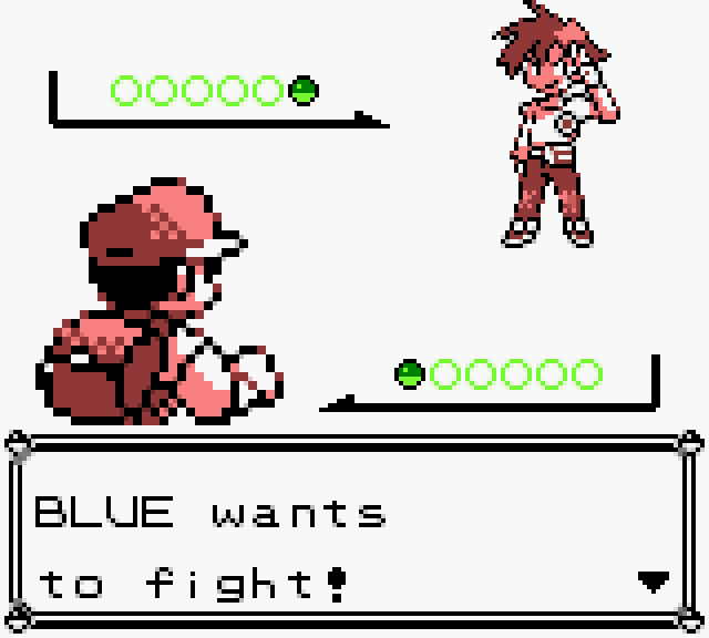
- The Pokémon belt(s) that appear(s) after the enemy entrance animation are shown on the sprite layer.
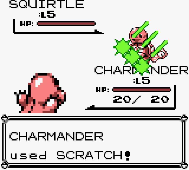
- Item and attack animations are shown on the sprite layer so that they appear in front of all other graphics.
These are all illustrated in the screenshots below taken from an emulator running Red in GBC mode, where window-layer graphics are displayed in shades of red and sprite-layer graphics are displayed in shades of green:
| Enemy entrance | Battle summary | Typical idle scene | Attack animation |
|---|---|---|---|
 |
 |
 |
 |
In issue #1, I decided on a standardised set of palette allocations for battle scenes that maximises utilisation of the GBC hardware while also defining clear requirements that all new Pokémon sprites must adhere to. The following table shows how the 8 background palettes will be divvied-up for the DX version of the game:
| # | Purpose | Colour 1 | Colour 2 | Colour 3 | Colour 4 |
|---|---|---|---|---|---|
| 1 | Playfield and details (i.e. tufts of grass, sea waves, cave rocks, etc.) | Playfield base colour | Playfield highlight colour | Playfield shade colour | Additional highlight or shade colour |
| 2 | Primary menu colours | Black | White | Red (for Pokéball) | Grey (for shading) |
| 3 | Health bar colours (smoothly transition from green, through yellow and orange, to red) | Black | Playfield base colour | Enemy Pokémon’s health bar colour | Player’s Pokémon’s health bar colour |
| 4 | Used for enemy Pokémon’s outline and HUD | Black | Playfield base colour | Pokémon colour 1 | Pokémon colour 2 or playfield shade colour (e.g. for Pokémon’s shadow or glow) |
| 5 | Used for player’s Pokémon outline and HUD | Black | Playfield base colour | Pokémon colour 1 | Pokémon colour 2 or playfield shade colour (e.g. for Pokémon’s shadow or glow) |
| 6 | Enemy Pokémon’s primary palette | Anything | Anything | Anything | Anything |
| 7 | Enemy Pokémon’s secondary palette | Anything | Anything | Anything | Anything |
| 8 | Player’s Pokémon’s palette | Anything | Anything | Anything | Anything |
The following diagram is an example of how these palettes may be attributed to a typical battle scene:
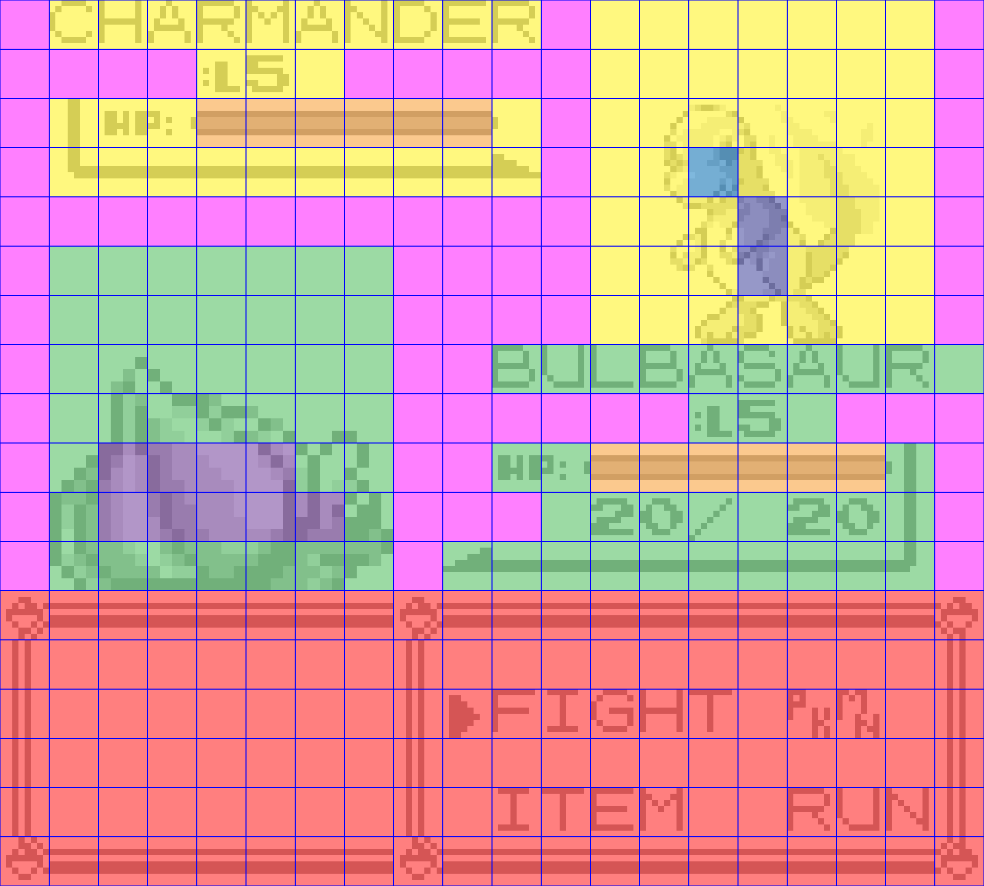
The colours in the image pertain to the palette table above’s palette numbers as follows:
- Palette 1 – pink.
- Palette 2 – red.
- Palette 3 – orange.
- Palette 4 – yellow.
- Palette 5 – green.
- Palette 6 – blue.
- Palette 7 – violet.
- Palette 8 – indigo.
If it turns-out that this set of palette allocations is too limiting, then one thing we could do would be to abandon the different types of playfield (grass, water, cave, etc.) to free-up colours for the Pokémon themselves, but I think that’d be a unique nicety to keep if possible. I think this plan gives a nice balance of lots of different elements, rather than giving the Pokémon graphics all of the love, and instead enhancing the whole experience to further set it apart from the non-deluxue games.