A simple Carousel Widget with multiple configuration option.
...
dependencies:
 ...
 flutter_multi_carousel: ^1.0.0
...
And install it using flutter packages get on your project folder. After that, just import the module and use it:
import 'package:flutter/material.dart';
import 'package:flutter_multi_carousel/carousel.dart';

void main() => runApp(MyApp());

class MyApp extends StatelessWidget {
  // This widget is the root of your application.
  @override
  Widget build(BuildContext context) {
    return MaterialApp(
      title: 'Flutter Demo',
      home: CarouselExample(),
    );
  }
}

class CarouselExample extends StatelessWidget {
  @override
  Widget build(BuildContext context) {
    return Scaffold(
      body: Center(
        child: Carousel(
            height: 350.0,
            width: 350,
            type: "slideswiper",
            indicatorType: "bubble",
            arrowColor: Colors.white,
            axis: Axis.horizontal,
            showArrow: true,
            children: List.generate(
                7,
                (i) => Center(
                      child: Container(color: Colors.red),
                    ))),
      ),
    );
  }
}
For detailed demonstration refer this GitHub link
https://github.com/jaiswalshubham84/Flutter-Carousel
| Properties | Type | Default Value | Description |
|---|---|---|---|
| height | Double | null | Defines height of carousel.This field is required |
| width | Double | null | Defines width of carousel. This field is required |
| axis | Axis | Axis.horizontal | Defines axis of carousel. |
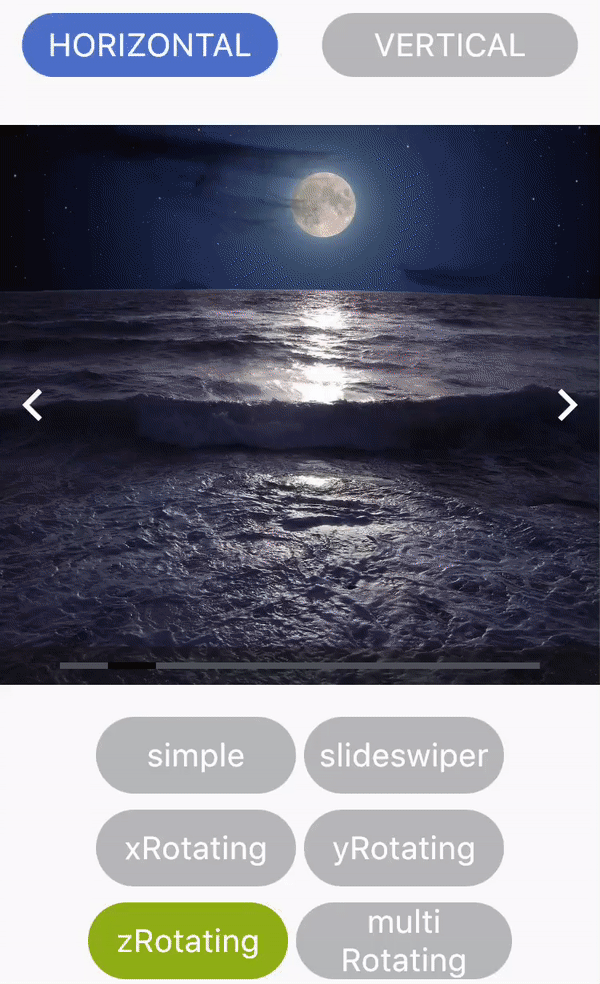
| type | String | "simple" | Defines type of carousel. Available carousel types are: "simple", "slideswiper", "xrotating", "yrotating", "zrotating", "multirotating" |
| showArrow | Bool | true | choice to show arrow in carousel |
| arrowColor | Color | Colors.white | Define the color of arrow |
| showIndicator | Bool | true | Choice to show indicator in carousel |
| indicatorType | String | bar | Defines the type of indicator. Available indicator types are: "bar", "dot", "bubble" |
| activeIndicatorColor | Color | Colors.white | Defines the color of active indicator |
| unActiveIndicatorColor | Color | Colors.black | Defines the color of unactive indicator |
| indicatorBackgroundColor | Color | Color(0xff121212) | Defines the background color of indicator |
| indicatorBackgroundOpacity | Double | 0.5 | Defines the opacity of indicator background |
 |
 |
 |
|---|---|---|
 |
 |
 |
Developed by Shubham Jaiswal jaiswal.shubham84@gmail.com
Feel free to Contribute!
For help getting started with Flutter, view our online documentation.