Visualizing and modeling the COVID-19 is the main objective here.
I'm trying to use R to implement this idea. The initial idea was to create an animated map with dots. I generalized the code in order to plot multi countries if we have the detailed location data of the cases. You can find my post here. It includes some other types of plots, such ggplotly and shiny app.
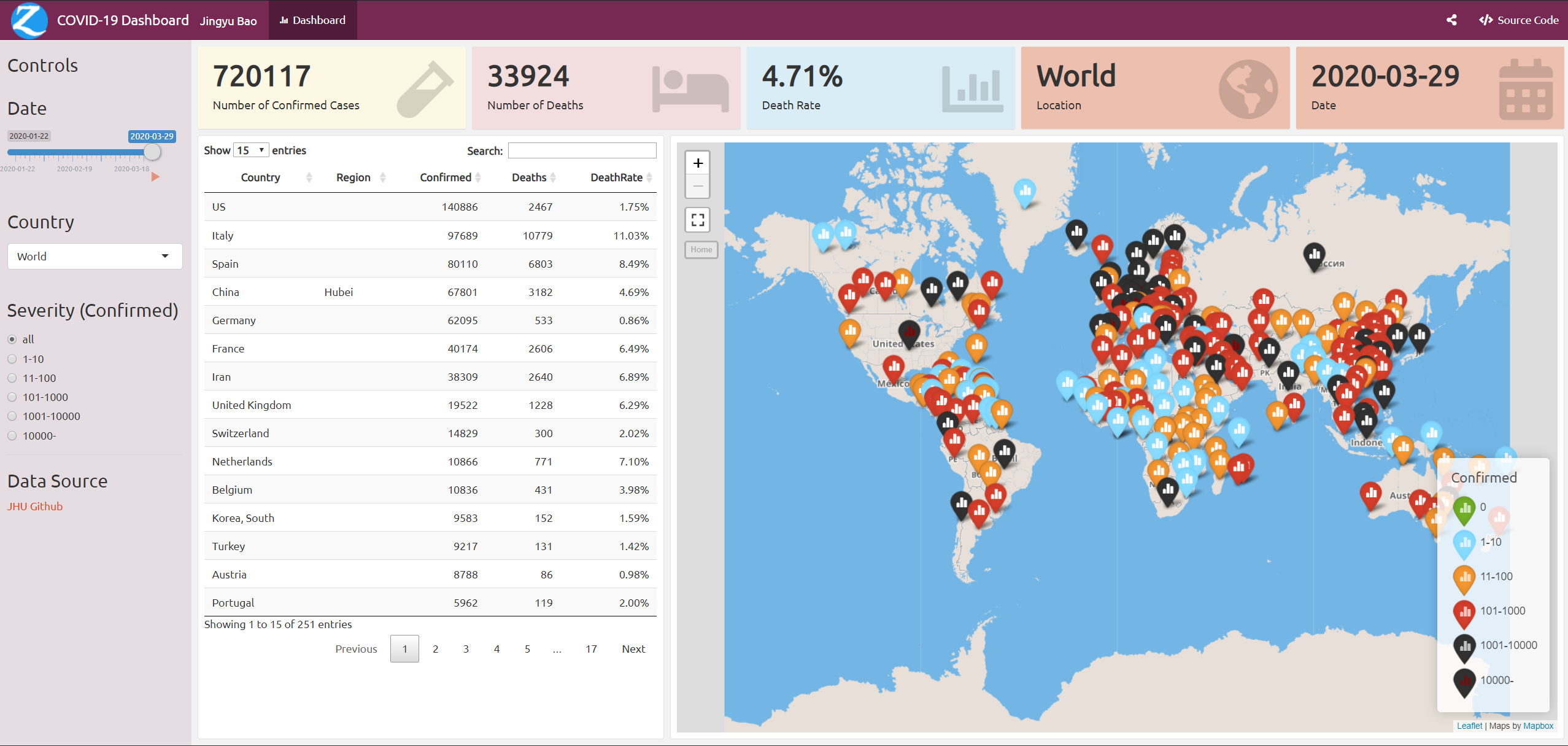
I created a shiny flexdashboard here.

Here are the plots for China and the entire world. I removed US plots as the data format keeps changing.


I come into this github and created similar plot in R.

- Modelling the data with SIR.
- Shiny app update.
- The data source is from JHU CSSE (Old website is JHU nCov).
- Some countries didn't report recovered cases, like Canada. I fill it as 0.
- I changed the Country/Region to China for Hong Kong, Macau and Taiwan in the github plots, but not in the shiny flexdashboard.
- JHU CSSE
- 2019-wuhan-ncov
- some blog
- changing-ggplot-geom-sf-choropleth-fill-color
- ggplot2-sf
- cn-cities
- convert-some-column-classes-in-data-table
This work is licensed under CC BY-NC 4.0