Grids
Grids are used to break any space into fractions, they can be nested and stacked. A unit can contain another line or it can contain other objects directly. The sum of the fractional sizes of all children of one line should be equal to one. Grids control width, content controls height. The grids have all the functionality of YUI grids and some other important features.
- Less than 1kb! (including full templates and grids)
- Infinite nesting and stacking.
- The only change required to use any of the objects, is to place it in the HTML. No changes to other places in the DOM, and no location dependent styling.
- Easy integration with back-end development.
- Easy for beginners to create complex page layouts.
Please help me test the grids and template objects. Put them through their paces and let me know if you manage to break them!
| Property | Description |
|---|---|
line |
Groups units on one horizontal line. Note: for mobile layout units may be stacked to avoid horizontal scrolling. |
unit |
Base class which divides a line into sections (columns). |
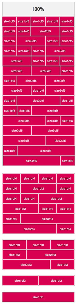
sizeXofY |
Extends unit. Indicates the fractional width of the unit, for example size3of4 would take up three quarters, or 75%, of the horizontal space. The following fractions are supported: 1, 1/2, 1/3, 2/3, 1/4, 3/4, 1/5, 2/5, 3/5, 4/5 |
lastUnit |
Extends unit. Applied to the last child of every line. |
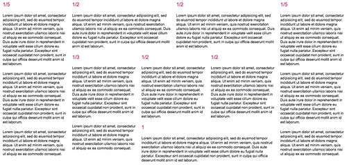
<div class="line">
	<div class="unit size1of2">
		<h3>1/2</h3>
		<p>Lorem ipsum dolor sit amet...</p>
	</div>
	<div class="unit size1of2 lastUnit">
		<h3>1/2</h3>
		<p>Lorem ipsum dolor sit amet...</p>
	</div>
</div>
<div class="line">
	<div class="unit size1of3">
		<h3>1/3</h3>
		<p>Lorem ipsum dolor sit amet...</p>
	</div>
	<div class="unit size1of3">
		<h3>1/3</h3>
		<p>Lorem ipsum dolor sit amet...</p>
	</div>
	<div class="unit size1of3 lastUnit">
		<h3>1/3</h3>
		<p>Lorem ipsum dolor sit amet...</p>
	</div>
</div>
<div class="line">
	<div class="unit size1of3">
		<h3>1/3</h3>
		<p>Lorem ipsum dolor sit amet...</p>
	</div>
	<div class="unit size2of3 lastUnit">
		<h3>2/3</h3>
		<p>Lorem ipsum dolor sit amet...</p>
	</div>
</div>
<div class="line">
	<div class="unit size1of4">
		<h3>1/4</h3>
		<p>Lorem ipsum dolor sit amet...</p>
	</div>
	<div class="unit size1of4">
		<h3>1/4</h3>
		<p>Lorem ipsum dolor sit amet...</p>
	</div>
	<div class="unit size1of2 lastUnit">
		<h3>1/2</h3>
		<p>Lorem ipsum dolor sit amet...</p>
	</div>
</div>
<div class="line">
	<div class="unit size3of4">
		<h3>3/4</h3>
		<p>Lorem ipsum dolor sit amet...</p>
	</div>
	<div class="unit size1of4 lastUnit">
		<h3>1/4</h3>
		<p>Lorem ipsum dolor sit amet...</p>
	</div>
</div>
<div class="line">
	<div class="unit size4of5">
		<h3>4/5</h3>
		<p>Lorem ipsum dolor sit amet...</p>
	</div>
	<div class="unit size1of5 lastUnit">
		<h3>1/5</h3>
		<p>Lorem ipsum dolor sit amet...</p>
	</div>
</div>
<div class="line">
	<div class="unit size2of5">
		<h3>2/5</h3>
		<p>Lorem ipsum dolor sit amet...</p>
	</div>
	<div class="unit size3of5 lastUnit">
		<h3>3/5</h3>
		<p>Lorem ipsum dolor sit amet...</p>
	</div>
</div>
Many years ago Arnaud Gueras, an excellent developer I worked with, created this litmus of a great grids system. It should be able to nest any combination of the units and lines, and so it should be able to create the complicated layout below. His test reminded me of the golden mean, so I still use it today.
<div class="line">
	<div class="unit size1of5">
		<h3>1/5</h3>
		<p>Lorem ipsum dolor sit amet...</p>
		<p>Lorem ipsum dolor sit amet...</p>
		<p>Lorem ipsum dolor sit amet...</p>
	</div>
	<div class="unit size3of5">
		<!-- line -->
		<div class="line">
			<div class="unit size1of2">
				<h3>1/2</h3>
				<p>Lorem ipsum dolor sit amet...</p>
			</div>
			<div class="unit size1of2 lastUnit">
				<h3>1/2</h3>
				<p>Lorem ipsum dolor sit amet...</p>
			</div>
		</div>
		<!-- /line -->
		<div class="line">
			<div class="unit size1of3">
				<h3>1/3</h3>
				<p>Lorem ipsum dolor sit amet...</p>
                                <p>Lorem ipsum dolor sit amet...</p>
			</div>
			<div class="unit size2of3 lastUnit">
				<!-- line -->
				<div class="line">
					<div class="unit size1of2">
						<h3>1/2</h3>
						<p>Lorem ipsum dolor sit amet...</p>
					</div>
					<div class="unit size1of2 lastUnit">
						<h3>1/2</h3>
						<p>Lorem ipsum dolor sit amet...</p>
					</div>
				</div>
				<!-- /line -->
				<div class="line">
					<div class="unit size1of1">
						<h3>1</h3>
						<p>Lorem ipsum dolor sit amet...</p>
					</div>
				</div>
			</div>
		</div>
	</div>
	<div class="unit size1of5 lastUnit">
		<h3>1/5</h3>
		<p>Lorem ipsum dolor sit amet...</p>
		<p>Lorem ipsum dolor sit amet...</p>
		<p>Lorem ipsum dolor sit amet...</p>
	</div>
</div>