The library is supposed to be used in applications where UI is rendered every time there's a change. The layout is defined declaratively using elements like dock or stack panels similarly to WPF. Once defined it can be rendered into a buffer and then sent to the display driver. This library does not include platform specific communication code for SSD1306. It requires an implementation of a tiny interface or use one of the avalialbe ones:
- IoT.Display.UWP UWP adapter and demo app;
- IoT.Display.RaspberrySharp .Net/Mono adapter for Raspberry Pi and demo app (based on RaspberrySharp).


- Dock panel
- Stack panel
- Border
- Text (wrapping: char, word)
- Image
- Canvas
- Horizontal/Vertical alignment
- Marging/Padding
- Min/Max width/height
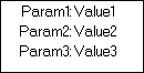
The stack panel stacks child elements either vertically or horizontally which is controlled by the Orientation attribute.
    let paramStyle:ITextAttribute list = [HorizontalAlignment HorizontalAlignment.Right; Margin (thickness 0 2 1 2)]
    let valueStyle:ITextAttribute list = [HorizontalAlignment HorizontalAlignment.Left; Margin (thickness 1 2 0 2)]

    stack [Orientation StackPanelOrientation.Horizontal; HorizontalAlignment HorizontalAlignment.Center; Padding (thicknessSame 1)] [
        stack [Orientation StackPanelOrientation.Vertical; Width 64] [
            text paramStyle "Param1:"
            text paramStyle "Param2:"
            text paramStyle "Param3:"
        ]
        stack [Orientation StackPanelOrientation.Vertical; Width 64] [
            text valueStyle "Value1"
            text valueStyle "Value2"
            text valueStyle "Value3"
        ]
    ]
Dock panel allows to attach child elements to one of the sides or fill the remaining space.
    dock [] [
        text [Dock Dock.Bottom; Margin (thicknessSame 1)] "Bottom line"
        stack [Orientation StackPanelOrientation.Vertical; Dock Dock.Left; Margin (thicknessSame 1)] [
            text [] "1"
            text [] "2"
            text [] "3"
        ]
        text [Dock Dock.Fill; HorizontalAlignment HorizontalAlignment.Center; VerticalAlignment VerticalAlignment.Center] "Filled"
    ]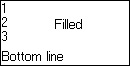
The order in which the children are added affects space allocation. The element with Dock Fill should be the last child.
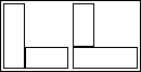
    dock [] [
        dock [Width 64; Padding (thicknessSame 2)] [
            border [Dock Dock.Left; Width 20; Thickness (thicknessSame 1)] ( canvas [] [] )
            border [Dock Dock.Bottom; Height 20; Thickness (thicknessSame 1)] ( canvas [] [] )
        ]
        dock [Width 64; Padding (thicknessSame 2)] [
            border [Dock Dock.Bottom; Height 20; Thickness (thicknessSame 1)] ( canvas [] [] )
            border [Dock Dock.Left; Width 20; Thickness (thicknessSame 1)] ( canvas [] [] )
        ]
    ]
While rendering text it's possible to set word wrapping to none, char, or word.
text [TextWrapping Word] "Lorem Ipsum is simply dummy text of the printing and typesetting industry. Lorem Ipsum has been the"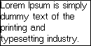
While rendering text it's possible to set word wrapping to none, char, or word.
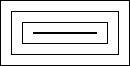
    let attrs:IBorderAttribute list = [thicknessSame 10 |> Margin; thicknessSame 1 |> Thickness]
    border attrs (
        border attrs (
            border attrs (canvas [][])
        )
    )
It's also possible to render basic primitives like dot, line, polyline, filled rectangle, or quadratic bezier curve. The bridge between LayoutElement and Visual is Canvas.
    dock [] [
        canvas [Dock Dock.Fill; HorizontalAlignment HorizontalAlignment.Center; VerticalAlignment VerticalAlignment.Center; Width 21; Height 21] [
            Polyline [{X = 5; Y = 9}; {X = 9; Y = 16}; {X = 15; Y = 5}]
            QuadraticBezier ({X = 0; Y = 10}, {X = 0; Y = 20}, {X = 10; Y = 20})
            QuadraticBezier ({X = 0; Y = 10}, {X = 0; Y = 0}, {X = 10; Y = 0})
            QuadraticBezier ({X = 20; Y = 10}, {X = 20; Y = 20}, {X = 10; Y = 20})
            QuadraticBezier ({X = 20; Y = 10}, {X = 20; Y = 0}, {X = 10; Y = 0})
        ]
    ]
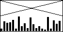
    let r = System.Random()
    canvas [Width 128; Height 64] (
        List.init 21 (fun _ -> r.Next(30) + 2)
        |> List.mapi(fun i p -> Visual.Rectangle {Point = {X = i * 6; Y = 63 - p}; Size = {Width = 4; Height = p }})
        |> List.append [
            Visual.Line ({X = 0; Y = 0},{X = 127; Y = 31})
            Visual.Line ({X = 0; Y = 31},{X = 127; Y = 0})
        ]
    )
Here are a few examples of commands.
    use display = new SSD1306(device) :> ISSD1306

    setup128x64 |> List.iter display.SendCommand
    let g = Graphics.createFromDisplay display
    dock [][] |> renderToDisplay display

    SetMemoryAddressingMode Vertical |> display.SendCommand
    DeactivateScroll |> display.SendCommand
    SetPageAddress (Page0, Page7) |> display.SendCommand
    SetColumnAddress (0uy, 127uy) |> display.SendCommand
    SetDisplayStartLine 0uy |> display.SendCommand
    SetDisplayOffset 0uy |> display.SendCommand
    EntireDisplayOn true |> display.SendCommand
    EntireDisplayOn false |> display.SendCommand
    InverseDisplay true |> display.SendCommand
    InverseDisplay false |> display.SendCommand
    SetColumnAddress (16uy, 111uy) |> display.SendCommand
    SetMultiplexRatio 16uy |> display.SendCommand
    SetMultiplexRatio 26uy |> display.SendCommand
    SetMultiplexRatio 36uy |> display.SendCommand
    SetMultiplexRatio 46uy |> display.SendCommand
    SetMultiplexRatio 56uy |> display.SendCommand

    let hConfig = {
        Direction = ScrollDirection.Right;
        StartPage = Page0;
        EndPage = Page1;
        Interval = ScrollInterval.Frames64
    }

    let vConfig = {
        Offset = 2uy;
        StartRow = 24uy;
        Height = 16uy;
    }

    SetupScroll (hConfig, Some vConfig) |> display.SendCommand
ActivateScroll |> display.SendCommandAdd Border- Add Text Direction
- Add Font Size
Add Clip to GraphicsAdd text wrappingSupport on mono/.net core- Support for SH1106
IoT.Display is licensed under the MIT license.